A commemorative Borges coin.
He says, “Two aesthetics exist: the passive aesthetic of mirrors and the active aesthetic of prisms. Guided by the former, art turns into a copy of the environment’s objectivity or the individual’s psychic history.” There, of course, he sums up all of realism, no? “Guided by the latter, art is redeemed, makes the world into its instrument and forges, beyond spatial and temporal prisons, a personal vision.” That’s Borges.
• The Borges Behind the Fiction: Colin Marshall talks to translator Suzanne Jill Levine. Related: The Garden of Forking Paths.
• From The Quietus: Blondie in Conversation with William S. Burroughs by Victor Bockris, 1979; An Interview with Laurie Anderson by Robert Barry, 2010.
In 962 Abd-er Rahman III was succeeded by his son Al-Hakim. Owing to the peace which the Christians of Cordova then enjoyed […] the citizens of Cordova, Arabs, Christians, and Jews, enjoyed so high a degree of literary culture that the city was known as the New Athens. From all quarters came students eager to drink at its founts of knowledge. Among the men afterwards famous who studied at Cordova were the scholarly monk Gerbert, destined to sit on the Chair of Peter as Sylvester II (999–1003), the Jewish rabbis Moses and Maimonides, and the famous Spanish-Arabian commentator on Aristotle, Averroes.
Entry for The Diocese of Cordova from The Catholic Encyclopedia (1917).
• Professor Newt’s Distorted History Lesson. A riposte to the ignorance of the wretched Gingrich. Related: the Mezquita de Córdoba.
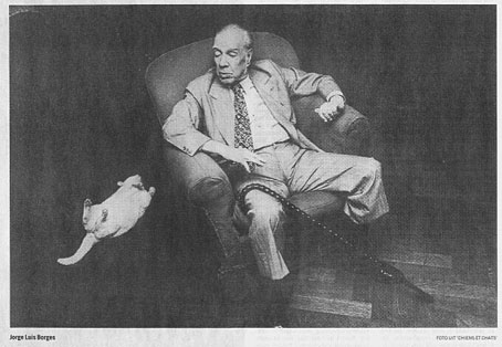
Jorge Luis Borges and a cat. Via.
• Joseph and His Friend—A Story of Pennsylvania (1870) by Bayard Taylor, America’s first (?) gay novel. Related: 20 classic works of gay literature.
• Elegies For Angels, Punks and Raging Queens at the Shaw Theatre, London, from 10–28 August 2010.
• Tristan Perich’s 1-Bit Symphony is released later this month. Café Kaput’s first release, Electronic Music in the Classroom by DD Denham, appears in September.
• “Just relax and enjoy it.” k-punk on the ambition and vision of David Rudkin’s Artemis 81.
• Chris Watson explores Alan Lamb’s The Wires: three audio recordings to download.
• Jonathan Barnbrook: Tuxedomoon fan, 1988, and Tuxedomoon designer, 2007.
• Rob Young’s Electric Eden reviewed by Michel Faber.
• Brian Eno gets the Warp factor.
• No Tears (1978) by Tuxedomoon; Atomic (1979) by Blondie; Everything You Want (1980) by Tuxedomoon; Next One Is Real (1984) by Minimal Compact; Hologram (2010) by These New Puritans.