Eduardo Paolozzi at New Worlds

paolozzi00.jpg

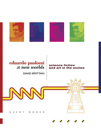
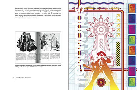
I was working on this book throughout the autumn, and it could hardly be more different to some of the visual extravagance that came before and after. Eduardo Paolozzi at New Worlds is published by Savoy Books this month. Predominantly an examination by David Brittain (no relation to David Britton) of the connections between artists such as Paolozzi and Richard Hamilton with New Worlds magazine in the 1960s, the book is also a rare study of the science fiction magazine when it was making its greatest impact in the late 60s and early 70s.

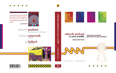
Brittain highlights many examples of Paolozzi’s sf-influenced art of the period, and examines the development of the magazine under Michael Moorcock’s editorship during which time New Worlds evolved from being a slightly moribund sf title in the early 60s to what JG Ballard later called “one of the most exciting magazines of any kind in this country”. An appendix features interviews with some of the key creators and contributors: editor Moorcock, designer Charles Platt, art editor Christopher Finch, contributor Michael Butterworth, and critic John Clute. Writer and illustrator Pamela Zoline created some original artwork for the endpapers. The introduction is by Rick Poynor.
paolozzi01.jpg

Despite being pressured for time I was very pleased to be designing this book. I’d liked Paolozzi’s work since I first encountered it in the Tate Gallery in the 1970s; a couple of years later I was buying up anthologies featuring New Worlds stories (I was too young for the 60s magazine), so discovering that Moorcock had made Paolozzi the magazine’s “Aeronautics Advisor” made perfect sense. In the past I’ve said that New Worlds ruined my taste for hard sf but that’s not really true since I never really liked the stuff beyond a few Arthur C. Clarke books. Too much bad writing, too many cardboard characters shuffling around between chunks of explanation about made-up technology. The discovery of New Worlds merely demonstrated that there were other ways of approaching sf, and you didn’t have to put up with the rubbish.

I also enjoyed the magazine’s bolshy attitude, a quality shared by Harlan Ellison in his Dangerous Visions anthologies. Moorcock says in Brittain’s interview that NW sympathised with the Underground of the late 60s but also tried to be more disciplined in its approach, especially where the design was concerned. You couldn’t have treated fiction to the semi-legible printing that Oz and Frendz often deployed. But the radical attitudes of the Underground can be discerned in the stance NW adopted. Some of the reviews and polemical articles by Moorcock (often under his “James Colvin” pseudonym), M. John Harrison and John Clute are bracingly vitriolic to a degree which if delivered today would probably see them ostracised for life.
paolozzi02.jpg

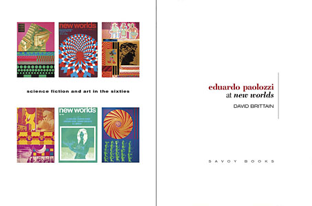
With the design the main intention was to present the information clearly and let the visuals speak for themselves. The book is heavily illustrated throughout, with many examples of Paolozzi’s marvellous prints. The layout nods obliquely to the period; before getting started I spent some time looking at the work of Erik Nitsche. I like the way Nitsche laid out the books he designed in the 1960s, and there’s also a connection in his work as a designer for the General Dynamics corporation: one of Paolozzi’s print series of the period is entitled General Dynamics F.U.N.

Being full-colour throughout, the print run for this book is smaller than usual so anyone interested is advised to move swiftly. Official publication is December 16th but it’s on sale now at Savoy and at Amazon.
paolozzi03.jpg

Continue reading “Eduardo Paolozzi at New Worlds”

The Weird

weird.jpg

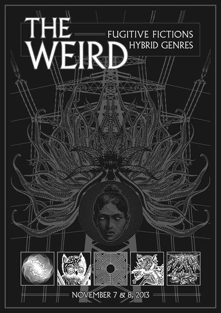
This is a piece of promotional art I’ve done for The Weird: Fugitive Fictions/Hybrid Genres, a two-day event taking place in London next month at the Horse Hospital and the Institute of English Studies, University of London. Organiser Tim Jarvis asked me to contribute an unspecified something; I suggested a poster but that idea proved to be too ambitious, somewhat fortuitously since I had an elaborate design in mind that the current workload would have compromised. This design is the distilled version. The five inset images are a result of having written this post at the beginning of the month. The bespectacled owl is an alchemical illustration from a book I’d found in a charity shop a couple of days earlier.

The event looks like a good one. In addition to the opportunity to see M. John Harrison and others reading on day one, there’s a host of talks on day two that push many of my cult buttons, including discussion of the works of Nigel Kneale and William Hope Hodgson. There’s also Dr Benjamin Noys on “Full Spectrum Offence: The Neo-Weird of Savoy” which I guess may touch on some of the work I’ve done for Savoy Books with David Britton. I’ve got a couple of deadlines looming at the moment so it’s unlikely I’ll be able to attend but I’ll certainly be there in spirit.

Words and pictures

ghosts.jpg

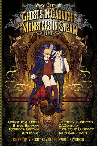
This one has been a long while gestating. Evan J. Peterson asked me late last year to contribute a cover to a new edition of Seattle’s Gay City anthology which he was editing with Vincent Kovar. In May this year the anthology successfully covered some of its production costs with a Kickstarter fund, and the anthology will have its official launch next month (although the book is on sale now). Ghosts in Gaslight, Monsters in Steam combines a loose take on steampunk themes with spectral or horror material, and adds a queer twist. The contents are as follows:

Cover art by John Coulthart
Illustrations by M S Corley and Levi Hastings
Graphic story: Paper Lantern by Jon Macy

Poetry:
from Preternatural Conversations and Oblivious Imperialism is the Worst Kind by CAConrad
Dear Dr. Frankenstein by Jericho Brown
Anaphora as Coping Mechanism and American Dreams by Ocean Vuong
Orpheus on the 74 and The Resurrection Spell by Oscar McNary
Zombie Autopsy by Janie Miller
Moon Goddess by Imani Sims

Hybrid/Flash Fiction/Prose Poetry:
Psychopomp by Lydia Swartz
Thangs by Imani Sims
The Door, Casualties of War, and The Worst is that You Can’t Even Ask Him to Use Protection by Jeremy Halinen

Short Stories:
Demon Lover by Dorothy Allison
Monster Movie by Rebecca Brown
B.E.M.s by Gregory L. Norris
Feeding Desire by Steve Berman
Medium Méchanique by Catherine Lundoff
Study in Blue, Green, and Gold by John Coulthart
A Captive Audience by Ryan Keawekane
Splinter by Ryan Crawford
The Difference Men by Kat Smalley
Alexander’s Wrath by J L Smither
Quota by Amy Shepherd
Heart of the Labyrinth by Tony Rella

This isn’t the first occasion when I’ve produced the cover for an anthology and also contributed some fiction inside—The Thackery T. Lambshead Pocket Guide to Eccentric and Discredited Diseases included a short fiction piece—but the Gay City anthology marks the first appearance in print of anything from my ongoing Axiom project. This is a long-term endeavour which I began in March 2001 but haven’t referred to much in public, mainly because the bulk of the project to date has been written fiction. There are few words more dismaying to hear than the dread phrase “I’m writing a novel”, especially today when the activity of fiction writing seems to have undergone an exponential increase. I tend to believe that unless you’re an established author there’s little to be gained by discussing your own literary labours in public until you have some results to offer. Well, now I have.

I know some people have been curious about the Axiom project so—keeping things brief—I can say it’s two novels, one finished, the second one nearly finished. Axiom was written from 2001 to 2007, and concerns a year in the life of an invented city. It’s fantasy of a sort but closer to the world of Reverbstorm than anything you’ll find on the swords-and-dragons shelves. The idea began in the late 1990s when I was working on Reverbstorm with David Britton and realised I could easily shift the city in that book a few degrees sideways to provide a setting for my own obsessions. I’d been writing a lot of fiction in the 1980s—short stories and two unfinished novels—and wanted to return to this seriously having tired of collaborations and illustrating the work of other people. Axiom marked out some territory I wanted to explore; the new novel, Vitriol, uses the territory to stage a “psychedelic apocalypse”. The project as a whole is loose enough to evolve into other media, and eventually there should be some Axiom-related art. I’ve been working on Vitriol since August 2006 (there was some overlap while finishing the first book); my contribution to the Gay City anthology, Study in Blue, Green, and Gold, is an extract from the work-in-progress which happened to function quite well as a self-contained piece. Despite the anthology theme it’s not quite a steampunk affair but there are some steam locomotives present so it has the required flavour.

Whilst working on the new book I’ve had an agent (Leslie Gardner at Artellus) trying to sell Axiom. This would have been in print by now if the London publisher who agreed to take it 18 months ago hadn’t gone bust after they’d sent us a contract. I’ve been considering putting out a limited hardback edition of the novel, although I’m busy enough as it is, and don’t relish having to self-distribute even a small number of books. For now it’s an option that remains open.

Gay City’s own site points to Amazon for sales of Ghosts in Gaslight, Monsters in Steam so on this occasion I’ll do that too. If you’re in the Seattle area there’s a launch party on September 27th. Details here.

Update: I’ve belatedly noticed that Evan is interviewed about the anthology here.

The art of Roland Cat

cat02.jpg

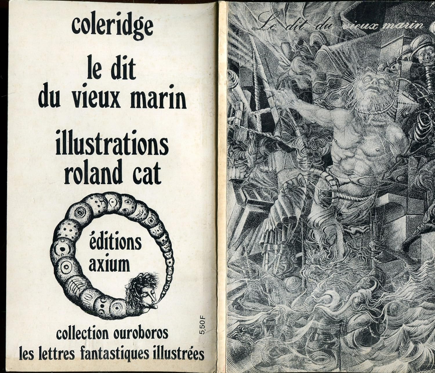
The Rime of the Ancient Mariner (Axium, 1969).

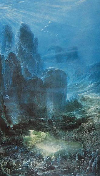
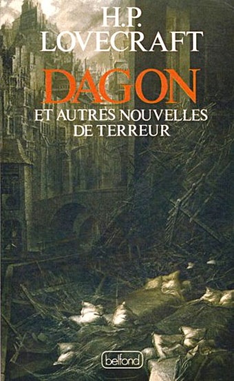
The work of French artist Roland Cat is less Surreal—although some of it could be classed as such—than Fantastic in a manner similar to that of contemporaries such as Michel Henricot, Jean-Pierre Ugarte, Jean-Marie Poumeyrol, Gérard Trignac and others. Art of this nature receives support and encouragement from the French to a degree which often seems inversely proportional to the ignorance it receives from the Anglophone art world. For years the only example of Cat’s work I’d seen was the picture that Dave Britton used on the cover of the Savoy edition of New Worlds magazine in 1979. The examples here are the result of a web trawl, hence the missing titles and dates.

The Coleridge illustration above was for a volume that was part of a series produced by a French publisher in 1969, each edition of which was illustrated by a different artist. This forum post has more details. For more about Roland Cat see this short appraisal at Visionary Review.

cat08.jpg

Sleep (1980).

cat01.jpg

Dagon (Belfond, 1987).

Continue reading “The art of Roland Cat”

Reverbstorm at Supervert

reverbstorm.jpg

Keith Seward’s Horror Panegyric was a concise examination of David Britton’s multimedia Lord Horror project which Savoy Books published in 2007. I designed the book, the cover of which was my Arcimboldo pastiche of Lord Horror’s profile which appeared on the cover of issue 3 of Reverbstorm. The Supervert site which hosts an online copy of Horror Panegyric has this month posted my answers to some questions about Reverbstorm, the series having grown out of the first Lord Horror novel and the earlier comics:

The graphics in Reverbstorm sometimes seem more narrative than the words. How did you and David work out a scenario?

I don’t have objections per se to the usual story structures but in this series we both wanted to create something that wasn’t following familiar adventure narrative lines. The precedents for me were the European comic artists from Métal Hurlant who often favoured art over story; also Burne Hogarth whose work was a great influence on the style I used to draw Lord Horror. Hogarth’s Tarzan strips are adventure narratives but in his later books it’s the art that’s paramount. James Joyce is one of the characters in Reverbstorm, and you can also find a precedent in Ulysses where the story is overwhelmed by the surface detail.

Reverbstorm began with Paul Temple’s lyrics for the Reverbstorm song and a brief Lord Horror film treatment that Dave and Mike had put together for a production company. I don’t recall much about the treatment — I only looked at it once in the office — but it concerned Horror and Jessie Matthews in New York City, opening with a sequence where his Lordship kills some policemen in an alleyway. That vague outline can be seen in the first few pages of Reverbstorm with NYC changed to Torenbürgen. Other elements taken from the film treatment included the name Blue Blaze Laudanum — the actual robotic character came later — and the Souls which likewise became more substantially developed as the comic progressed.

Once we’d introduced all the characters things developed along thematic lines rather than strictly narrative ones. So the second part introduces the Ether Jumpers, the third part has the Apes, the fourth part the Ononoes, the fifth part Picasso and T.S. Eliot, and so on. Musical structure is an obvious parallel, and I consider some of the recurring background material to be visual leifmotifs which can indicate or imply one of the three main characters even if they aren’t present on the page. This musical analogy is an important one for appreciating the series as a whole. The entwined themes and references work in a manner that’s a lot closer to musical works than to the mechanics of an adventure narrative. (more)

Previously on { feuilleton }
Reverbstorm in print
Reverbstorm update
James Joyce in Reverbstorm
A Reverbstorm jukebox
Reverbstorm: Bauhaus Horror
Reverbstorm: an introduction and preview