Covering Joyce

joyce1.jpg

First editions of Ulysses (1922) and Finnegans Wake (1939).

I like Peter Mendelsund’s book cover designs so it’s good to find the designer given the opportunity to provide new covers for James Joyce. Mendelsund’s blog post announcing the news mentions nothing about his intentions, instead we have a reminiscence about Ireland à la Molly Bloom, and pictures of the three covers below.

joyce2.jpg

I’ve never felt a pictorial treatment works with Joyce; his books, especially the Big Two, concentrate so much on words and the labyrinths made by language that anything other than a purely typographic treatment seems superfluous. Art directors going the pictorial route generally end up using familiar photos of the author or views of Dublin circa 1900. The first editions of Ulysses and Finnegans Wake set the pattern for many later editions, and I’ll guess it’s that pattern which Peter Mendelsund has followed here. The typeface used is Poetica, a Robert Slimbach design from 1992, completed by what may be Joyce’s own hand (I’m guessing again) in the manner of the author’s corrected typescripts. The amendments for Dubliners and Portrait of the Artist don’t require explanation but what about the title of Ulysses? I’d read this (so to speak) as representing the novel’s two main characters—Stephen Dedalus: the cold and precise man of letters, and Leopold Bloom: the all-too-human Everyman—who in their circumambulation and eventual meeting comprise the twin poles of the story. There’s also a subtle and clever allusion to Molly Bloom but I’ll let you find that…

The three new books will be published by Vintage but I’ve not managed to find a publication date.

joyce3.jpg

In other Joyce news, the first Chinese translation of Finnegans Wake has proved to be a surprising bestseller. And I ought to mention that Lord Horror: Reverbstorm, my own Joycean excursion (among other things) with David Britton, is now available at Amazon. You can, of course, still buy the book direct from the publishers.

joyce4.jpg

Elsewhere on { feuilleton }
The book covers archive

Previously on { feuilleton }
James Joyce in Reverbstorm
Joyce in Time
Happy Bloomsday
Passages from James Joyce’s Finnegans Wake
Books for Bloomsday

Reverbstorm on sale

reverbstorm1.jpg

At long last, the news that many people have been waiting for: the Reverbstorm book is now on sale at Savoy. From the hyperbolic press release:

“Surfin’ bird Bbbbbbbbbbrbrbrbrbrb…awawawawawawawaaaaaah! A-pa-pa-pa-pa-pa-pa-pa-pa-pa-pa-pa-pa-pa-pa-pa-pa-pa-pa-pa-pa-pa-pa-pa-pa-pa-pa-pa-pa-pa-pa-ooma-mow-mow Papa-oom-mow-mow!” The Trashmen, Surfin’ Bird

Welcome to the nightmare metropolis of Torenbürgen, where New York’s Art Deco architecture has fused with the termination machinery of Auschwitz. In this urban inferno Jessie Matthews is singing Sondheim, James Joyce is at work on a new novel and Lord Horror, ex-Nazi propaganda broadcaster and Torenbürgen’s model citizen, is stalking the streets in search of fresh victims for his razors. Murderous apes infest the alleyways, Ononoes feast on the living and the dead, while above the rooftops the Soul of the Virgin Mary drifts like a swollen Lovecraftian dirigible, picking at bodies destined for the charnel furnaces.

Lord Horror: Reverbstorm is a unique graphic collaboration between writer David Britton, the author of four Lord Horror novels, and artist John Coulthart, whose book of Lovecraft-derived comic strips and illustrations, The Haunter of the Dark, featured a collaboration with Alan Moore. Reverbstorm was originally published in serial form and is now being presented in a single volume for the very first time. Britton’s debut novel, Lord Horror (1990), was the last work of fiction to be banned in the UK; an earlier Lord Horror comic series, Hard Core Horror, was also banned by a British court in 1995. Coulthart’s death-camp artwork from the final issue in that series appears in Reverbstorm as a prelude to the main narrative.

There’s never been a comic like this surreal collision between Modernist art and pulp aesthetics, a world where Finnegans Wake is drenched in Alligator Wine and Picasso’s Guernica is invaded by Tarzan’s simian hordes. Ambitious, transgressive and meticulously rendered, Reverbstorm is one answer to the eternal question posed by those cultural philosophers, The Cramps: “How far can too far go?”

“Bababadalgharaghtakamminarronnkonnbronntonnerronn-
tuonnthunntrovarrhounawnskawntoohoohoordenenthurnuk!”
James Joyce, Finnegans Wake

reverbstorm2.jpg

rev2.jpg

Previously on { feuilleton }
Reverbstorm in print
Reverbstorm update
James Joyce in Reverbstorm
A Reverbstorm jukebox
Reverbstorm: Bauhaus Horror
Reverbstorm: an introduction and preview

Reverbstorm in print

rev1.jpg

A couple of months ago I was starting to wonder whether I’d ever see this book printed, the production process became so tortuously drawn out. But Reverbstorm is finally in print and looking exactly the way I intended with black boards, black endpapers and black ink on the page edges. The latter proved to be a costly extra which explains why it’s an uncommon effect.

rev2.jpg

More important than the book design is that the printing of the artwork is excellent, with rich blacks and pin-sharp detail throughout. You’d think that printing black-and-white pages was a fairly straightforward business but the first set of proofs were pretty disastrous, the ink bleeding over the edges of many panels and detail elsewhere being blacked in. A combination of copious cross-hatching, spattered ink and—on later pages—brush shading and monochrome painting proved to be too much when the A3 artwork was reduced to half its size. This was particularly galling since these pages had never been properly printed since they were drawn: the original comics looked glossy enough but were all produced by back-street printers who didn’t bother too much about quality, and even made mistakes. They were a necessary evil at a time when other Savoy books had been refused by printers who objected to the material they contained. The relief at finally seeing the series completed and printed to this standard is considerable.

rev3.jpg

However, I’m afraid would-be purchasers still have a slight wait before they can buy a copy. The official publication date will now be early February but copies will be available to buy from the first week in January after distribution details have been finalised. I tried to persuade Savoy to relent on this and let a few copies go out prematurely but that won’t be happening. Sorry to anyone who’s been waiting since April (!) for the book but the decision is out of my hands. I believe it’ll be worth the wait. This is a better book than The Haunter of the Dark, and the best (and last) thing I’ll do in the comics medium. Next up is Axiom, a different world entirely. More about that later.

rev4.jpg

Previously on { feuilleton }
Reverbstorm update
James Joyce in Reverbstorm
A Reverbstorm jukebox
Reverbstorm: Bauhaus Horror
Reverbstorm: an introduction and preview

Covering Viriconium

pennington-pastel.jpg

The Pastel City (New English Library, 1971). Illustration by Bruce Pennington.

There are writers’ writers, of course, and M. John Harrison is one of those. He moves elegantly, passionately, from genre to genre, his prose lucent and wise, his stories published as sf or as fantasy, as horror or as mainstream fiction. […] His prose is deceptively simple, each word considered and placed where it can sink deepest and do the most damage.

Neil Gaiman in the introduction to the Bantam/Spectra edition of Viriconium (2005)

This is a lengthy post of potentially minority interest for which I make no apologies. It’s often been a function of the writing here to think aloud while communicating an enthusiasm; as enthusiasms go this one runs deeper than usual. I love these books indecently. If they were people I’d want to sleep with them even though doing so might mean contracting some debilitating illness. When you’re employed as a book designer and illustrator it’s impossible to avoid taking a professional interest in the packaging of your favourite books. M. John Harrison‘s Viriconium books—three novels and a collection of short stories—present challenges that the illustrators and art directors of the past have invariably failed to meet. This post looks at prior cover designs while a subsequent post will suggest some solutions to the challenges. But first it’s necessary to say something about Viriconium itself.

In the distant future of the Earth, when the human race has flourished then lapsed into a state of terminal decay, only one city of note remains: Viriconium, the Pastel City, surrounded by the wastes and fens of a ruined world. Or so we’re told in the first book of a series which begins as outright fantasy and moves by an astonishing feat of authorial dexterity closer to our world and our time. (A shorthand description might describe a series that starts out reading like Jack Vance and ends up closer to Bruno Schulz.) It becomes apparent that Viriconium stands for all the cities that have ever been, and with its avenues, rues and strasses often seems to be a composite of them all. Aside from the unspecified future its fixture in time is indeterminate: one story may concern events which are in the distant past of another while the streets and quarters never remain anchored enough for any kind of map to be drawn. Areas of continuity rise like towers from a sea of vapour. Even the city’s name slips its mooring: the origin is Viroconium Cornoviorum, a Roman town in Shropshire, and Viroconium, a poem by Mary Webb. In the later books we’re told the city is also called Uriconium or Vriko but whether these variants lie in the past or future of Viriconium is unclear. The indeterminacy was deliberate, a riposte to what Harrison calls “fauxthenticity”, and the tendency of genre readers to reduce the subtleties of fiction to the schematics of role-playing games, spaceship diagrams and books with titles like The Science of Middle-Earth. It’s this indeterminacy and a refusal to offer neat resolutions (or that awful term “closure”) that no doubt explains why Harrison’s books often seem to attract more praise than actual readers.

The most remarkable aspect of the books presents the greatest problems in design terms. In the fourteen years that Harrison worked on his series he used its mutable qualities to pull the entire project to pieces without actually destroying it or turning the whole thing into a self-regarding postmodern game. The early books critique the lazy assumptions of the fantasy genre while the later books recast the earlier stories as myths or half-remembered dreams. The first two books may use the apparatus of the fantasy genre but that doesn’t mean the tired imagery of fantasy illustration necessarily suits their covers. The very last story, A Young Man’s Journey to Viriconium, is set in the north of England in our own time. Changing the name Viriconium to London throughout the text, which Harrison has done when the story has been published elsewhere, dissolves the remaining genre trappings. The process is akin to watching those Buddhist monks who construct elaborate mandalas of coloured sand only to sweep them away when the work is finished. All this makes the Viriconium books unique, it’s one of many reasons why I hold them in such high regard and it’s also why they frequently irritate those who want simpler fare. The problem of appealing to a reactionary readership may explain why many of the following covers have failed to honour the content of the books.

pastel-minor.jpg

The Pastel City (Doubleday, 1972) Illustration by Wendell Minor.

Dustjacket summaries do none of the books any favours but for the unacquainted they help give a flavour of each volume. They also show how the presentation gradually shifts emphasis. Here’s the Doubleday edition:

An intriguing fantasy in which past and future blend uniquely on an Earth far different from any known to man.

There, in the Empire of Viriconium, a world of chivalry, of magic and strange powers, two Queens clash in bloody warfare for control of the Pastel City and all of its domains. The armies of the defender, Queen Methvet, are led by Lord tegeus-Cromis and the rest of a legendary band of knights, while their attackers are the vicious and cunning Northmen who serve the rival Queen Moidart.

More is involved than a struggle for a throne however, for in their lust for victory the forces of Queen Moidart have unleashed creatures from Earth’s dim past whose terrible potential they little realize until too late. And as Lord Cromis and the rest of his band seek to meet the challenge of these nightmare apparitions, their quest leads them on a perilous journey across many weird lands to a deadly climax in a buried city where a solution is revealed that is as old as time itself.

It’s apposite that a series about an indeterminate city begins with some confusion evident from the outset. The Pastel City in its first UK printing was described on the cover as a fantasy yet compared to Dune which is generally regarded as science fiction; the Doubleday edition is labelled science fiction yet the cover illustration shows a mailed and armoured warrior; the narrative is situated somewhere between the genres in what used to be called science fantasy. While the story concerns the distant future many of the props are the familiar material of heroic fantasy: horses, swords, feuding queens, an axe-wielding dwarf. What technology remains is either defunct or barely functioning. The ruin and decay of Harrison’s world is part of the pleasure, as is the vacillating and ambivalent nature of the characters, a quality which increases as the series develops. None of the publishers dare to reflect this ambivalence in the cover art. Unaware readers would be led to believe from subsequent editions that these books contain the determined and super-efficient heroes they’d find in other books. Compared to what follows the first two covers aren’t so bad; Bruce Pennington gives us one of his flying saucer apocalypses while Wendell Minor’s avoidance of a genre scene is an approach that might have been deployed a lot more often later on.

Continue reading “Covering Viriconium”

A Reverbstorm jukebox

lordhorror.jpg

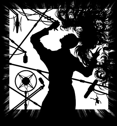
Another in a series of posts that supplement the forthcoming Reverbstorm book. Music, especially the rock’n’roll of the mid-50s to the mid-60s, was an important motor in Reverbstorm‘s creation: the title comes from the lyrics to Paul Temple’s song, and the song itself was included as a CD-single with the first issue. Each issue opened with a playlist of ten pieces of music offered as a complement to the narrative. We alternated the choices: David Britton chose the first ten, I chose ten for the second issue and so on. Dave’s choices were mainly the rock’n’roll he’s been listening to all his life while I tried to balance this with a more eclectic selection. But in Reverbstorm itself it’s the rock’n’roll that’s referenced the most, and it was this era of music we were both listening to a great deal during the composition of the series.

What follows is a guide to some of the songs and instrumentals referred to in the book, together with some of my favourite tracks from a compilation tape I used to play repeatedly while I was drawing. A few of these tracks are very obscure one-off singles so this list serves an additional function in saving people the trouble of hunting around.

bo.jpg

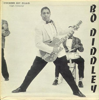
Bo Diddley (1955) by Bo Diddley
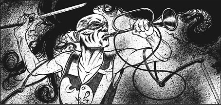
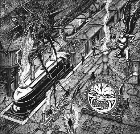
Part 3 of Reverbstorm, “The Big Beat of Apes”, is subtitled “Bo Diddley meets William Hope Hodgson”, and it’s to the Bo Diddley Beat that we’re referring. Diddley recycled his highly influential riff/rhythm many times, and inspired many cover versions, pastiches or outright thefts. A heady mix of these may be heard on one of the key albums for the creation of the series, a 1989 vinyl-only compilation entitled Bo Did It! which gathered seventeen obscure Diddley Beat singles. A couple of these are listed in Lord Horror’s radio playlist seen in part two, while others are present in this list. But this Bo Diddley song is where it all begins.

Bottle To The Baby (1956) by Charlie Feathers
Classic hiccoughing rockabilly and a favourite of Savoy cult band The Cramps who covered Feathers’ I Can’t Hardly Stand It. Bottle To The Baby gets a mention in part 3 while Charlie himself is quoted in part 8.

The Monkey (Speaks His Mind) (1957) by Dave Bartholomew
A moral tale from Mr Bartholomew, also quoted in part 3.

Esquerita And The Voola (1958) by Esquerita
Often cited as the guy that Little Richard stole all everything from, the very flamboyant Eskew Reeder Jr had an erratic career which yielded this berserk highlight, the B-side of his Rockin’ The Joint single. I first heard this when Dave played it in Savoy’s Peter Street shop one day and couldn’t believe how crazy it sounded. It’s also hard to believe it was on a major label. Play loud.

Hootchy-Koo (1958) by Larry Williams
Larry Williams was the prince of big bawdy numbers like this, and a favourite of The Beatles who covered three of his songs. The version I used to listen to was a slightly different demo recording (not on YT, unfortunately). Lucy Swan liked Hootchy-Koo so much she mentions it in her Lord Horror-related novel The Adventures of Little Lou.

Rumble (1958) by Link Wray
The ultimate swaggering riff and the moment where the guitar takes over from the saxophone as the locus of menace in popular music. Most people have probably heard this in the background of the Jack Rabbit Slim’s scene in Pulp Fiction but you’ll find it elsewhere, notably a Ry Cooder cover version in Streets of Fire, the highlight of an otherwise lacklustre film.

Alligator Wine (1958) by Screamin’ Jay Hawkins
The witches’ recipe from Macbeth gets reworked by Leiber & Stoller as a swampland love potion for Screamin’ Jay.

Storm Warning (1959) by Mac Rebennack
Before a bullet ruined one of his fingers, Dr John was guitarist Mac Rebennack whose early career produced some impressive singles such as this Diddley Beat instrumental. That title is now impossible to disassociate from the devastation wrought by Hurricane Katrina in 2005.

Tall Cool One (1959) by The Wailers
The Wailers, a Seattle group, are often listed now as The Fabulous Wailers to distinguish them from Bob Marley’s group. They had a knack for catchy instrumentals; in addition to this there was also Mau Mau.

Wang Dang Doodle (1960) by Howlin’ Wolf
Given a choice between this version of Willy Dixon’s song and the later Koko Taylor recording (which includes Dixon on vocals) I’d probably choose Koko’s but the Wolf came first, and this was the one Dave listed in the first issue of the series.

I Want Some of That (1961) by Kai Ray
One from the Lord’s playlist in part 2.

Let There Be Drums (1961) by Sandy Nelson
Sandy Nelson made a career out of recording drum instrumentals. This thundering opus is his finest moment.
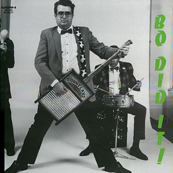
bodidit.jpg

Bo Did It! (1989)

Boom Stix (1962) by Curley and The Jades
Who the hell were Curley and The Jades? Don’t ask me but this obscure single from the Bo Did It! collection manages to weld a Sandy Nelson drum break to the Diddley Beat.

Papa-Oom-Mow-Mow (1962) by The Rivingtons
One of the great nonsense hits, and endlessly imitated afterwards, the title gets a mention in part 2. Kim Fowley had something to do with the release so it’s fitting that he’s wound up with Savoy as well, having written the insert notes to the recent Fenella Fielding album.

Surfin’ Bird (1963) by The Trashmen
Of all the copyists and imitators that chased The Rivingtons’ success none can approach these two minutes and twenty seconds of demented genius.

The Fourth Dimension (1964) by The Ventures
I find a little of The Ventures’ twanging instrumentals usually goes a long way, like many of these groups they work best on compilations. But I do like The Ventures in Space which is where this spooky David Lynch-style number originates.

Strychnine (1965) by The Sonics
Psycho would have been the obvious choice here but I tried to avoid being predictable. Everything The Sonics recorded sounds cranked to the point of distortion, and this is no exception. Garage punk at its wildest.

Bop Diddlie In The Jungle (1966) by Tommy King and The Starlites
Another track from Lord Horror’s playlist found on the Bo Did It! collection, this is Bo’s Diddley Daddy relocated to a jungle setting.

Electricity (1967) by Captain Beefheart and his Magic Band
The whole of Reverbstorm is dedicated to Trout Mask Replica but this was a track from one of my playlists. A compelling argument for why there should be more theremins in pop music.

I Wanna Be Your Dog (1969) by The Stooges
Lust For Life was the album I was playing a lot whilst drawing but this song was another of Dave’s choices. One of the Savoy “Lord Horror” singles in the 1980s was a cover of Raw Power.

Garbageman (1980) by The Cramps
And another of the Savoy “Lord Horror” singles was a cover of this unstoppable beast from The Cramps. “Do you want the real thing, or are you just talkin’?”

Previously on { feuilleton }
Reverbstorm: Bauhaus Horror
Reverbstorm: an introduction and preview