The Adventures of Little Lou

lou1.jpg

lou2.jpg

lou3.jpg

lou4.jpg

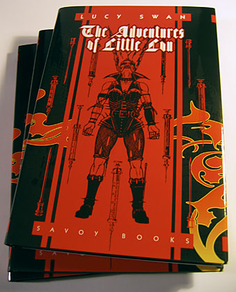
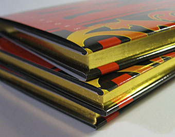
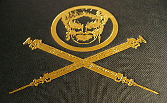
People ask me now and then what I prefer working on the most, and the answer is always the same—book design. The Adventures of Little Lou, a short novel by Lucy Swan for Savoy Books turned up today from the printers and it’s a good example of why I find this kind of work so enjoyable. For a start, the printers, Anthony Rowe Ltd, always do an excellent job. One of the things which makes CD design aggravating at times is the lack of care from pressing plants when it comes to print quality. But most of all there’s the pleasure of being able to make a book a beautiful object in its own right.

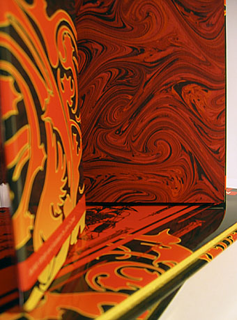
For this title we used gold blocking on the pages again and endpapers patterned with a red marbling design. The gold and red complements the dust jacket, and the scarlet swirls correspond to a number of motifs in the book, from the delirium of the characters’ drug states to the quantities of blood spilled as the story progresses. Lucy’s book riffs on David Britton’s Lord Horror and Meng and Ecker characters in much the same way that some of the New Worlds‘ writers of the late Sixties riffed on Michael Moorcock‘s Jerry Cornelius character, taking prior creations as a starting point for something new. This won’t appeal to a general readership; it’s vicious, offensive, scatalogical, wonderfully imaginative, downright nasty in places, and frequently very funny. But that’s okay, it’s a Savoy book, not another clunker from Jonathan Cape.
My pastiches

rev3cov.jpg

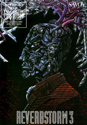
Lord Horror: Reverbstorm #3 (1992).

Following from the post about an art forgery exhibition (and Eddie Campbell discussing his American Gothic cover for Bacchus), I thought I’d post some of my own forgeries, or pastiches as we call them when no deception is intended.

Reverbstorm was the Lord Horror comic series I was creating with David Britton for Savoy in the 1990s. The Modernist techniques of collage (as in the work of Picasso and others) and quotation (as in TS Eliot’s The Waste Land) became themes in themselves as the series developed, so it seemed natural to imitate the styles of various artists as we went along. Pastiche is also a chance to flagrantly show off, of course, and I can’t deny that this was also one of my impulses here.

Issue #3 of Reverbstorm had marauding apes as its theme, from the Rue Morgue to Tarzan and King Kong, so I had the idea of doing an ape cover in the style of the celebrated paintings by Giuseppe Arcimboldo (1527–1593) which make human heads out of fruit, flowers or animals. Easy enough to have the idea but making it work took a lot of effort and required careful sketching beforehand, something I rarely do. The painting was gouache on board, a medium I’d been using for years and this was about the last gouache work I did before switching to acrylics.

Continue reading “My pastiches”

Reverbstorm

reverbstorm.jpg

My discipline here has rather collapsed since returning from Paris. Lots of things that required sorting out and the distraction of a new computer is the excuse. Time for a new announcement, however. Now that The Haunter of the Dark is back in print, work has begun at the Savoy HQ on the eventual reprinting of my comics magnum opus, Reverbstorm. This was the 8-part Lord Horror series I was producing for Savoy with David Britton that sprang directly out of my Lovecraft comics work and is, in some small way, a continuation of it (hence the inclusion of some pages in the final part of HOTD).

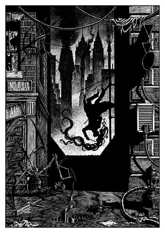
Reverbstorm was an attempt by Dave and I to produce a graphic novel (wretched term, but if the boot fits…) that was truly adult, at a time—the early Nineties—when much there was much discussion of “adult comics” but little worthy of the name being produced. Reverbstorm is adult in terms of its often aggressive and challenging content; so are many mainstream comics now. But it’s also adult in terms of style and technique, being laden with quotation and literary and artistic allusion that requires an understanding of some of the key works of the Modernist movement to fully appreciate. Being a Lord Horror work, there’s also plenty of reference to the fascist philosophy that Dave’s character (based on William Joyce, Lord Haw-Haw) subscribes to. Mix all this with a great deal of violence and you have a very dark work indeed, one that most readers and reviewers of the time were happy to ignore.

Well Reverbstorm is returning to the world in a definitive form. All the artwork is being scanned and cleaned (and in some cases, amended slightly); the eighth and final part will see its first publication in this new edition and there’ll be some previously unseen or unpublished material also. The series as a whole contains 270 pages of some of my best ever black and white artwork (and some great additional work from Kris Guidio) so I’m very pleased that this volume is set to appear in a form that will do justice to the years we spent creating it. Publication will probably be in autumn 2007 but watch this space for further details.

For more on the Reverbstorm series, read my short essay about its genesis here.

New work for July

sh_cover.jpg

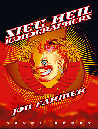
This new Savoy volume was an exhausting task, 608pp with illustrations on nearly every page. The book is another study of Savoy’s long career as publishers with many digressions examining the various maverick and often unsavoury characters that have fuelled David Britton’s books and the wider Savoy corpus, from real and imagined fascists to pulp writers, movie cowboys, PJ Proby and sundry rock’n’rollers. It forms a loose trilogy with two earlier books, Robert Meadley’s A Tea Dance at Savoy and DM Mitchell’s A Serious Life.

For the design I wanted to avoid the obvious that the title would imply and play around with a different brand of totalitarian imagery, namely the iconography of Soviet Russia and its accompanying propaganda. We used Jonathan Barnbrook’s Newspeak font for all of the titles and headings, a great design that has the right look while still being contemporary. The cover and interior chapter spreads borrow elements of the Soviet style, with some nods towards the general Bauhaus and Art Deco designs of the 1920s and ’30s. It was an enjoyable project even if it did seem interminable at times.