top left: artist unknown (1969); top right: Patrick Woodroffe (1975)
bottom left: Peter Elson (1988); bottom right: artist unknown (1995)
The Men with snakes post at the weekend finished on a note of Freudian melodrama with a picture of Doc Savage battling a giant python. Lester Dent’s brazen hero has appeared a number of times in the work of Philip José Farmer, a writer who’s spent much of his career laying bare the psychosexual forces which give us stories of pulp heroes struggling with (among other things) enormous snakes.
Farmer is famous—notorious, even—for being the first writer to place sex centre stage in science fiction with his story of a human/alien encounter, The Lovers, in 1952. While subsequent writers have broadened the field in their own way, Farmer is somewhat unique in being equally adept at writing solidly successful sf adventure such as the World of Tiers or Riverworld books, yet with a mischievous and intellectual facility that could be upsetting to what used to be a very conservative sf establishment. Farmer was writing about sex at a time when few genre writers wanted to deal with the subject. He also loves pulp fiction in all its manifestations yet isn’t afraid of examining its characters with the objectivity of an anthropologist. Both these impulses came together (so to speak) in the late Sixties with the outrageous pulp pornography of Image of the Beast and A Feast Unknown. More about these in a minute.
Farmer has a particular enthusiasm for Tarzan and Doc Savage and eventually wrote “official biographies” of the pair with Tarzan Alive (1972) and the splendidly-titled Doc Savage: His Apocalyptic Life (1973). These books saw the beginning of his Wold Newton Universe which sought to connect all the heroes and villains of the late 19th and early 20th century into a vast, incestuous family tree, a scheme which predates similar exercises such as Alan Moore and Kevin O’Neill’s League of Extraordinary Gentlemen by three decades or more. His versatility and delight in pastiche was demonstrated in Jungle Rot Kid on the Nod (1968) which rewrote Edgar Rice Burroughs’ Tarzan in the style of William Burroughs. There aren’t many writers with a full-enough appreciation of both these authors to pull off such a challenge.
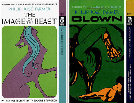
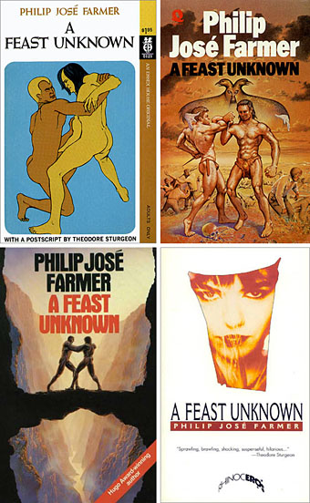
Original Essex House editions, 1968 & 1969. Artist/designer unknown although the cover of Blown is based on Geopoliticus Child Watching the Birth of the New Man by Salvador Dalí.
Image of the Beast (1968), its sequel, Blown (1969), and A Feast Unknown (1969) were all written for sf-porn publisher Essex House, an opportunity which unleashed Farmer’s already fertile imagination. These took a while to be reprinted but are now considered among his best works; they’re certainly favourites of mine and I love the simple graphics of the original covers, such a change from the usual airbrushed sf fare. I produced a cover illustration for the Creation Books edition of Image/Blown in 2001 which, while okay, I now feel could have been better. A Feast Unknown is Farmer’s most gloriously excessive novel, and still surprises when read today. Illustrator Patrick Woodroffe, who painted the cover for the first UK printing, thought the book “dangerous” and complained in his Mythopoeikon collection that there was little he could safely illustrate. The story has a thinly-disguised Tarzan (Lord Grandrith) and Doc Savage (Doc Caliban) set against each other by a group of mysterious immortals. The pair discover that violence gives them erections and killing provokes an orgasm, the cue for a couple of hundred pages of eye-popping, ball-busting mayhem. It’s ironic that during the Seventies when general readers were looking for racy thrills in books by Harold Robbins or Jackie Collins, the real hardcore stuff was over on the science fiction shelves with Farmer’s work, Ballard’s Crash, Samuel Delany’s Equinox, aka The Tides of Lust, Charles Platt’s The Gas, and others.
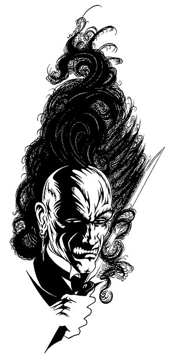
Farmer wrote two equally crazy sequels to Feast in 1970, Lord of the Trees and The Mad Goblin but unfortunately stripped out the excesses of the former book. I’ve always been disappointed by this and continue to hope that one day the original versions of the sequels will see print. Science fiction may have calmed down a bit (or grown conservative again) since the Seventies but Farmer’s work still exerts an influence. His unveiling of the weird psychosis at the heart of pulp fiction certainly affected the approach I took with the Lord Horror series Reverbstorm, created with David Britton in the 1990s, a series I’ve referred to more than once as a psychopathology of heroic fantasy.
The covers above all come from the official PJF website which also includes my Image/Blown cover design. (And where they also spell my name wrong.)
Previously on { feuilleton }
• Men with snakes
• The book covers archive