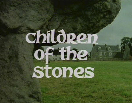
“Pretty phantasmagorical!” says precocious teenager Matthew when he and his father drive into the fictional village of Milbury in the opening scene of Children of the Stones. Matthew’s father is a scientist whose work requires a three-month stay in a village built in the centre of a series of ancient ramparts and stone circles. Once settled, they find many of the villagers to be blandly cheerful, while Matthew discovers that his maths skills at the local school pale beside younger children who can solve complex equations with ease. Omnipresent characters in the village are Hendrick, a retired astronomer who owns the local manor house and acts as village squire; Margaret, a newly-arrived archaeologist who knows the history of the stones; and Dai, a vagrant poacher who lives outside the circle, and who seems eager to remain free of the Stepford-like happiness afflicting his neighbours.
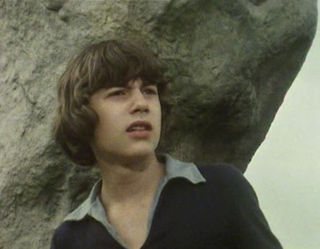
Matthew (Peter Demin).
Matthew’s “phantasmagorical” epithet is directed at the neolithic mound outside the village but could easily apply to the whole of this seven-part serial which I watched again recently. HTV produced Children of the Stones which was first broadcast in early 1977. A mystery serial for children involving pagan history, folk rituals and an undercurrent of science fiction wasn’t such a surprising thing in the 1970s, this being a decade when a popular interest in the occult and the paranormal was more prevalent than at any time before or since. Children’s television reflected adult trends which is why we got to see an adaptation of Alan Garner’s The Owl Service, the occult adventure series Ace of Wands (with its hero named “Tarot”), The Tomorrow People (which occasionally strayed from science fiction to science fantasy) and others (see an earlier post, Occultism for kids). Children of the Stones was the most complex of all of these, a well-crafted drama with similarities to Nigel Kneale’s TV plays, The Wicker Man and The Prisoner. With a slight change of emphasis it would have worked just as well as a serial for adults. The best children’s serials of the period were usually adaptations of novels; Children of the Stones was an original work for television, written by Jeremy Burnham & Trevor Ray, and directed by Peter Graham Scott.
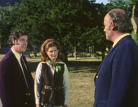
Adam (Gareth Thomas), Margaret (Veronica Strong) and Hendrick (Iain Cuthbertson).