S. Latitude 47°9′, W. Longitude 126°43′

shipattack.jpg

Then, driven ahead by curiosity in their captured yacht under Johansen’s command, the men sight a great stone pillar sticking out of the sea, and in S. Latitude 47°9′, W. Longitude 126°43′, come upon a coastline of mingled mud, ooze, and weedy Cyclopean masonry which can be nothing less than the tangible substance of earth’s supreme terror—the nightmare corpse-city of R’lyeh, that was built in measureless aeons behind history by the vast, loathsome shapes that seeped down from the dark stars. There lay great Cthulhu and his hordes, hidden in green slimy vaults and sending out at last, after cycles incalculable, the thoughts that spread fear to the dreams of the sensitive and called imperiously to the faithful to come on a pilgrimage of liberation and restoration.

HP Lovecraft, The Call of Cthulhu (1928)

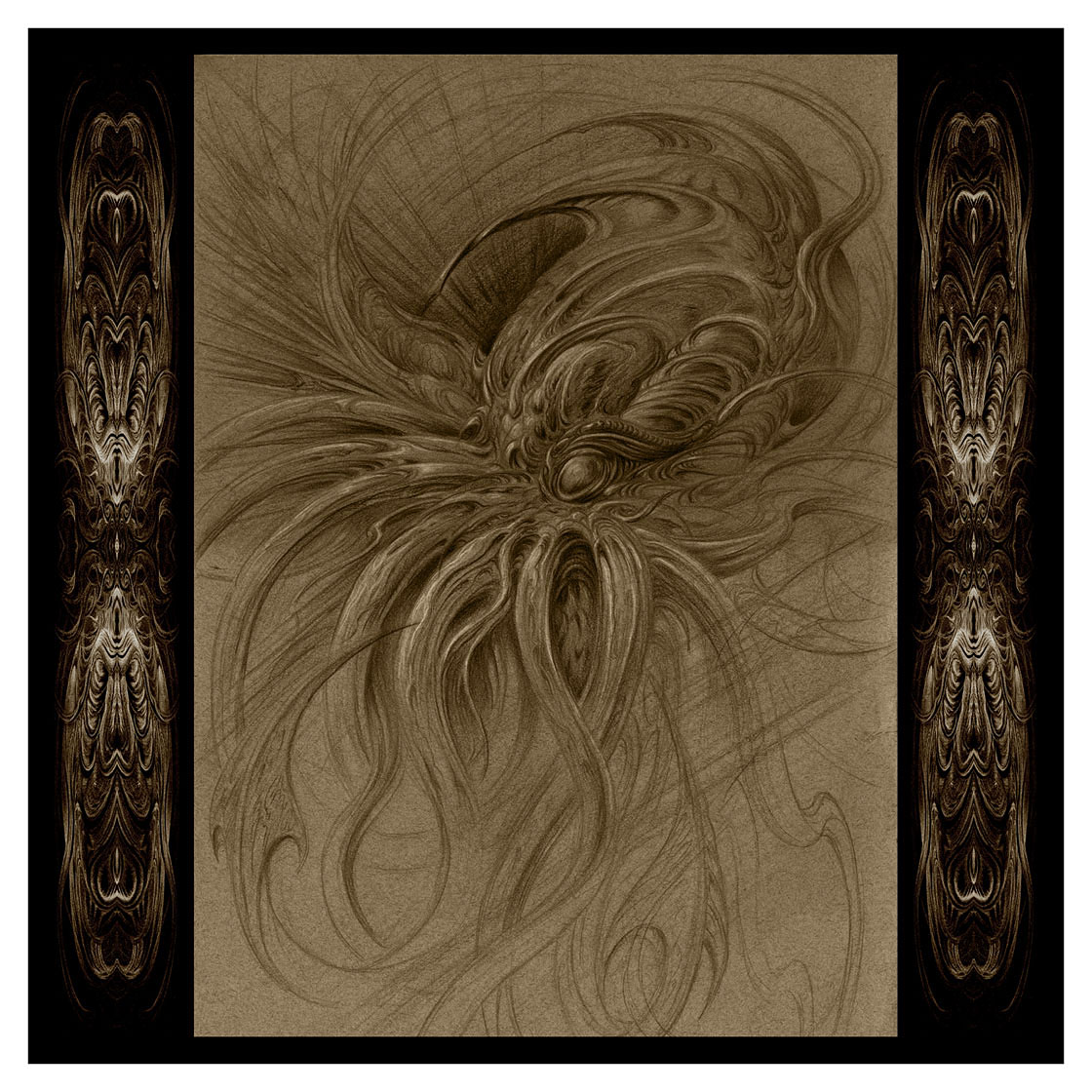
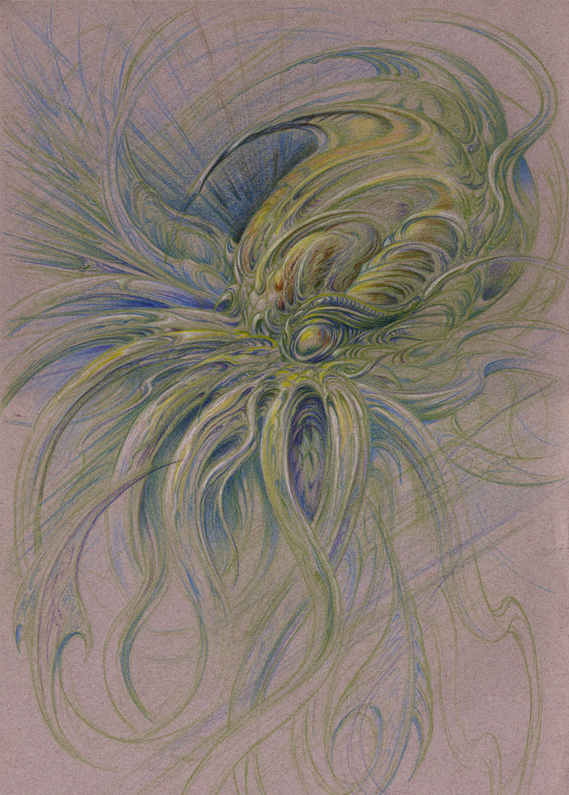
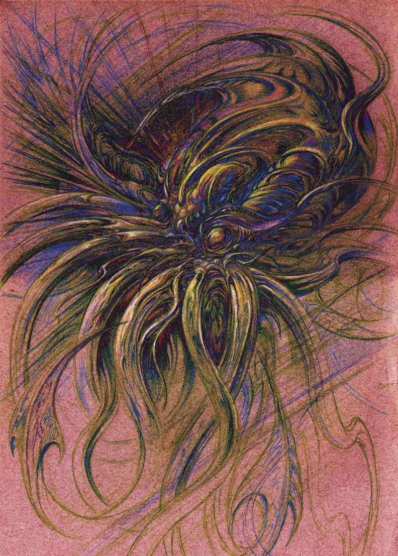
“Great Cthulhu and his hordes…” People never mention the hordes, do they? I’m pleased to say that the loathsome horde gathered in my forthcoming Cthulhu Calendar are in situ at last, since I’ve found the time this week to get everything finished. I still need to write a couple of new web pages then upload all the images to CafePress. I’ll be doing that over the weekend so Monday will be the launch day.

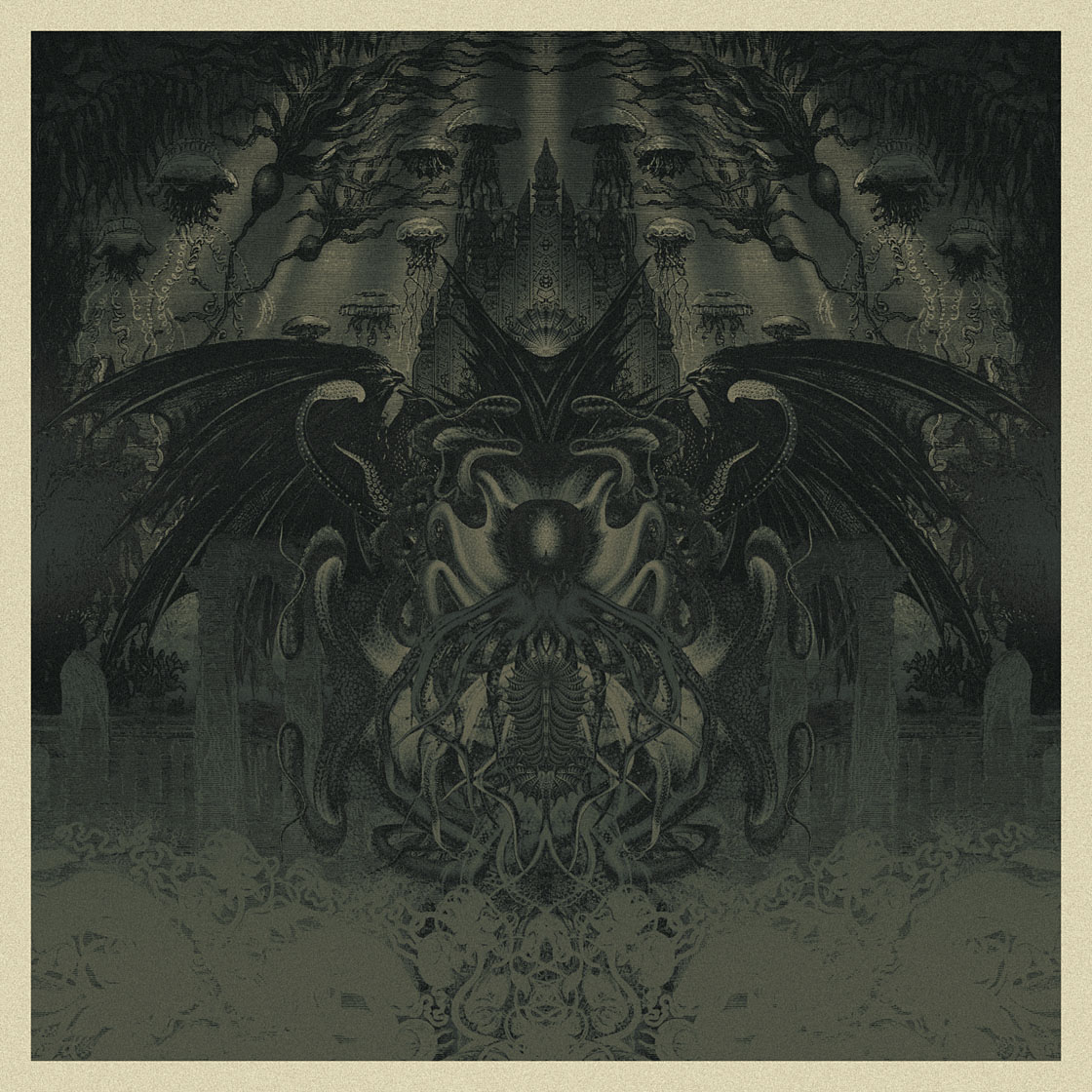
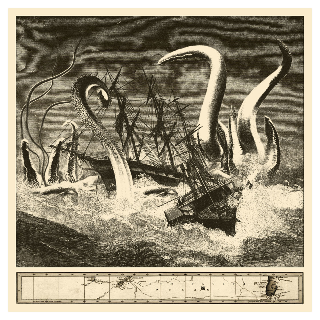
For the final piece I decided against doing another portrait in favour of a picture of an attack at sea as it might have appeared in a 19th-century newspaper. This kind of imagery will now make many people think of the Kraken scenes in the second Pirates of the Caribbean film but it predates cinema, of course, as it also predates Lovecraft. Despite Lovecraft’s indelible association with monstrous tentacles there are a lot more incidents of this nature in William Hope Hodgson’s stories and novels than in the Cthulhu Mythos. In which case this scene, which will be the page for December, can be regarded as a tip of the hat to William as much as to Howard.

Elsewhere on { feuilleton }
The Lovecraft archive

Resurgam variations

resurgam1.jpg

Another new page completed for my forthcoming Cthulhu Calendar, I decided to give this one another Latin title for maximum pomposity. “Resurgam” means “I shall rise again” which seems a fitting sentiment for the loathsome Spawn of the Stars. This piece was an improvised drawing which from the outset I wanted to leave incomplete. I’ve always liked pencil drawings which grade from detail to an insubstantial sketchiness, and most of the other representations in the calendar are already highly finished. I usually can’t resist filling every last centimetre so this should be regarded as a rare exercise in restraint.

resurgam2.jpg

This is the drawing in its original state. After scanning it and messing with various colour overlays I decided to go with sepia tones. The calendar is already heavy on the green so umber shades will vary things a little. Since it’ll be a CafePress product all the pages have to be square which presents a problem for non-square artwork. I dislike cropping a drawing to fill the page so the additional panels are samples from the drawing quartered and mirrored, a simple effect that always works well. The picture below is one of the earlier variations, the result of applying some Photoshop solarisation then inverting the image.

resurgam3.jpg

I now have one more page to fill then the calendar will be finished. (The cover is already done.) I’m hoping to have it completed by this time next week. Keep your tentacles crossed.

Elsewhere on { feuilleton }
The Lovecraft archive

De Profundis

deprofundis.jpg

De Profundis (2012).

The title is nothing to do with Oscar Wilde’s famous epistle from prison, but then that should be obvious looking at my latest piece of tenebrous artwork. “De Profundis” means “From the depths” which in this case is applied to another piece with a Cthulhu theme. I made a decision earlier this year that my calendar design for 2013 would comprise a collection of all my Cthulhu portraits to date, from The Call of Cthulhu on. I didn’t have 12 pictures, however, so I’m currently making up the numbers between other jobs. This is the first completed piece which steals a background from the illustrations by Alphonse de Neuville and Édouard Riou for Jules Verne’s Twenty Thousand Leagues Under the Sea (1871). The voyagers in the Nautilus encountered some fearsome creatures but nothing quite like this. I can’t say at the moment when the calendar will be ready but I’m hoping to have it finished before the end of the month.

Elsewhere on { feuilleton }
The Lovecraft archive

Skull, 1983

skull.jpg

Mention yesterday of pencil drawing prompted me to dig out this item from one of my old portfolios. It was drawn shortly after I was given a somewhat battered human skull by a student nurse (hello, Victoria, wherever you are), an object I sketched on a number of occasions before eventually making it into the finger-slashing fetish object below which appeared recently in the The Thackery T. Lambshead Cabinet of Curiosities. The drawing dates from 1983—I remember listening to the Art of Noise EP Into Battle whilst working—and it’s unusual for me in showing the drawn object alone on a sheet of paper with no attempt made to place it in a scene. It’s also a slightly misjudged rendering; this ink drawing from a year later shows a more careful representation of the skull’s proportions, spoiled a little by the pointless and unconvincing seascape I placed behind it.

skull2.jpg

The Bookman Histories

bookman.jpg

Now that Angry Robot books has revealed the cover design which kept me busy throughout July I can do the same here. The Bookman Histories is an omnibus reprinting of Lavie Tidhar‘s steampunk trilogy which comprises The Bookman, Camera Obscura and The Great Game. The stories are frenetic, crowded with incident and feature a huge range of characters that find real people such as Jules Verne and Harry Houdini encountering contemporaries—both human and non-human—from the fiction of the late 19th century. All the requisite steampunk boxes are ticked. David Icke will be thrilled to know that in these books the British royal family are a bunch of lizards from space…

My initial impulse when faced with far too much material was to cram every square centimetre of the cover with detail but if I’d have done that I’d probably still be working on it, and would also have run the risk of it turning into an incoherent mess. So this layout, which is crowded enough, is something of a compromise. I also wanted to save some space for the title design.

bookman2.jpg

The main body of the title isn’t a font but was created from scratch based on letterforms and decorative elements from this fantastic set of fire insurance title pages. I’d been wanting to try something based on these hand-drawn designs ever since Mr Peacay posted them at BibliOdyssey last year. This particular design provided the basic letter shapes although I had to invent several of missing characters.

bookman3.jpg

In the third part of the trilogy the Martians from HG Wells’ War of the Worlds invade, so I spent rather too much time fashioning a Martian tripod from lots of tiny bits of machinery. This is one of the earlier drafts. It was an odd thing finishing this cover (which includes the planet Mars in the background) whilst the world was getting excited by the real landing on Mars of the Curiosity Rover.

The Bookman Histories will be published in March next year. Meanwhile there’s more steampunk design on its way. Watch this space.

Previously on { feuilleton }
Aether Cola
Crafting steampunk illustrations
SteamPunk Magazine
Morlocks, airships and curious cabinets
The Steampunk Bible
Steampunk Reloaded
Steampunk overloaded!
More Steampunk and the Crawling Chaos
Steampunk Redux
Steampunk framed
Steampunk Horror Shortcuts