Icons

icon1.jpg

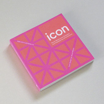
“Iconic” is a much abused word these days but this book from UK publisher Counter-Print can claim the term with some justification:

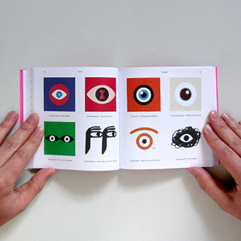
Icon contains over 200 examples of social media icons from many well-known, as well as up-and-coming, graphic designers and illustrators. This limited and concise canvas for self-expression is represented within this book through a host of examples collected from around the world, chosen for their creativity, intelligence and beauty.

My own icon/monogram/whatever is one of those featured in the “Shapes” section. It’s strange seeing this symbol subjected to any kind of attention even though it’s at the top of this web page and can also be found in much of my work. It appeared in drawings when I was about 15 or 16 and eventually became a personal identifier some time in the early 1980s. One reason I like it and continue to use it is because I don’t know what it is; it doesn’t originate out of any conscious expression, and doesn’t refer to any specific symbolic history even though it resembles other symbols. I always liked Whistler’s habit of using a peacock as his signature so he didn’t have to spoil his paintings with a scrawl; Aubrey Beardsley imitated his example for a while using three vertical lines as his signature. This icon has served a similar purpose for me although these days I’m as likely to use my surname and some Roman numerals.

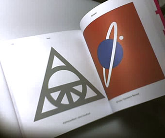
Icon is a great little book, smartly designed by Leterme Dowling and brimming with equally smart content. Some page samples follow.
icon2.jpg

icon3.jpg

Continue reading “Icons”

Fuseli’s Nightmare

nightmare1.jpg

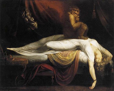
The Nightmare (1781).

Christopher Frayling’s Nightmare: The Birth of Horror (1996) opens with a prologue examining Henry Fuseli’s most celebrated painting:

Henry Fuseli, who later wrote that “one of the most unexplored regions of art are dreams”, and who was said to have supped on raw pork chops specifically to induce his nightmare, made his name with this painting. And engraved versions, produced in 1782, 1783 and 1784, distributed the image across Europe, until Fuseli’s masterpiece became the way of visualising bad dreams.

Although The Nightmare was painted just before the Romantic craze in Western Europe—which revelled in peeling back the veneer of rational civilisation to reveal the “natural” being or the raw sensations beneath, sometimes through the gateway of dreams—it was well-known to the writers and painters of the early nineteenth century. One of them wrote that “it was Fuseli who made real and visible to us the vague and insubstantial phantoms which haunt like dim dreams the oppressed imagination”.

The Nightmare was fascinating—and scary—because it operated at so many different levels at once. It was set in the present (the stool and bedside table are “contemporary” in style), and it was concerned not so much with an individual’s nightmare—the usual subject-matter of dream paintings, often involving famous individuals and their prophecies—as with nightmares in general. It was not A Nightmare, but The Nightmare; not a vision but a sensation. This gave it a direct impact, unmediated by history, which put a lot of critics off.

nightmare2.jpg

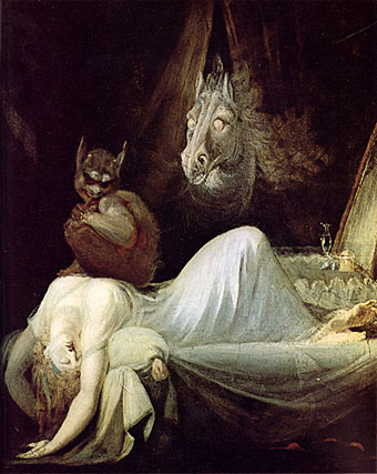
The Nightmare (1791).

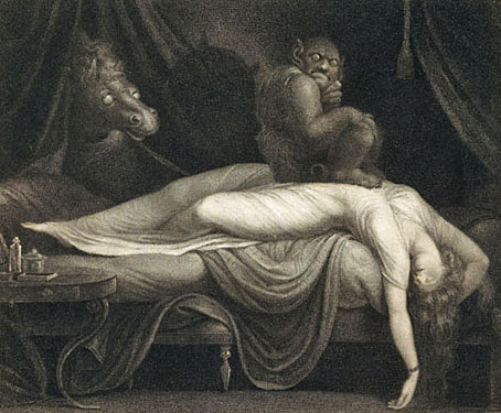
Later generations of critics have had no such problems, of course, nor have the legions of artists and cartoonists who’ve plagiarised and parodied this memorable scene. I had a vague notion of collecting some of the derivations but a quick image search reveals an endless profusion of squatting figures and thrusting horse heads. Wikipedia did provide two of the engraved versions, however. Of the two paintings above I’ve always preferred the later one: the incubus, or “mara” as Frayling calls it, looks more sinister, and the horse head has become an almost unavoidable sexual symbol. No wonder that Siegmund Freud had a copy of The Nightmare on the wall of his waiting room.

nightmare3.jpg

Engraving by Thomas Burke (1783).

Continue reading “Fuseli’s Nightmare”

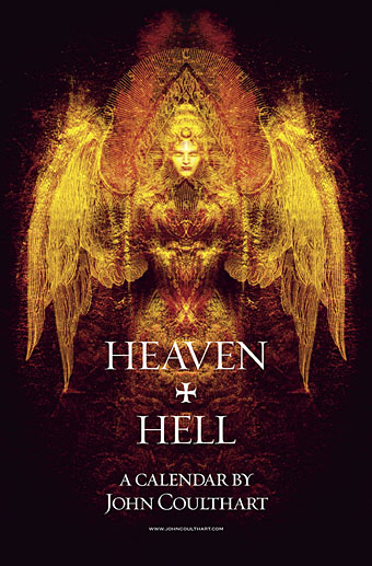
Heaven and Hell calendar

heavenhell00.jpg

Painting from the poster art for The Highbury Working (2000) by Alan Moore & Tim Perkins.

Unlike last year, this year’s CafePress calendar arrives on time, its creation being eased by the fact that it’s a reworking on an earlier version. The idea with the previous Heaven & Hell calendar had been to alternate various pieces of infernal Cradle of Filth artwork with contrasting imagery; as things turned out I had more offerings for Hell than for Heaven—no surprise there—so the reality wasn’t very satisfying.

This year I’ve managed to fill out the Heaven sequence with more recent works, all of which have been slightly adjusted to fit the square page ratio required by CafePress. So even though these are old pieces many of them are unique to this printing. Larger copies of the pages may be seen here while the CafePress purchase page is here. As always, my thanks to everyone who buys these things.

And as before, the calendars for previous years are now available all year round; see the full range here. Note that this means you need to select January as the starting month if you want the months to run for a single year only.

heavenhell01.jpg

JANUARY: Variation of the poster art for Angel Passage (2001) by Alan Moore & Tim Perkins.

Angel Passage was Alan and Tim’s album about the life and work of William Blake. I designed the CD, a poster, and also produced a video for the multi-media performance of the piece at the Purcell Room, London, in February 2001.

heavenhell02.jpg

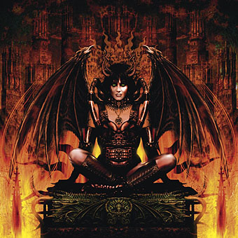
FEBRUARY: Cover for Bitter Suites To Succubi by Cradle of Filth (2001).

My first piece of Cradle of Filth art. I was a little surprised when working on this that they really did want the wings and horns; Dani loved that kind of imagery. I was even more surprised when this cover was subsequently showcased in an entire window in Tower Records’ main London shop in Piccadilly.

Continue reading “Heaven and Hell calendar”

More vapour trails

jeter.jpg

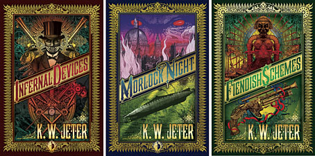
Those covers everyone likes. My designs for KW Jeter’s steampunk novels from Angry Robot and Tor Books.

When I wrote a brief history of steampunk for Eye magazine last year I ended by somewhat provocatively declaring that until something better appeared this was the defining aesthetic of the moment. A year later, the movement (if we can use that term) continues to evolve despite the steady drip of complaints that it’s all reactionary, historically illiterate, and so on. Much of the ire remains nonsensical, and often seems to boil down to a common disdain for people enjoying themselves in some unorthodox manner.

manual.jpg

Design by Galen Smith after the Hetzel editions of Jules Verne’s novels.

If I hadn’t got involved on the art side I would have found it difficult to avoid being attracted by steampunk in one form or another since so much of it originates in areas I was already interested in, not least HG Wells and Victorian science fiction. The rapid evolution of the past few years means we’re currently seeing an aesthetic leaving behind its origins to become an international subculture. What’s striking about this activity—and this is something that doesn’t seem to have been discussed very much—is the way the whole thing has been birthed by genre fiction rather than by pop music, as was the case for the second half of the 20th century. This piece is meant to be a news post, however, not another cultural critique, but if I happen to write any more on the subject there’s something there that’s worth exploring.

manual2.jpg

As to the news: this month finds my steampunk artwork manifesting in three very different locations in one of those odd coincidences of timing that occur now and then. First up there’s the Steampunk User’s Manual edited by Jeff VanderMeer & Desirina Boskovich, a follow-up to 2011’s Steampunk Bible. For the new volume I designed spreads for three entries by Jess Nevins from The Encyclopedia of Fantastic Victoriana: Alternative History Edition.

Continue reading “More vapour trails”

Shapeshifters

arvin.jpg

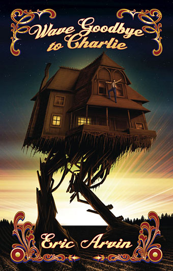
Time for another work update. These are three covers for fantasy novels from LGB imprints due for release in the next week or so. The brief for Eric Arvin’s cover was walking house plus some kind of fairground (or carnival) decoration. I found a nice trove of fairground art at Sheffield University but the picture was working so well I didn’t want to clutter it with extraneous detail. Wave Goodbye to Charlie is published by Wilde City Press.

hale1.jpg

And speaking of extraneous detail… Ginn Hale’s books continue a series featuring swashbuckling, shapeshifting characters, witches and the like. (There’s also a witch in Eric Arvin’s novel but she drives a Buick.) I spent a great deal of time collaging bits of gargoyles and statuary from A. Raguenet’s six-volume Materials and Documents of Architecture and Sculpture (1915) into two elaborate arch designs…then covered them over. This is a bad habit but at least everything ended up in the finished artwork. My other bad habit is spending ages creating something only to place it into the composition and find it doesn’t work at all… Ginn Hale’s novels are published by Blind Eye Books.

hale2.jpg