Whoever I. Paulini was, no one seems to know his (or, indeed, her) first name. Even the Metropolitan Museum of Art, NYC, which owns a copy of these plates, doesn’t elaborate. The copies here are scans from a Getty edition of Alphabeto, part of the collection of Getty Institute volumes at the Internet Archive. The book is usually dated 1570 but a note states that “The watermarks … suggest a printing date closer to the end of the 16th century than to 1570, the conjectural date of first publication.”
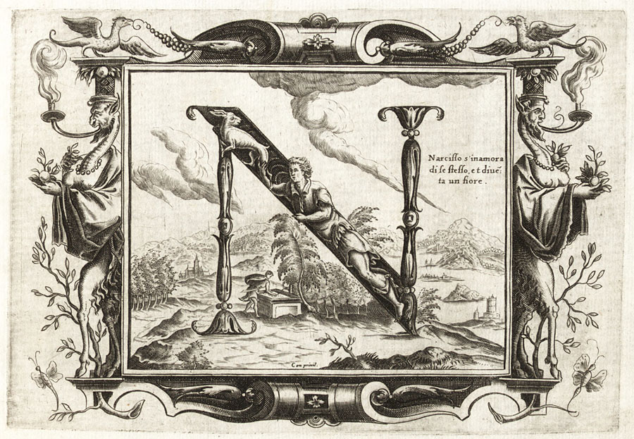
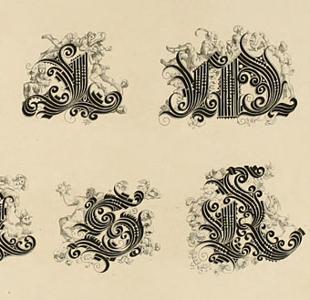
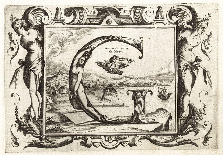
Paulini gives use twenty engraved plates each showing an ornamented letter of the Roman alphabet with a background depicting a scene from Greek and Roman mythology; each letter is tied to a different character or scene, so here we have G for Ganymede, and N for Narcissus. Mister Aitch at the late, lamented Giornale Nuovo was a great enthusiast for these kinds of alphabets, and for engravings in general. He pursued his own researches into the Paulini mystery back in 2006 when copies of the complete set of letters were difficult to find.
Elsewhere on { feuilleton }
• The etching and engraving archive
Previously on { feuilleton }
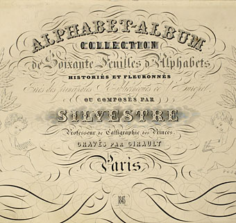
• Joseph Balthazar Silvestre’s Alphabet-album
• Johann Theodor de Bry’s Neiw Kunstliches Alphabet
• The Book of Ornamental Alphabets
• Paul Franck’s calligraphy
• Gramato-graphices
• John Bickham’s Fables and other short poems
• Letters and Lettering
• Studies in Pen Art
• Flourishes