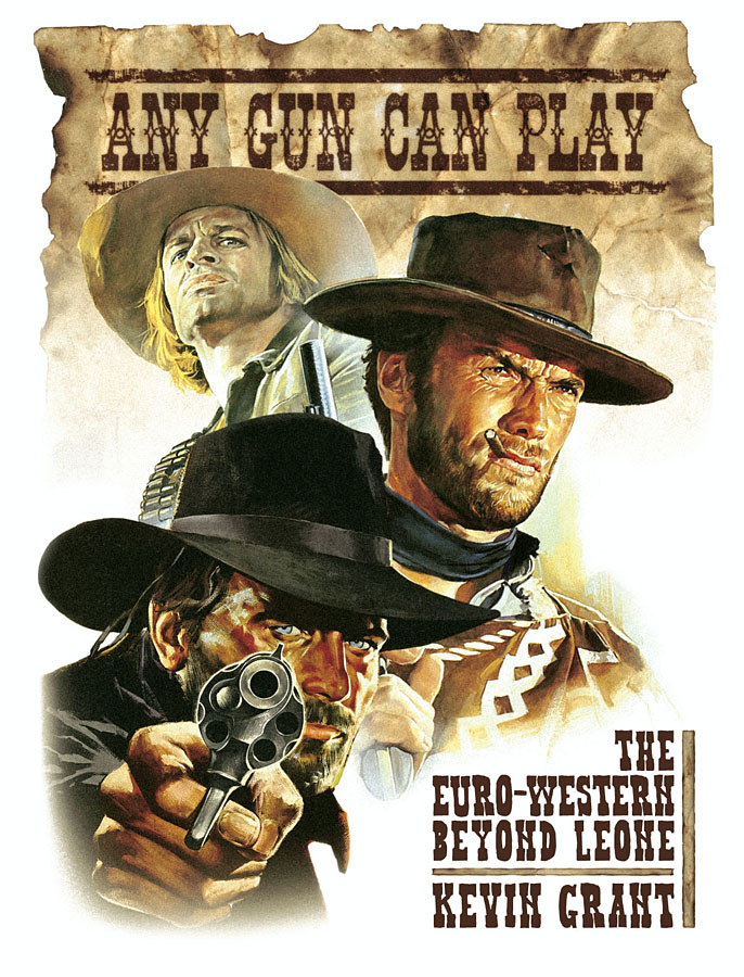
This was something I put together last year for FAB Press but the book has only been published in the past month. The design was little more than an assembly job on my part, with Harvey at FAB requesting a montage of the three poster-art gunmen plus suitable Western typography. We went through a number of generic fonts then I added a little creative touch with the background for the title type which was a sheet of paper scorched and stained using tap water, a tea bag and a gas-ring. Forget Photoshop filters, you still can’t beat the trusty tea bag for random stains.
Cynical and stylish, bloody and baroque, Euro-westerns replaced straight-shooting sheriffs and courageous cowboys with amoral adventurers, whose murderous methods would shock the heroes of Hollywood Westerns. These films became box-office sensations around the world, and their influence can still be felt today.
Any Gun Can Play puts the phenomenon into perspective, exploring the films’ wider reaches, their recurrent themes, characters, quirks and motifs. It examines Euro-westerns in relation to their American ancestors and the mechanics of the Italian popular film industry, and spotlights the unsung actors, directors and other artists who subverted the ‘code’ of the Western and dragged it into the modern age.
Based on years of research backed up by interviews with many of the genre’s leading lights, including actors Franco Nero, Giuliano Gemma and Gianni Garko, writer Sergio Donati, and directors Sergio Sollima and Giuliano Carnimeo, Any Gun Can Play will satisfy both connoisseurs and the curious.
Despite my minimal contribution, this is a very handsome volume to be connected to. I’ve had Christopher Frayling’s Spaghetti Westerns (1981) book for years so I’m already disposed towards the subject. Frayling’s book is a semi-academic analysis which for a long time was the only serious study of the subgenre. Additional studies by Frayling and others have followed but Kevin Grant’s book, subtitled The Essential Guide to Euro-Westerns, looks like a tough one to beat: 480 pages, detailed analyses, a who’s who section, filmography, and a huge quantity of photos and poster graphics, many in colour. There’s also a foreword by actor Franco Nero, threatening everyone on the cover in his Django guise. To test the author’s thoroughness I looked up Se sei vivo spara (1967) (If You Live, Shoot!), a film also known as Django Kill! even though it’s nothing to do with the Django series. Giulio Questi’s film is a very bizarre (and occasionally inept) blend of Spaghetti tropes and horror-style scenes of graphic gore, featuring (among other things) a crucified hero, a vampire bat, and a band of black-clad homosexual cowboys. Frayling’s book devotes a few paragraphs to the film while Grant gives it two-and-a-half pages plus pictures. IMDB may tell us the facts about a film’s production but the barely-literate reviews and troll-filled discussion boards on that site are useless. For authoritative review and analysis you still need a book like this. Any Gun Can Play can be ordered direct from FAB Press where they’re selling a limited number signed by Franco Nero and the author.