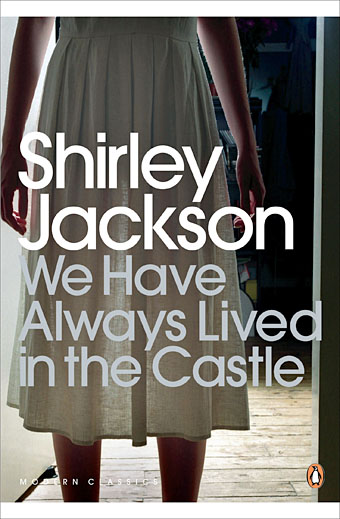
Penguin, 2009. Photo by Lisa Johansson.
Having recently re-read Shirley Jackson’s The Haunting of Hill House (1959) I thought it was about time I read her final novel, We Have Always Lived in the Castle (1962), and I’m very pleased that I did. I was less pleased, however, with the cover of the current edition from Penguin which, like many of the recent Penguin Classics, aspires to a kind of evasive blandness. There are recurrent problems in designing covers for books of exceptional quality: the more the writing opens itself to interpretation, and refuses to be easily categorised, the greater the challenge of finding a single design or image which might represent the book. It’s this that leads literary novels, classics especially, down the road of the text-only cover.
We Have Always Lived in the Castle may be of exceptional quality but it’s also very strange, dark and disturbing, something which the Penguin cover does little to communicate. The opening paragraph doesn’t match the justly celebrated opening of The Haunting of Hill House but it still sets out its stall in no uncertain terms:
My name is Mary Katherine Blackwood. I am eighteen years old, and I live with my sister Constance. I have often thought that with any luck at all I could have been born a werewolf, because the two middle fingers on both my hands are the same length, but I have had to be content with what I had. I dislike washing myself, and dogs, and noise. I like my sister Constance, and Richard Plantagenet, and Amanita phalloides, the death-cup mushroom. Everyone else in my family is dead.
Merricat (as her sister calls her) neglects to mention that they live with one other member of the family, Uncle Julian, a wheelchair-bound survivor of an unresolved poisoning that killed the rest of the family six years earlier. Julian devotes himself to obsessively writing an account of that fatal day while Constance works equally obsessively in the kitchen of the house they share. Mary does little except run errands to the nearby village (whose populace she hates and fears), and play outdoors with her cat, Jonas. Mary is the focus of the novel, a character as painfully introverted as Eleanor in Hill House but with more self-possession and some dangerous obsessions of her own. Joyce Carol Oates in the afterword to the current Penguin edition calls her a witch, which she is in a very diffuse sense. She protects the house with objects that she turns into charms, buries other significant objects, and selects words at random which she believes will protect her. Unlike Hill House there’s nothing at all supernatural in We Have Always Lived in the Castle but Merricat successfully predicts that change is going to disrupt the happily insular household which it does with the arrival of boorish cousin Charles.
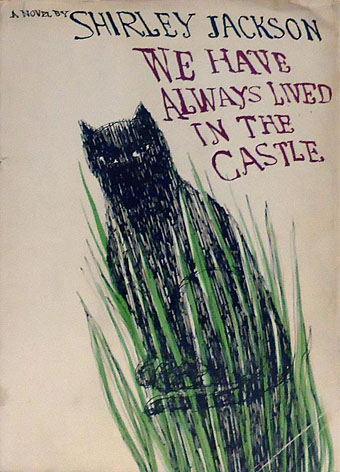
First edition, Viking Press, 1962.
What’s notable for me when looking at earlier cover designs is seeing how much more successful the original covers are compared to later editions. The drawing of Jonas on the jacket of the first edition is suitably wary and even baleful, as Merricat is where strangers are concerned. The lurching, uneven script reflects the skewed lives of the novel’s characters. The cover could have been the work of Merricat herself.
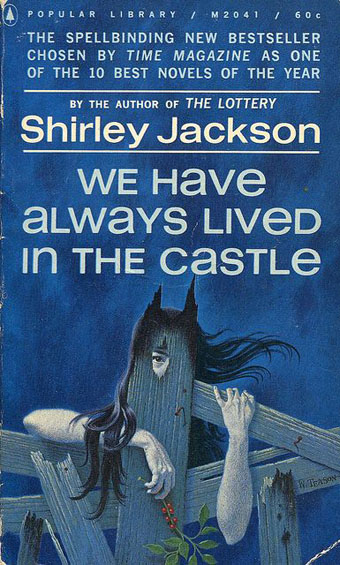
Popular Library, 1963. Illustration by William Teason.
And it’s Merricat who appears on the first paperback edition. I tend to disapprove of the depiction of central characters on book covers but this addresses the challenge brilliantly: the wild hair, the suspicious eye, the charred wood (there is a fire in the second half of the book), and the spikes which give her cat-like ears.
Continue reading “We Have Always Lived in the Castle by Shirley Jackson”