The Joe Phenix Detective Series

joephenix.jpg

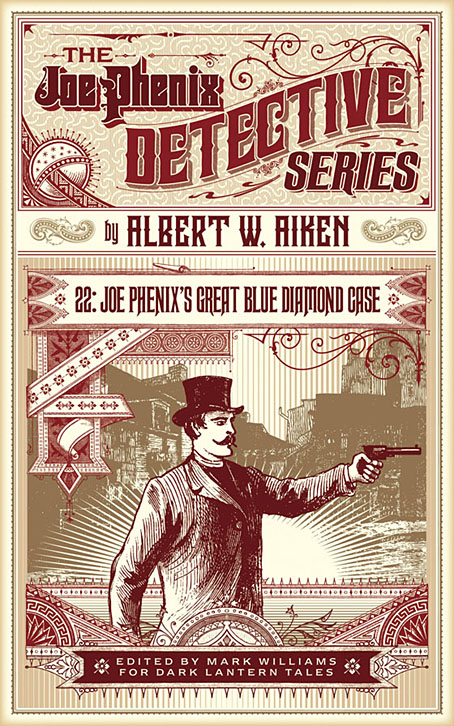
After six months of black-and-white drawing it’s been good to return to colour book covers of which this is the first of a new crop of designs. Albert W. Aiken (c.1846–1894) was a prolific American author of pulp fiction, whether writing under his own name or pseudonymously (and sometimes as a woman) for Dime Library, Banner Weekly, Saturday Journal and many other publications. Joe Phenix (also named Phoenix in later stories) was one of his more popular creations, a late-Victorian detective whose investigations ran to over 20 adventures. These tales are in the process of being made available by Mark Williams in ebook form so my task was to provide a single cover design that could function for all the titles.

In keeping with the new format, the style deployed here is mostly a pastiche of the dime novel idiom with a few contemporary touches. Many of the dime publications favoured a large box in the top third of the cover which would contain a typically florid title arrangement. The accompanying illustrations were often comparatively crude but the titles followed the style of the period with engraved drop shadows, gradients and lots of fine decoration. It’s fun to imitate this style although it can also be more time-consuming than contemporary design since everything has to be worked out one piece at a time. Several of the decorative elements on this cover are what printers used to refer to as “combination ornaments”, very small details which can be pieced together in a number of ways to form banners, borders and other motifs. Combination ornaments were a solution to the problem of working elaborate decoration into spaces of variable size and shape; instead of a pre-shaped design you’d shape the decoration to fit the space. They were also lucrative since printers charged for the use of each small element. In a digital composition such as this the joins between the pieces are invisible but in a period design you can often spot the combination pieces (especially in border designs) when the individual elements fail to line up properly. The figure with the gun, incidentally, is Mr Phenix himself, taken from the cover of Beadle’s Dime Library.

The first few Joe Phenix titles are available now at Amazon and other ebook outlets with further titles to follow.

Previously on { feuilleton }
The man who wasn’t Tesla
The George Dower Trilogy by KW Jeter
Steampunk in the Tank
More vapour trails
Steampunk catalogued
Steampunk: The Art of Victorian Futurism
Steampunk Calendar
Words and pictures
Nathanial Krill at the Time Node
Fiendish Schemes
Ghosts in Gaslight, Monsters in Steam
Steampunk Revolution
The Bookman Histories
Aether Cola
Crafting steampunk illustrations
SteamPunk Magazine
Morlocks, airships and curious cabinets
The Steampunk Bible
Steampunk Reloaded
Steampunk overloaded!
More Steampunk and the Crawling Chaos
Steampunk Redux
Steampunk framed
Steampunk Horror Shortcuts

James Cawthorn: The Man and His Art

cawthorn-cover.jpg

The past year would have been busier than usual with the amount of illustration work I had to deal with, but it was made even busier with my having to design this book at the same time. James Cawthorn: The Man and His Art was originally intended to be a modest memorial by Maureen Cawthorn Bell for her artist brother following his death in 2008, but the book grew into a heavyweight volume of 448 pages containing over 800 individual pieces of art: book covers, illustrations for magazines and fanzines, private pieces for friends and relatives, and many sketches or preliminary works, most of which have never seen print before.

cawthorn-coverspread.jpg

Given Jim Cawthorn’s long association with Michael Moorcock, as both friend and collaborator, the task of collating the artwork and editing the book went to Moorcock bibliographer John Davey, who also serves as the book’s publisher. John spent three years locating over 3000 pieces of artwork, large and small. Some of these pieces are now lodged with the Moorcock archives in the Bodleian Library, Oxford, while others may only be found in the pages of the many science fiction and fantasy fanzines that Jim illustrated, copies of which are stored at the British Library. From this body of material Maureen and John selected a core of representative work from Jim’s private as well as public life, although no-one at the outset of the project was expecting the final picture tally to be so high.

cawthorn-spread-01.jpg

My task as the book’s designer involved making the text presentable (easy) and corralling the artwork (not so easy, and I also had to either clean or colour-adjust every single piece). Maureen had divided the book into several sections, beginning with a lengthy biographical reminiscence. Following this was “Jim by Jim”, a selection of interviews, magazine pieces, some fiction, essays and book reviews. There was also a lengthy extract from Fantasy: 100 Best Novels (1988), a book credited to Jim and Michael Moorcock but, by Moorcock’s admission, mostly Jim’s work. Jim Cawthorn was very well-read, especially in the genres—he was old enough and interested enough to have read The Lord of the Rings when it was first published—and could also present his erudition engagingly for a reader, so the text section of Maureen’s book is far from indulgent.

cawthorn-spread-02.jpg

The book design isn’t as elaborate as some I’ve worked on but it didn’t need to be when the pictorial material is rich with what Moorcock calls “wizardry and wild romance”. Maureen wanted a particular picture of Moorcock’s Elric character on the cover so I took details and motifs from some of Jim’s many Elric illustrations to give the book a thematic thread and internal consistency. Cawthorn was present at the creation of Elric in the early 1960s; he not only provided Moorcock’s characters with their first illustrations but even helped plot one of the earliest stories, Kings in Darkness.

cawthorn-number.jpg

Page numbers are framed by the swords from the Elric stories.

Using motifs such as the sword silhouette and Elric head is something I frequently do with book designs but for this book I also went to the trouble of creating a one-off font for the drop capitals based on Jim’s hand-drawn lettering. Jim drew titles and other lettering throughout his career, so again this was a decision warranted by the book’s contents. The few times we met I never asked him about this but I’ve always thought his lettering designs were derived from the stylised titles that J. Allen St. John created for many of the early Edgar Rice Burroughs books. Jim spent most of his life drawing Burroughs’ characters, and was very familiar with the work of Burroughs’ original illustrators. I was hoping to find a title design of Jim’s that I could rework for the book’s title but none of the examples worked as well as I hoped. For this reason the title lettering is based on different styles from the John Carter novels that were Jim’s favourites among Burroughs’ works.

cawthorn-spread-03.jpg

Other features include a foreword by Alan Moore, an afterword by Michael Moorcock, a gallery of Jim’s Lord of the Rings drawings and character sketches from the early 1960s (which predate all others bar those by Tolkien himself), artwork for Hawkwind (including Dave Brock’s “Meliadus” T-shirt), and even a handful of photos from the set of The Land that Time Forgot (1975), the ER Burroughs-derived feature film scripted by Jim with Michael Moorcock. The page samples here are necessarily few given the size of the book.

cawthorn-spread-04.jpg

For the moment James Cawthorn: The Man and His Art is available exclusively from publishers Jayde Design at a special pre-publication price of £20. After publication on 6th August the price will rise to £35. Further page samples follow.

Continue reading “James Cawthorn: The Man and His Art”

Weekend links 418

vertigo.jpg

Poster by Roman Cieślewicz for the 1963 Polish release of Vertigo. Via The Hitchcock Zone.

• Alfred Hitchcock’s Vertigo is sixty years old this year. It’s a film I’ve always found to be preposterous and very over-rated, despite the considerable strengths of its cast, production, etc; consequently, any claims to its being an unalloyed masterpiece (such as being voted the best film of all time in the 2012 Sight & Sound poll) have been difficult to accept. For the latest anniversary, David Thomson examined the film in the light of changing social attitudes.

• Currently seeking funding at Unbound: Stars, Fools and Lovers: An illustrated guide to the art and history of the Tarot by Joanna Ebenstein, Laetitia Barbier and Mark Pilkington. Another Tarot-related book, Pamela Colman Smith: The Untold Story by Stuart R. Kaplan with Mary K. Greer, Elizabeth Foley O’Connor and Melinda Boyd Parsons, will be published next month.

• Everybody wants to talk to Jon Hassell at the moment, which is no bad thing: recent interviews have appeared at The Vinyl Factory, Red Bull Radio and Vice.

• Coming soon from Lazarus Corporation: England’s Dark Dreaming by Paul Watson.

• Sean Kitching on The Strange World of Charles Hayward (This Heat et al).

• At Dennis Copper’s: The title sequences of 56 mostly horror movies.

• Stone circles: Adam Scovell chooses 10 notable cinematic examples.

• “You gotta be selfish. It’s a terrible thing,” says David Lynch.

Wolf’s Kompaktkiste shows off a serious record collection.

Boy with Cat (1966), a short film by Donald Richie.

• Mix of the week: Secret Thirteen Mix 256 by Nina.

Tank (2018), a short film by Stu Maschwitz.

Phantom Islands—A Sonic Atlas

Letraset, design and music

• Vertigo (1988) by Flash Cero | Psyko (Themes from Psycho and Vertigo) (1993) by Laika & The Cosmonauts | Vértigo Magnético (2014) by Liquidarlo Celuloide

Weekend links 413

bester.jpg

Cover art and design by David Pelham, 1974. The author’s name is set in Marvin (see below).

• Revelation of the week is a lengthy, career-spanning interview with Igor Wakhévitch, the French composer whose extraordinary run of albums from the 1970s are cult items in these parts. (Previously) Wakhévitch isn’t exactly reclusive but he lives in India, and hasn’t recorded anything since the 1980s, so in recent years he wasn’t visible or even known much at all outside France. The release in 1998 of a CD collection, Donc…, and a handful of vinyl reissues, brought him out of obscurity, although all the reissues to date have been in limited quantities. Work of this quality really warrants a wider release.

The Sky Torn Apart is a new album by Paul Schütze, his first for several years. Very good it is too, 56 minutes of growling and glittering atmospherics that could equally suit the enervating heights of summer (as in Wendy Carlos’s drone piece from Sonic Seasonings) as the depths of winter, the inspiration being the apocalyptic cycles of Norse mythology.

• At Lambda Literary: Cathy Camper talks to cartoonist Justin Hall about his planned film, No Straight Lines, about the history of queer comics. There’s a Kickstarter for the project, and more background detail at QueerClick (NSFW).

• Introducing Marvin Visions, a digital revival of Marvin, a photoset typeface first launched in 1969, and very popular during the 1970s on science-fiction cover designs. Marvin Visions is free for personal use.

• The second number of the relaunched Wyrd Daze—”The multimedia zine of speculative fiction + extra-ordinary music, art & writing”—has arrived.

• At New Noise: Dylan Carlson (again) talking about the influences on his solo album, Conquistador.

• Video Drone: Russell Cuzner talks to Rose Kallal about her audio-visual concerts.

• Mix of the week: a Dark Souls-inspired drone mix from Justin C. Meyers.

• RIP Glenn Branca

The Ascension (1981) by Glenn Branca | Ascension (1992) by O Yuki Conjugate | Ascension (2014) by The Bug

Weekend links 389

adam.jpg

I Had Sweet Company Because I Sought Out None. Collage by Helen Adam.

• Readers of The Library of Babel by Jorge Luis Borges continue to be compelled to either illustrate the impossible archive or create virtual equivalents. The Library of Blabber by nothke is a procedural version for home computers in which each volume on the shelves contains randomly-generated content.

• The Japanese American Toy Theatre of London presents: James Bonk in Matt Blackfinger (1987). Directed by Akiko Hada, with music by David Toop, and a song from Frank Chickens’ Kazuko Hohki (who also co-wrote the script).

• Music, Time and Long-Term Thinking—The Long Now Foundation (and a fair amount of Brian Eno) by Austin Brown, Alex Mensing and Ahmed Kabil.

• A Return to Normilcy: Bernie Brooks talks to post-punk group Normil Hawaiians about their 1982 album More Wealth Than Money which has just been reissued.

• Sound artist and theremin player Sarah Angliss has reworked music by Bernard Herrmann for an upcoming stage adaptation of The Twilight Zone.

• Does the world need another reissue of A Secret Wish by Propaganda? Not really but there’s a “deluxe” vinyl and CD edition on the way.

• “What Would [Bernard] Wolpe Do?” Talking Wolpe, Albertus and book cover design with the Faber & Faber Art Department.

• Mixes of the week: FACT mix 629 by Idle Hands/Chris Farrell, and XLR8R Podcast 518 by Cassy.

• At Phantasmaphile: Neglected collage artist Helen Adam (1909–1993).

Collectors’ corner: photos of book and music libraries

• The Black Meat (Deconstruction Of The Babel-Tower of Reason) (1994) by Automaton | Babel (2010) by Massive Attack feat. Martina Topley-Bird | Branching (2016) by The Library of Babel