Weekend links 192

fournier.jpg

“Chloromgonfus detectis, a dragonfly that can detect volatile pollutants.” A speculative insect by artist Vincent Fournier.

• “…a modern taxonomist straddling a Wellsian time machine with the purpose of exploring the Cenozoic era…” Butterflies tied together Vladimir Nabokov’s home, science, and writing, says Mary Ellen Hannibal.

• More ghosts: Kira Cochrane on the Victorian tradition of the Christmas ghost story, and Michael Newton on why Jack Clayton’s The Innocents (1961) remains one of the very best ghost films. No argument there.

• Should you require further persuasion, Daniel Barrow reviews I Am The Center: Private Issue New Age Music In America 1950-1990, an album still receiving heavy rotation in these quarters.

Swords, daggers—weapons with a blade—retained a mysterious, talismanic significance for Borges, imbued with predetermined codes of conduct and honor. The short dagger had particular power, because it required the fighters to draw death close, in a final embrace. As a young man, in the 1920s, Borges prowled the obscure barrios of Buenos Aires, seeking the company of cuchilleros, knife fighters, who represented to him a form of authentic criollo nativism that he wished to know and absorb.

The Daggers of Jorge Luis Borges by Michael Greenberg

The Junky’s Christmas (1993): a seasonal tale from William Burroughs turned into a short animated film by Nick Donkin and Melodie McDaniel.

• Mixes of the week: Secret Thirteen Mix 101 by Jan Jelinek, and The Conjuror’s Hexmas by Seraphic Manta.

• Meet the 92-year-old Egyptian [Halim El-Dabh] who invented electronic music.

The Mysterious Lawn Home of Frohnleiten, Austria.

The Peacock Room at Sammezzano Castle in Italy.

The Quay Brothers’ Universum.

Alan Bennett‘s diary for 2013.

Butterfly (1968) by Can | Butterfly (1974) by Herbie Hancock | Butterfly (1998) by Talvin Singh

Doctor Moreau book covers

moreau22.jpg

William Heinemann (first edition, 1896).

The inevitable book cover post. The examples here are among the better ones, Wells’ novel having been blighted over the years by monstrosities as hideous as those that fall from Moreau’s vivisection table. That said, some early covers might be bad but they look like masterpieces next to some of the fatuous offerings from the current ebook bonanza. The novel has great illustration potential but few of the covers below seem to have given the matter much consideration. Bantam’s Rousseau painting would suit many other novels but doesn’t belong with this particular book. Even Penguin seem to have been confounded of late; their illustration of feline eyes peering through undergrowth could again be used on many other novels, while their most recent edition sports a maze design which doesn’t communicate anything of the book’s content to a curious reader.

The one I like best of this selection is Cuchi White’s illustration for the 2001 Gallimard edition, a picture that does much to convey the novel’s disturbing blend of speculative fiction and outright horror.

moreau16.jpg

Ace (1958).

moreau06.jpg

Ballantine Books (1963).

moreau12.jpg

Magnum Books (1968); illustration: Douglas Rosa.

Continue reading “Doctor Moreau book covers”

The Island of Doctor Moreau

moreau2.jpg

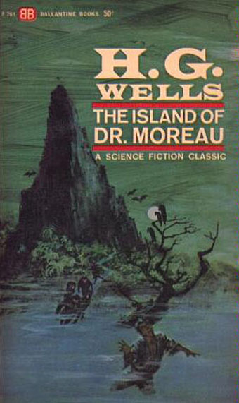
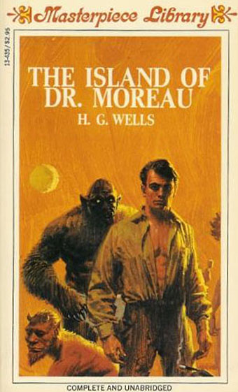
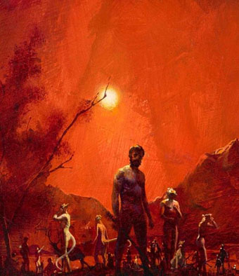
Painting by Paul Lehr for the Berkley Highland paperback (1970).

The Island of Doctor Moreau is one of those Victorian novels everyone thinks they know well enough from various film or television adaptations, even when those adaptations have accreted a layer of misconception around the story. In the case of HG Wells’ novel we have The Island of Lost Souls (1932), which the author loathed for its vulgarisations, and which he helped get banned in Britain for many years; the 1977 film directed by Don Taylor which nobody seems to have a good word for; and Richard Stanley’s 1996 adaptation which might have been worthwhile if he hadn’t been kicked off his own film shortly after shooting began. These films may not distort Wells’ novel as much as the numerous adaptations of Dracula, and Dr Jekyll and Mr Hyde, but they still present a skewed impression of a book which is stranger and more disturbing than any screen version.

Wells’ story purports to be the written account of one Edward Prendick who finds himself on Moreau’s remote island after a shipwreck. The bare bones of the story are familiar: Prendick is rescued by Moreau’s alcoholic assistant, Montgomery, and ends up on the island against the doctor’s wishes. The story deviates from the films very quickly by introducing a setting that’s commonplace in Victorian literature but which Hollywood abhors: the all-male enclave. The Island of Lost Souls put “Edward Parker” on the island with his fiancée but went further (to the outrage of Wells and the British censors) by adding a sexy Panther Woman to the menagerie with whom Moreau encourages Parker to mate. There are women among the “Beast People” in Wells’ novel but we’re assured that they’re as grotesque as their male counterparts.

moreau3.jpg

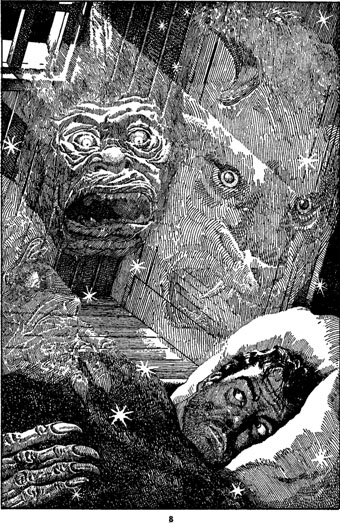
Illustration by Lawrence Sterne Stevens (aka Lawrence) for Famous Fantastic Mysteries, October 1946.

And here we have the second major difference between novel and films: given the limitations of makeup effects—not to say the limitations of the human body—it’s no surprise that the Beast People in the films tend to be like Star Trek aliens, mostly humanoid with a variety of different facial features. Stan Winston’s effects in the 1996 film were the most successful, and were aided considerably by casting a range of actors of different sizes and shapes. All the films tend to present single types, however: wolf-man, cat-woman, bear-man, etc. Wells was writing in 1896 yet his imagination had already brought him this far:

The two most formidable Animal Men were my Leopard-man and a creature made of hyena and swine. Larger than these were the three bull-creatures who pulled in the boat. Then came the silvery-hairy-man, who was also the Sayer of the Law, M’ling, and a satyr-like creature of ape and goat. There were three Swine-men and a Swine-woman, a mare-rhinoceros-creature, and several other females whose sources I did not ascertain. There were several wolf-creatures, a bear-bull, and a Saint-Bernard-man. I have already described the Ape-man, and there was a particularly hateful (and evil-smelling) old woman made of vixen and bear, whom I hated from the beginning. She was said to be a passionate votary of the Law. Smaller creatures were certain dappled youths and my little sloth-creature. But enough of this catalogue.

Later on Moreau has this to say:

“The fact is, after I had made a number of human creatures I made a Thing—” He hesitated.

“Yes?” said I.

“It was killed.”

“I don’t understand,” said I; “do you mean to say—”

“It killed the Kanaka—yes. It killed several other things that it caught. We chased it for a couple of days. It only got loose by accident—I never meant it to get away. It wasn’t finished. It was purely an experiment. It was a limbless thing, with a horrible face, that writhed along the ground in a serpentine fashion. It was immensely strong, and in infuriating pain. It lurked in the woods for some days, until we hunted it; and then it wriggled into the northern part of the island, and we divided the party to close in upon it. Montgomery insisted upon coming with me. The man had a rifle; and when his body was found, one of the barrels was curved into the shape of an S and very nearly bitten through. Montgomery shot the thing. After that I stuck to the ideal of humanity—except for little things.”

Continue reading “The Island of Doctor Moreau”

Harry Willock book covers

moreau.jpg

This time last year I happened to be re-reading my way through the collected short stories of HG Wells; this year I’ve been reading The Island of Doctor Moreau, not to continue the seasonal trend, I simply felt the urge. More about Moreau tomorrow.

These covers are from a series of Penguin reprints which first appeared in 1967 and went through several editions. Harry Willock was the cover artist, and may also have been the designer of the Wells and Verne titles, other text-only Penguin covers from around this time being credited to Willock. The Penguin Science Fiction site describes the obtrusive “A Penguin Book” legend as the “panic top”, a heavy-handed attempt by Penguin’s management to reinforce their brand. Later reprints dropped this but it’s stamped across most of these editions.

war.jpg

This edition of The War of the Worlds was my first encounter with the novel so the cover has always been very familiar, a factor which probably prevented me from seeing how effectively all the Willock Wells covers work as a set. The Martian war machines aren’t very menacing—especially when they seem to have done little but arouse a pair of butterflies—but I do like the type layouts and the way the illustrations are concentrated into a circle. Willock’s drawings so closely imitate the style of Victorian engravings it’s easy to take them at first glance for the genuine article.

air.jpg

Continue reading “Harry Willock book covers”

Eduardo Paolozzi at New Worlds

paolozzi00.jpg

I was working on this book throughout the autumn, and it could hardly be more different to some of the visual extravagance that came before and after. Eduardo Paolozzi at New Worlds is published by Savoy Books this month. Predominantly an examination by David Brittain (no relation to David Britton) of the connections between artists such as Paolozzi and Richard Hamilton with New Worlds magazine in the 1960s, the book is also a rare study of the science fiction magazine when it was making its greatest impact in the late 60s and early 70s.

Brittain highlights many examples of Paolozzi’s sf-influenced art of the period, and examines the development of the magazine under Michael Moorcock’s editorship during which time New Worlds evolved from being a slightly moribund sf title in the early 60s to what JG Ballard later called “one of the most exciting magazines of any kind in this country”. An appendix features interviews with some of the key creators and contributors: editor Moorcock, designer Charles Platt, art editor Christopher Finch, contributor Michael Butterworth, and critic John Clute. Writer and illustrator Pamela Zoline created some original artwork for the endpapers. The introduction is by Rick Poynor.

paolozzi01.jpg

Despite being pressured for time I was very pleased to be designing this book. I’d liked Paolozzi’s work since I first encountered it in the Tate Gallery in the 1970s; a couple of years later I was buying up anthologies featuring New Worlds stories (I was too young for the 60s magazine), so discovering that Moorcock had made Paolozzi the magazine’s “Aeronautics Advisor” made perfect sense. In the past I’ve said that New Worlds ruined my taste for hard sf but that’s not really true since I never really liked the stuff beyond a few Arthur C. Clarke books. Too much bad writing, too many cardboard characters shuffling around between chunks of explanation about made-up technology. The discovery of New Worlds merely demonstrated that there were other ways of approaching sf, and you didn’t have to put up with the rubbish.

I also enjoyed the magazine’s bolshy attitude, a quality shared by Harlan Ellison in his Dangerous Visions anthologies. Moorcock says in Brittain’s interview that NW sympathised with the Underground of the late 60s but also tried to be more disciplined in its approach, especially where the design was concerned. You couldn’t have treated fiction to the semi-legible printing that Oz and Frendz often deployed. But the radical attitudes of the Underground can be discerned in the stance NW adopted. Some of the reviews and polemical articles by Moorcock (often under his “James Colvin” pseudonym), M. John Harrison and John Clute are bracingly vitriolic to a degree which if delivered today would probably see them ostracised for life.

paolozzi02.jpg

With the design the main intention was to present the information clearly and let the visuals speak for themselves. The book is heavily illustrated throughout, with many examples of Paolozzi’s marvellous prints. The layout nods obliquely to the period; before getting started I spent some time looking at the work of Erik Nitsche. I like the way Nitsche laid out the books he designed in the 1960s, and there’s also a connection in his work as a designer for the General Dynamics corporation: one of Paolozzi’s print series of the period is entitled General Dynamics F.U.N.

Being full-colour throughout, the print run for this book is smaller than usual so anyone interested is advised to move swiftly. Official publication is December 16th but it’s on sale now at Savoy and at Amazon.

paolozzi03.jpg

Continue reading “Eduardo Paolozzi at New Worlds”