Weekend links 191

strongowski.jpg

Two cover designs from Eliash Strongowski’s 30 Days—30 Covers project.

My thanks once again to Dennis Cooper for placing this blog on his end-of-year lists. Meanwhile. one of the albums I designed earlier this year, Cold Mission by Logos, made the 30 Best Album Covers of 2013 list at FACT.

• “Many of their more outlandish ideas never saw fruition: an organ powered by an entire factory, an electro-acoustic orchestra mounted on a fleet of airplanes.” Colin McSwiggen reviews Sound in Z: Experiments in Sound and Electronic Music in Early 20th Century Russia by Andrey Smirnov.

Queer Pagan Punk, a major film retrospective of the work of Derek Jarman, will take place in February and March 2014 at the BFI Southbank, London.

• “For over forty years, Iain Sinclair’s work has combined obsessive myth-making with urban despair. But what do we know about him?” asks Fatema Ahmed.

• “Rather than trying to intercept alien communications, perhaps we should go looking for alien artefacts.”

• Mix of the week: Radio Belbury Programme 12, and Winter Hours, the Cafe Kaput 2013 winter mix.

BEEP BEEP. BLOOP BLEEP: Road Runner cartoons soundtracked by a Eurorack synthesizer.

Historia Discordia: Documenting the Origins, History & Chaos of the Discordian Society.

gebbie.jpg

Pink Boy by Melinda Gebbie.

Suffered From The Night: Queering Stoker’s Dracula edited by Steve Berman.

• At Dangerous Minds: An interview with soundtrack composer Cliff Martinez.

Sarah Schoenfeld puts recreational drugs under the microscope.

• Powerplant Art-déco, a set of photos by Romain Veillon.

Adrian Curry chooses the best film posters of 2013.

Portent’s Content Idea Generator

Tarkovsky at Pinterest

The Sea Named Solaris (1977) by Tomita | Is That What Everybody Wants? (2002) by Cliff Martinez | Reyja (2011) by Ben Frost & Daníel Bjarnason

Opening the Seven Gates of Transcendental Consciousness

burchette1.jpg

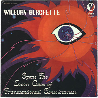
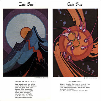
Wilburn Burchette Opens The Seven Gates Of Transcendental Consciousness (1972). Art by Caren Caraway.

For the next two weeks I’ll be playing out the end of the year with a 2-CD compilation from Light In The Attic, I Am The Center (Private Issue New Age Music In America, 1950–1990), 20 tracks of ambient/meditation music, most of which has never been widely distributed before. The “New Age” label is a thing I’ve loathed for years so buying this has meant trashing a decades-long embargo; it helps to examine your prejudices now and then.

burchette2.jpg

New Age in the 1970s referred, among other things, to the oft-promised, seldom-evident “Age of Aquarius”, a term vague enough to be used on albums by Steve Hillage, Manuel Göttsching and others without referring to anything specific. In the 1980s it was taken up by publishers as a marketing label, a catch-all for anything “spiritual” or mildly occult. (I can’t imagine the Goetic Demons ever being called New Age, even if you sprayed them pink.) Out went all the witchy strangeness of the occult boom of the 1970s—spiky typefaces, magical primers sold like Dennis Wheatley novels—in came a profusion of pastel shades, airbrushed pyramids and sparkly, crystal things. Having a fondness for the witchy strangeness I wasn’t impressed. I was even less impressed when New Age became a prevalent label for a style of instrumental music which was too obtrusive to be ambient (in the Brian Eno sense of the word), and also too bland and unassertive to be either jazz or electronica. The popularity of labels such as Windham Hill meant that the large record chains started using New Age as another catch-all label, this time for anything that wouldn’t fit the rock, jazz or folk categories. Along with Windham Hill releases you’d find Eno’s ambient recordings, Harold Budd, Jon Hassell, various German things like Cluster, and anything else that resisted easy labelling. The way the music business tries to hammer everything into a small number of boxes has always been annoying but this seemed like a major insult, hence my loathing of the term.

burchette3.jpg

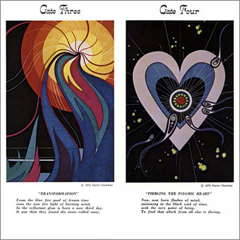
I Am The Center is a curious album in that it embraces both the recent New Age music label while also harking back to the spiritual yearnings of the 1970s. The general effect is of an impossible collision between the Harold Budd of Pavilion of Dreams, Steve Hillage’s Rainbow Dome Musick, and the lighter moments of Alice Coltrane. Many of the tracks are so good I’ve been searching through Discogs.com to discover more about the artists which is how I came across this album art from Wilburn Burchette. Witch’s Will is Burchette’s track on I Am The Center, from his Guitar Grimoire (1973) album. Looking through his discography, with its attention-grabbing titles and cover art, it’s surprising that his albums haven’t yet been reissued. This will no doubt change soon, especially when his music is like an American equivalent of Achim Reichel’s spacey guitar improvisations. The sleeve and booklet art for Wilburn Burchette Opens The Seven Gates Of Transcendental Consciousness is by Caren Caraway, and the album features notes by the indefatigable UFO/paranormal researcher Brad Steiger. They really don’t make them like this any more.

Joe Muggs enthused about I Am The Center last month for FACT. As I said about the Outer Church album earlier this year, compilations provide an invaluable service in concentrating the attention on overlooked or under-examined areas of music. I’m looking forward to seeing what emerges in the wake of this one.

Continue reading “Opening the Seven Gates of Transcendental Consciousness”

Gare d’Orsay to Musée d’Orsay

orsay01.jpg

Gare d’Orsay, coupe transversale (1898). Plan de Victor Laloux.

The Google Art Project is currently featuring a slideshow history of the Musée d’Orsay in Paris, showing the museum’s evolution from the world’s first all-electric rail terminal to its current status as a major repository of 19th-century art. The Gare d’Orsay was built to bring visitors to the Exposition Universelle of 1900, an event regular readers should be familiar with by now, a connection which only compounds the interest I have in the place. (See this recent post and the links below it for more on the subject.)

orsay02.jpg

Projet A.C.T. Architecture (Renaud Bardon, Pierre Colboc, Jean-Paul Philippon). Coupe perspective générale, Octobre 1979.

orsay03.jpg

The Trial.

In addition to the building being one of the few structures remaining from the exposition, its dishevelled splendour provided Orson Welles with a fantastically evocative (and cheap!) set for his 1962 film of The Trial. It’s surprising to read that people objected to this, believing the spaces to be too large. The disjunction of space in Welles’ film is one of its great strengths, as is the confusion of architectural styles and detail. Much of this was improvisation imposed by necessity—money not being available for the sets that were planned—but it makes the film all the more labyrinthine and disorienting.

Continue reading “Gare d’Orsay to Musée d’Orsay”

Eduardo Paolozzi at New Worlds

paolozzi00.jpg

I was working on this book throughout the autumn, and it could hardly be more different to some of the visual extravagance that came before and after. Eduardo Paolozzi at New Worlds is published by Savoy Books this month. Predominantly an examination by David Brittain (no relation to David Britton) of the connections between artists such as Paolozzi and Richard Hamilton with New Worlds magazine in the 1960s, the book is also a rare study of the science fiction magazine when it was making its greatest impact in the late 60s and early 70s.

Brittain highlights many examples of Paolozzi’s sf-influenced art of the period, and examines the development of the magazine under Michael Moorcock’s editorship during which time New Worlds evolved from being a slightly moribund sf title in the early 60s to what JG Ballard later called “one of the most exciting magazines of any kind in this country”. An appendix features interviews with some of the key creators and contributors: editor Moorcock, designer Charles Platt, art editor Christopher Finch, contributor Michael Butterworth, and critic John Clute. Writer and illustrator Pamela Zoline created some original artwork for the endpapers. The introduction is by Rick Poynor.

paolozzi01.jpg

Despite being pressured for time I was very pleased to be designing this book. I’d liked Paolozzi’s work since I first encountered it in the Tate Gallery in the 1970s; a couple of years later I was buying up anthologies featuring New Worlds stories (I was too young for the 60s magazine), so discovering that Moorcock had made Paolozzi the magazine’s “Aeronautics Advisor” made perfect sense. In the past I’ve said that New Worlds ruined my taste for hard sf but that’s not really true since I never really liked the stuff beyond a few Arthur C. Clarke books. Too much bad writing, too many cardboard characters shuffling around between chunks of explanation about made-up technology. The discovery of New Worlds merely demonstrated that there were other ways of approaching sf, and you didn’t have to put up with the rubbish.

I also enjoyed the magazine’s bolshy attitude, a quality shared by Harlan Ellison in his Dangerous Visions anthologies. Moorcock says in Brittain’s interview that NW sympathised with the Underground of the late 60s but also tried to be more disciplined in its approach, especially where the design was concerned. You couldn’t have treated fiction to the semi-legible printing that Oz and Frendz often deployed. But the radical attitudes of the Underground can be discerned in the stance NW adopted. Some of the reviews and polemical articles by Moorcock (often under his “James Colvin” pseudonym), M. John Harrison and John Clute are bracingly vitriolic to a degree which if delivered today would probably see them ostracised for life.

paolozzi02.jpg

With the design the main intention was to present the information clearly and let the visuals speak for themselves. The book is heavily illustrated throughout, with many examples of Paolozzi’s marvellous prints. The layout nods obliquely to the period; before getting started I spent some time looking at the work of Erik Nitsche. I like the way Nitsche laid out the books he designed in the 1960s, and there’s also a connection in his work as a designer for the General Dynamics corporation: one of Paolozzi’s print series of the period is entitled General Dynamics F.U.N.

Being full-colour throughout, the print run for this book is smaller than usual so anyone interested is advised to move swiftly. Official publication is December 16th but it’s on sale now at Savoy and at Amazon.

paolozzi03.jpg

Continue reading “Eduardo Paolozzi at New Worlds”