Weekend links 222

wicker.jpg

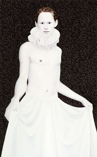
A self-portrait by Nadia Wicker from her Projectie series.

• “And boy, did that Rain Parade sleeve look cool with its picture of the insouciant band sitting in front of large hot-house (or glass palace), the sky behind them tinted a sickly shade of apocalypse pink…” Joe Banks on the Rain Parade’s finest moment, Explosions In The Glass Palace.

• “…there are pleasures to be had from books beyond being lightly entertained. There is the pleasure of being challenged; the pleasure of feeling one’s range and capacities expanding…” Rebecca Mead on the pleasure of reading to impress yourself.

• “If Gengoroh Tagame performed the acts he drew in his comics he’d probably be dead or in jail,” says Zac Bayly, interviewing Tagame for BUTT.

Crime does not fascinate James Joyce as it fascinates the rest of us—the suggestion of crime dismays him. He tells me that one of his handicaps in writing Work in Progress is that he has no interest in crime of any kind, and he feels that this book which deals with the night-life of humanity should have reference to that which is associated with the night-life of cities—crime. But he cannot get criminal action into the work. With his dislike of violence goes another dislike—the dislike of any sentimental relation. Violence in the physical life, sentimentality in the emotional life, are to him equally distressing. The sentimental part of Swift’s life repels him as much as the violence of some of his writing.

Padraic Colum attended Joyce’s 47th birthday party.

• I’m currently reading The Wanderer, “a weird document” by Timothy J. Jarvis, which is officially published this week.

The Changes, another remarkable children’s TV series from the 1970s, is out on DVD next week.

Sir Richard Bishop has made all 14 of his solo albums available as free downloads.

• “How long do CDs last? It depends, but definitely not forever,” says Laura Sydell.

• “Readers absorb less on e-readers than on paper, study finds

• Book designer Craig Mod wants to talk about margins.

• Mix of the week: a mix for The Quietus by Helm.

Ozu’s passageways

• The Rain Parade: No Easy Way Down (BBC TV, 1984) | No Easy Way Down (studio, 1984) | No Easy Way Down (Tokyo, 1984)

Don Cherry, 1967

doncherry.jpg

Poème, scénario, interprétation, musique: Don Cherry
Poème dit par Antony Braxton
Deuxième flûte jouée par Karl Berger
Réalisation: Jean-Noël Delamarre, Natalie Perrey, Philippe Gras, Horace
Image: Jean-Noël Delamarre, Horace
Montage: Natalie Perrey
Photographies: Philippe Gras

In which jazz trumpeter Don Cherry materialises in Paris to prowl the streets, joust with the gargoyles of Notre Dame, and encounter some ancient Egyptian statuary. This is listed all over the web as being from 1973 but more authoritative French sites say it’s from 1967, as does IMDB. Cherry’s music also sounds close to the improvised Mu sessions he’d record in Paris two years later. Watch Don Cherry at Ubuweb.

El Lissitzky record covers

genx.jpg

Your Generation (1977) by Generation X. Design by Barney Bubbles.

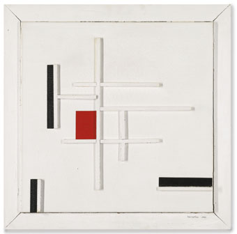
Continuing an occasional series about the work of particular artists or designers being used on record sleeves. El Lissitzky (1890–1941) is an interesting candidate in this area since his pioneering abstractions have greatly influenced subsequent generations of graphic designers. As a result of this you’re just as likely to find his Suprematist style being pastiched on an album cover as find one of his paintings decorating the sleeve. Pastiches are difficult to locate unless you already know they exist—or unless the album credits acknowledge the style they’re imitating—so this list will no doubt be incomplete.

Barney Bubbles’ design for the debut single by Generation X is the earliest example I’m aware of that makes use of the El Lissitzky style. It was also one of Bubbles’ first sleeves for a punk band, and a significant break with his often florid hippy designs.

kraftwerk1.jpg

Die Mensch Maschine (1978) by Kraftwerk. Design by Karl Klefisch, “inspired by El Lissitzky”.

Kraftwerk’s seventh album uses Lissitzkian typography and graphics on its front and back covers. A very popular album with the post-punk crowd that would have been the first introduction for many people to El Lissitzky’s name. Kraftwerk still use that vibrant arrangement of black, red and white in their stage shows.

kraftwerk2.jpg

sakamoto1.jpg

B-2 Unit (1980) by Riuichi Sakamoto. Design by Tsuguya Inoue.

More pastiche, this time borrowing from El Lissitzky’s Suprematist book for children: About Two Squares: In 6 Constructions: A Suprematist Tale (1922). The book’s two characters of a red square and a black square appear on the vinyl labels. This is a great album, incidentally, still my favourite by Sakamoto.

sakamoto2.jpg

Continue reading “El Lissitzky record covers”

Weekend links 221

cornell.jpg

Untitled (Penny Arcade Portrait of Lauren Bacall) (1946) by Joseph Cornell.

• Having been a Bernard Szajner enthusiast for many years it’s good to see his music receiving some belated reappraisal. David McKenna talked to Szajner about his Visions Of Dune album (which is being reissued by InFiné next month), laser harps, The (Hypothetical) Prophets, and working with Howard Devoto.

• Priscilla Frank posts some big views of Marjorie Cameron’s occult paintings as a preview of the forthcoming exhibition at MOCA Pacific Design Center, Los Angeles.

• Fascinating reading in light of the recent kerfuffle over True Detective, Christopher Loring Knowles on the possible sources of HP Lovecraft’s Cthulhu Mythos.

Those who set up oppositions between the electronic technology and that of the printing press perpetuate Frollo’s fallacy. They want us to believe that the book—an instrument as perfect as the wheel or the knife, capable of holding memory and experience, an instrument that is truly interactive, allowing us to begin and end a text wherever we choose, to annotate in the margins, to give its reading a rhythm at will—should be discarded in favor of a newer tool. Such intransigent choices result in technocratic extremism. In an intelligent world, electronic devices and printed books share the space of our work desks and offer each of us different qualities and reading possibilities. Context, whether intellectual or material, matters, as most readers know.

Alberto Manguel, lucid as always, on the act and import of reading.

• “It’s time to give prog rock’s artist-in-residence Roger Dean his due,” says Amber Frost. No argument there, I did my bit in 2010.

• “Why do the covers of so many self-published books look like shit?” asks B. David Zarley.

• Mixes of the week: FACT mix 455 by Airhead, and Secret Thirteen mix 225 by Clock DVA.

• At Core77: Rain Noe chooses favourite skyscraper photos by Russian urban explorers.

• “O, Excellent Air Bag”: Mike Jay on the nitrous oxide fad of the early 19th century.

Nick Carr goes in search of Manhattan’s last remaining skybridges.

Lauren Bacall at Pinterest.

• Shaï Hulud (1979) by Zed (Bernard Szajner) | Welcome (To Death Row) (1980) by Bernard Szajner | Person To Person (1982) by The (Hypothetical) Prophets

Balloon parade

rainparade.jpg

Emergency Third Rail Power Trip (1983) by The Rain Parade.

Another minor piece of album-cover detective work. A couple of years ago I was looking for dirigible pictures for a steampunk book I was working on, and in the searching came across the original of the photo used on the cover of the Rain Parade’s neo-psychedelic debut album. I didn’t want pictures of round balloons, however, and since I was ripping through a number of websites I neglected to bookmark the page. I’ve still not seen the photo since—which I recall was in a landscape ratio with more balloons to the left—but I’m fairly sure I’ve identified the event as being the balloon race that took place in the Bois de Vincennes, Paris, in October 1900.

balloons1.jpg

The significance of the cover photo for this blog is that the balloon race in question was one of the Olympic Games competitions being held that year in tandem with the Exposition Universelle, an event which has been fairly thoroughly explored in earlier postings. Needless to say, balloon racing was later discontinued as an Olympic sport. The picture above shows another view of the “Parc Aérostatique”, while from the map below one can determine that the people in the foreground of the album cover photo are standing on the velodrome parapet.

balloons3.jpg

The picture below from L’Illustration magazine might have made a better cover shot for Emergency Third Rail Power Trip if it was suitably cropped and coloured. If I turn up the errant photo at a later date I’ll post it here. As for the album itself, it was reissued on CD in 1992 together with its follow-up, Explosions In The Glass Palace, a mini-album that remains the pinnacle of the Rain Parade’s studio recordings.

balloons2.jpg

Elsewhere on { feuilleton }
The album covers archive

Previously on { feuilleton }
Balloons in the Grand Palais