A Wilde Night

bragdon.jpg

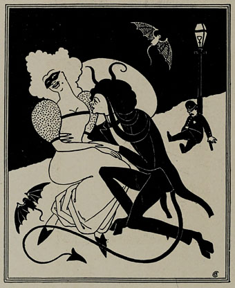
A couple more pieces from yesterday’s Posters in Miniature. The drawing above is entitled A Wilde Night and credited to Claude Fayette Bragdon (1866–1946) whose design work has appeared here before. Bragdon was an acquaintance of Will Bradley’s, and like Bradley was a man of many talents being variously employed as an architect, writer and stage designer. Bragdon and Bradley both worked together on The Chap-Book, Herbert Stone’s Chicago periodical which commenced publication in 1894, the same year as The Yellow Book, a magazine whose style and light-hearted content Stone and co. seemed keen to emulate. Bragdon’s small drawings for The Chap-Book are less Beardsley-like than Bradley’s designs which is why this very overt homage appears as a surprise.

yellowbook.jpg

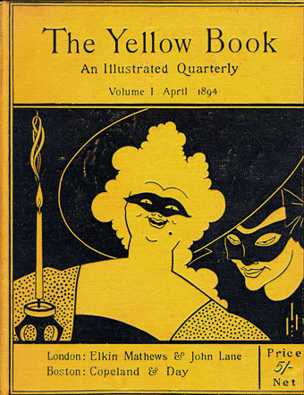
Bragdon’s picture is undated but the female figure is taken from Beardsley’s cover for the first issue of The Yellow Book which would place it in around 1894; the satyr-like male is an odd blend of bits of Beardsley’s male and female figures. Aubrey, however, would never have drawn bats like Bragdon’s, or a sleeping policeman…too gauche, my dear. As for the Wildeness, 1894 was only a year away from Oscar’s trial, a time when London was buzzing with scandalous rumours, none of which appear to have reached Chicago.

giannini.jpg

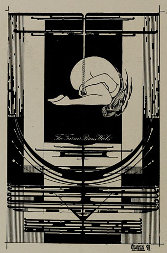
Also in Posters in Miniature is this piece by another American, Orlando Giannini (1860–1928), a glass designer and another Chicagoan who worked for a while with Frank Lloyd Wright. This design is dated 1895 and struck me with its radical appearance, so very different from the evolving Art Nouveau styles of the time. Giannini’s work as a glass designer evidently brought a different sensibility to graphic design, one which would have still looked bold and original ten years later.

Elsewhere on { feuilleton }
The Aubrey Beardsley archive
The illustrators archive
The Oscar Wilde archive

Burroughs in Paris

wsb-paris1.jpg

William Burroughs and Maurice Gerodias.

More specifically, William Burroughs photographed in 1959 for Life magazine by Loomis Dean. This was no doubt a story based around the publication of The Naked Lunch by Olympia Press: in the full set there’s shots of Burroughs with Olympia boss Maurice Gerodias, some pictures of the author signing copies of his novel (which can also be seen resting on the newspaper above), and many shots of the shabby interior of the Beat Hotel where the walls of Burroughs’ and Brion Gysin’s rooms are decorated with Gysin’s calligraphic paintings.

wsb-paris2.jpg

Burroughs and Gysin.

Over at the Time archives there’s an amusingly snotty review from 1962 of the first US publication of The Naked Lunch. The reviewer isn’t credited but they trot out details of Burroughs’ history with the implication that nasty people can’t possibly be good or worthwhile writers. In 1962 the Pulitzer Prize for Fiction was won by something called The Edge of Sadness by Edwin O’Connor. What? Who? Exactly.

wsb-paris3.jpg

Elsewhere on { feuilleton }
The William Burroughs archive

The art of Robert Venosa, 1936–2011

venosa.jpg

A few years back, while experimenting with the hallucinogens, I experienced visions of a dynamic energy in constant high-velocity motion, crystallizing and manifesting in a form which could only be described as angelic. Potential energy, crystallizing energy and structured energy were all visible in the same instant…time and space transcended. These visions, and a new-found awareness of spirit brought about through worship and meditation, were too powerful not to be expressed: a translation had to be attempted.

Robert Venosa, Manas Manna, 1978.

I only discovered a few days ago that American artist Robert Venosa had died last month. As with the late Sibylle Ruppert there’s the inevitable wish for some wider acknowledgement of the passing of these unique talents.

santana.jpg

Millions of people have seen one of Venosa’s creations without being aware of it: in 1970 he designed the logo/title for Santana’s Abraxas album (the one with the amazing Mati Klarwein cover), a design which is still in use today. But it’s as a painter that he ought to be remembered. Manas Manna was the first collection of Venosa’s art published by Peter Ledeboer’s Big O imprint in 1978, and could be found on bookshelves that year with a pair of equally remarkable auto-monographs: Mati Klarwein‘s God Jokes and the first English edition of HR Giger‘s Necronomicon. All three artists were aware of each other (Venosa was friends with the other two), and all had managed the difficult feat of having their work sold in art galleries whilst also being visible to a much larger audience on album covers. All three books were eagerly plundered that year by the art team of OMNI magazine whose early issues made heavy use of paintings by Klarwein, Giger, Venosa, De Es Schwertberger and others. Of this Venosa has said:

OMNI was the first to give the artist equal credit with the author…something that to this day is still not seen in any other newsstand magazine. OMNI also put Fantastic Realism, Surrealism, Visionary, and every other type of ‘Fantasy’ art, square into the public’s eye. I and my colleagues owe OMNI a large measure of gratitude for its uncompromising stance and visionary concepts.

Venosa had been an art director at Columbia Records in the 1960s, a job he abandoned after he met Mati Klarwein and decided he’d rather devote his time to painting. Despite describing Klarwein in his book as his painting master, only a couple of his pictures are reminiscent of Klarwein’s distinctive style. Many of Venosa’s works are more loose and abstract than Klarwein’s tableaux, extending the processes of decalcomania which Max Ernst refined in works such as Europe After the Rain (1942) and The Eye of Silence (1944) to create stunning views of cosmic eruptions and vistas of crystalline beings rendered in a meticulous, hyper-realist manner. Many of his pictures could serve as illustrations for the later chapters of JG Ballard’s The Crystal World.

If the lazy definition of psychedelic art refers merely to shapeless forms and bright, clashing colours, Venosa’s art is psychedelic in the truest sense, an attempt to fix with paint and brush something revealed by a profound interior experience. This was deeply unfashionable by 1978, of course, but he carried on working anyway, and there are further book collections for those interested in his paintings. The Venosa website has a small selection of his extraordinary pictures although they really need to be seen at a larger size.

Elsewhere on { feuilleton }
The album covers archive
The fantastic art archive

Darmstadt documents

darmstadt1.jpg

More from the University of Heidelberg’s treasure trove of digitised books, Die Ausstellung der Darmstädter Künstler-Kolonie (1901) is also related to Deustche Kunst und Dekoration by being a product of that journal’s publisher, Alexander Koch. The book showcases the work and philosophy of the Darmstadt art and design colony, many of whose artworks and architecture designs were featured in DK&D. Since having gone through the back issues of Koch’s journal I’ve become increasingly fascinated by the Darmstadt group and their contemporaries in the Wiener Werkstätte so finding a handful of new documents is very welcome, even if much of the work is now familiar. The continual use of the square at this period of German and Austrian design is particularly notable (Ver Sacrum, lest we forget, was a square-format magazine) and square motifs have been feeding into my own work in various ways recently, some of which will be revealed here soon.

Also in the Heidelberg archive are some related publications, Ein Dokument deutscher Kunst: die Ausstellung der Künstler-Kolonie in Darmstadt (1901) by Peter Behrens, and Die Ausstellung der Künstler-Kolonie Darmstadt (1902) by Joseph Maria Olbrich, several pages of German text but it does include a plan of the colony grounds.

darmstadt2.jpg

Previously on { feuilleton }
Ver Sacrum, 1898