Polanski details

polanski01.jpg

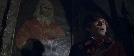
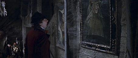
Roman Polanski as Alfred in Dance of the Vampires (1967).

I’ve always admired the attention to detail in Roman Polanski’s films, a quality evident not only in his careful adaptations but also in areas that lesser filmmakers might ignore. Dance of the Vampires (1967) is a good example (sorry, I refuse to call it by the title MGM used for its edited US release): the sets and decor are remarkable, and the editing and camera work so skilfully blends studio constructions with location shots that for years I was convinced the film was made in a genuine European castle. The atmosphere is so carefully sustained that I found the whole thing as terrifying on first viewing as any Hammer film, despite the broad humour. In the set-piece moments Polanski (and soundtrack composer Krzysztof Komeda) put many of the later Hammer vampire films to shame.

polanski02.jpg

The Vampire Portraits

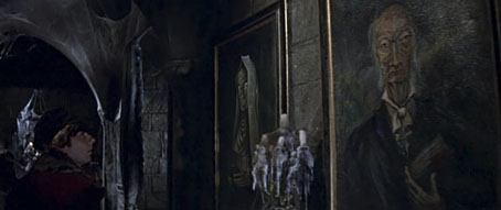
The production design and art direction for Dance of the Vampires was created by Wilfred Shingleton and Fred Carter, both of whom later worked on Polanski’s Macbeth, and who fill the rooms with mouldering furnishings and rotting decoration. One striking sequence concerns a walk through a gallery of vampire portraits that are the creepiest paintings seen on film since Ivan Albright’s portrait of a decrepit Dorian Gray. Film credits in the 1960s were sparse so there’s no indication of the artist responsible. However, one portrait glimpsed at the end of the gallery (below) is a copy of the “Ugly Duchess” painting by Quinten Matsys.

polanski03.jpg

polanski04.jpg

Rosemary’s Book

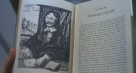
A sign that filmmakers care about detail is when they make their fictional books look like the genuine article. The history of witchcraft in Rosemary’s Baby (1968) could easily have been glimpsed very briefly but Polanski shows Rosemary leafing through its pages in a sequence of Hitchcock-like view-reaction-view shots that make it appear as convincing as possible. The shots also make the viewer examine the book through Rosemary’s eyes, something Polanski does throughout the film.

polanski05.jpg

Continue reading “Polanski details”

Weekend links 140

cards.jpg

Thanks to Callum for pointing the way to a beautiful set of playing cards designed by Picart le Doux.

Of cigars and pedants by Houman Barekat, in which Vladimir Nabokov has a problem with Henry James. Tangentially related: Post-Punk’s Nabokov: Howard Devoto and Magazine, live from Berlin, 1980. (Given A Song From Under The Floorboards, and lines like “I could have been Raskolnikov / But mother nature ripped me off”, I’d say it’s more accurate to describe Devoto as Post-Punk’s Dostoyevsky.)

• “I was introduced to Kneale’s work like most kids: by a fifty-foot hologram of a psychic locust and a British colonel deliquesced by five million years of bad Martian energy.” In Keep Me in the Loop, You Dead Mechanism Dave Tompkins looks back at Nigel Kneale’s TV play The Stone Tape. I reported my own impressions at the end of October.

• At The Quietus this week, Carol Huston on Lord Horror: A History Of Savoy Publishing. Michael Butterworth is interviewed, and the piece includes some quotes from earlier interviews by yours truly.

As the Massachusetts minister Increase Mather explained in 1687, Christmas was observed on Dec. 25 not because “Christ was born in that Month, but because the Heathens Saturnalia was at that time kept in Rome, and they were willing to have those Pagan Holidays metamorphosed into Christian” ones. So naturally, official suppression of Christmas was foundational to the godly colonies in New England.

Rachel N. Schnepper on the Puritan War on Christmas.

• Maxine Peake and the Eccentronic Research Council have a seasonal song for you. Take the title, Black ChristMass, as a warning. The group recently played live on The Culture Show.

• Clive Hicks-Jenkins’ Artlog is currently hosting Alphabet Soup, an online exhibition by different artists each depicting the letters of the alphabet. Start here and click forward.

Ornate Typography from the 19th Century featuring samples from the King George Tumblr. Related: Sheaff ephemera.

saturn.jpg

Saturn at Saturnalia. A Cassini image of the planet’s nightside.

Kenneth Anger interviewed by P. Adams Sitney. A 53-minute tape recording from 1972.

• At The Outer Church: James Ginzburg of Emptyset posts a winter music mix.

When Candy Darling met Salvador Dalí.

The psychedelic secrets of Santa Claus.

• At Pinterest: Camp as…

Saturn (1956) by Sun Ra | Permafrost (live, 1980) by Magazine | Uptown Apocalypse (1981) by B.E.F.

Weekend links 139

barnes.jpg

Lucy in the Sky with Diamonds (2012) by Lesley Barnes. She also has peacock wrapping paper.

Big thanks to Dennis Cooper for including this blog in his favourite music, fiction, poetry, film, art & internet lists for 2012. Lots of good company there. One benefit of end-of-year lists is the way they suggest things to look for in January.

• “…the best pictures of dicks that I’ve ever seen…” Rudy Rucker reviews Malcolm McNeill’s The Lost Art of Ah Pook Is Here and Observed While Falling, out at last from Fantagraphics. Rucker notes that William Burroughs’ text is still only available in out-of-print editions in which case you’ll need a book dealer. Elsewhere, Burroughs: The Movie has cleared 50% of its restoration Kickstarter goal but still needs supporters.

• Julia Holter has been a recurrent presence in these posts since the release in March of her acclaimed second album, Ekstasis. FACT has an alternate version of the album’s opening song, Marienbad, one of the extra tracks on the recent UK reissue.

Suttree’s saga carried me down, down, down to the bottom of a heightened surrogate reality, a nadir where the rarest jewels of clarity are found. The fourth time through the novel I arrived at a state of barometric equipoise, a balancing between my mental state and Suttree’s. Then, as he descended again, I began to rise. There was a hypnotic poetry to his fall — his life disintegrated, then the fragments disintegrated, then those fragments followed suit ad infinitum.

Jim White on the life-preserving qualities of Suttree by Cormac McCarthy.

• “An 18-year-old boy who discovers he has a fetish for the aged gets a job in a nursing home and develops an intimate relationship with one particular old man.” Gerontophilia, a proposed film by Bruce LaBruce, is looking for funding.

• Can’t wait for this: Groenland Records announces Who’s That Man?, a four-CD set of music produced and performed by Conny Plank. FACT has a track list.

• At BUTT magazine: Pink Courtesy Phone Mix by Richard Chartier, a great selection of electronica old and new.

• Another end-of-year list: Volumes 1 & 2 of The Graphic Canon are in NPR’s Indie Bookseller best of 2012 selection.

The Nightmare Paintings: art by Aleister Crowley currently touring Australia.

• Christmas with Monte: Colin Fleming on the ghost stories of MR James.

• “The war on drugs is a war on human nature” says Lewis Lapham.

Alan Moore: why I turned my back on Hollywood.

• More electronica: Chris Carter discusses synths.

Saul Bass poster sketches for The Shining.

• At Pinterest: The Pan Within.

Ah Pook Is The Mayan God Of Death (1975) by William Burroughs | Panic (1985) by Coil | Light Shining Darkly (1992) by Coil.

The poster art of Vic Fair

fair1.jpg

The Man Who Fell to Earth (1976).

This weekend’s viewing was The Man Who Fell to Earth on Blu-ray, highly recommended for anyone who likes the film, Anthony Richmond’s photography looks better than ever. I’ve had this for a while on DVD and what’s notable about the old and new formats is that both UK editions use Vic Fair’s poster design as the cover art. It often seems a hit-or-miss affair whether the original poster gets used for home release. This tends to happen more with older films that have acquired an artistic reputation; the recent UK release of The Conformist by Arrow Films prints four different poster designs on the inlay, with the box enclosure having a clear window that allows one or other of the designs to be facing out. A great idea which makes owning the physical copy a little more worthwhile.

I’d known the poster for Nic Roeg’s film for years but until this weekend I’d never thought to find out who was responsible for the artwork. Vic Fair was a prolific artist for UK film releases during the 1970s and 1980s so this is a small selection of his work. Apparently he was so pleased with the Roeg poster that he signed it. As is often the case with film posters, there’s no record of the designers for these examples so we don’t know who was responsible for the type layouts.

fair5.jpg

Countess Dracula (1972).

The Countess Dracula art looks surprisingly similar to some of the promotional art that Roger Dean produced around this time for UK studios, Hammer included. A few examples appear in his Views book but it’s a side of his work that’s seldom seen or discussed. I recall being impressed by the Vampire Circus poster in the past (although the big cats look a little silly). One of the better Hammers of the 70s, with a cast including cult cutie John Moulder-Brown.

fair2.jpg

Vampire Circus (1972).

fair3.jpg

The Hireling (1973).

As with many posters of the 1970s, The Hireling is a great example of an approach that marketing departments would never allow today.

fair4.jpg

Castaway (1987).

Another Nic Roeg film, and another subtle design, possibly too subtle as I don’t recall seeing it used anywhere. First time I saw this was on the cover of a soundtrack album a few years back when I was putting together Jon Hassell’s website. There’s a piece of his music used in the film so we were trying to trace all the relevant cover art.

There’s more about Vic Fair and his contemporaries in British Film Posters: An Illustrated History by Sim Branaghan & Steve Chibnall, a book I think I ought to buy. If anything it may spare me the temptation to start collecting film posters again.

Previously on { feuilleton }
Petulia film posters
Lucifer Rising posters
Wild Salomés
Druillet’s vampires
Bob Peak revisited
Alice in Acidland
Salomé posters
Polish posters: Freedom on the Fence
Kaleidoscope: the switched-on thriller
The Robing of The Birds
Franciszek Starowieyski, 1930–2009
Dallamano’s Dorian Gray
Czech film posters
The poster art of Richard Amsel
Bollywood posters
Lussuria, Invidia, Superbia
The poster art of Bob Peak
A premonition of Premonition
Metropolis posters
Film noir posters

Painting the Henge

stonehenge1.jpg

Wiltonia sive Comitatus Wiltoniensis; Anglice Wilshire (1649) by Atlas van Loon.

Avebury doth as much exceed Stonehenge in grandeur as a Cathedral doth an ordinary Parish Church.

John Aubrey

John Aubrey (1626–1697) was the pioneering antiquarian and archaeologist whose interest in the ancient sites of southern England made him the first person to subject Avebury to any serious study. As a consequence his comparison between Avebury and Stonehenge may contain some bias—Stonehenge’s site on the desolate Salisbury Plain made its presence well-known even if it was little understood—but it should be noted that in Aubrey’s time there were more stones at Avebury than there are today, and the long avenues leading to and from the outer circle were still intact. The stones of Avebury were unfortunately small enough to be broken up by the locals for building materials.

stonehenge2.jpg

Stonehenge (1835) by John Constable.

The size of the stones, and the isolation of the site explains why Stonehenge has proved more attractive to the arts than other Neolithic monuments. William Macready in the 19th century added Stonehenge-like trilithons to his stage designs for King Lear, an addition that persisted for decades; Thomas Hardy’s Tess of the d’Urbervilles (1891) famously ends with a scene at the stones, while in the 20th century Stonehenge was shoehorned into Night of the Demon (1957), Jacques Tourneur and Charles Bennett’s film adaptation of Casting the Runes by MR James. James was an antiquarian himself so may well have approved of the inclusion, especially the way the stones are used in the opening scene.

stonehenge3.jpg

Stonehenge at Sunset (1835) by John Constable.

Painted renderings of the stones tend to be a mixture of archaeological studies and depictions like those featured here. The site had an understandable attraction to the Romantics, and drew both Constable and Turner there. (See Turner’s paintings and sketches here.) Constable’s watercolour of the stones against a turbulent sky is oft-reproduced. Some of the stones seen in 19th paintings and drawings lean more than they do today, having been restored to the vertical in the 20th century.

stonehenge4.jpg

Stonehenge – Twilight (c. 1840) by William Turner of Oxford (not to be confused with his more famous namesake).

Closer to our own time there’s Henry Moore’s marvellous series of lithograph prints from 1973 which study the stones from a variety of angles. These include close views, something few other artists seem to attempt. The photo print below shows the site as it was in the 1890s with cart tracks passing nearer to the stones than visitors today are allowed to venture.

stonehenge5.jpg

Previously on { feuilleton }
Stonehenge
Stonehenge panorama