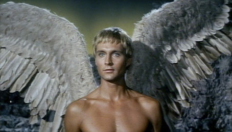
Pygar the angel, Barbarella (1968).
John Phillip Law, who died on Tuesday, was featured here last year in a look at Mario Bava’s crazy live action fumetti, Danger Diabolik (below). Law made that film the same year as he played a blind angel in an equally crazy slab of Sixties’ decadence, Barbarella. In a more serious role, he played opposite the very formidable Rod Steiger in The Sergeant which was released the same year; together with Victim, this was one of the first films I remember watching that dealt with same-sex attraction (albeit in the usual angst-ridden mode), with Law’s character being the understandable object of Steiger’s doomed affection.
After those heights, things tended to be more down than up but I do have an affection for Ray Harryhausen’s The Golden Voyage of Sinbad (1974). Law’s Sinbad was pretty good even if he spends much of the time fighting monsters while Tom Baker was great as the villainous Koura. And I always appreciated that screenwriter Brian Clemens made Lemuria the destination of the voyage, a lost continent mentioned by Madame Blavatsky and many of the Weird Tales writers, including HP Lovecraft in The Haunter of the Dark.
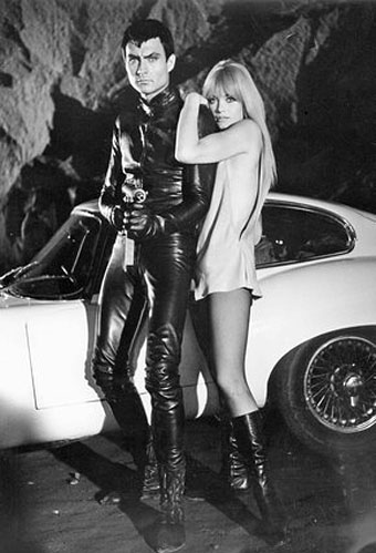
Danger Diabolik (1968).
Previously on { feuilleton }
• CQ
• Danger Diabolik