I was rather aggrieved a few weeks ago when I found a copy of James Whitcomb Riley’s The Flying Islands of the Night (1913) at the Internet Archive. Nice to find a free copy of a rare book but the grievance came as a result of an intention to write something about its illustrator, Franklin Booth (1874–1948), and post a picture or two. It turns out that the scanned copy available is complete but all the colour plates have been removed, probably stolen during its career as a library volume. Riley’s story is a piece of light fantasy which might well have been forgotten by now if it wasn’t for Booth’s incredible illustrations; as a result it’s the illustrations that make the book worth seeking out.
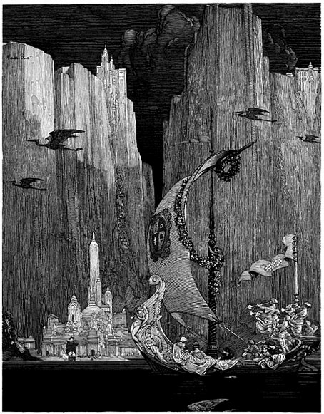
Booth’s penmanship from Franklin Booth: American Illustrator.
Happily, and by coincidence, Mr Door Tree at the essential Golden Age Comic Book Stories has uploaded scans of his own in the past few days. Beautiful stuff and easily the equal of Booth’s contemporaries in Britain such as Charles and William Heath Robinson, Edmund Dulac et al. Booth’s colour work resembles similar watercolour book illustration of the period but his black & white work was quite unique, being done in a pen style derived from his boyhood interest in engraved magazine illustrations. His careful use of hatched lines went on to influence later American illustrators including Roy Krenkel, Mike Kaluta, Berni Wrightson and others. Golden Age Comic Book Stories has an earlier posting featuring one of Booth’s pen drawings here and a page of Mucha-esque women here.
• Bud Plant’s Franklin Booth page
• Franklin Booth: American Illustrator
Elsewhere on { feuilleton }
• The illustrators archive