Solid Space: Jon Anderson’s cosmic voyage

olias1.jpg

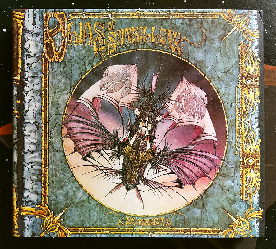
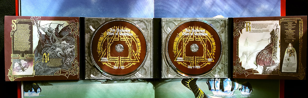
Jon Anderson’s solo debut, Olias Of Sunhillow, is reissued this week in a double-disc set comprising a remastered CD plus an audio DVD. I’d been hoping for some time that this album might be given a proper reissue, it’s one I like a great deal but my old CD has never sounded as good as it ought to. The album may command cult status round here but you don’t see it mentioned anywhere outside Yes forums or partisan enclaves like the Prog Archives. This post may be taken as a small corrective to the neglect.
olias2.jpg

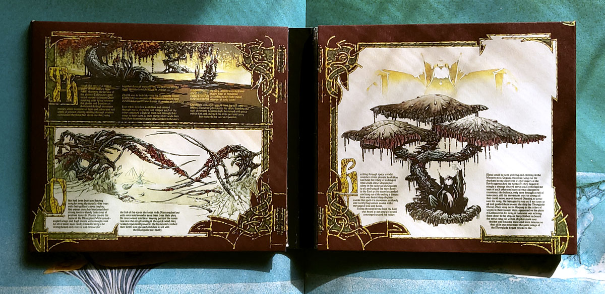
Olias Of Sunhillow was released in 1976, and was the most unusual of all the solo albums recorded by the individual members of Yes in the mid-70s, being a spin-off from some of the group’s early albums, or at least their cover art. Roger Dean’s first cover work for the group was on Fragile in 1971, for which he painted a miniature world rather like one of MC Escher’s planetoids. This was Dean’s idea, the band had suggested a broken piece of porcelain as the cover image. The back cover of the album showed the same planet in a state of fragmentation with a fish-like spaceship floating above it (see below). Another drawing of the fish-ship was added to the front cover before the album’s release, and it’s this ship, and the narrative it suggests, that leads eventually to Anderson’s solo album. Two years after Fragile, the planetary disintegration had turned into an exodus on the group’s triple-live album, Yessongs, the back cover of which shows pieces of planet being towed through space by a similar fish-ship. The other panels of the cover depict the arrival of these fragments on a newer, larger world. Anderson’s album takes this sequence of events then filters them through Vera Stanley Alder’s mysticism to craft a musical odyssey which Discogs describes as:

…the story of an alien race and their journey to a new world due to catastrophe. Olias, the title character, is the chosen architect of the glider Moorglade, which will be used to fly his people to their new home. Ranyart is the navigator for the glider, and Qoquaq is the leader who unites the four tribes of Sunhillow to partake in the exodus.
olias3.jpg

For many years in British music circles it would have been a grave error to even acknowledge this album’s existence, never mind admit to actually liking it. This was partly the old animus against progressive rock, an unexamined prejudice that lasted well into the 1990s, but Anderson’s album had so many strikes against it that it might have stood as the winner of a disapproval lottery for the more ideologically rigid writers and readers of the NME. It’s Jon Anderson (strike 1), the lead singer of progressive rock (2) group Yes (3), whose album is a science fiction (4)/ fantasy (5) concept (6), littered with Tolkien-like invented names and words (7), and with a multi-page sleeve embellished with detailed fantasy illustrations (8) by David Fairbrother-Roe. The design was art directed by Hipgnosis, who subsequently designed the next two Yes albums. Anderson originally wanted Roger Dean to create the packaging, which would have provided a further strike of disapproval against the album, but Dean’s career had gone into overdrive following the publication of Views so he either didn’t have the time or didn’t want to be involved. In Views Dean mentions “another project” based on the fish-ship’s journey which may be a reference to Anderson’s forthcoming album, the credits of which thank Dean for “planting the seed”.
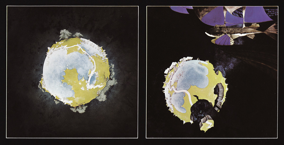
views1.jpg

Roger Dean’s original artwork for Fragile (1971). Another fish-ship was added to the final cover art.

Continue reading “Solid Space: Jon Anderson’s cosmic voyage”
Body Shocks

bodyshocks.jpg

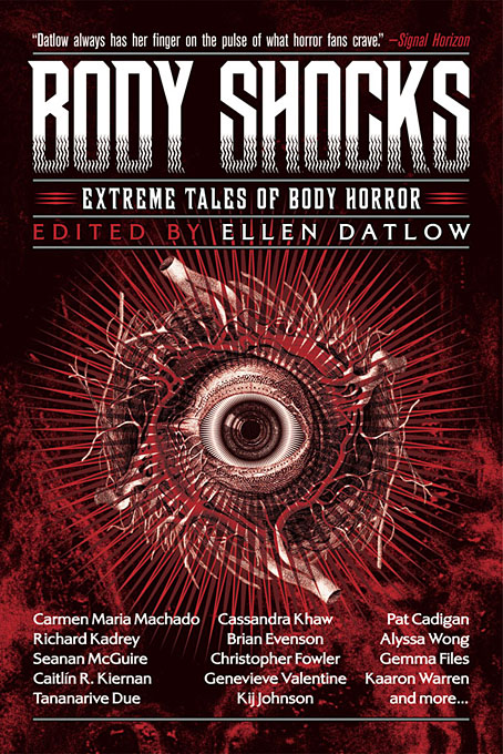
Presenting my latest cover design for Tachyon Publications, and one which it hardly needs stating is another collection of horror stories edited by Ellen Datlow. Body horror is the general theme but these aren’t all accounts of evisceration and dismemberment of the type that made the later Pan horror collections an increasingly dismal read. Several of the stories are outright science fiction, while the final entry, Tissue Ablation and Variant Regeneration: A Case Report by Michael Blumlein, is a Ballardian critique of a former US President that unnerves with its dispassionate medical tone.

eyeballs.jpg

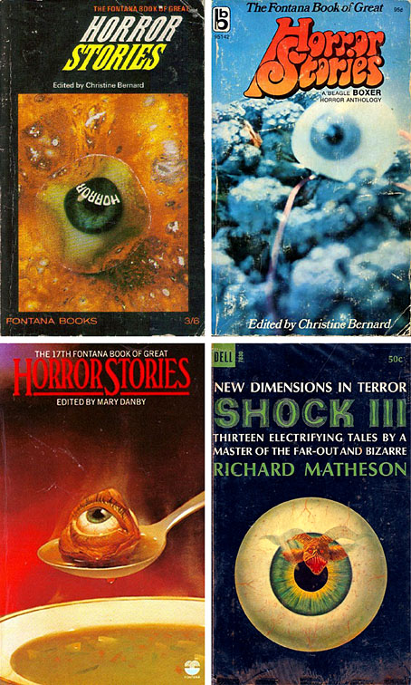
The cover design for this one went through many drafts before everyone was satisfied, the placing of the solitary eyeball being the crucial element. This is something of a stereotype on horror covers, a feature I’ve seen often enough to have it mentally tagged as “the Eyeball of Horror” (see above). But design stereotypes evolve because they serve their purpose so well, as this one does. Some of the earlier drafts incorporated anatomical diagrams but none of the results were really satisfying, especially when a large amount of text also needed to be placed on the cover. In the past I might have posted one or two of these early versions but I was dissuaded from doing this when Jonathan Barnbrook wrote about the gentle rebuke he received from David Bowie after he showed the preliminary stages of his cover design for Bowie’s The Next Day. Bowie’s attitude was that making public a working version changed the audience’s perception of the end result, a comment that comes to mind every time Spine has a new post showing drafts of recent cover designs.

Body Shocks will be published in October.

Previously on { feuilleton }
• The Monstrous
• Lovecraft’s Monsters unleashed
• New work: Two forms of darkness

Weekend links 561

ghostbox.jpg

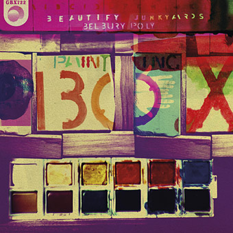
The next release on the Ghost Box label, Painting Box is a collaborative seven-inch single by Beautify Junkyards and Belbury Poly, the A-side of which is a cover of a song by The Incredible String Band. Available on 30th April. Design, as always, is by Julian House.

• “What is good for you as a person is often bad for you as a writer. People will tell you that this not true, and some of the people who will tell you that are also writers, but they are bad writers, at least when they try to convince you, and themselves, that the most important thing for a fiction writer to have is compassion.” Brock Clarke on the case for meanness in fiction.

• The week in non-human intelligence: “Life beyond human has to play by the rules of natural selection,” says David P. Barash, and Thomas Moynihan on dolphin intelligence and humanity’s cosmic future.

• Ilia Rogatchevski speaks with historian Juliane Fürst about her new history of Soviet hippies and the counterculture of the former USSR.

• Mushroom with a view: Karen Schechner at Bookforum talks with Bett Williams about her mycological journey.

• Retro instinct versus future fetish: Fergal Kinney on Stereolab’s Emperor Tomato Ketchup 25 years on.

• At Dennis Cooper’s: Spotlight on…JG Ballard: The Atrocity Exhibition (1970).

• This is Hexagon Sun: A feature-length video on Boards of Canada.

• Mix of the week: The Ides by The Ephemeral Man.

• New music: Gyropedie by Anne Guthrie.

• Paintbox (1967) by Pink Floyd | Orgone Box (1989) by Haruomi Hosono | God Box (1996) by Paul Schütze & Andrew Hulme

Weekend links 560

martin.jpg

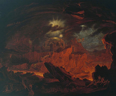
The Fallen Angels Entering Pandemonium, from ‘Paradise Lost’, Book 1 (c.1841) by John Martin.

• “Hergé’s heirs sue artist over his Tintin/Edward Hopper mashups.” The complaint is that the paintings of Xavier Marabout besmirch Tintin’s character by making him seem…human? Silly. I’d sooner complain that Hergé’s ligne claire drawing style is an awkward match for Hopper’s realism. And besides which, isn’t Tintin gay? There’s a lot of wish-fulfilling slash art showing Tintin and Captain Haddock in a closer relationship than Hergé ever would have wanted. This Canadian magazine cover by Normand Bastien dates from 1987.

• “Everyone wanted to make products that looked fast and angry and maybe wanted to lay eggs in your brain.” Alexis Berger tells S. Elizabeth how she avoided years stuck in a design office by becoming a jeweller instead.

• New music: Chiaroscuro by Alessandro Cortini, and Frequencies For Leaving Earth Vol. 4 (One-Hour Loop) by Kevin Richard Martin & Pedro Maia.

The Willows is less a flight of fancy and more an attempt to articulate the ways in which what we dubiously still call “nature” is at once an object of human systems of knowledge and yet also something that undermines those same systems. Thus if The Willows is indeed a classic of “supernatural horror” (as HP Lovecraft would famously note), we might also be justified in calling it “natural horror” as well. In Blackwood’s wonderfully slow, patiently constructed scenes of atmospheric suspense, there is the sense of an impersonal sublime, a lyricism of the unhuman that shores up the limitations of anthropocentric thinking, as well as evoking the attendant smallness of human beings against the backdrop of this deep time perspective.

Eugene Thacker on how Algernon Blackwood turned nature into sublime horror

• Women of Letters: John Boardley talks to Lynne Yun, Deb Pang Davis, Coleen Baik and Duong Nguyen about their typographic designs.

• At Google Arts & Culture: Music, Makers & Machines: A brief history of electronic music.

• At The Public Domain Review: The Universe as Pictured in Milton’s Paradise Lost (1915).

• Beyond the Perseverance drone: Chloe Lula on the sounds of space.

• At Wormwoodiana: Colour magazine (1914–1932).

• Wyrd Daze Lvl.4 FOUR STAR is here.

• At Dennis Cooper’s: Hell.

• O Willow Waly (1961) by Isla Cameron And The Raymonde Singers | Cool Iron (1972) by The Willows | The Willows (2005) by Belbury Poly

Voice of the Fire by Alan Moore

votf1.jpg

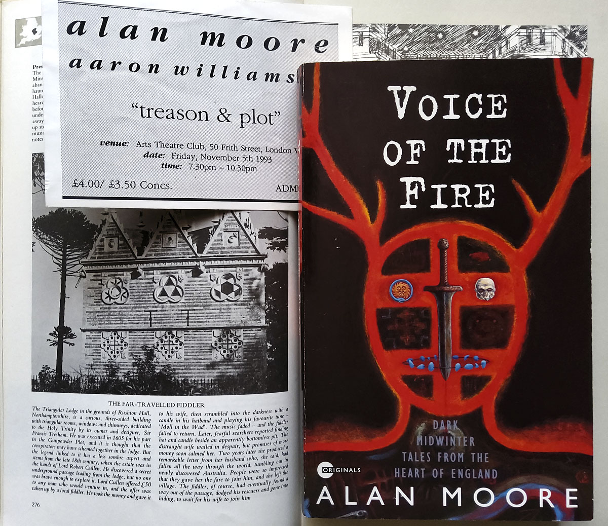
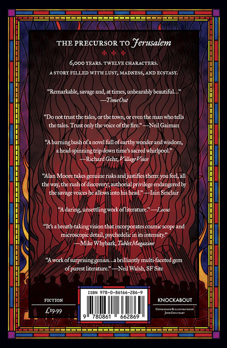
“History is a heat,” says Alan Moore at the end of his first novel, Voice of the Fire, when the author takes centre stage to add his own voice to those of his characters. History is a heat, and fire is its agent, the element that provides a connecting thread between the twelve people whose voices comprise the text of the book. Late last year I was asked to design a new cover for Voice of the Fire which will be published by Knockabout in a 25th anniversary edition later this year. I’d read the book when it was first published, and even saw Alan read some of the opening chapter in 1993 at an event at the Arts Theatre Club in Soho. That event, which took place on November 5th, was titled “Treason and Plot”, and the pages from the work-in-progress novel had been collected from the offices of Gollancz after Alan left the unfinished manuscript of Yuggoth Cultures—which he was supposed to be reading from that evening—in the back of a cab. I was in London that day to talk to Alan about illustrating Yuggoth Cultures, so to find myself illustrating Voice of the Fire many years later feels a little like being caught by one of the acausal connecting threads that he weaves through his novel.

votf3.jpg

The first edition: design by Gary Day-Ellison, illustration by Robert Mason. The photo on the left shows Thomas Tresham’s Triangular Lodge, a folly outside Northampton encoded with references to the Holy Trinity via a profusion of triangles and tripartite details. Tresham’s Lodge is described in the Gunpowder Plot chapter of Alan’s novel; the triangles on my cover may be taken as a reference to this.

November is the dominant month in Voice of the Fire, and the ritual fires of November 5th are one of many recurrent motifs. The novel’s twelve characters live in Alan’s home town of Northampton at different periods of history, from 4000 BC to 1995, a span of time that charts the town’s foundation and growth, taking in the Viking invasions, the Roman occupation, the Crusades, the treason and plot of Guy Fawkes and his conspirators, witch trials, the poet John Clare, and Alan himself. A lot of history and a wealth of incident to try and symbolise in a cover design. Author and publisher both liked the stylised outline of a horned head that Robert Mason painted on the cover of the first edition, a reference to the opening chapter of the novel in which a Neolithic shaman performs a ritual that marks the land as the site of the future town. I liked the original cover but felt it made the novel seem too much like something by Henry Treece or Alan Garner, with no indication of more recent history. A stained-glass window seemed like a good solution to the problem of how to bring together so many disparate elements into a single design. Stained-glass windows are often things from the distant past still visible in the present day, and they have the additional convenience of being a single container for many small pictorial details.

votf2.jpg

It’s Bonfire Night on the back cover.

My design doesn’t attempt to illustrate all the characters or events from the novel but shows the more salient moments together with smaller details, some of which (the noose, for example) appear in multiple chapters. The horned shaman is at the centre of the design which radiates out from his ritual fire. I avoided making the window design too much like a church window; the book contains many references to churches and Christian history but there’s also a strong pagan element in many of the chapters. Magic, in the occult sense, is a recurrent thread, and Alan’s favourite Elizabethan magus, Dr. John Dee, is present (albeit offstage) in the Angel Language chapter. To acknowledge this I placed an inscription in Enochian—Dee’s “Angel Language”—underneath the title. There’s more magic in the font used for the title and author’s name, Albertus, which was named after Albertus Magnus, a philosopher and theologian often described as an alchemist. The main reason to use Albertus is for its timeless styling and its readability, an important quality for such a busy cover design; the font is a common one on London street signs.

The creature with the floppy ears in the lower centre is another recurrent motif, the sinister “shagfoal”, or Black Dog, whose presence is a sign of the darker energies that seem to thrive in that part of the world. Black Dogs appear in folklore all over Britain but there are few pictorial examples to be found in old texts. I based my hound on the “Straunge and terrible Wunder” depicted in 1577 on the title page of Abraham Fleming’s account of the Black Dog of Bungay. Other details are more obvious for those who read the novel so I won’t spell out everything here. If you haven’t read it then I’d urge you to do so, it’s one of Alan Moore’s major works, and a book I’m hoping might receive more attention than it did in 1996 when Gollancz only saw fit to publish it in paperback. Voice of the Fire will be published by Knockabout in May in paperback and a limited edition hardback which will include a card signed by the author. Top Shelf will be doing something similar for the US but I don’t think they’ve announced any dates or other details as yet. Anyone looking for further information is advised to keep an eye on the Knockabout news page or the publisher’s social media accounts.

Previously on { feuilleton }
• The Blake Video
• The Cardinal and the Corpse
• Mapping the Boroughs
• Tresham’s Trinities
• The Triangular Lodge again
• Art is magic. Magic is art.
• Alan Moore: Storyteller
• Alan Moore: Tisser l’invisible
• Dodgem Logic #4
• The Triangular Lodge