Darmstadt documents

darmstadt1.jpg

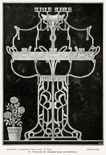
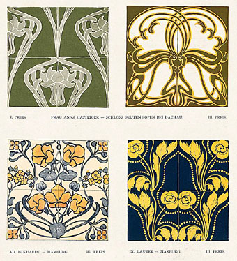
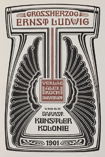
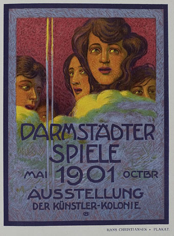
More from the University of Heidelberg’s treasure trove of digitised books, Die Ausstellung der Darmstädter Künstler-Kolonie (1901) is also related to Deustche Kunst und Dekoration by being a product of that journal’s publisher, Alexander Koch. The book showcases the work and philosophy of the Darmstadt art and design colony, many of whose artworks and architecture designs were featured in DK&D. Since having gone through the back issues of Koch’s journal I’ve become increasingly fascinated by the Darmstadt group and their contemporaries in the Wiener Werkstätte so finding a handful of new documents is very welcome, even if much of the work is now familiar. The continual use of the square at this period of German and Austrian design is particularly notable (Ver Sacrum, lest we forget, was a square-format magazine) and square motifs have been feeding into my own work in various ways recently, some of which will be revealed here soon.

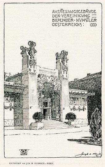
Also in the Heidelberg archive are some related publications, Ein Dokument deutscher Kunst: die Ausstellung der Künstler-Kolonie in Darmstadt (1901) by Peter Behrens, and Die Ausstellung der Künstler-Kolonie Darmstadt (1902) by Joseph Maria Olbrich, several pages of German text but it does include a plan of the colony grounds.

darmstadt2.jpg

Previously on { feuilleton }
Ver Sacrum, 1898

Deutsche Kunst und Dekoration #3

dkd03-01.jpg

A slight return to Deutsche Kunst und Dekoration, the German periodical of art and decoration. Volume 3, which covers the period from October 1898 to March 1899, was missing from the copies stored at the Internet Archive but has recently been added to the burgeoning collection of books and journals being digitised at the University of Heidelberg. What might have been a frustrating omission turns out to be less interesting than some of the editions which followed but it still features plenty of examples of the German Art Nouveau style.

dkd03-02.jpg

dkd03-03.jpg

dkd03-04.jpg

Eritis Similis Deo (They were like God) (1896) by Félicien Rops.

Previously on { feuilleton }
Deutsche Kunst und Dekoration #25
Deutsche Kunst und Dekoration #24
Deutsche Kunst und Dekoration #23
Deutsche Kunst und Dekoration #22
Deutsche Kunst und Dekoration #21
Deutsche Kunst und Dekoration #20
Deutsche Kunst und Dekoration #19
Deutsche Kunst und Dekoration #18
Deutsche Kunst und Dekoration #16
Deutsche Kunst und Dekoration #15
Deutsche Kunst und Dekoration #12
Deutsche Kunst und Dekoration #11
Deutsche Kunst und Dekoration #10: Turin and Vienna
Deutsche Kunst und Dekoration #10: Heinrich Vogeler
Deutsche Kunst und Dekoration #9
Deutsche Kunst und Dekoration #8
Deutsche Kunst und Dekoration #7
Deutsche Kunst und Dekoration #6
Deutsche Kunst und Dekoration #5
Deutsche Kunst und Dekoration #4
Deutsche Kunst und Dekoration #2
Deutsche Kunst und Dekoration #1
Deutsche Kunst und Dekoration
Jugend Magazine revisited

Weekend links 69

evans.jpg

Peacock Apocalypse (detail) by Julie Evans in collaboration with Ajay Sharma.

Here at { feuilleton }, home of the curly bracket affectation, your correspondent is still surprised to find his postings the subject of a critique by Rick Poynor in the latest edition of Eye magazine, the international review of graphic design. I haven’t seen a print copy yet but you can read Mr Poynor’s appraisal here. Meanwhile, over at Design Observer this week there’s another Poynor piece about the collage illustrations of Andrzej Klimowski.

Alan Moore (yes, him again) discusses the moment when the League of Extraordinary Gentlemen gets all swinging and psychedelic. And Iain Sinclair (yes, him again) is still doing the interview rounds promoting his current book, Ghost Milk.

Ayin Acla, a short film by Anna Thew with a soundtrack by Cyclobe. The most recent Cyclobe album, Wounded Galaxies Tap at the Window, was previously vinyl-only but is now available on CD.

• Bones and beads and other things in Wren Britton’s Pure Vile clothing and accessories. Related: Patrick Veillet’s wearable bone sculptures.

Lambshead Cabinet of Curiosities Q&A: Ann & Jeff VanderMeer answer questions about their latest anthology at Fangoria.

• Being a lifelong introvert, I’m sympathetic to Four Ways Technology Can Enable Your Inner Introvert by Philip Bump.

• In an all-too-rare meeting of minds and talents, Roy Harper talks to Joanna Newsom.

Jon Macy’s Teleny and Camille is reviewed at Lambda Literary.

• Author Carol Birch tells us how best to read Finnegans Wake.

Joel Pirela’s Design Classics posters.

Each And Every Word Must Die (1999) by Cyclobe | Brightness Falls From The Air (2001) by Cyclobe | Indulge Yourselves With Our Delicious Monster (2006) by Cyclobe

John Dee’s Monas Hieroglyphica

monas1.jpg

I swear I didn’t go hunting for this. Among the various library collections at the Internet Archive one can find The Getty Alchemy Collection, a substantial gathering of very old alchemical texts scanned in a variety of formats. John Dee’s Monas Hieroglyphica caught my eye during a random search, a third edition of his treatise from 1564 in which he describes his Monas Hieroglyphica, a glyph designed to combine symbols of the Sun, the Moon, the Elements and Fire in a single figure.

monas2.jpg

The glyph also intentionally resembles a human form, and Dee relates its individual parts to various astrological and chemical symbols. I’ve mentioned before that Dee scholar Derek Jarman deliberately based Prospero on John Dee in his 1979 film of The Tempest, giving the magus a scrying wand shaped to resemble the Monas Hieroglyphica.

monas3.jpg

I produced my own variations on the glyph in 2009 when working on the cover of Jeff VanderMeer’s novel, Finch. The symbol recurs in Jeff’s fictional city of Ambergris and I seem to recall there being some discussion about including this doorway design somewhere in the book. In the end it was incorporated into the cover design in a rather subtle fashion. I think this is the first time the design alone has appeared in public.

The Internet Archive has a few other Dee-related items, including Lists of manuscripts formerly owned by Dr. John Dee; with preface and identifications (1921), a 500-page book by antiquarian and ghost story writer MR James.

Previously on { feuilleton }
Mister Jarman, Mister Moore and Doctor Dee
Alchemically Yours
Laurie Lipton’s Splendor Solis
The Arms of the Art
Splendor Solis
Amphitheatrum Sapientiae Aeternae
The Tempest illustrated
Cabala, Speculum Artis Et Naturae In Alchymia
Digital alchemy
Designs on Doctor Dee

Ceramic Buddha Machines

fm3.jpg

The experimentalists at Fm3 continue to impress with their commitment to unorthodox music delivery when the trend remains digital and ephemeral. Back in April they announced a new line of ceramic-bodied players for their series of Buddha Machines, that essential collection of ambient loops in a case the size of a box of matches. The new players will be available at the end of the year. Being ceramic they’re probably a little less portable than the plastic versions, and might also be more fragile. For durability and retro cachet I would have opted for Bakelite if that material is still being manufactured anywhere. (It seems it is, thanks Wikipedia.)

Back in the digital and ephemeral world, Fm3 also have a Buddha Machine app for iPhones and iPads. If that seems to defeat the object of the loops being encased in a box of their own you do at least have the option of mixing six of the machines at once. For an idea of how far the mixing and extrapolation of these sounds can be taken, Robert Henke’s two ambient mixes of Buddha Machine samples from 2007 and 2008 are still available as free downloads on his website.

Previously on { feuilleton }
Gristleism
Uncopyable
Buddha Machine Wall
God in the machines
Layering Buddha by Robert Henke