Bruno Taut’s Glass Pavilion

taut2.jpg

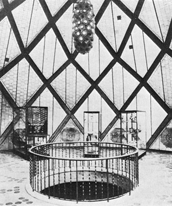
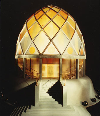
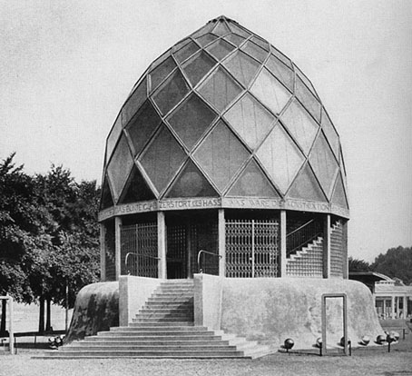
Some speculative architecture that for once isn’t from Paris in 1900. Bruno Taut (1880–1938) gets labelled an Expressionist architect although it’s always a hazardous business connecting people in other disciplines to whatever art movement may be around at the time. The Glass Pavilion was a showcase structure commissioned by the German glass industry for the 1914 Werkbund exhibition in Cologne. The colour photo is a model from this V&A page where we learn that:

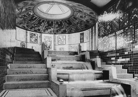
Bruno Taut’s structure demonstrated the various ways glass could be used in a building, but also indicated how the material might be used to orchestrate human emotions and assist in the construction of a spiritual utopia. Taut’s interest in this aspect of glass (explored more intensively during the First World War and later in his book Alpine Architecture and in the Glass Chain letters) had been stimulated by the writer Paul Scheerbart whom he had met in 1912 and who argued for an earthly paradise based on a new architecture of glass and colour. Subsequently, Scheerbart wrote Glasarchitektur (Glass Architecture) in 1914, which he dedicated to Taut, while Taut produced his Glass Pavilion and inscribed aphorisms from Scheerbart on the lintels of the 14 side walls. […] The glazed walls were topped by a dome of reinforced concrete ribs and a double skin of glass: reflecting glass on the outside and coloured prisms inside. In the interior, the colour effects produced by sunlight were enhanced by the reflections of the pool and water cascade on the lower level, visible through a circular opening in the floor. Two flights of glass steps enclosed with glass walls produced the sensation of descending to the lower level ‘as if through sparkling water’. The cascade was made of yellow glass, while the pool was of its complementary colour, violet. A mechanical kaleidoscope overhead projected images, an early version of a light show, intensifying the overall impression on the visitor.

All of which makes one wish there were more colour photos available. There’s another photo of the model here which shows a very different arrangement of light and colour.
taut1.jpg

Le Corbusier apparently disliked Taut’s obsession with vivid colours, accusing him of being colour blind. There’s more about Taut’s philosophy of colour here. Taut wasn’t the only architect at the time interested in glass, his contemporary Hermann Finsterlin designed a “dream in glass” in 1920 that still looks radical today, as do many of Finsterlin’s other designs, all of them a good reminder that biomorphic architecture isn’t exactly new, it’s just become easier to build.

See also: Lebbeus Woods on Taut’s plan to refashion the Alps into a range of crystalline buildings.
taut3.jpg

The cascade.

taut4.jpg

The dome interior.

Six Suites of Engravings

suite1.jpg

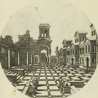
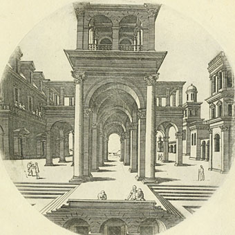
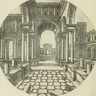
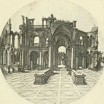
Something discovered following another delve through the collections of etchings and engravings at the Internet Archive where a frustrated search for one subject turns up something else. This 1549 folio of architectural engravings is credited to architect and designer Jacques Androuet du Cerceau (1510–1584), and the plates are based on earlier renderings by Agostino Veneziano and Hieronymus Cock, he of the incredible map of the Americas. Among the details of columns and caryatids there’s a series of the kind of imaginary perspective views I always like to see, lots of sparsely-populated courtyards in various states of ruin. It’s easy to imagine these prospects being transformed into scenarios from Paul Delvaux or Giorgio de Chirico after a suitable change of lighting.

suite2.jpg

suite3.jpg

suite4.jpg

Elsewhere on { feuilleton }
• The etching and engraving archive

Weekend links 72

lesyeux.jpg

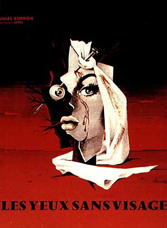
If Jean Cocteau had made a horror film it might have resembled George Franju’s dreamy and disturbing body-horror masterwork Les Yeux Sans Visage (1960). I’ve not been able to trace the artist for this poster but it’s a good example of the diluted Surrealism which was still prevalent in poster graphics at this time.

If I were asked what’s needed today, I’d say innovation, and greater timbral variety. If you truly want the audience to experience the clammy thrill of the grotesque, the uncanny and the fearful, you have to reach for the unfamilar, the perplexing, even the ugly; there’s an infinite Lovecraftian sound-world out there waiting to be explored. We need new combinations, new textures in film scoring. Horror has a licence to be weird – it’s supposed to mess with our heads. (more)

Stephen Thrower.

Stephen Thrower is an ex-member of Coil, a current member of Cyclobe, was the editor of a great magazine, Eyeball, devoted to horror cinema and what Kim Newman (casting about for a wider, non-generic label) calls “nightmare movies”, and is the author of Nightmare USA and Beyond Terror: The Films of Lucio Fulci. In other words, he’s more than qualified to write about horror film soundtracks. The reason is an event at the South Bank Centre, London, two weeks from now, Sound of Fear: The Musical Universe of Horror, one of the highlights of which will be a performance by John Carpenter’s soundtrack collaborator Alan Howarth. Related: my post about Italian horror soundtracks from 2008.

lovato.jpg

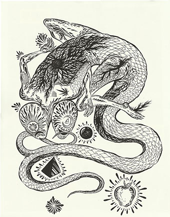
Art by Justin Lovato.

• Mind Over Matter: Alan Fletcher’s The Art of Looking Sideways. “The Art of Looking Sideways captures the sensory overload of contemporary visual culture, while also acting as a primer in visual intelligence.” Related: Alan Fletcher profiled at the Design Museum.

• More music and more psychedelia: Past Present Future Space-Time “Wysing Arts Centre explores the legacy of psychedelia in this year’s annual music event”.

• The Coilhouse International Silent Auction is GO and ends Sunday night if you want to bid for some rare and special things.

• The Garden of Kama and Other Love Lyrics from India (1901), illustrated by John Byam Shaw.

• Chris Marker’s take on the recent London riots: Overnight.

• Bristol’s graffiti artists are redecorating the city’s streets.

• Women and knives: a Dario Argento poster gallery.

• Inferno (1993) by Miranda Sex Garden, from their album Suspiria.

Whistler’s Peacock Room revisited

whistler1.jpg

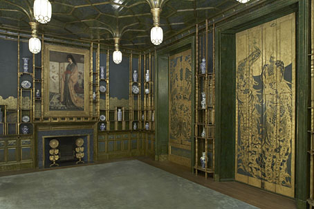
The Peacock Room (1876–1877).

More Japonism courtesy of the Google Art Project where it’s possible to pan around this view of Whistler’s Peacock Room at the Freer Gallery of Art. There’s only one view, unfortunately, it would have been good to see the reverse angle or, better still, a full panorama.

whistler2.jpg

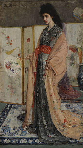
The Princess from the Land of Porcelain (1864).

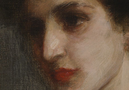
Google has a number of the Freer’s collection of Whistler drawings and paintings, including The Princess from the Land of Porcelain, the painting which the Peacock Room was designed to show to best effect along with patron Frederick Leyland’s blue-and-white china. Once again the Google views allow us to scrutinise the details of a painting in a way which would otherwise be impossible. It’s fascinating for me to see how loose Whistler’s technique was even at this early date, the brushstrokes of the face seem to have been scumbled over raw canvas.

whistler3.jpg

whistler4.jpg

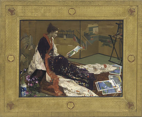
Caprice in Purple and Gold: The Golden Screen (1864).

Also at the Freer is another piece of exotica from the same period with a suitably Japanese frame. Whistler’s Japonism, and the Peacock Room in particular, leads directly to Aubrey Beardsley’s art thirty years later.

Previously on { feuilleton }
• The Peacock Clock
• Whistler’s Peacock Room

Hapshash Takes a Trip

ufocoming.jpg

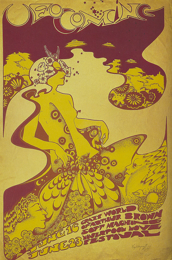
UFO Coming (1967) by Hapshash and the Coloured Coat.

It’s always difficult to choose a favourite from the posters that Nigel Waymouth and the late Michael English produced under the name Hapshash and the Coloured Coat, their standards remained high (so to speak) throughout their partnership. But I always liked the ejaculating penis butterfly on this early design for Joe Boyd’s UFO club, a detail which would have given Aubrey Beardsley a chuckle and which is probably unique in art. The gorgeous Hapshash posters receive another airing next month in an exhibition at the Idea Generation Gallery, London, entitled Hapshash Takes a Trip: The Sixties Work of Nigel Waymouth:

Waymouth’s own archive plays a major part in the retrospective. Kept privately for decades and rarely seen since their first creation in the late ’60s, the artist’s personal collection features works made as part of Hapshash and his designs for Granny Takes a Trip. Furthermore it contains his own album covers, photographs, press clippings and magazines. This extraordinary collection unites rare works with rare moments, through photographs never before seen in public.

The exhibition opens on September 9th. There’s more detail on the press release (PDF) including a promise that “Huge silk-screened reproductions of their iconic posters will fill the entirety of one of the Gallery’s soaring 20 foot walls.”

The exhibition title alludes to the celebrated King’s Road boutique Granny Takes A Trip whose series of striking shopfronts were decorated by Waymouth before and during his partnership with Michael English. The Look posted some pictures of Waymouth’s 1947 Dodge decor earlier this week.

Previously on { feuilleton }
• The Dukes declare it’s 25 O’Clock!
• Psychedelic Wonderland: the 2010 calendar
• Michael English, 1941–2009
• Max (The Birdman) Ernst
• The Look presents Nigel Waymouth
• The New Love Poetry