Compass Road by Iain Sinclair

sinclair.jpg

I was hoping to get my delayed 2011 calendar launched today but other work needed completing so here’s an interim post.

Think of your journey through mortality as a sequence of valid movies and the pain is ameliorated. Forget the tedious 60-minute division of the lecture hall or dead television (quartered by adverts): arrange just enough markers for the 90-minute slots of Golden Age cinema. And then it’s only a question of nominating the eight guides, culture-figures who will dominate your thoughts (and reveries) for as long as you stay upright. The road is endless, you aren’t. Iain Sinclair

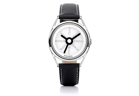
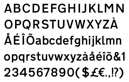
There may be a recession on but people still keep putting out the luxury goods; maybe the bankers are buying all this stuff with their unwarranted bonuses. Compass Road is a limited edition wristwatch from Mr Jones Watches, London, and sports a design commissioned from writer Iain Sinclair, a somewhat surprising choice given that these things are more usually farmed out to those individuals we have to call celebrities. Sinclair is too intelligent and interesting to be a mere celebrity and consequently designs a watch I’d probably buy if I had an excessive income. The watch middle and the hands are based on the British road signs designed by Margaret Calvert and Jock Kinneir while the typeface used for the compass points is Calvert and Kinneir’s Transport (below) which is also used across Britain’s road signs. For the destinations Sinclair has chosen eight writers with London associations: John Clare, Gerald Kersh, Bram Stoker, Joseph Conrad, William Blake, HG Wells, JG Ballard and Louis-Ferdinand Céline. The last seems an odd choice but he did work in London for a while.
transport.jpg

Sinclair’s design is a flexible enough to be applied to other literary cities which raises the question of which names you’d choose for Paris, say, or New York. And which signage systems? Subways or the local roads? Compass Road meanwhile can be yours for £145.
Design as virus 13: Tsunehisa Kimura

kimura.jpg

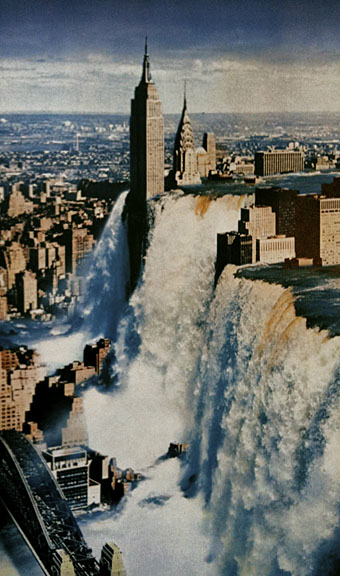
Waterfall by Tsunehisa Kimura.

Continuing an occasional series. Japanese artist Tsunehisa Kimura (1928–2008) was initially inspired by the polemical graphics of John Heartfield to create his own photomontages, a painstaking collage technique now rendered obsolete by Photoshop. Kimura’s work exchanges Heartfield’s satire for an overt and frequently apocalyptic Surrealism, as in his most visible piece, Waterfall. The copy above is one of a number of pictures reproduced by Geoff Manaugh at BLDGBLOG from a 1979 Kimura collection, Visual Scandals by Photomontage.

schutze1.jpg

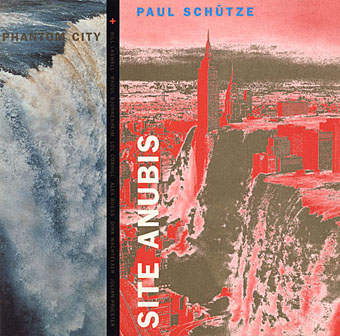
Design by Anne-Louise Falson & Paul Schütze.

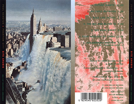
I was first startled by Waterfall in 1996 when Paul Schütze released his Site Anubis album, the product of a “virtual group” comprised of musicians recording in different studios around the world:

The musicians comprising Phantom City—the name, incidentally, originating from the book title Topology of a Phantom City by French novelist Alain Robbe-Grillet—never met for the recording of Site Anubis, as each one recorded in a different studio in a different country: guitarist Raoul Björkenheim in Helsinki, bass- and contra-bass clarinetist Alex Buess in a Basel studio, soprano saxophonist Lol Coxhill in London, bassist Bill Laswell at Green Point Studio in Brooklyn, New York, trombonist Julian Priester in Seattle, drummer Dirk Wachtelaer in Brussels, and Schütze himself in London and Basel. Incredibly, Laswell had only Schütze’s electronic backing track to respond to. Wachtelaer had Laswell and Schütze to play against, Björkenheim had drums and bass,—in short, certain players had more information than others.

schutze2.jpg

Kimura’s picture is an ideal accompaniment to this excellent album, especially when you note a Ballard reference in the titles (not the first in Schütze’s oevre), and read the scene-setting piece of fiction on the CD insert, an explanation of the album title:

That morning a report came in from an unmarked helicopter somewhere over the city. The waters were subsiding and the smoke from a thousand fires had begun to drift inland revealing an impossible new structure. Towering some eight hundred feet over the gleaming devastation of the streets, its base occupying an entire city block, was a colossal black basalt figure. The body was male and human, – the head, which stared expectantly toward the boiling western horizon, was the head of a jackal. From the air it was clear that the pattern of destruction on the ground was radial and that the massive figure was sited precisely at its centre.

Continue reading “Design as virus 13: Tsunehisa Kimura”

Esquisses Décoratives by René Binet

exposition1.jpg

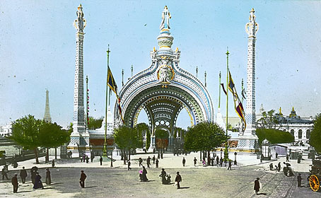
The work of French architect and designer René Binet (1866–1911) has been featured here before with one of his most famous creations, the monumental gate he designed for the Paris Exposition Universelle of 1900. Philippe Jullian in his 1974 book about the exposition, The Triumph of Art Nouveau, calls the gate the “Porte Binet” and also notes that it was referred to as “the Salamander” for its resemblance to the salamander stoves of the period.

binet1.jpg

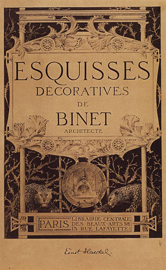
The reference to nature is apt, albeit for a different reason, since it was Ernst Haeckel’s Kunst-Formen der Natur which Binet used as inspiration for his designs, the encrustation on the gate being based on Haeckel’s studies of shell forms. This influence was developed four years later in Binet’s Esquisses Décoratives, a series of speculative designs which applied Haeckel’s work to architecture and interior design as a whole; the Porte Binet can be seen on the title plate above and the print there seems to have been either signed by or dedicated to Haeckel.

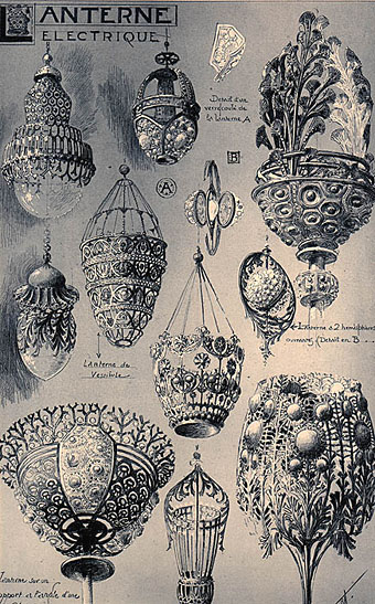
Art Nouveau design is usually thought of in terms of the curvaceous style derived from Alphonse Mucha and others, but there were several designers of the period looking to nature for inspiration in a way which went beyond William Morris’s application of plant forms to flat surfaces. Binet’s lamp designs below show how Haeckel’s sea-life could be transmuted into enclosures for electric lights. These designs hint at a direction which went unexplored in the 20th century; the Art Nouveau style was steadily vulgarised after the Exposition Universelle until it was replaced altogether by the development of Art Deco following the First World War. Binet went on to design the extension of the Paris department store, Printemps, but his huge Art Nouveau atrium was later destroyed by fire.

binet2.jpg

There aren’t many examples of Binet’s designs on web pages, the ones here are from this Flickr set and a vintage print seller. There is a recent study of Binet’s work available, however, René Binet: from Nature to Form by Olaf Breidbach. For an idea of how an entire city based on Haeckel might look, we have Schuiten and Peeters’ imaginary metropolis of Blossfeldtstad whose “Vegetalistic” architecture was featured in an earlier post.

Previously on { feuilleton }
• Le Palais de l’Optique, 1900
• Exposition Universelle films
• Exposition jewellery
• Exposition Universelle catalogue
• Exposition Universelle publications
• Exposition cornucopia
• Return to the Exposition Universelle
• The Palais Lumineux
• Louis Bonnier’s exposition dreams
• Exposition Universelle, 1900

Weekend links 29

dancer.jpg

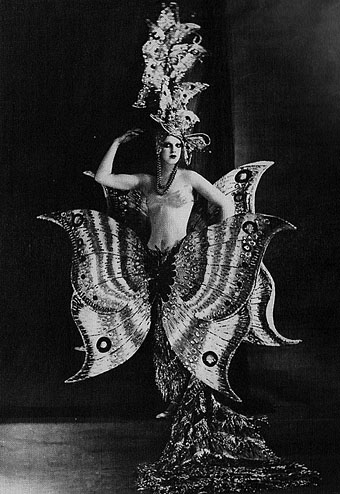
A Folies Bergère dancer, c. 1909.

• Six Novels in Woodcuts: The Library of America publishes a boxed set of Lynd Ward’s works: Gods’ Man, Madman’s Drum, Wild Pilgrimage, Prelude to a Million Years, Song Without Words and Vertigo.

• RIP ace graphic designer Raymond Hawkey. Related: Raymond Hawkey: An eye for detail, and Hawkey’s James Bond cover designs from the mid-60s.

• The Record: Contemporary Art and Vinyl, an exhibition at Duke University, North Carolina, features work by 41 artists from around the world, from the 1960s to the present, using vinyl records as subject or medium.

decaris.jpg

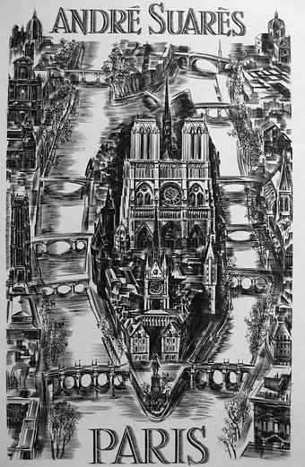
The Île de la Cité, a steel engraving by Albert Decaris (1950).

• Fred Tomaselli will have a new exhibition of his work at the Brooklyn Museum next month.

• Socialist Monuments in Bulgaria photographed by Linda Ferrari.

• What would Howard think of the Mythos Art Dildo?

• Space is Process, a film about Olafur Eliasson.

• Thurston Moore’s Indie Books.

• Chris Colfer in a leather bar.

• Ephemeral New York.

• Chrome! Helios Creed’s YouTube channel.

Le Palais de l’Optique, 1900

optique1.jpg

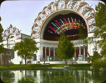
Here at {feuilleton} the Paris Exposition Universelle of 1900 is never far away. This post is linked to those of the previous two days via the zodiac signs which decorate the lavish canopy on the Palais de l’Optique, one of the smaller exposition halls. The zodiac signs seem oddly inappropriate for displays of scientific endeavour until you discover that the principal attraction was François Deloncle’s Grande Lunette, or Great Telescope, one of the largest refracting telescopes ever built.

optique2.jpg

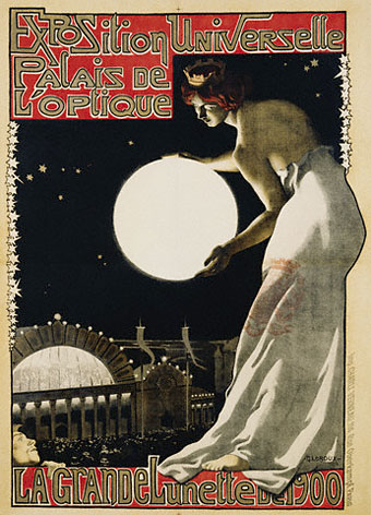
The astrological signs, then, signify the heavens which the telescope allowed an audience to view on a giant screen. The elegant poster advertising the attraction is by Georges Paul Leroux (1877–1957), and was discovered at Gatochy’s Flickr pages. The diagram below shows the colossal scale of thing and—appropriately—ought to be viewed at a larger size on Pignouf’s page. When you consider the small scale of film projections in 1900 the screenings from this monster must have been quite spectacular. The Exposition Universelle 3D Project has additional photos.

optique3.jpg

Previously on { feuilleton }
• Exposition Universelle films
• Exposition jewellery
• Exposition Universelle catalogue
• Exposition Universelle publications
• Exposition cornucopia
• Return to the Exposition Universelle
• The Palais Lumineux
• Louis Bonnier’s exposition dreams
• Exposition Universelle, 1900
• The Palais du Trocadéro