
Maurice Leloir’s Three Musketeers

leloir03.jpg

Just after Christmas I watched the recent French film adaptation of The Count of Monte Cristo, after which I resolved to finally read The Three Musketeers, something I’d been intending to do since reading The Count of Monte Cristo four years ago. I’m currently two thirds of the way through The Three Musketeers and enjoying it very much despite the familiarity of the story. (I’ve watched Richard Lester’s two-part film adaptation many times.) For the most part, the novel avoids the flaws which make Monte Cristo a laborious read (Umberto Eco described the latter as “one of the most exciting novels ever written and on the other hand…one of the most badly written novels of all time and in any literature”), but The Three Musketeers isn’t without flaws of its own. I don’t think too many people would regard the lack of descriptive detail as a flaw per se—this is an adventure story, after all—but I enjoy a well-crafted description, and Dumas’s sketching of costume and place ranges from the scant to the non-existent. We’re told, for example, that d’Artagnan is a member of the King’s Guard, and that the Guards and the Musketeers are identifiable by the differences of their uniforms. But I don’t recall any instance when we’re told how these differences are manifest, or even how any of the principle characters dress from day to day. The same applies to the settings; much of the novel is set in the Paris of the 1620s but Dumas ignores any scenic description in what would have been a darker, muddier and altogether less salubrious city than his own Paris of the 1840s.

leloir01.jpg

All of which brings us to Monsieur Maurice Leloir (1853–1940) and his illustrations for the novel which were published in a two-volume edition in 1894 (Tome 1 | Tome 2). Leloir was a painter and illustrator with a considerable knowledge of French historical dress; in 1907 he became the founding president of the Société de l’histoire du costume. His illustrations of The Three Musketeers, therefore, may be taken as authoritative when it comes to the costuming of the characters. Leloir was very good with everything else, as it happens; his characterisation is better than those of an earlier edition which makes d’Artagnan and friends barely distinguishable from each other, something not helped by the barbering habits of the day which had every gentleman sporting the same elaborate moustaches.

leloir02.jpg

Most of Leloir’s illustrations are placed vignette-style inside the page but a few of the larger ones run across two pages, especially those involving fights or other action scenes. And there are many illustrations, what you see here is a very small sample. A couple of them so closely match scenes in the Richard Lester films that I’m sure the books must have been referred to for details of costuming. Douglas Fairbanks certainly saw them; after playing d’Artagnan in his own film production of The Three Musketeers he invited Maurice Leloir to advise with the costuming of another Dumas adaptation, The Iron Mask, in 1929.

leloir05.jpg

leloir06.jpg

Continue reading “Maurice Leloir’s Three Musketeers”

Weekend links 816

rossignol.jpg

The Creative Power of the Spirit, No. 31 of A Goodly Company series, 1920–1933 by Ethel le Rossignol.

• “One moment it was a little blip. The next, our friends are dying”: the gay porn soundtrack composers lost to the Aids crisis. More gay porn: Pink Narcissus, James Bidgood’s micro-budget homoerotic fantasy, will receive a UK blu-ray release later this year.

• Old music: Thirst by Clock DVA gets a very welcome reissue later this year, having been unavailable in any form since 1992. I’m not so happy about the changes to Neville Brody’s original cover design but the album itself is a major post-punk statement.

• “Graphic design was thought to be a man’s discipline,” she says. “So I think it was quite a surprise for people to find me there.” A profile of Margaret Calvert, designer of (among other things) Britain’s road signs.

• At Colossal: A major survey in Paris chronicles Leonora Carrington’s esoteric Surrealism.

• At Public Domain Review: Sara Weiss’ Journeys to the Planet Mars (1903).

• At the BFI: The mystery music video for The Beatles’ Penny Lane.

Winners and entrants for Close-up Photographer of the Year 7.

• “Cats to blame for octopus deity enshrinement delay.”

• Steven Heller’s font of the month is Cattivo.

• At Dennis Cooper’s it’s Jack Arnold’s Day.

Pink Noir (1996) by David Toop | Pink Dust (2013) by Sqürl | The Pink Room 2 (2024) by Seigen Ono

Weekend links 815

hawksmoor.jpg

A photograph by FR Yerbury of St George’s-in-the-East, London. From Nicholas Hawksmoor (1924) by HS Goodhart-Rendel.

• “Sixty years later, the Spectacle saturates us in ways the Situationists never imagined. Online platforms structure our personal relationships; algorithms nudge us toward the platform owners’ preferred choices. ‘Intelligence’ is embedded into everything from our phones to our kitchen appliances. But back in the Sixties, the Situationists saw the physical environment of the city as an expression of the mass society created by consumerism and governed by the Spectacle, and they felt power closing in around them: ‘All space is occupied by the enemy. We are living under a permanent curfew. Not just the cops—the geometry.'” Hari Kunzru takes a psychogeographical dérive through the streets of London, encompassing the Hawksmoor churches, Iain Sinclair’s own peregrinations, Alan Moore’s Sinclair-influenced script for From Hell, Arthur Machen and more. (No mention of Alan’s ongoing Long London series, however, the first book of which is a deep dive into Machen territory.) Kunzru could be accused of being 30 years too late with his piece but for younger readers and many Americans these paths are worth retracing.

Enemies from Venus!: “The only surviving fragment of a Dutch science fiction series for children from the mid-sixties (that never was).” CGI animation by Ernst-Jan van Melle in the style of black-and-white puppet shows like Fireball XL5, Space Patrol, etc.

• “If this is a horror story, it’s a horror story about being desperate for love, and about the vulnerability, loneliness, and difficulty in understanding other people that might drive this state.” Olivia Laing on Jonathan Glazer’s second feature film, Birth.

• At the BFI: Rory Doherty selects 10 great British heist films.

• At The Daily Heller: Posting Posters about Fellini.

• RIP Sly Dunbar; James Sallis; Catherine O’Hara.

• At Dennis Cooper’s it’s Peter Whitehead’s Day.

• The Strange World of…Toumani Diabaté.

• New music: Errata by WF 98.

Birth (1971) by Keith Jarrett | Birth (1995) by Howie B | Birth (2013) by Roly Porter

Tadami Yamada’s illustrated Carnacki

carnacki10.jpg

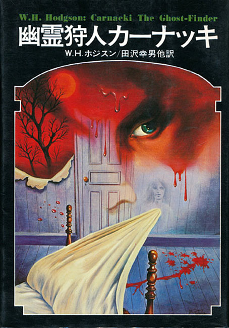
It’s William Hope Hodgson’s occult detective again. Late last year I was looking for Hodgson illustrations after reading Timothy S. Murphy’s William Hope Hodgson and the Rise of the Weird: Possibilities of the Dark but couldn’t find much of interest apart from book covers I’d seen many times before. Tadami Yamada’s illustrations for a Japanese edition of Carnacki, The Ghost-Finder have yet to be catalogued at ISFDB, and don’t seem to have been disseminated much at all. Once again, I’m indebted to 70sscifiart for turning up art that I might not otherwise have seen.

carnacki01.jpg

The Thing Invisible.

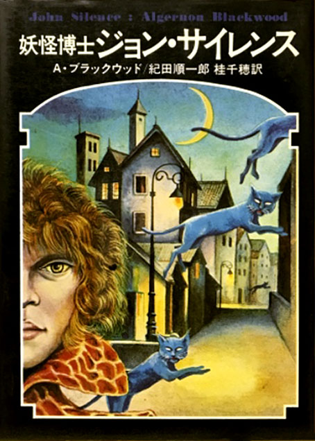
Information about the Japanese collection was difficult to find in general, a common problem with older Japanese books when most of the online documentation hasn’t been translated. The book was published by Kokusho Kankōkai in 1977 as part of a series of weird fiction reprints along with collections by HP Lovecraft, Algernon Blackwood and others. The Hodgson volume contains the expanded collection of Carnacki stories, with the three posthumously published tales–The Haunted “Jarvee”, The Find and The Hog–appended to the original 1913 edition.

carnacki06.jpg

The Gateway of the Monster.

As to the illustrations, these were early works by Tamada, an artist with a lengthy career as an illustrator and painter. The copies of the illustrations don’t reveal much about their medium but they all appear to be paintings; the ones for The Find and The Hog (whose Japanese title translates as The Witch Pig) both show signs of the patterning you get with the decalcomania process, something you can’t easily create in other media. If this book was part of a series then I don’t imagine it was the sole illustrated edition, which raises the possibility that the Lovecraft, Blackwood and other titles were fully illustrated as well. Once again, further research is required.

carnacki08.jpg

The House Among the Laurels.

carnacki02.jpg

The Whistling Room.

Continue reading “Tadami Yamada’s illustrated Carnacki”

Beautiful and macabre: two books from Century Guild

posters.jpg

Arriving in the mail last week, a pair of beautifully-produced volumes which Thomas Negovan very generously sent to me. Negovan’s Century Guild publishes the kind of art I’ve been writing about here for the past twenty years: Symbolist painting, Art Nouveau graphics, Decadent illustration and more. There’s some intersection between the publisher’s backlist and earlier titles from Dover Publications, but where Dover have mostly concentrated on mass-produced paperbacks Century Guild deploy the full range of finishings available to a publisher of high-quality art books: foil embossing, faux leather finishes, spot-varnished boards, edges sprayed in metallic ink, and ribbon place-markers. Beautiful Macabre is Negovan’s own selection of rare poster art from 1868 to 1981, rare enough for most of the material to be new to me: theatre posters, Expressionist film posters, exhibition posters, etc, with an emphasis on Decadence through the ages. This is another of those books that show how the morbid preoccupations of the 1890s became codified in the 20th century into generic horror.

seder.jpg

Cover design by Jack Hargreaves.

The Anton Seder book is a more singular study, reprinting the intricate plates from Das Thier in der Decorativen Kunst (The Animal in Decorative Art) and Moderne Malereien, a collection of Seder’s interior designs in the Art Nouveau style. Seder’s book of animal designs has its own Dover reprint (which may explain how Murray Tinkelman was able to incorporate some of the creatures into his Lovecraftian cover art) but the Century Guild collection includes much more than this, with biographical notes, and pages that place Seder’s books in the context of previous guides and templates for use by artists and craftspeople. This type of book was a common thing around 1900 (Alphonse Mucha produced three of them), while similar examples abound in previous centuries. The fragmentation of art and craft in the 20th century, and the turn against exuberant decoration, put an end to a form whose spirit survives today in reprints such as this. And it happens to have arrived at a time when its contents will be very useful reference for my current commission. Thanks, Thomas!

Previously on { feuilleton }
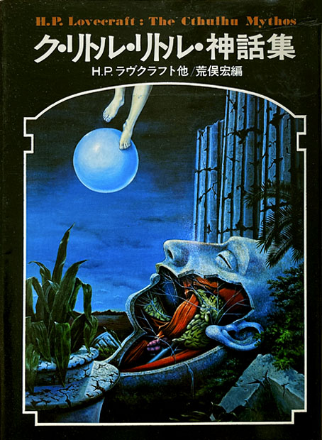
Eldritch Art Nouveau: Lovecraft at Ballantine
Moderne Malereien, 1903
Das Thier in der Decorativen Kunst