Gay slang from the 1970s

gay1.jpg

While browsing recently through the available back issues of Oz magazine I noticed a guide to gay slang that I didn’t recall seeing before. The underground magazines and newspapers of the 60s and 70s were a lot more tolerant of the nascent gay rights movement than their “straight” (ie: non-freak) counterparts. Oz magazine published pieces about gay rights, notably so in issue 23 which ran an extract from The Homosexual Handbook (1969) by Angelo d’Arcangelo among a couple of other features; the UK’s first gay magazine, Jeremy, advertised regularly in Oz and IT; later issues of Oz carried ads for another gay mag, Follow Up, and there’s a letter in one issue from a gay freak complaining about the state of the few gay pubs in London where the clientele was apparently not freaky enough. (His solution was to try and persuade them all to drop acid.) Arguments which still circulate today, between those who want to assimilate and those who prefer to remain separate from general society, go back a long way.

The gay slang guide was extracted from The Queens’ Vernacular: A Gay Lexicon by Bruce Rodgers (1942–2009), published in the US by Straight Arrow Books in 1972. Straight Arrow was affiliated with Rolling Stone magazine, later publishing two volumes of Wilfried Sätty’s art, and Kenneth Anger’s Hollywood Babylon. Rodgers’ book was reissued in 1979 as Gay Talk: A (Sometimes Outrageous) Dictionary of Gay Slang (Formerly entitled The Queens’ Vernacular) but has been out-of-print ever since, unsurprisingly since so much of it is now completely outmoded. That doesn’t make the content uninteresting, however. The phraseology may be ribald, obscene and offensive (misogynist, especially) but the book has been described as “the first serious dictionary of gay slang and the definitive gay American jargon resource”. Rodgers was a serious researcher with an interest in all forms of slang. Just as the Dictionary of the Vulgar Tongue (1811) by Francis Grose gives a more-or-less unmediated insight into the lives of the working and criminal classes of 18th-century London, so Rodgers’ dictionary tells us something about the way gay people, especially gay men in the US, were talking to each other for much of the 20th century. What’s striking now about this truncated list is the degree to which so much of the language is obsolete—nobody under the age of 60 would use the term “queen” with such frequency—while the wider acceptance of porn has made once-esoteric terms like “golden shower” much more common. Notable by its absence is “queer” as a purely positive description (not reclaimed until the 1980s), and no mention of “twink” (which goes back to the early 60s) or “bear” (another term from the 80s).

There’s a tendency when looking at lists such as this to imagine a group of people using most of the terms all the time, but as with any form of slang this would be unlikely. The same goes for Polari or the handkerchief codes of the 1970s. As you’d expect from a document that’s 42 years old, some of the language that Rodgers collected tramples over many current sensitivities.

gay2.jpg

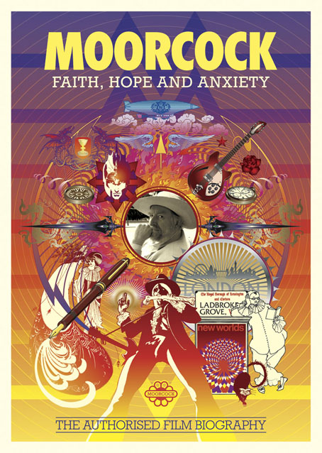
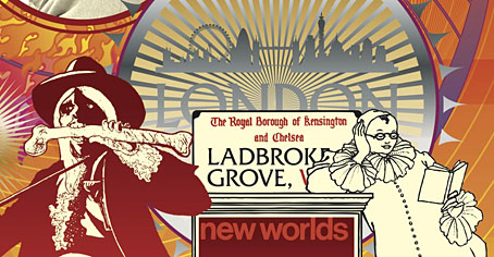
Illustration by Rod Beddall.

THE QUEEN’S VERNACULAR, Oz 46, Jan–Feb 1973

Gay slang has been coined and used by those within the gay subculture who themselves feel the most oppressed—the flagrant wrist benders, the screaming queens, the men who look like women, the women who don’t shave their moustaches.

It is a form of social protest, aimed at the establishment; it is also self-protective and self-defeating. Gay militants would like to see it go, and argue rightly that gay jargon is yet another link in the chain which holds the homosexual enslaved and oppressed—yet its widespread use and complex vocabulary indicate that gay liberation has still along battle in front of it. The selections which follow are taken from a Straight Arrow publication, The Queens’ Vernacular by Bruce Rodgers. The words are mostly American. Even the classic English phrase, “queer basher” is not included.

* * *

advertising 1. to dress in a sexually provocative manner. Gay maxim: “It pays to advertise.” 2. (camp) to pluck and then paint the eyebrows.

army style (mid ’60s) beating the cocksucker after the act.

bumping pussies the embarrassment of two homosexual men who find themselves too passive, active, or in other ways too similar to create a sexual situation. “He thought you and I were carrying on together—what would we do, bump pussies?”

cash-ass (from cautious) cynically applied to hustler who feigns coyness until assured of material gain. “He’s not shy, he’s cash-ash. Mention money and watch his cheeks light up.”

catalogue queen homosexual who collects physique magazines for masturbation purposes.

cheesy having the foreskin lined with smegma. Stale and musky smelling. “The sailor was so cheesy that I felt like asking him where be hid his crackers.”

chic the latest craze. Cruising the busy streets after the bars close is chic. Getting invited to an orgy is chic. Sucking men off in a public lavatory is not chic. Wearing pearls with grey flannel is not chic either, unless one is serving tea in a closet.

Continue reading “Gay slang from the 1970s”

Walter Ruttmann’s abstract cinema

ruttmann1.jpg

Histories of abstract cinema often begin with Oskar Fischinger, a filmmaker and animator who was certainly a pioneer of the form. But these four silent shorts by Walter Ruttmann (1887–1941), Lichtspiel: Opus I, II, III & IV (1921–25) predate Fischinger’s work, and also prefigure Fischinger’s own animations of swooping shapes, blooming circles and stabbing triangles. Ruttmann’s abstractions are very sophisticated considering they’re such early examples of this type of experimental cinema. Some of the sequences in Opus IV resemble the kinds of graphics seen during title sequences in TV programmes of the 1960s.

ruttmann2.jpg

Elsewhere on { feuilleton }
The abstract cinema archive

Moorcock: Faith, Hope and Anxiety

moorcock.jpg

Photo of the author by Linda Moorcock.

I mentioned a few days ago that I had another new piece of work to reveal, and this is it, a poster/promotional piece for Russell Wall’s forthcoming documentary about Michael Moorcock. The main challenge with one was to create something that would give a sense of Moorcock’s extensive career and the genre-spanning content of his many books.

mm1.jpg

I took the 1970s as the starting point, since this was the period when his reputation as a writer was established worldwide. The decade began with Britain’s bookshelves being colonised by Moorcock’s SF and fantasy novels published by Mayflower with vivid covers; it saw a cult feature film—The Final Programme—made from his first Jerry Cornelius novel, and it ended with the fourth Jerry Cornelius novel, The Condition of Muzak, winning a serious literary award, the Guardian Fiction Prize.

mm2.jpg

So the general appearance of the design, the headline typography, and the colour scheme are a nod to the Mayflower covers and especially to Bob Haberfield’s artwork which often used a similar style of Tibetan flames and clouds. The rest of the type is set in Rockwell, a preferred typeface of the Hipgnosis design team for much of the 1970s. Early on I had the idea of filling the design with stylised graphics like those used by some of the Hipgnosis illustrators, chiefly George Hardie, but that idea receded once the composition began to arrange itself. The fountain pen is the main hangover from this, a hard-edged graphic tilted at an angle like many of Hardie’s illustrations. The pen is a little inappropriate given that Moorcock is famous for knocking out novels at speed on a typewriter but it made a good visual rhyme with the guitar, a Rickenbacker like the one the author played in his Deep Fix band.

mm3.jpg

Elsewhere there are many specific references competing for attention: the Elric head is Jim Cawthorn’s illustration from the first edition of Stormbringer (1965); the Jerry Cornelius figure (straddling a repurposed Mayflower logo) is one of Mal Dean’s best, as seen on the cover of issue 191 of New Worlds magazine; the sorcerous blades are my own designs from 1985 as seen on the sleeve of Hawkwind’s Chronicle of the Black Sword album; the Beardsley figures from Salomé were a vague gesture to the 1890s but the Pierrot figure happens to be one Moorcock used for a while as a bookplate, something I didn’t know until I’d placed it in the design; the cat at Pierrot’s feet is another Beardsley from one of the Bon-Mots books; the London skyline is a contemporary one, London past and present having been a continual feature of Moorcock’s writing throughout his career. Lastly, all these details are contained by a graphic based on Abram Games’ BBC TV ident from the 1950s. When Russell and I began talking about this project the words “television biography” were being used so this would have connected to that idea, and to the decade when Moorcock’s career began.

mm4.jpg

I don’t know when the documentary will be released but any news will be posted here in due course. There’s also talk of making copies of the poster available for purchase but nothing concrete has been decided yet.

Previously on { feuilleton }
Eduardo Paolozzi at New Worlds
Elric 1: Le trône de rubis
Into the Media Web by Michael Moorcock
The Best of Michael Moorcock
Revenant volumes: Bob Haberfield, New Worlds and others

Weekend links 238

hinrichsen.jpg

We Are The Water – Snow Drawings Project, Colorado (2014) by Sonja Hinrichsen with 50 volunteers.

• I don’t do end-of-year lists but Dennis Cooper does. My thanks to Dennis once more for including this blog among his selections. Also there is Jonathan Glazer’s film of Under the Skin, an adaptation of Michel Faber’s novel that impressed me as the most insidiously disturbing thing I’ve seen since Mulholland Drive. The Guardian‘s film critics agreed, making it their film of the year. I’d add to Peter Bradshaw’s appraisal by noting the superb score by Mica Levi, the refusal to spoon-feed the audience with explanations, and a refreshing absence of Hollywood gloss. Glazer’s film, like Kill List before it, shows that mundane British streets and interiors can still be a setting for serious horror.

• Related to the above: “I like Caravan, Coil—it’s very sad that they’re both dead now. In fact, Peter Christopherson, who was leader of Coil, contributed a song to a CD which I made for my wife for what we believed would be her last birthday.” Michel Faber talks to Hope Whitmore about Under the Skin and his new novel, The Book of Strange New Things. M. John Harrison recommends the latter on his own end-of-year list. In January Black Mass Rising will release a recording of The Art of Mirrors, Peter Christopherson’s homage to Derek Jarman from 2004.

David Bowie and band live on Musikladen in 1978: 40 minutes with Adrian Belew on squealing lead guitar, some Kurt Weill and an outstanding performance of “Heroes”.

• “Realism is a literary convention – no more, no less – and is therefore as laden with artifice as any other literary convention.” Tom McCarthy on realism and the real.

• Mixes of the week: The Best of the Best of the Best by TheCuriosityPipe, and Secret Thirteen Mix 138, a medley of post punk from Psyche.

• “We spent two weeks making the penises.” Livin’ Thing: An Oral History of Boogie Nights by Alex French and Howie Kahn.

• At Dangerous Minds: Seeing The Man Who Fell to Earth was one of the greatest experiences of Philip K. Dick’s life.

• Giving Voice to Our Pagan Past and Present: Pam Grossman on Witches, Women and Pop Occulture.

• Neglected last week (and linked everywhere but still a good one): The typography of Alien.

William Mortensen, the photographer who Ansel Adams called the Anti-Christ.

• Hear a track from analogue synthesizer virtuoso Kaitlyn Aurelia Smith.

Rick Poynor on illustrations by Bohumil Stepan for Crazy Fairy Tales.

12 excellent features from directors who never made another feature.

Werner Herzog Inspirationals

The Devil in the Hedgerow

New Warm Skin (1980) by Simple Minds | Rapture Of The Skin (1996) by Paul Schütze | Take Me Into Your Skin (2007) by Trentemøller

Max Ernst album covers

ernst01.jpg

The Road To Ruin (1970) by John & Beverley Martyn. Art: Un Semaine de Bonté (1934).

Having already looked at cover art featuring the work of Salvador Dalí and René Magritte, a similar post for Max Ernst seemed inevitable. I did search for Ernst cover art after the Dalí post but at the time there were fewer examples. As usual there may be more than these since Discogs is the main search tool and they (or the albums) don’t always credit the artists. Despite having several books of Ernst’s work I’ve not been able to identify all the artwork so the Ernst-heads out there are welcome to fill in the gaps.

The Road To Ruin was John Martyn’s fourth album, and the second he recorded with wife Beverley. I’m surprised that this is the earliest example, I’d have expected a classical album or two to have predated it.

ernst02.jpg

Martinu’s Symphony No. 6 (Fantaisies Symphoniques) / Vorisek’s Symphony In D Major (1971); New Philharmonia Orchestra, Michael Bialoguski. Art: Bottled Moon (1955).

ernst03.jpg

Bluebeard’s Castle by Béla Bartók (1976); Tatiana Troyanos, Siegmund Nimsgern, BBC Symphony Orchestra, Pierre Boulez. Art: The Eye of Silence (1943–44).

Bluebeard’s Castle is my favourite opera, and The Eye of Silence is my favourite Ernst painting, so this is a dream conjunction even if the match doesn’t work as well as it did for the cover of The Crystal World by JG Ballard. One to seek out.

Continue reading “Max Ernst album covers”