Weekend links 79

brody-va.jpg

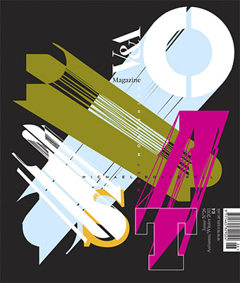
Neville Brody creates a cover design for an issue of the V&A magazine tied to the museum’s current exhibition, Postmodernism: Style and Subversion 1970–1990. Brody’s comment amused me for the way he smartly explained the thinking behind the design whilst also distancing himself from its theme:

For me, Post Modernism felt like a kind of facade built to cover over the cracks of a divided world, a surface of plucked effects and stylistic devices emptied of meaning, an extrusion of hollow traces and flat outlines forcing 2D into apparent depth. I was never a Post Modernist, rather a Modernist exploring humanist lines of enquiry in the collapsing world behind a wall of decoration.

• It’s a common thing today to give images from the past a queer reappraisal, finding homoerotic qualities in pictures which, when they were made, would have seemed free of any sexual subtext. This post finds such a subtext in recruitment posters for US armed forces although none of the examples are as overt as this wartime magazine ad. Over at Front Free Endpaper Callum notes that many vintage photos which people regard today as evidence of gay relationships are unlikely to be quite that. The photo he posts, however, really does appear to show a pair of men who were more than just good friends.

• A play by Ororo Productions of HP Lovecraft’s The Dunwich Horror will be staged at the London Horror Festival from October 25th. Related: Horror Made Delightful: The Strange Stories of Sheridan Le Fanu, MR James, and Robert Aickman. “Aickman never spells out his meaning,” says Greer Mansfield, “His stories end abruptly and inconclusively, and in fact the ‘meaning’ is less important than the utter mysteriousness of what happens.” Which is just what some of us enjoy.

deville.jpg

Black Beauty, a decorated horse skull by Julia deVille.

• “Jackpot is a comedic short film about a 14-year-old gay boy in 1994 who sets off on a quest to find a stash of gay porn and get it home before anyone finds out.” Director Adam Baran is requesting completion funds at Kickstarter.

Gendai Shogyo Bijutsu Zenshu (The Complete Commercial Artist), published in Tokyo from 1927 to 1930.

Ishac Bertran tries some analogue sampling by chopping up vinyl discs with a laser cutter.

Steve Jobs does LSD and The Residents pay tribute to Steve Jobs.

• A rare post at Ballardian: Outpost 13: The Atrocity Exhibition.

• It’s all fun and games until Charles Manson turns up…again.

The Edgar Allan Poe Portfolio (1976) by Berni Wrightson.

• RIP David Bedford and Bert Jansch.

John Waters: Roles of a Lifetime.

Octopi Wall Street!

Homocomix.

Poison (1969) by Bert Jansch | Pentangle at the BBC (1970): Train Song | House Carpenter | Hunting Song | Light Flight

Crafting steampunk illustrations

steampunk.jpg

Today’s post is another guest piece at Tor.com where I talk a little about using collage to create steampunk illustrations and designs. The post is part of their Steampunk Week, and I take the opportunity to acknowledge the influence of some artists who have become familiar points of reference here, namely Max Ernst and Wilfried Sätty.

Meanwhile, in light of this news, I should say that I don’t own an iPod, iPad or iPhone but there are four Apple computers of various vintage in this place, all of which have been used to create the art and design work I’ve been producing since the late 1990s. Apple machines and Adobe software literally changed my life by allowing me to get involved in graphic design and create artwork that would have been impossible to produce using pencil, ink and paint. Many thanks, then, to Steve Jobs. And RIP.

Previously on { feuilleton }
Initiations in the Abyss: A Surrealist Apocalypse
SteamPunk Magazine
Morlocks, airships and curious cabinets
The Steampunk Bible
Vultures Await
Steampunk Reloaded
Wilfried Sätty: Artist of the occult
Illustrating Poe #4: Wilfried Sätty
Steampunk overloaded!
More Steampunk and the Crawling Chaos
Steampunk Redux
Steampunk framed
Steampunk Horror Shortcuts

From LSD to OSX

itunes_jelly.jpg

A few servings of iTunes jelly.

I’ve spent the past week or so enjoying the delights of Leopard, the 10.5 iteration of Apple’s OS X operating system, but have only just noticed the new Visualizer patterns in the latest version of iTunes. I don’t use the Visualizer much, especially since the introduction of Front Row, Apple’s home media management system, but it’s always nice to know it’s there. The original Visualizer isn’t so far removed from the graphic tricks I used to laboriously program into my old Spectrum computer in the 1980s, simple repeated shapes with coloured lines, albeit a lot faster and with far more detail and animation than a 48k Spectrum could ever manage. The latest Visualizer has been significantly supercharged, however, and the new “Jelly” setting creates some really beautiful (and it should be noted, trippy) patterns, reminiscent of Steven Spielberg’s Close Encounters UFOs or James Cameron’s Abyss inhabitants.

I can’t help but see a direct line of continuity here from Apple’s origin in the head culture of Sixties and Seventies’ California to the present. Writer John Markoff examined some of the connections between psychedelic culture and the nascent computer scene in What the Dormouse Said: How the Sixties Counterculture Shaped the Personal Computer Industry where we find Apple CEO Steve Jobs saying that “taking LSD was one of the two or three most important things he had done in his life.” Given this, the glowing, pulsating mandalas in the new iTunes can be seen as a vestigial remnant of that era, and it seems fitting that those patterns are integrated into a music player; it was upon the Sixties’ music scene, after all, that LSD originally had its greatest cultural impact.

Update: For anyone wanting to play with iTunes Jelly, there’s a couple of undisclosed features (this is for Macs but I imagine they’d be the same in the PC version). Pressing M tells you the name of the pattern currently being displayed, pressing 1 shrinks part of the pattern, 2 zooms it out and 8, 9 and 0 cause different colours to over-saturate. It’s a full-on psychedelic light-show, in other words.

Update 2: If you press M so it shows the pattern name then press the Up or Down arrow, you can flick through the various pattern settings.

Watch Jelly in action
Steve Jobs drops acid in Pirates of Silicon Valley

Previously on { feuilleton }
iTunes 7

You, me and the continuum

time.jpg

More magazine covers as Time makes everyone using the web (yes, you, dear reader) its person of the year. The first Time cover to favour an object over a human also featured a computer back in 1982, in a picture that looks like one of Ed Kienholz’s assemblages. Steve Jobs must be pleased they used an iMac as the model for this year.

“It is no longer possible to be rooted in history. Instead, we are connected to the topography of computer screens and video monitors. these give us the language and images that we require to reach others and see ourselves.” Celeste Olalquiaga, writing presciently in Megalopolis: Contemporary Cultural Sensibilities (University of Minnesota Press, 1992).

The Apple logo

apple01.jpg

The original company logo from 1976 depicts Isaac Newton sitting under a tree with the fateful apple glowing above his head and looks about as far removed from a computer company logo as it’s possible to get. The picture frame contained Wordsworth’s description of Newton, “A mind forever voyaging through strange seas of thought, alone.”

apple02.jpg

Rob Janoff designed the more familiar Apple at about the same time. The typeface used was Motter Tektura.

According to the logo designer…the typeface was selected for its playful qualities and techno look, in line with Apple’s mission statement of making high-technology accessible to anyone.

As with many old typefaces, there doesn’t seem to be a font of Motter Textura available today apart from this Cyrillic clone.

apple03.jpg

The original apple was streamlined and given coloured bars at
Steve Jobs’ behest in order to “humanise the company”.

apple04.jpg

Ironically, it was Jobs who also decided to remove the colour bars in 1998. The current logo is now a typical piece of flexible contemporary branding, easily reproduced in any colour, at any size or shape.