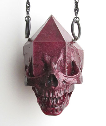
Orson Welles: The One-Man Band

omb1.jpg

Vassili Silovic’s 90-minute documentary about the uncompleted films of Orson Welles’ later years was a revelation when it appeared in 1995. Orson Welles: The One-Man Band was shown on UK TV as The Lost Films of Orson Welles but “one-man band” is more appropriate, not only because of the bizarre song-and-dance sequence he filmed in London, but also because it’s an apt description of Welles’ approach to filmmaking. Directors who also write and produce are rare but not too uncommon; directors who write, produce and also act in major roles are in a minority. Welles did all those things and often much more, including editing, set decoration and providing voices for minor characters. The latter habit can be distracting in some of the films, especially Mr Arkadin where it often seems he was doing the voices for everyone who wasn’t already a known actor.

omb2.jpg

The One-Man Band is a compendium of clips from footage bequeathed to his partner, Oja Kodar, together with interviews, TV appearances, a witty and duplicitous trailer for F for Fake, and other odds and ends. This was the first public airing of scenes from The Deep, an unfinished feature based on a thriller, Dead Calm (1963) by Charles Williams (later filmed by Philip Noyce as Dead Calm in 1989.) There’s also a sequence from The Other Side of the Wind, another feature that was closer to completion, and which may yet receive a proper release. The sequence showing Welles discussing The Trial with an audience is now available in full on YouTube. The London clips were intended for US TV, part of an unfinished special entitled Orson’s Bag. These were filmed in the late 60s, and the song-and-dance sequence is probably the strangest thing he directed. I’m more taken with the Tailors sketch which has Jonathan Lynn and the wonderful Charles Gray as a pair of disrespectful outfitters.

Previously on { feuilleton }
The Immortal Story, a film by Orson Welles
Welles at 100
The Fountain of Youth
The Complete Citizen Kane
Return to Glennascaul, a film by Hilton Edwards
Screening Kafka
The Panic Broadcast

Weekend links 148

lanna.jpg

Quantum Entanglement by Duda Lanna.

An hour-long electronica mix (with the Düül rocking out at the end) by Chris Carter for Ninja Tune’s Solid Steel Radio Show.

• “…a clothes-optional Rosicrucian jamboree.”: Strange Flowers on the paintings of Elisàr von Kupffer.

• A Paste review of volume 2 of The Graphic Canon has some favourable words for my contribution.

It is an entertaining thought to remember that Orlando, all sex-change, cross-dressing and transgressive desire, appeared in the same year as Radclyffe Hall’s sapphic romance The Well of Loneliness. The two novels are different solar systems. The Well is gloomy, beaten, defensive, where women who love women have only suffering and misunderstanding in their lonely lives. The theme is as depressing as the writing, which is terrible. Orlando is a joyful and passionate declaration of love as life, regardless of gender. The Well was banned and declared obscene. Orlando became a bestseller.

Jeanette Winterson on Virginia Woolf’s androgynous fantasia.

Jim Jupp discovers the mystical novels of Charles Williams.

Michael Andre-Driussi on The Politics of Roadside Picnic.

Les Softs Machines: 25 August 1968, Ce Soir On Danse.

• At 50 Watts: Illustrations and comics by Pierre Ferrero.

Soviet posters: 1469 examples at Flickr.

Oliver Sacks on drugs (again).

• At Pinterest: Altered States.

• Farewell, Kevin Ayers.

Darkest London

Why Are We Sleeping? (1969) by The Soft Machine | Lady Rachel (1969) by Kevin Ayers | Decadence (1973) by Kevin Ayers

The faces of Parsifal

parsifal.jpg

Parsifal by Jean Delville (1890).

Continuing the occasional series of posts examining the evolution of a particular design or image, this one begins with a mystical charcoal drawing by Belgian Symbolist, Jean Delville (1867–1953), our object of concern being that entranced or dreaming face.

lamb.jpgMy first encounter with Delville’s image wasn’t via the original but came with this Seventies’ version produced for a Charles Williams paperback cover by illustrator Jim Lamb. (And this copy is the only one I can find, reused on a recent audiobook of Williams’ novel. If anyone has a link to a larger copy of the paperback cover then please post it in the comments.) Yes, this is tenuous but when I eventually got to see Delville’s picture it made me think immediately of Lamb’s illustration. Many Dimensions is one of my favourite books by Williams and unusually for him it deals with Islamic rather than Christian mysticism; in that case if Lamb was borrowing from Parsifal then it’s a case of the right image for the wrong book.

Jim Lamb is another illustrator from this period who now works mainly as a landscape artist.

Continue reading “The faces of Parsifal”

Pauline Baynes, 1922–2008

baynes1.jpg

Pauline Baynes, who died earlier this week, was for a long while the only Tolkien illustrator of note. Her work was approved by Tolkien himself but faded from view as the JRRT spin-off industry began to expand in the late Seventies and other artists quickly crowded the field, many of whom lacked her subtlety and sympathy for the material. It was her artwork which Allen & Unwin used on their single-volume edition of Lord of the Rings and in the late Sixties they also produced a poster of her Middle Earth map (above; complete version here). That poster hung on my bedroom wall and fascinated me with its view of the now over-familiar characters and the vignette details of various locations.

baynes3.jpg

Those vignettes, such as her tiny rendering of Sauron’s Dark Tower, seemed at the time a perfect summation of Tolkien’s world and I still prefer her hulking Barad-dûr to the spiny monolith seen in Peter Jackson’s films. Her friendship with Tolkien led to a similar commission for maps and illustrations from CS Lewis and it’s as the illustrator of the Narnia books that she’s most celebrated. I never read Lewis’s work, and came to Lord of the Rings late, so the infatuation with this brand of heroic fantasy swiftly gave way to the ambivalent moralities of Michael Moorcock‘s Elric, Fritz Leiber‘s Lankhmar and Mervyn Peake’s Gormenghast. Her work wouldn’t have suited those writers but for Tolkien and Lewis she was ideal.

baynes2.jpg

The Fellowship of the Ring from the Middle Earth map.

One of the newspaper obituaries notes:

It was somewhat to her chagrin that she developed a reputation over the years as an illustrator of mostly Christian works and, to redress the balance, one of her last creations (her “children” as she called them) was a series of designs for selections from the Qur’an, scheduled for publication in 2009.

These days Charles Williams is the writer who interests me still from the Oxford group known as “the Inklings”, of whom Tolkien and Lewis were the most famous members. Williams was also a Christian propagandist but his use of fantasy was more sophisticated and, in the extraordinary Many Dimensions (1931), he too managed to depart from the Christian sphere by blending HG Wells-style science fantasy with Islamic mysticism.

Brian Sibley wrote a Pauline Baynes obituary for The Independent and his blog features an excellent overview of her life and work.

Elsewhere on { feuilleton }
The illustrators archive

Previously on { feuilleton }
Mervyn Peake in Lilliput

Boys Own Books

boys_own1.jpg

boys_own2.jpg

boys_own3.jpg

More pulp revenants come blinking back into the light. The runaway success of The Dangerous Book for Boys among fathers as well as sons has set British publishers casting about for new ways to exploit masculine nostalgia. Repackaging a few old warhorses is Penguin’s solution and a cheap one since most (all?) of these titles are out of copyright. I like these covers (and can’t find a design credit unfortunately), they’re well done, capture the right tone and look great as a set.

zenith.jpgThe Man Who Was Thursday seems to be the odd man out (as it were) story-wise. All the other books are typical adventure fare but in Chesterton’s novel what appears at first to be a pot-boiler turns out to be a metaphysical allegory closer to Charles Williams than John Buchan. One of Sax Rohmer‘s Fu Manchu volumes would have been more suited to this series but I suspect their “Yellow Peril” racism makes that less easy today. The Chesterton cover is curiously out-of-synch too, a pastiche of El Lissitzky/Bauhaus styles rather than the Edwardian designs the others are imitating. This isn’t a mistake, however, the fractured lettering suits a tale of anarchists with a plot full of twists and surprises. I tried a similar Modernist approach in 2001 with my jacket for Savoy’s edition of Zenith the Albino. In that instance the style was derived from Mondrian, with the colours coming from the initial description of the albino’s black clothes, white skin and red eyes. I’d venture to suggest that Anthony Skene’s thriller is a far better book than all of the above, Chesterton included, but then I am rather biased.

Update: Coralie from Penguin has the credits in the comments.

Elsewhere on { feuilleton }
The book covers archive