The art of Bertrand

bertrand1.jpg

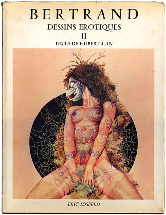
The first question has to be “Bertrand who?” but you won’t receive an answer here since information is scarce (see below). Bertrand’s erotic surrealism first appeared in the late Sixties, going by the dates in collections of his work. Some of his paintings and drawings crept into the underground mags of the period then turned up in odd places throughout the Seventies. The first I saw of any Bertrand art was on the cover of the pre-Savoy publication, Wordworks #6, and a music paper ad for the Chrome 12″, Inworlds.
bertrand2.jpg

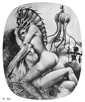
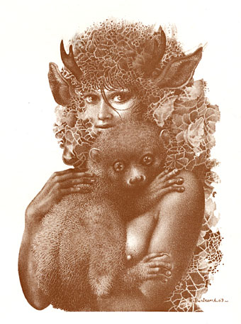
French porn publisher Eric Losfeld produced a couple of large, limited edition collections of Bertrand’s work in the early Seventies. All the drawings reproduced here are from the battered 1971 volume shown above. If it seems surprising that these haven’t been reprinted it may be that Bertrand’s concerns are too weird or simply too unpleasant for contemporary tastes. Many of his ink drawings, and some of his paintings, seem to have begun life as decalcomania splotches, a Surrealist technique invented by Oscar Dominguez as a means of injecting chance into the creative process. Decalcomania produces random patterns which the artist then elaborates upon. Max Ernst’s famous Europe After the Rain, and a number of his other paintings from the 1940s, began life as a field of vaguely organic marks created by pressing thickly applied paint to the canvas with a sheet of glass or paper. Bertrand used ink stains in a similar way, with the result that most of his doe-eyed female figures (and his figures are nearly always women) are fringed by leafy or fungal growths. Many of his scenes are a kind of lesbian equivalent of the human/alien entanglements one finds in William Burroughs’ more elaborate flights of fancy. If his women aren’t being absorbed into some organic mass, they’re often being subject to investigation (even impalement) by spikes or claws, and here we perhaps find the reason his work remains out of print. Feminists then and now would have taken a dim view of Bertrand’s more violent works; even if Taschen did produce a Bertrand collection, it’s unlikely that many of the more grotesque pictures would be included.

All the pictures in the Losfeld books were produced in a short period from 1967–69. What happened to Bertrand afterwards remains a mystery. Did he decide to do pursue a different, more commercial direction? Is he still alive? The books offer no clue but maybe someone out there has the answer.

Update: Nathalie discovers that the artist in question is Raymond Bertrand, and more of his work can be seen here.
bertrand3.jpg

Continue reading “The art of Bertrand”

Revenant volumes: Bob Haberfield, New Worlds and others

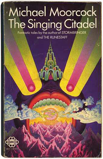
moorcock_citadel.jpg

The Singing Citadel (1970).

Michael Moorcock’s Elric books are being prepared for republication by Del Rey in the US next year. I’ve assisted with some minor parts of this preparation, including sourcing pictures from Savoy’s edition of Monsieur Zenith the Albino. (Anthony Skene’s albino anti-hero is a precursor of Moorcock’s albino anti-hero.)

Discussion of the Elric books with Dave at Savoy prompted my excavation of this battered Mayflower paperback from the retired book boxes. This slim volume collected four fantasy stories: the title piece (possibly the first Elric story I read), Master of Chaos, The Greater Conqueror and To Rescue Tanelorn…. I’d forgotten about the garishly strange cover, one of many that Bob Haberfield produced for Moorcock’s books during the 1970s. Haberfield is one of a number of cover artists from that period who worked in the field for a few years before moving on or vanishing entirely. The swirling clouds derived from Tibetan Buddhist art identify this as one of his even without the credit on the back; later pictures were heavily indebted to Eastern religious art and while technically more controlled they lack this cover’s berserk intensity. Haberfield’s site has a small gallery of his splendid paintings, including a rare horror work, his wonderfully eerie cover for Dagon by HP Lovecraft.

Searching for more Haberfield covers turned up these two examples, both part of the SciFi Books Flickr pool, a cornucopia of pictures by vanished illustrators. Browsing that lot is like being back inside the In Book Exchange, Blackpool, circa 1977. The digitisation of the past continues apace at the Old-Timey Paperback Book Covers pool and the Pulp Fiction pool. Don’t go to these pages if you’re supposed to be doing something else, it’s easy to find yourself saying “just one more” an hour later.

new_worlds.jpg

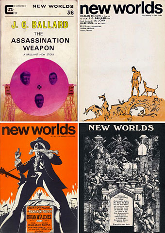
And in other Moorcock-related news, Jay alerts me today to the existence of an archive of New Worlds covers, something I’d been hoping to see for a long time. New Worlds was one of the most important magazines of the 1960s, mutating under Moorcock’s editorship from a regular science fiction title to a hothouse of literary daring and experiment. As with so many things in that decade, the peak period was from about 1966–1970 when the magazine showcased outstanding work from Moorcock himself, JG Ballard, Brian Aldiss, Harlan Ellison, Samuel Delany, M John Harrison, Norman Spinrad and a host of others. For a time it seemed that a despised genre might be turning away from rockets and robots to follow paths laid down by William Burroughs, Salvador Dalí, Jorge Luis Borges and other visionaries. We know now that Star Wars, Larry Niven and the rest swept away those hopes but you can at least go and see covers that pointed to a future (and futures) the world rejected.

Elsewhere on { feuilleton }
The book covers archive
The illustrators archive

Previously on { feuilleton }
Barney Bubbles: artist and designer
100 Years of Magazine Covers
It’s a pulp, pulp, pulp world

Robert Anton Wilson, 1932–2007

raw.jpg

There are few people who really change your life but Robert Anton Wilson—who died earlier today—certainly changed mine. Wilson’s Illuminatus! trilogy (written with Robert Shea) was my cult book when I was at school in the 1970s, a rambling, science fiction-inflected conspiracy thriller that opened the doors in my teenaged brain to (among other things) psychedelic drugs, HP Lovecraft, James Joyce, William Burroughs and Aleister Crowley as well as being a crash-course in enlightened anarchism. I’ve had people criticise the books to me since for their ransacking of popular culture but this was partly the point, they were collage works, and they worked as a perfect introduction for a young audience to worlds outside the usual circumscribed genres.

The philosophical side of Wilson’s work was probably the most important at the time (and remains so now), his “transcendental agnosticism” made me start to question the adults around me who were trying to force my life to go in a direction I wasn’t interested in at all. I’m sure I would have resisted that kind of pressure anyway but the value of RAW’s writings in Illuminatus! and the later Cosmic Trigger came with being given an intelligent rationale for those decisions; I couldn’t necessarily articulate why I was “throwing my life away” by wanting to drop out of the whole education system but Wilson’s work had convinced me it was the right thing to do. I still mark the true beginning of my life as May 1979, the month I left school for good.

He wouldn’t want us to be maudlin, I’m sure. It’s typical for a writer who spent so much of his life writing about drugs and coincidences that he managed to die on Albert Hofmann’s birthday. So I’ll just say thank you Robert, for changing my life. And Hail Eris!

Previously on { feuilleton }
The Absolute Elsewhere

The art of Shinro Ohtake

queer.jpg

Shinro Ohtake is always on the attack. Whether it’s against misguided art education, against the cold treatment and economic constraints Japan puts on anyone who could dare to live differently, against the contemporary art establishment that can’t be bothered to even disguise its own incomprehension—his fight as an artist continues. Ohtake is prodigious, original, and a trouble-maker—in the sense that the work of the artist is always to create difference.

William Burroughs

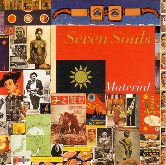
Two disparate things had me looking for Shinro Ohtake‘s work this week: I’ve been doing a short interview about album cover design (more about that at a later date) in which I mentioned his collage for the cover of Seven Souls by Material (1989), then an editorial in the latest Wire describes his current retrospective exhibition at the Museum of Contemporary Art in Tokyo.

seven_souls.jpg

The Material cover is one I picked as a favourite design. It’s difficult trying to pin-point why I think this works so well without it being at all illustrational. (I’m guessing, but it’s likely that Bill Laswell picked it out of one of Ohtake’s collage books, rather than it being specially commissioned.) It may be the collage aspect that works here. The album features readings by William Burroughs set to music and for me is the best of all the Burroughs recordings (Dead City Radio being a close second). Burroughs’ work, of course, involved literary collage via his own cut-up process, and the musical content can also be seen as a collage in the way it mixes different styles and musicians—Simon Shaheen, Shankar, Rammellzee, Foday Musa Suso, Fahiem Dandan and samples of the famous Brian Jones recordings of the Jajouka pipers. It’s a shame that when the CD was reissued in 1997 (in a superior mastering, it should be noted), the original artwork was largely junked in favour of a lot of muddy Photoshop work from the usually excellent Russell Mills. I’ve a huge respect for Mills but this treatment was a serious mistake.

Elsewhere on { feuilleton }
The album covers archive

Previously on { feuilleton }
William Burroughs book covers