The first of the books I’ve been designing for Tachyon Publications appears this month. Two more are due to follow and I’m working on another at the moment; more about those titles later.
The Best of Michael Moorcock was a pleasure to be involved with not only because I’ve been reading Moorcock’s fiction for a very long time but I’ve also been fortunate during that time to get to know the writer and Linda Moorcock, his wife. Mike likes the work I’ve done in the past for Savoy Books and we did have an anthology of his favourite pieces by other writers planned for Constable & Robinson back in 2005. That book didn’t work out so this makes up for its cancellation. This is an excellent anthology, put together initially as a private enterprise by editor John Davey who managed the difficult task of compiling a collection which ranges over forty years of writing. Ann and Jeff VanderMeer came aboard as co-editors for the Tachyon edition.
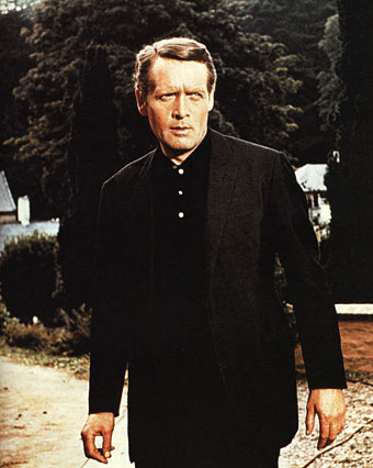
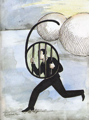
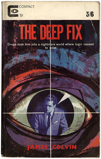
I’ve been working mainly on the interior design of the Tachyon volumes (although I’ve also done the cover for Jeff VanderMeer’s forthcoming Booklife) and for this title I took a cue from Ann Morn’s cover design which features a pair of gates emblazoned with large letter Ms. The title spread above takes the letter M from the typeface used for the author’s name and multiplies that to create an equivalent set of gates for the reader to pass through. I try to play down the pyrotechnics for fiction—the words are the important thing, not the graphic design—but since this was a story collection I thought I’d try illustrating each piece using the title typography alone. Most of these are done by using a suitable typeface but for a few pieces I managed to create an arrangement that reflected the story. Behold the Man (below) is the Nebula Award-winning story of a journey back in time to find the historical Jesus. The cross shape not only relates to the Biblical theme but also implies the crossed time streams and Moorcock’s layered, cross-cut narrative.

The Best of Michael Moorcock is available now from the usual sources and received a glowing review in the Guardian. Later this month, and other work permitting, I’m hoping to make a start on what will effectively be a companion volume, Savoy’s long-delayed Into the Media Web, another collection by John Davey which this time collects the best of Moorcock’s copious essays, reviews and other non-fiction.
Previously on { feuilleton }
• Designing Booklife
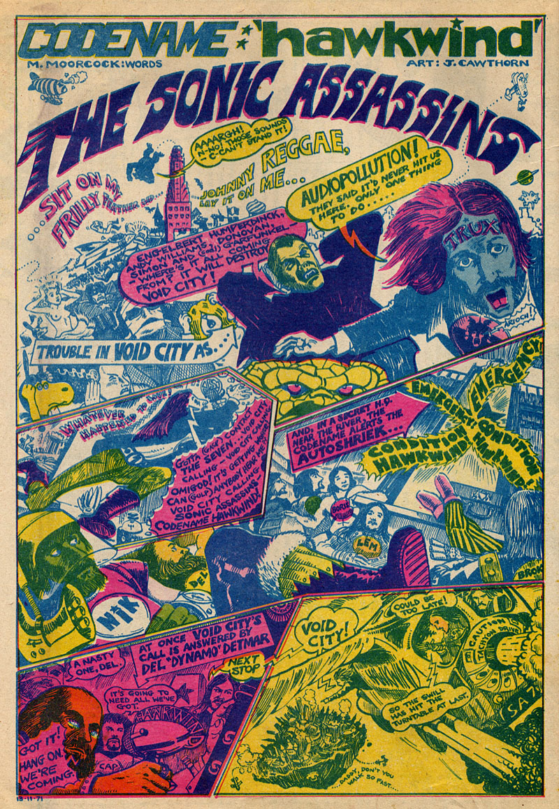
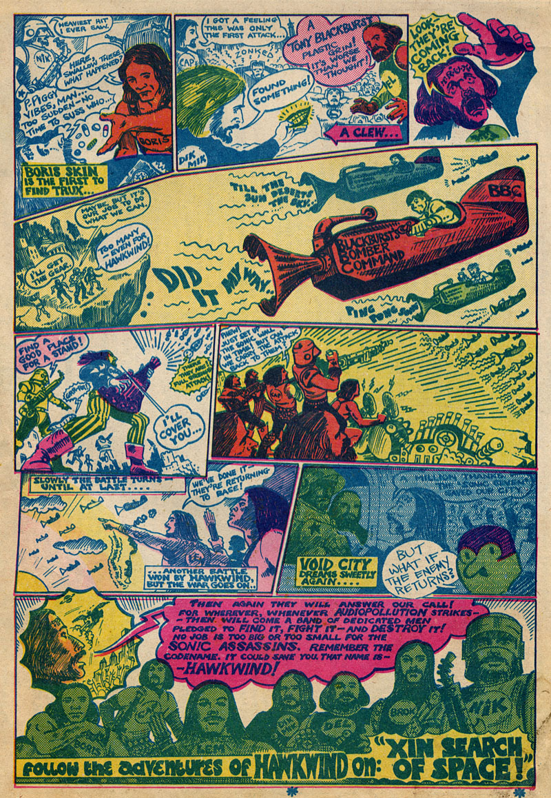
• The Sonic Assassins
• Revenant volumes: Bob Haberfield, New Worlds and others
• An announcement redux