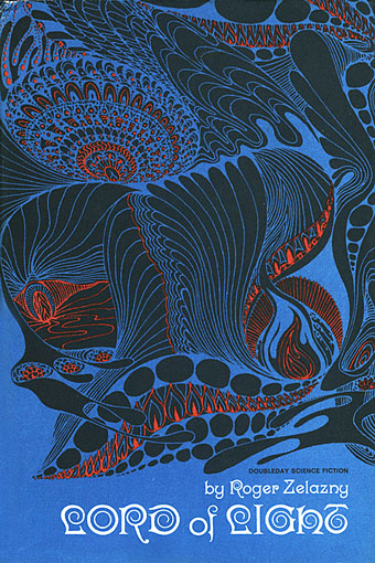
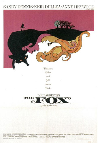
Leo Dillon, 1933–2012

dillons.jpg

Illustrations for Dangerous Visions (1967) by Leo & Diane Dillon.
top left: Lord Randy, My Son by Joe L. Hensley; top right: Gonna Roll the Bones by Fritz Leiber
; bottom left: The Happy Breed by John Sladek; bottom right: Shall the Dust Praise Thee? by Damon Knight

Beyond my love for them and my understanding that they have influenced my ethical and moral life almost more than anyone else I’ve ever known, my respect for their artistic intelligence and their incomparable craft is enormous. Leo and Diane Dillon are the best. Simply put: the best.

Harlan Ellison, from The Illustrated Harlan Ellison (1978)

Pre-internet, illustrators and designers often suffered from being landlocked by whatever territories (to use that wretched marketing term) the work they embellished was sold in. I’ve said as much in the past but it’s worth repeating since it explains how reputations could loom large in one country while the artists in question might be unknown elsewhere. Leo and Diane Dillon are a good example of this, lauded in the US for work that spanned a variety styles and media yet barely visible in Europe unless you chanced across an imported paperback bearing one of their covers. Their long and fruitful relationship with Harlan Ellison saw them illustrate many of his major works, books which when they were reprinted here were often packaged with inappropriate spaceship art by Chris Foss or one of his imitators. Happily the Dillons’ superb woodcut illustrations for Ellison’s Dangerous Visions anthology survived the journey across the Atlantic. I still find those illustrations thrilling for the way they condensed the essence of thirty-two challenging stories with the greatest economy of means. And thanks to the internet we can see just how versatile they were at The Art of Leo and Diane Dillon. That site also includes links to interviews and further examples of their art.

Elsewhere on { feuilleton }
The illustrators archive

Previously on { feuilleton }
Science fiction and fantasy covers
Groovy book covers
Harlan Ellison: Dreams with Sharp Teeth

Weekend links 90

varo.jpg

Portrait of Dr. Ignacio Chavez (1957) by Remedios Varo (1908–1963) some of whose Surrealist paintings can be seen at Frey Norris, San Francisco, from 19th January. There’s also In Wonderland: The Surrealist Adventures of Women Artists in Mexico and the United States at the Los Angeles County Museum of Art from 29th January.

The current crop of Republicans jostling for the Presidential nomination have reminded me of the Downunder people in Harlan Ellison’s post-apocalypse novella A Boy and His Dog (1969): a retrograde, fear-ridden community who send troublesome individuals to be exterminated at “the farm”. Rick Santorum (unforgettably pictured here with family in 2006 after losing an election) almost received the majority of Iowa’s votes for his nomination last week, prompting renewed scrutiny of his negative views about gay people, sexually active people, foreign people (especially Arabs and Mexicans), and anyone generally who isn’t a white, Catholic, Downunder person. Santorum is against gay marriage, of course—it’s hard to find a Republican who isn’t—but he also wants to ban abortion even in cases of rape and incest, and given the opportunity would allow US states to prevent any use of contraception. Add to this his pro-torture stance (which offends current Catholic church policy), and his willingness to wage war with Iran, and it’s easy to see why his name prompts reactions such as this:

I have a history with Rick Santorum. In 2003, when Santorum, in an interview with the Associated Press, first compared gay relationships to child rape and dog fucking (have I mentioned that Santorum has compared gay relationships to child rape and dog fucking?), I held a contest to redefine Santorum‘s last name. The winning definition: “the frothy mix of lube and fecal matter that is sometimes the byproduct of anal sex.” (“Sometimes” is the most important word in the new definition of santorum; if you’re doing anal sex correctly, there won’t be any santorum – lower- or upper-case.) And since 2003, the new definition has been the No. 1 Google return when you search “santorum“.

Rick Santorum’s homophobic frothing by Dan Savage

Related: Santorum was named one of the three “most corrupt” Senators in 2006 | “Homohater fosser fram” which is how Dagbladet, Norway’s second largest tabloid newspaper, introduces Santorum to its readers | “Rick Santorum channels Saint Augustine” an article at Slate exploring the Handmaid’s Tale extent of Santorum‘s attitudes towards sex and morality | Rick Santorum quotes as New Yorker cartoons.

marlin.jpg

The Rod (1973) by Brigid Marlin.

• Ballardian posts a long-overdue interview with Brigid Marlin, famous now for having brought two lost Paul Delvaux paintings back to life for JG Ballard, but also a woman with an extensive career as a fantastic artist using Ernst Fuchs‘s laborious mische painting technique.

Quentin Blake on Ronald Searle, in which Blake notes that his hero was given a full-scale exhibition of his work at the Bibliothèque Nationale, France, in 1973 whilst being ignored throughout his life by the major institutions in Britain.

Alfred Jarry: A Pataphysical Life by Alastair Brotchie is reviewed by Michael Moorcock who tells me the Guardian cut out his references to Boris Vian, Maurice Richardson and David Britton.

Ian McKellen stirs things up by suggesting (not for the first time) that Shakespeare was bisexual.

• Ten posters by Only More Never Less inspired by Pink Floyd’s Dark Side of the Moon.

An end to bad heir days: The posthumous power of the literary estate.

Peace Eye! Fug! A Long Talk With Ed Sanders.

• Sand sculptures by Carl Jara.

Letterheady

• Skylab: These Are The Blues (1995) | Beyond The Breeze (1995) | Red Light, Blue Light (1995) | Indigo (Sabres of Paradise remix, 1995) | Seashell (Nobukazu Takemura mix, 1995).

The City of the Singing Flame

cas1.jpg

Wonder Stories, July 1931. Illustration by Frank R. Paul.

Looking over Bruce Pennington’s artwork this week sent me back to some of my Clark Ashton Smith paperbacks, many of which sport Pennington covers. One of my favourite Smith stories, The City of the Singing Flame, is also one of his finest pieces, and a story that Harlan Ellison has often referred to as his favourite work of imaginative fiction.

cas2.jpg

Tales of Wonder, Spring 1940. Illustration by WJ Roberts.

The story as it’s known today was originally a shorter piece, The City of the Singing Flame, followed by a sequel, Beyond the Singing Flame; both stories were published in Wonder Stories magazine in July and November of 1931, then as one in Arkham House’s CAS collection Out of Space and Time in 1942. The two-in-one story is now the definitive version.

Smith’s tale concerns the discovery of a dimensional portal somewhere in the Sierras. Beyond this there lies a path leading through an otherworldly landscape to a colossal city peopled by a race of mute giants. A temple at the heart of the city protects the prodigious green flame of the title, an eerie and alluring presence whose siren call draws creatures from adjacent worlds who prostrate themselves before the flame before immolating themselves in its fire. A narrator, Philip Hastane, give us details of diary entries from a friend who discovered the portal, and who subsequently has to decide whether to resist the lure of the mysterious flame or follow the other creatures into the fire. More than this would be unfair to divulge if you’ve never read Smith’s remarkable piece of fiction.

Continue reading “The City of the Singing Flame”

The psychedelic art of Howard Bernstein

bernstein1.jpg

Lord of Light by Roger Zelazny (1967).

I made a post a while back about the work of Bob Pepper, an artist whose illustrations from the 1960s can also be described as psychedelic and who was equally visible in the music and book publishing worlds. Howard Bernstein (not to be confused with musician Howie B) wasn’t as prolific as Pepper but this post was prompted by the appearance at Sci-Fi-O-Rama of the swirling abstractions of his Roger Zelazny cover. Like Pepper, Bernstein produced album cover art as well as book covers although it’s possible the Zelazny piece may have been a one-off. This was the jacket of the first edition and a rather flagrant attempt by Doubleday to co-opt the trendiness of the psychedelic style for a science fiction readership. They tried something similar with the cover for Harlan Ellison’s landmark anthology Dangerous Visions in the same year, the art in that case being the work of Leo & Diane Dillon. The Zelazny cover caught my attention for another reason, the typography is a variation on the 19th century Kismet typeface by John F Cumming which I used for my two Alice in Wonderland calendars and which turns up regularly in psychedelic design. And while we’re considering conjunctions of music and science fiction, I ought to note that the Hawkwind song Lord of Light lifts its title from Zelazny’s novel.

bernstein4.jpg

The Heliocentric Worlds Of Sun Ra, Vol. I (1965).

As for Bernstein’s music work, most of this appears to have been for Bernard Stollman’s eccentric ESP Disk label where the roster of artists included many free-jazz greats along with The Fugs, William Burroughs, Timothy Leary and fringe psychedelic groups such as Pearls Before Swine, Cromagnon, The Godz and others. Bernstein’s Cromagnon cover (below) exists in both monochrome and coloured versions but the monochrome one seems to be the original. In fact much of his art looks like it was drawn in black-and-white with the colours being created by separations at the print stage. His poster for The Godz is especially striking, so much so I’m surprised to find there isn’t more of his work around. Wolfgang’s Vault has a blacklight poster and there are some other blacklight works here. If anyone knows of other posters, please leave a comment although I suspect if there was much more then Wolfgang’s Vault would have the goods.

Continue reading “The psychedelic art of Howard Bernstein”

More book design

hotel.jpg

Yes, it’s been a busy year. These are books three and four respectively of the titles I’ve been designing for Tachyon Publications, and there are more on the way.

Kage Baker’s The Hotel Under the Sand is a charming fantasy for children concerning the hotel of the title and its curious inhabitants, which include a ghost bellboy and a pirate captain. The illustrations were by Stephanie Pui-Mun Law and I tried to complement these with the lettering design and graphic elements. I always enjoy working on illustrated books.

fandsf.jpg

The Very Best of Fantasy & Science Fiction is a very different beast, a big (480 pages) selection by Gordon Van Gelder of some of the many first-class stories from the sixty-year history of the fiction magazine. F&SF has published so many classic stories over the years the book could easily have been twice as big. As it is there are pieces by Alfred Bester, Ray Bradbury, Shirley Jackson, Philip K Dick, Harlan Ellison, Stephen King and Neil Gaiman, among others. The design in this case came from studying a copy of the magazine from 1967; I was already thinking of using Bodoni for the story titles and that choice was confirmed when I saw it used for the same purpose in the magazine. The calligraphic titles were also scanned from there, their design going back to the very first issue.

Both these books are on sale now, and Keith Brooke gave a glowing appraisal to the latter in The Guardian at the weekend.

Previously on { feuilleton }
Medicine Road by Charles De Lint
The Best of Michael Moorcock