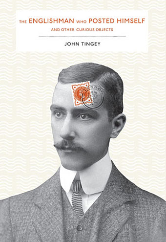
Cover design by Deb Wood.
Arriving most appropriately by post last week from Princeton Architectural Press was this fascinating book by John Tingey, an account of Mr W. Reginald Bray (1879–1939) of South London, and his games with the British postal service:
In 1898, Bray purchased a copy of the Post Office Guide, and began to study the regulations published quarterly by the British postal authorities. He discovered that the smallest item one could post was a bee, and the largest, an elephant. Intrigued, he decided to experiment with sending ordinary and strange objects through the post unwrapped, including a turnip, a bowler hat, a bicycle pump, shirt cuffs, seaweed, a clothes brush, even a rabbit’s skull. He eventually posted his Irish terrier and himself (not together), earning him the name “The Human Letter.”
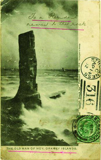
In addition to posting himself (twice!), Bray also challenged the nation’s postmen by addressing his cards and letters with rebuses, with longitude and latitude coordinates or, as in the example below, a pictorial clue to the location of the recipient. Tingey’s book is illustrated throughout with examples of Bray’s inventiveness, and includes a selection of the autographs he plied from famous individuals of the era (many of whom, it should be noted, are now very un-famous indeed). One of the few people to refuse an autograph was a name with which I’m familiar, the British Symbolist painter George Frederick Watts, and his letter of refusal is also included.
The Englishman who Posted Himself and Other Curious Objects may be purchased direct from the publisher.
Previously on { feuilleton }
• A postcard from Doctor Kafka