Jugend, 1897

jugend-97-01

Continuing the series of posts about Jugend magazine, all these samples are from the issues for 1897. This is where things start getting really interesting graphically so I’m only posting a very small selection from 900 pages of content. As before, anyone interested is advised to examine the complete volumes which can be viewed and downloaded here and here.

jugend-97-02

jugend-97-03

Cupid drawings abound in early issues of Jugend, with men and women falling prey to love’s vicissitudes. This is one of the more unusual examples.

Continue reading “Jugend, 1897”

Jugend, 1896

jugend-96-05.jpg

So, then, I’ve now looked through several thousand pages of Jugend magazine and a few things have become apparent. If you’re interested in fin de siècle art and design then all the most interesting material is in the first four years of the magazine’s run, from 1896 on. After 1900 there are still examples of the florid Art Nouveau motifs which filled their earlier pages but the overall style becomes progressively dull, with endless pictures of German towns and hearty country folk. The magazine also begins to reflect an obviously belligerent mood in the country as a whole, pictures of military types and patriotic themes proliferate and the satirical material grows overtly aggressive towards neighbouring nations. Racist cartoons are to be expected—British magazines of the period are much the same—but there’s also a vicious antisemitism boiling away in later issues of Jugend which creates a toxic mix when seen beside the war-mongering on display elsewhere.

jugend-96-01.jpg

Politics aside, these magazines are still a revelation. Pan magazine was being published at the same time (its entire run is also available in the Heidelberg archives) and is the finer journal if it’s art you’re interested in. But Jugend, being a lighter read, contains a wealth of strange and surprising illustrations. Many are naive or just plain bad, of course, but some are quite remarkable. This is the first of a number of posts I’ll make which highlight illustrations that catch my eye. I’ll also be making some follow-up posts about individual artists as the magazine has been a great introduction to minor illustrators I’ve not come across before. This first post is from the two volumes covering 1896 which can be browsed and downloaded here and here.

Continue reading “Jugend, 1896”

Empusa

empusa1.jpg

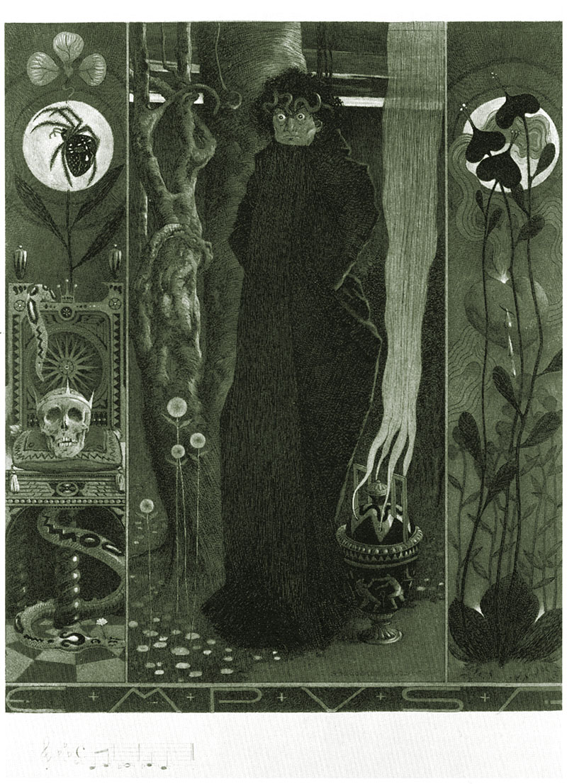
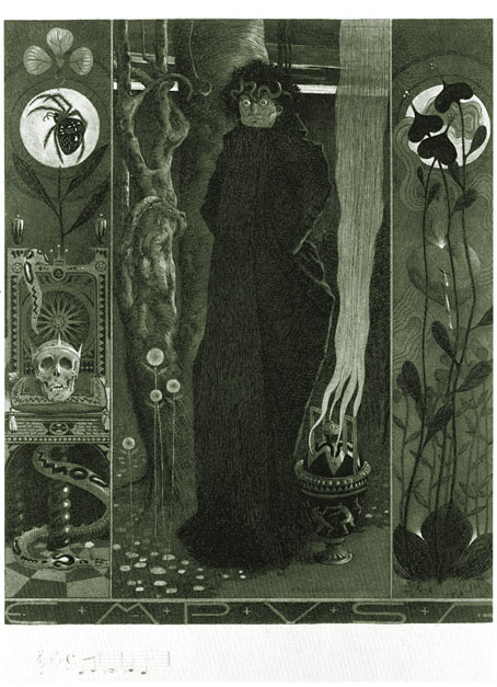
The Empusae, we’re told, were daughters of Hecate in Greek mythology, sent to harass the unwary traveller on lonely roads, as if travellers on lonely roads didn’t have enough to worry about from human malefactors. The sinister femme fatale of mythology was a popular subject among fin de siècle artists which perhaps explains why Carl Schmidt-Helmbrechts (1871–1936) went to such trouble with this etching of one of the baleful demonesses.

There’s very little information about Schmidt-Helmbrechts on the web and little of his other work to be seen; this picture was scanned from High Art and Low Life: ‘The Studio’ and the fin de siècle (1993) and even there they don’t give a date for it although I’d guess it was a product of the 1890s. The description does say it was printed in olive, however, so I’ve taken the liberty of tinting their black and white version accordingly. I’ve no idea what the musical notes at the bottom left are for but I like the lettering design, there’s almost enough of it to develop into a font.

Update: I’ve since discovered that the print was made in 1894.

Elsewhere on { feuilleton }
The etching and engraving archive

Previously on { feuilleton }
The art of Philippe Wolfers, 1858–1929
The Masks of Medusa