Weekend links 189

wilson.jpg

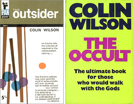
The Outsider (1956), 1963 edition; The Occult (1971), 1973 edition.

The cover of the 1973 UK paperback of Colin Wilson‘s mammoth overview of occultism can still be offered as a pinnacle of hyperbole. The book itself is a very serious and informative study but its success set Wilson on a path as a writer about the paranormal where he’d previously been concerned with literature, philosophy and psychology. For many critics this finished his already shaky reputation as a serious thinker. He continued to write about philosophy and literature in subsequent books but dubious speculations about Atlantis are always more commercially attractive than studies of Nietzsche, hence the proliferation of lost continents in the later part of a bibliography which the Wilson website lists at 114 titles. Wilson was a maverick intellectual whose curiosity ignored many of the boundaries that restrained his metropolitan contemporaries; he was also an autodidact of a type that seems to irritate the university-educated. Mentions of his name in British newspapers were frequently couched in sneering or dismissive terms. His current reputation can be measured by the lack of attention the news of his death has prompted in the UK at the time of writing. (That said, dying on the same day as Nelson Mandela was unfortunate timing.)

Savoy Books published an edition of Wilson’s crime novel, The Killer, in 2002. I designed that volume, rather badly, I think. In 2004 Robert Meadley wrote a book-length reaction to Wilson’s autobiography, Dreaming to Some Purpose, which can be downloaded for free from Savoy. In it Meadley mounts a robust defence of Wilson against the broadsheet termagants. Elsewhere: the only newspaper obituary so far is at The Times (subscription required); Colin Wilson on Desert Island Discs in 1978; Gary Lachman interviewing Wilson for Fortean Times in 2004; musician Anthony Reynolds discussing his collaboration with Wilson.

• “Art, music and a mind-blowing voyage of discovery”: Richard Neville on the late Martin Sharp. At Design Observer Rick Poynor looks back at Sharp’s book and magazine illustrations of the 1960s. Of particular note is Sharp’s contribution to the “Magic Theatre” issue of Oz magazine, a unique combination of collaged visuals and text which Alan Moore often refers to as a favourite work. (See issue 12 of Moore’s Promethea, “The Magic Theatre of the Mind“.)

• “The naked woman in art isn’t unusual, but we have trouble viewing the male body as a sexual, or artistic, object,” says James Polchin.

But how can anyone be bored when there’s always death to think about? Every day. Every hour. Don’t you? All the rest is just evading or glossing the real subject of our lives. Beckett, again, the maestro of death: Never but the one matter. The dead and gone. The dying and the going. From the word go. I too shall cease and be as when I was not yet, only all over instead of in store.

Jenny Diski on death and dying.

• A teaser trailer for The Dreamlands, a film by Huan Vu (Die Farbe) based on HP Lovecraft’s Dream Cycle.

• “On Watching Wages of Fear with my 11-Year-Old Daughter” by Debra Morris.

Abram Games’ “bat wings” BBC logo is 60 years old. See it in action here.

• At Strange Flowers: Romaine Brooks‘ portraits of her famous friends.

• At Front Free Endpaper: Mervyn Peake illustrates Treasure Island.

The Great God Pan (plus satyrs and fauns) at Pinterest.

Dan Wilson on “Electric Music” on the Victorian stage.

• Mix of the week: Fact Mix 414 by Julianna Barwick.

• The BFI chooses 10 great British rural horror films.
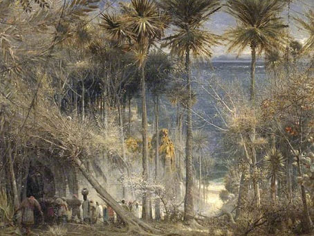
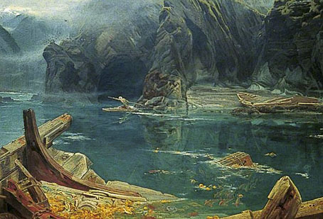
Dunwich – The search for Britain’s Atlantis.

The Grand Canyon filled with fog.

• The Bells of Dunwich (1975) by Stone Angel | O.O.B.E. (1992) by The Orb (feat. Colin Wilson) | Why We Make It Difficult On Ourselves (2010) by Anthony Reynolds & Colin Wilson

Raphaël Freida’s Torture Garden

freida1.jpg

The guarded, the cautious, the small-scale, the modest, the well-crafted—such books may be rewarded (in our own time, at the national level), but they are rarely preserved. They are not preserved because guardedness, caution, smallness, modesty, and craft can be replaced in any given generation. What is irreplaceable is excess: Of verbal kinesis, religious intensity, intellectual voracity.

Amit Majmudar on Entertainment and Excess: The Great Literary Audiences.

Amit Majmudar is talking about literature and posterity but his argument can be applied to other forms of art. I find the thesis a persuasive one, especially where novels are concerned, for the way it accounts for those works that manage to survive even when they offend the principles of craft and taste by which most novels are judged and criticised. No one would ever claim William Hope Hodgson as a great prose stylist but the excesses of his imagination have ensured that his work remains in print a century after it was first published, while hundreds of “finer” contemporary writers are completely forgotten.

freida2.jpg

Octave Mirbeau’s The Torture Garden (1899) is excessive enough to have ensured that if the author’s other works are reprinted at all it’s because they follow in The Torture Garden‘s wake of notoriety. The moral purpose behind Mirbeau’s scenes of lingering death may have been overwhelmed by its reputation as a classic of erotic sadism, but we’re a long way from 50 Shades of Grey as is evident from these etchings by French artist Raphaël Freida (1877–1942). Given the content it’s surprising to find an illustrated edition at all, Freida’s volume being a limited one published in 1927. The book contained 11 illustrations of which 7 are shown here from two different sources. The impaled figure in the second plate was a surprise since it seems to have been borrowed by Philippe Druillet for one of his pages in his bande dessinée album Yragaël (1974). (See below.) Druillet, like Freida, is an artist whose work is sufficiently excessive to prove attractive to future generations of comic readers and art enthusiasts.

freida3.jpg

Continue reading “Raphaël Freida’s Torture Garden”

Albert Goodwin’s fantasies

viriconium-goodwin.jpg

Viriconium (Millennium/Gollancz, 2000). Painting: The Gates of the Inferno (no date).

The web continues to be an incomparable treat for anyone interested in art history. One of the great advantages of the BBC’s Your Paintings site is having the opportunity to see pictures by artists whose output would rarely be deemed important enough to appear in a book. Albert Goodwin (1845–1932) is one such artist, a painter of landscapes and seascapes with a sideline in fantastic scenes, some of which may have been inspired by the apocalyptic canvases of John Martin. The cover of the Viriconium anthology was my first sighting of anything by Goodwin. That particular painting appears to be in private hands so to date this is the only copy I’ve seen. The combination of minatory architecture and a nebulous atmosphere is just the kind of thing I enjoy so it’s disappointing to not find him producing anything similar.

The paintings below show some of Goodwin’s other forays into the fantastic, mostly illustration of one sort or another. The two final pictures wouldn’t be out-of-place on a collection of William Hope Hodgson sea stories; the devastated Armada isn’t fantastical per se but it reminds me of Hodgson’s descriptions of the Sargasso Sea.

goodwin7.jpg

Apocalypse (1903).

goodwin1.jpg

Ali Baba and the Forty Thieves (1901).

goodwin2.jpg

Sinbad Entering the Cavern (1879).

Continue reading “Albert Goodwin’s fantasies”

The Court of the Dragon

atget.jpg

50 Rue de Rennes (1900) by Eugène Atget.

I live in the Court of the Dragon, a narrow passage that leads from the Rue de Rennes to the Rue du Dragon.

It is an “impasse”; traversable only for foot passengers. Over the entrance on the Rue de Rennes is a balcony, supported by an iron dragon. Within the court tall old houses rise on either side, and close the ends that give on the two streets. Huge gates, swung back during the day into the walls of the deep archways, close this court, after midnight, and one must enter then by ringing at certain small doors on the side. The sunken pavement collects unsavoury pools. Steep stairways pitch down to doors that open on the court. The ground floors are occupied by shops of second-hand dealers, and by iron workers. All day long the place rings with the clink of hammers and the clang of metal bars.

Unsavoury as it is below, there is cheerfulness, and comfort, and hard, honest work above.

Five flights up are the ateliers of architects and painters, and the hiding-places of middle-aged students like myself who want to live alone. When I first came here to live I was young, and not alone.

In the Court of the Dragon (1895) by Robert W. Chambers.

Drawing the King in Yellow for the Karl Edward Wagner story in Lovecraft’s Monsters (see yesterday’s post) sent me back to the Robert W. Chambers story collection where the strange and terrible regent first appears. Despite having written in the past about the covers for Chambers’ book I hadn’t read the stories for some time. Chambers’ blending of Bohemian romance, fantasy, horror, and early science fiction is just the thing to point to when people ask for a definition of weird fiction, writing that comes from a period before the straightjacket of genre definition had fastened itself about imaginative writing.

Chambers’ collection contains ten stories but only the first four are weird tales: The Repairer of Reputations, The Mask, In the Court of the Dragon, and The Yellow Sign. Of the four, In the Court of the Dragon is the weakest, although my re-reading caused some surprise when I realised that the story takes place in a location in Paris which the great photographer of the city, Eugène Atget, had memorably fixed five years after the book was published. Chambers was American but pursued a career as an artist in Paris before he took up writing; the description above can be taken as his own experience of the city.

ruederennes3.jpg

Undated postcards showing wider views.

ruederennes2.jpg

Atget is a photographer whose work I’m always happy to return to, especially his views of the streets and courtyards of a Paris now cleaned and tidied, if not altogether redeveloped. His view of the dragon balcony in the Rue de Rennes features everything I like about his street scenes: an unpeopled vista, weathered cobblestones, curious architectural detail, and the hazy distance of the courtyard itself. Chambers’ story may not communicate quite the same atmosphere but the pair for me are now inextricably linked. This place couldn’t have survived, could it?

ruederennes.jpg

Well, yes and no. The dragon is still there on the wall at 50 Rue de Rennes but the court was apparently redeveloped in the 1950s. Behind those blue doors is a tidy little park for the use of the locals, a common feature in Paris although tourists seldom see more than a glimpse of these places when gates are opened.

dragon.jpg

The satellite view below shows the park, the red A marking the position of the blue doors. Nothing in Paris looks like Atget’s photos any more—that’s a part of their fascination—so these kinds of changes are no surprise. But I’m pleased to discover that the dragon still exists. Next time I’m there I’ll have to pay homage.

court.jpg

ernst.jpg

Fourth collage from the La Cour du Dragon chapter of Une Semaine de Bonté (1934) by Max Ernst.

The King in Yellow at the Internet Archive.

Update: Added a couple more pictures.

Update 2: Thanks to Herr Doktor Bimler for reminding me of Ernst’s collage novel, Une Semaine de Bonté, whose second chapter takes its title from the court. Considering this is a favourite book I really ought to have remembered it. Two of the collages show the entrance to the court but the dragon isn’t seen, its presence having been transferred to creatures lurking at the edges of the picture, and the Doré demon wings that many of the characters are sporting.

Update 3: Laurent drew my attention to this post which includes more photos and historical detail. Thanks, Laurent!

Previously on { feuilleton }
Atget’s corners
Rue St. Augustin, then and now
Brion Gysin’s walk, 1966
The King in Yellow

Lovecraft’s Monsters

Lovecraft's Monsters

Graphic for the title page and ends of chapters.

I don’t usually post things so far away from publication, but editor Ellen Datlow put these pictures on her Facebook page a few hours ago so I may as well do the same here.

Back in February I bought a Wacom Intuos drawing tablet, something I’ve been using with regularity for the past few months. The Alas Vegas Tarot cards I designed in the summer were the first major attempt at getting used to working with it; Lovecraft’s Monsters, a forthcoming fiction anthology for Tachyon is the second, and I now feel very comfortable working with it. More than that, I’m increasingly pleased with the way it’s possible to combine the drawing techniques I’ve been using for years with the additional possibilities provided by working in Photoshop. As always, it’s the end result that counts but arriving at an end result can be easy or difficult. Some of these illustrations look no different than they would have done had I used ink on paper but they took half the time to create, a considerable benefit when a deadline is looming.

The stories Ellen Datlow has chosen for this collection all present different aspects of monstrosity seen through the lens of Lovecraft’s fiction and his cosmic menagerie. Some are full-on extensions of the Mythos, others are more allusive; all the pieces bar one have been published before but I’d not read any of them so for me this was fresh material. Having spent the past few years saying I was finished with Lovecraft’s fiction I was excited to be working on this book. The stories are good, and I welcomed the challenge of having to illustrate such a variety of material.

Larger copies of all the pictures can be seen here.

The star-headed thing at the top of this page is another amalgam of elements plundered from Haeckel’s Kunstformen der Natur and other sources. I’ve leaned rather heavily on Haeckel in the past, something I wanted to avoid here; this serves as a kind of visual punctuation separating the stories.

Lovecraft's Monsters

Cthulhu.

The drawing I’ve called Cthulhu is a piece for the introductory pages. Having already produced a lot of Cthulhoid art I didn’t want to repeat myself. The initial idea was of a tiny human figure faced with something enormous and nightmarish; that could be a vast eyeball or it could be a mouth or some other organ/aperture, the vagueness was intentional. Lovecraft continually impresses upon his readers how difficult things are to describe or apprehend but you seldom find this quality in art based upon his stories. Cthulhu especially has devolved into little more than an outsize man-in-a-rubber-suit à la the Creature from the Black Lagoon. In The Call of Cthulhu the figure on the mysterious statuette is described as having a humanoid shape but Lovecraft doesn’t describe the appalling reality in any detail at all. When Cthulhu is struck by a ship at the end of the story it breaks apart and is then seen recombining, the implication being that the creature is corporeally amorphous.

Lovecraft's Monsters

Only the End of the World Again by Neil Gaiman.

Neil Gaiman’s entry concerns a werewolf private detective in Innsmouth. Lovecraft’s decaying fishing village and its inhabitants turn up in several of the stories so care was taken to avoid repetition.

Lovecraft's Monsters

Bulldozer by Laird Barron.

A great story about another detective, a Pinkerton agent this time, hunting his quarry through the Old West. Collin de Plancy’s Dictionnaire Infernal is mentioned so I used some of Louis Breton’s illustrations from the third edition.

Continue reading “Lovecraft’s Monsters”