Aubrey fakery

nichols2.jpg

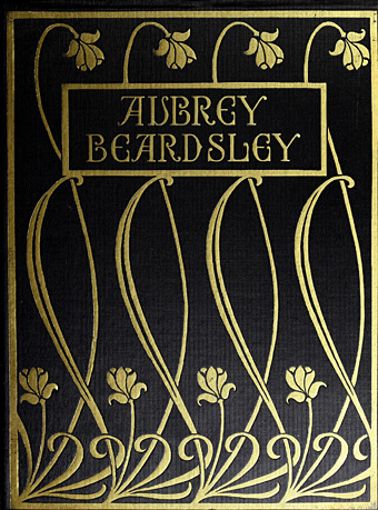
Cover of Fifty Drawings by Aubrey Beardsley (1920).

I’ve long been fascinated by fakes and forgeries especially those one finds in the art world where the ability to imitate another artist’s work succumbs to the temptation to defraud. Artistic forgeries succeed best when there are convenient gaps in an artist’s career, and when the historical record is vague enough to plausibly allow the existence of a lost or neglected work. The fake Aubrey Beardsley drawings that were presented by HS Nichols to the New York art world in 1919 are unusual for offending both these criteria. Beardsley and his work will be subject to renewed attention in March when Tate Britain stages the largest exhibition of his drawings for 50 years, and it was news of this that reminded me of the Nichols fakes. I know the drawings from an appendix in The Collected Works of Aubrey Beardsley (1967), edited by Bruce S. Harris, which presents almost everything that Nichols published in a subscriber-only collection, Fifty Drawings by Aubrey Beardsley, in 1920. Nichols had been in the Beardsley milieu in the London of the 1890s, and was for a short time a business partner of Leonard Smithers, the publisher and pornographer who not only published Beardsley’s later works along with The Savoy magazine but also commissioned the notoriously “obscene” Lysistrata drawings. Smithers was, by Victorian standards, a scoundrel, but also an aesthete, whereas Nichols seems to lack any redeeming qualities. One of the curators of the Tate exhibition, Stephen Calloway, describes Nichols in his 1998 study, Aubrey Beardsley, as “scurrilous”, and provides an account of the Nichols fakes:

That Beardsley’s style was more or less inimitable was sadly proved by almost all those, and there were many, who attempted to fake his work. From the period immediately after the First World War, at a time when AE Callatin and a number of other American collectors were beginning, really for the first time, to make Beardsley originals more valuable, forgeries began to abound. In 1919 a celebrated fraud was attempted when HS Nichols reappeared on the scene, claiming to have an important and sizeable cache of previously unknown Beardsley drawings. They were put on a show in New York. Considerable excitement was generated, especially when doubts about the authenticity of the works began to be voiced in several important quarters.

Denounced as fakes by Callatin, Joseph Pennell and other connoisseurs, these hopelessly inept specimens of the forger’s pen were vigorously defended by Nichols, who claimed in the New York Evening Post, “I know a great deal more about Beardsley than either Mr Pennell or Mr Callatin, but I absolutely decline to make known to the world what I do know”. In fact, he claimed to have had more intimate dealings with the artist than even his erstwhile partner Smithers. The drawings, fifty in number, were published in an expensively produced album, like the Van Meegeren Vermeers; it is difficult now, with hindsight, to see how anyone could possibly have been taken in even then. But, in spite of a useful essay on How to Detect Beardsley Forgeries by the great Beardsley scholar RA Walker, which specifically alludes to these efforts at deception, examples from this very group and others of their like still circulate and surface from time to time.

The note in the Harris book refers to a dismissal of the fakes by Oliver Brenning in the September 1919 edition of Vanity Fair, an article which may be read here (PDF). As for the Nichols book, this turned up recently at the Internet Archive so it’s now possible to see all the fakes in one place. Whoever was responsible for the Nichols drawings (I’ve seen Nichols himself credited) isn’t merely a bad imitator but is also a bad artist, with many of the drawings being remarkably graceless and inept. Beardsley’s art, especially his early work, is often grotesque (“I am nothing if I am not grotesque,” he once said) but it is never ugly. When they’re not being ugly the Nichols fakes assault one’s credulity by showing a pair of young women wearing clothes of a style unknown in the 1890s (Plate 15: “The Twins”), or plagiarising Alphonse Mucha (Plate 49: “Design for a Church Window”). I haven’t checked but I think another of the drawings may be a copy of a piece by Eugène Grasset.
nichols1.jpg

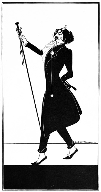
Whistler by unknown artist (not by Aubrey Beardsley, despite the signature).

Stephen Calloway is correct when he says that the fakes continue to circulate today, mechanical (and digital) reproduction having given them a life they really don’t deserve. (This post might be accused of extending that lifespan.) The Whistler portrait above is one of the more convincing examples which no doubt explains why it was credited to Beardsley in Nick Meglin’s The Art of Humorous Illustration (1973), a book from a reputable New York publisher, Watson-Guptil.
egerton.jpg

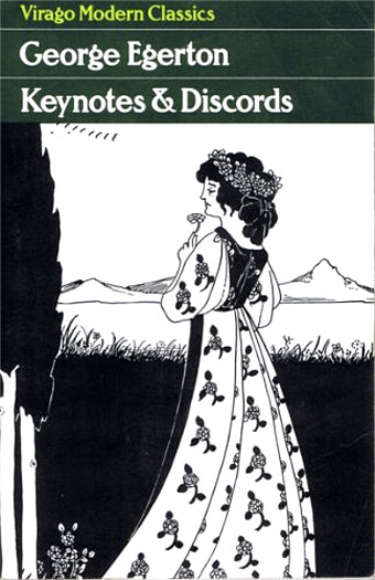
When Virago published Keynotes & Discords by George Egerton in 1995 they used another of the fakes on the cover. This was especially ironic when Egerton’s stories had seen their first publication in John Lane’s Keynotes series, a line of books that not only took their name from the first Egerton volume but which were illustrated by Beardsley himself. The worst example of proliferation I’ve seen in print was the Beardsley postcard book published by Taschen in the 1990s which scattered the Nichols fakes among genuine Beardsleys, thus ensuring that the uninitiated would continue to litter the world with the things. Today we have Pinterest, home of the erroneous credit. I doubt the Tate exhibition will draw any attention to the fakes but now that Nichols’ book is online it’s easier for those who suspect an attribution to assuage (or confirm) their suspicions.

Elsewhere on { feuilleton }
The Aubrey Beardsley archive
Weekend links 499

konoike.jpg

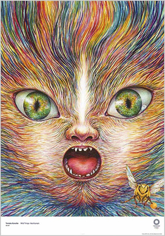
Wild Things – Hachilympic, a poster by Tomoko Konoike for the Tokyo 2020 Olympics.

• Hidden Jewels in ‘The Garden of Orchids’: Steve Toase on Der Orchideengarten (1919–1921), the German magazine of fantastic art and literature. Since the article doesn’t mention it, I’ll note again that the first Anglophone appraisal of the magazine (and also the place where it was drawn to the attention of myself and 50 Watts) was in Franz Rottensteiner’s The Fantasy Book (Thames & Hudson/Collier, 1978).

• “In its furtive, sotto-voce way, Gorey’s work is in conversation with gay history, gay literary influences, and, now and then, the gay-straight tensions of his time.” Mark Dery on the attempts by Edward Gorey’s readers and critics to ignore the obvious signs of a personal sexuality in his work.

• The Apotheosis of the Grotesque: illustrator Sidney Sime interviewed by Arthur H. Lawrence in The Idler, January 1898.

Goff would experiment with form, material, structure and ornament to almost absurd degrees. Materials he used in his buildings included aviation parts, goose feathers, oil rig equipment, orange artificial turf (on the roof), lumps of coal, and any kind of glass he could get his hands on. His 1948 Ledbetter House, also in Oklahoma, features a recurring motif of vertical lines of diamond-shaped glass studs set into doors and columns. In fact they are dime-store glass ashtrays.

Steve Rose on the restoration of “outsider architect” Bruce Goff

• At the BFI: Adam Scovell on where to begin with Delphine Seyrig; Kat Ellinger on giving Fellini’s later films their due; and Matthew Thrift on 10 great Acid Westerns.

• RIP Ivan Passer and Neil Peart. A reminder that John Patterson described Passer’s Cutter’s Way as a cinematic masterpiece. So it is.

Geeta Dayal on musician/composer Arthur Russell and yet another posthumous release.

Haunted And Known, a new recording by Six Organs Of Admittance.

• At Dennis Cooper’s: Hidden.

2112 (1976) by Rush | Xanadu (1977) by Rush | La Villa Strangiato (1978) by Rush

Illustrating Zothique

zothique00.jpg

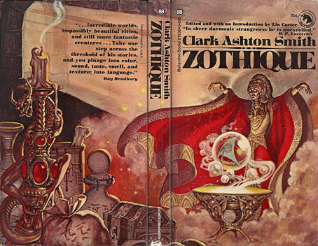
Cover art by George Barr, 1970.

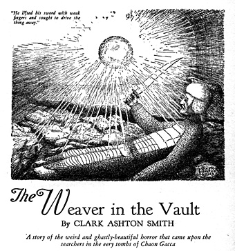
A few years ago I wrote a short piece about Virgil Finlay’s illustrations for a Zothique story by Clark Ashton Smith, The Garden of Adompha, so this post may be regarded as a more substantial sequel. If Smith remains something of a cult author then Zothique is the pre-eminent cult creation from his career as a writer of weird fiction. Most of Smith’s stories can be grouped together according to their location: Atlantis, Hyperborea, Averoigne in medieval France, the planet Mars, and so on. Zothique was a more original conception than his other worlds, being the last continent on Earth in the final years of the planet, an idea which had precedents in earlier novels such as William Hope Hodgson’s The Night Land but which hadn’t been used before as a setting for a cycle of stories. The distant future suggests science fiction but, as with the Zothique-influenced Dying Earth of Jack Vance, science and technology is long-forgotten and sorcery rules the day. The poetry that Smith wrote before he took to writing short stories had a distinctly Decadent quality—”like a verbal Gustave Moreau painting“—and Zothique is a richly Decadent world, with the entire planet in a state of decay along with its barbarous, demon-worshipping peoples.

zothique01.jpg

Weird Tales, September 1932. Art by T. Wyatt Nelson.

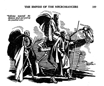
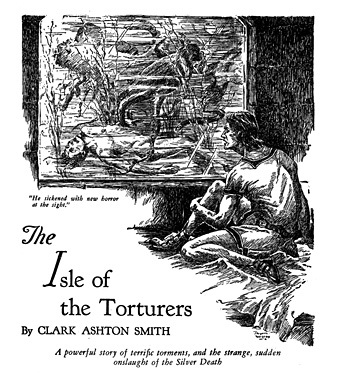
All the Zothique stories had their first printings in Weird Tales, a magazine that ran illustrations with most contributions, but unless you’re a pulp collector many of the illustrations have been difficult to see until very recently. One of the pleasures of looking through fiction magazines is seeing how their stories might have been illustrated when they were first published. Popular tales eventually find their way into book collections but their illustrations tend to be marooned in the titles where they first appeared unless the artist is of sufficient merit to warrant a collection of their own.

zothique02.jpg

Weird Tales, March 1933. Art by Jayem Wilcox.

The examples here are all from recent uploads at the Internet Archive which now has a complete run of Weird Tales from 1923 to 1954. The illustrations also run in order of publication with links to the relevant issues, although I agree with Lin Carter’s ordering of the stories. Smith never organised them himself, and the later reprints from Arkham House and others tend to scatter them through separate volumes. When Lin Carter edited the Zothique collection in 1970 he put the stories into an order that follows the very loose chronology running through the cycle.

zothique06.jpg

Weird Tales, January 1934. Art by Clark Ashton Smith.

One surprise of this search was discovering that Smith himself had provided illustrations for several of the stories. Some Smith enthusiasts like his drawings and paintings but I’m afraid I’m not among them, his sculpture work is better. It’s doubtful that these would have been printed at all if they weren’t the work of the author.

Continue reading “Illustrating Zothique”

Weekend links 498

mead.jpg

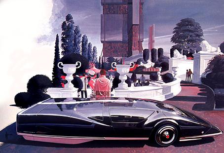
The Sentinel 280, a car design by Syd Mead from 1964.

• “Boris Dolgov did not exist. The man who bore that name may have existed, but there never was a man in the United States with that name until 1956, too late for Weird Tales.” Teller of Weird Tales on the mysterious identity of a magazine artist.

• Saying goodbye to 2019 also meant saying farewell to Vaughan Oliver, Neil Innes and Syd Mead. Related: Vaughan Oliver at Discogs; I’m The Urban Spaceman; a look back at Syd Mead’s vehicle designs.

Lanre Bakare on how ambient music became cool. (Again. This begs the question of when it became uncool, especially when a ten-year-old Brian Eno piece about “the death of uncool” is being quoted.)

Westerners interpreted the peyote experience very differently from the practitioners of the peyote religion, where the focus was “ritual, song and prayer, and to dissect one’s private sensations was to miss the point”. Writers such as Havelock Ellis, who published an essay on his peyote experiences in the Lancet in 1897 (it’s likely that he also administered the substance to his friends W.B. Yeats and Arthur Symons), instead tended to focus on its visual effects. Ellis described “the brilliance, delicacy and variety of the colours” and “their lovely and various textures”. Peyote reached Europe in tandem with the X-ray, cinema and electric lights, Jay notes, and “nothing delighted the eye of the mescal eater so much as the new electrical sublime”.

Emily Witt reviewing Mescaline: A Global History of the First Psychedelic by Mike Jay

Peter Bradshaw takes on the thankless task of ranking Federico Fellini’s feature films.

Geoff Manaugh on when Russia and America coöperated to avert a Y2K apocalypse.

• “Music is an ideal medium for interstellar communication,” says Daniel Oberhaus.

Keith Allison on Karel Zeman, a creator of remarkable cinematic fantasies.

•  Japanese Designer New Year’s Cards of 2020.

• At Dennis Cooper’s: Vera Chytilová Day.

2020 in public domain.

Sentinel (1992) by Mike Oldfield | Sentinels (2001) by Cyclobe | Sentinel (2004) by Transglobal Underground

André Castaigne’s Phantom of the Opera

castaigne1.jpg

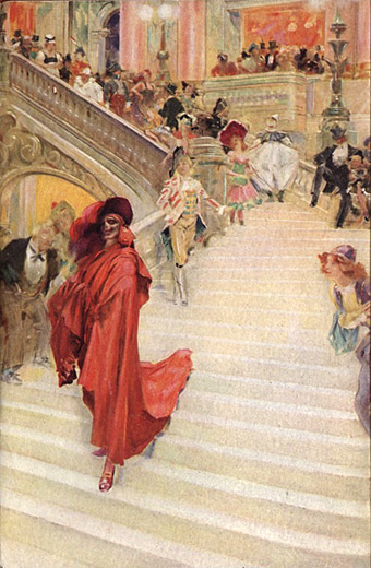
Frontispiece.

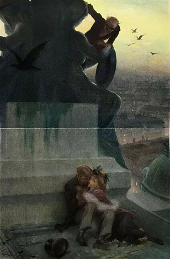
My recent film viewing has included two early adaptations of The Phantom of the Opera, the superb Lon Chaney version from 1925, directed by Rupert Julian, and the not-so-superb 1943 version with Claude Rains as the Phantom. I’d not seen the latter before but it was included in a blu-ray collection of Universal horror films; Rains is wasted in the title role but in its favour the film has Technicolor photography and huge sets, some of which were being reused from the 1925 film. The Chaney version is one of my favourite silent films so it was good to see again after a lengthy absence. It also sent me to Gaston Leroux’s novel at long last, and this in turn led me to the illustrations by André Castaigne for the first edition.

castaigne2.jpg

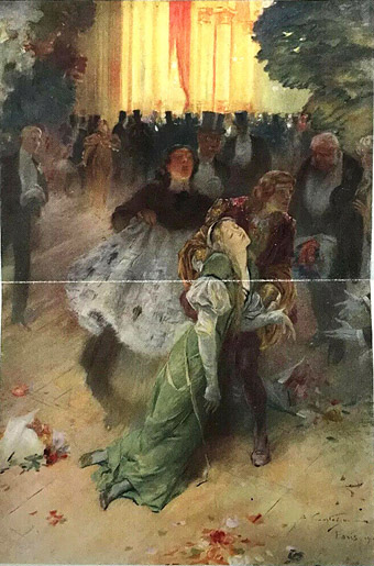
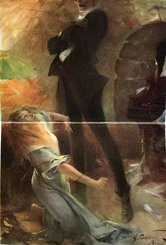
“She staggered swooning.”

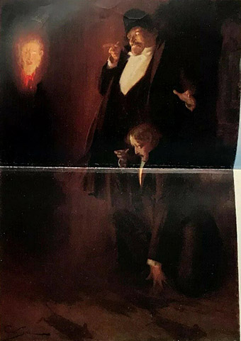
The Phantom of the Opera was published in 1911, and while it hasn’t been subjected to the overexposure sustained by Dracula and Frankenstein it’s still one of those stories where the adaptations now dominate the popular imagination. I’d not seen Castaigne’s illustrations before so I was surprised by how closely the 1925 film followed their details, especially the depiction of the Phantom’s appearance as the Red Death at the bal masque. The same goes for the ghostly head of fire which Raoul and the Persian encounter in the cellars beneath the opera. In the film this is an inexplicable moment but one which would no doubt have been familiar to the novel’s readers. Finally, there’s Lon Chaney’s incredible makeup which turns out to be very close to the glimpses of the Phantom’s skull-like face in these pictures. I often used to wonder about this, how much of Chaney’s appearance was merely an attempt to look as horrifying as possible. (In the 1943 film, and the 1962 Hammer adaptation with Herbert Lom, both Phantoms have been disfigured by acid scarring.)

castaigne3.jpg

“They sat like that for a moment in silence.”

By coincidence, a new illustrated edition of The Phantom of the Opera was published this month by the Folio Society, with a splendid set of illustrations by Taylor Dolan. As for the Lon Chaney film, the restored blu-ray print is the one to look for, with tinted scenes, the bal masque in two-strip Technicolor, and an excellent orchestral score by Carl Davis.

(Note: With the exception of the frontispiece, all the illustrations here were printed over two pages, hence the fold across each picture.)

castaigne4.jpg

“A head of fire came toward them.”

castaigne5.jpg

“Talking of death, I must sing.”

Elsewhere on { feuilleton }
The illustrators archive

Previously on { feuilleton }
A Pictorial History of Horror Movies by Denis Gifford