ER Herman’s Fables

herman11.jpg

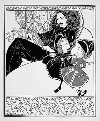
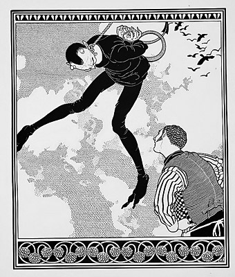
I: The Persons of the Tale.

The Fables in question are the short pieces by Robert Louis Stevenson that first appeared in a collected edition in 1896. These illustrations by British artist ER Herman are from a 1914 edition that I hadn’t encountered before until I received an email asking if I knew anything about the artist. I didn’t, and neither does anybody else it seems; Herman’s life and other works are a complete mystery, as are his forenames (he does seem to be a he, however, going by a review in The Bookman). I suspect the ominous date of publication may be a clue: Herman could well have died in the First World War without having the opportunity to publish anything else. On the other hand, a couple of biographical entries have 1890–1930 as birth and death dates, although this makes the absence of other artwork even more striking. And given such vagueness, it’s still possible that ER Herman could have been a woman who gave up her art career to raise a family, as my mother did in the 1950s.

herman15.jpg

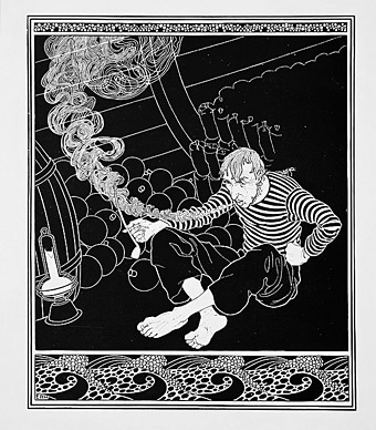
II: The Sinking Ship.

Regarding the drawings, The Bookman review identifies a Beardsley influence which is immediately evident in the use of pictorial space, the masses of black and white, and the parallel shading lines. So too with the treatment of clothing; Herman’s figures, however, are his (or her) own. It makes a change seeing illustrations for a Stevenson book that isn’t Treasure Island or A Child’s Garden of Verses. Fables includes The Persons of the Tale, a surprisingly early piece of metafiction in which Long John Silver and Captain Smollett briefly step out of the pages of Treasure Island to smoke their pipes and discuss the likely outcome of the story. “But there’s the ink-bottle opening. To quarters!”

herman19.jpg

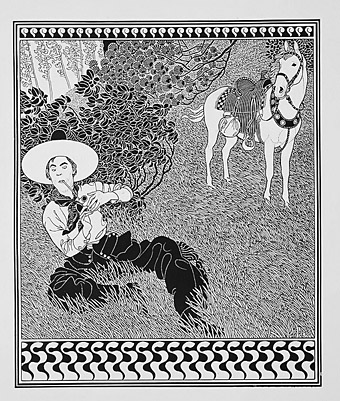
III: The Two Matches.

My thanks to Duncan for alerting me to these drawings which may be seen at a larger size here. If anyone has any details about ER Herman’s life or other work, please leave a comment.

herman14.jpg

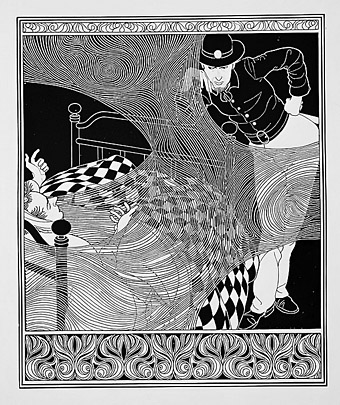
IV: The Sick Man and the Fireman.

herman05.jpg

V: The Devil and the Innkeeper.

Continue reading “ER Herman’s Fables”

Weekend links 507

plone.jpg

The next release on the Ghost Box label will be Puzzlewood by Plone, “unironically joyful and melodic electronica; informed by library music, music for children’s TV and a deep passion for the history of music technology”. The album will be available in April. Design, as always, is by Julian House.

• “With his panting breath and dripping sweat infused in each page of his memoir, Patrick Cowley describes himself on his knees, bending over and ‘worshipping Phallus.'” Maxwell Shand on Dark Entries‘ “holy trinity” of Patrick Cowley’s Mechanical Fantasy Box, Hot Rod To Hell by Roy Garrett & Man Parrish, and Maxx Mann’s gay synth-pop.

• “We’re gonna do economic activity—without money!”: Inside the criminal glamour of the San Francisco Diggers with Kent Minault. The third installment of a verbal history of the hippie anarchists by Jay Babcock.

• “Susanna Hoffs and friends remember David Roback, who stayed creative, and enigmatic, to the end.” By Randall Roberts.

My connection with [raga] was not to be able to duplicate or emulate it but to learn from it. I combined it with the electronics and the harmonizer and things like that. But I would have a line that was being drawn. You’re thinking about it like a shape that’s being drawn on a canvas. It’s a line that’s being drawn and another. You’re holding three pencils at once while you’re drawing on the wall. So, you’re able to get the shapes. This was my thing with it, because I was into the harmony that it would make. So, it was an easy and natural thing to do, was to go and move into the electronics. Then we had equipment that was doing transposition and all that kind of thing. So that’s one little part of it.

Jon Hassell talking to Aquarium Drunkard about his first album, Vernal Equinox, which is reissued later this month

• Published next month by Strange Attractor Press: Rated SavX: The Savage Pencil Skratchbook.

• They came from outer Finland: the town where everyone saw UFOs, as photographed by Maria Lax.

• Mix of the week: Through A Landscape Of Mirrors Vol. VI – Sweden II by David Colohan.

Moonstrips Empire News (1967) by Eduardo Paolozzi.

• At Dennis Cooper’s: Shelley Duvall Day.

Graham Massey‘s favourite albums.

Phallus Dei (1969) by Amon Düül II | Wrong Eye (1990) by Coil | Red Scratch (1994) by ELpH

Sculptured Melodies by Mera Sett

sett01.jpg

Another week, another link to the Internet Archive. It’s hard to resist reporting these discoveries when so many are either surprising, much-needed, or—as in this case—fantastically rare and obscure. Sculptured Melodies (1922) was a book of short stories published privately in Britain in an edition of 500 copies. The possibly pseudonymous author and illustrator, Mera Sett, is so off the map that almost all the available information seems to derive from a series of posts about the book by John Hirschhorn Smith of Side Real Press. (The Internet Archive scan is also from Smith’s own copy of the book.) Each story is inspired by a piece of music, and written “in a decadent style reminiscent of Pierre Louÿs”; Orientalist or Ancient World exotica is the predominant tone.

sett02.jpg

Whoever the author was, he (it does at least seem to be a he) illustrated his stories in the post-Beardsley idiom that continued to a feature of publishing in the 1920s. The drawings are very much the work of an enthusiastic amateur, although the same might be said of Sett’s better-known contemporary, Alastair (Hans Henning Voigt), another follower in Beardsley’s wake who compensated for his uneven figure drawing with copious decoration and outrageous costumes. Sett also uses decoration to disguise his shortcomings, borrowing some of Aubrey’s Japonisme peacocks along with other motifs from Persian and Indian art. The latter details suggest an unexplored artistic avenue that blends Beardsley’s black-and-white style with the tableaux of Persian miniatures.

sett03.jpg

sett04.jpg

sett05.jpg

Continue reading “Sculptured Melodies by Mera Sett”

Haeckel’s Radiolaria

haeckel01.jpg

I’ve been admiring (and plundering) Ernst Haeckel’s Kunstformen der Natur (Artforms in Nature, 1904) for many years, but until this week I hadn’t thought to look for other books by the German biologist. The plates in Haeckel’s Kunstformen fascinate for the way their drawings emphasise the aesthetic qualities of the animals being studied, without taking the wild liberties one finds in early zoological books or being photographically faithful to the specimens.

haeckel02.jpg

Of particular fascination are the many plates devoted to Radiolaria, tiny marine protozoa whose mineral skeletons look less like the product of living creatures than abstract decorations, crystalline growths or even pieces of alien architecture. These unusual forms were the ones that captured the imagination of René Binet, a French designer and architect who collaborated with Gustave Geffroy on a whole book of architectural and household designs derived from Haeckel’s plates. So too with Salvador Dalí who wasn’t above borrowing (or “quoting”) from Haeckel’s Radiolaria.

haeckel03.jpg

Haeckel was evidently just as fascinated with the protozoa, enough to write and illustrate a substantial monograph. Die Radiolarien (Rhizopoda radiaria): Eine Monographie (1862) is available at the Biodiversity Heritage Library and the Internet Archive in a mammoth four-volume set, a large portion of which is explanatory text. There’s also a separate volume with a selection of the plates alone which is easier to browse. These drawings show much more variety than the Kunstformen plates which represent the examples that Haeckel considered most visually appealing; they also show us how much Haeckel tailored his renderings for Kunstformen, favouring symmetry and harmony over natural imperfections. Oscar Wilde would have approved of Haeckel’s adjustments, as he writes in The Decay of Lying: “My own experience is that the more we study Art, the less we care for Nature. What Art really reveals to us is Nature’s lack of design, her curious crudities, her extraordinary monotony, her absolutely unfinished condition. Nature has good intentions, of course, but, as Aristotle once said, she cannot carry them out.”

haeckel04.jpg

haeckel05.jpg

haeckel06.jpg

Continue reading “Haeckel’s Radiolaria”

Édifices Anciens: Fragments et Détails, Anvers

bosschere01.jpg

Édifices Anciens: Fragments et Détails, Anvers is a surprise for being an example of early book by the Belgian artist and author, Jean de Bosschère, which is devoid of the idiosyncratic features of the artist’s later style, a style whose curious figures, human or otherwise, make de Bosschère a Belgian equivalent of Sidney Sime. Édifices Anciens was published in 1907, and if the illustrations lack the artist’s invention the architectural details that the drawings depict are inventive in their own way, being examples of the baroque style common to the old buildings of Belgium and the Netherlands.

bosschere02.jpg

Anvers is the French name for Antwerp, a city with many facades that peak into those wonderful ogee flourishes, corner finials and crow-step gables that look (to English eyes) typically Belgian and very un-English. One of the few places you’ll see facades like these in England is the city of Hull whose status as a port meant traffic with the Low Countries in architectural styles as well as in goods. (Crow-step gables are a common feature of buildings in Scotland, however, a nation whose architectural idioms are the first signal to a visitor from the south that you’re in a different country.)

bosschere03.jpg

Édifices Anciens may be browsed here or downloaded here. For more typical examples of Jean de Bosschère’s drawing style see the links below.

bosschere04.jpg

bosschere05.jpg

Continue reading “Édifices Anciens: Fragments et Détails, Anvers”