A feast of Poe

martini1.jpg

King Pest by Alberto Martini.

My thanks to the estimable Mr Shea for bringing to my attention this website devoted to the many illustrated editions of Edgar Allan Poe. Quite a few of the older illustrations have been featured here in the past but most of the later ones are new to me. The site is comprehensive enough to include my own illustrated edition from 2017, a book whose shortcomings I often find myself apologising for. (I was very pressured for time with that commission, and would welcome an opportunity to redo some of the pictures.)

martini2.jpg

A Descent into the Maelström by Alberto Martini.

I could draw attention to the later editions but I’ll single out the work of Alberto Martini (1876–1954), an Italian artist whose work I find especially attractive for the way it provides a bridge between Decadence and Surrealism. His Poe illustrations appear now and then in books or articles about horror fiction but you seldom see all of them together.

martini3.jpg

The Murders in the Rue Morgue by Alberto Martini.

Meanwhile, Ted Parmelee’s short but very effective animated adaptation of The Tell-Tale Heart (1953) turned up recently at the Internet Archive in a copy that’s the best I’ve seen to date. Watch it here.

tell-tale.jpg

Elsewhere on { feuilleton }
The illustrators archive

Previously on { feuilleton }
Robert Lawson’s House of Usher
Edmund Dulac’s illustrated Poe
The Fall of the House of Usher, 1928
The Purloined Eidolon
Martin van Maële’s illustrated Poe
Mask of the Red Death, 1969
Narraciones extraordinarias by Edgar Allan Poe
Fritz Eichenberg’s illustrated Poe
The Pendulum, the Pit and Hope
Hugo Steiner-Prag’s illustrated Poe
Burt Shonberg’s Poe paintings
Illustrating Poe #5: Among the others
Illustrating Poe #4: Wilfried Sätty
Illustrating Poe #3: Harry Clarke>
Illustrating Poe #2: William Heath Robinson
Illustrating Poe #1: Aubrey Beardsley
Poe at 200
The Tell-Tale Heart from UPA
William Heath Robinson’s illustrated Poe

Modern Pen Drawings, 1901

drawings08.jpg

Rustum and the Simoorg (1897) by Patten Wilson.

A new arrival at the Internet Archive. Modern Pen Drawings: European and American is a special number of The Studio magazine, one of several such numbers which they published in book form. The magazine’s editor, Charles Holme, edited the volume which maintains the high quality typical of all these publications, with excellent reproductions and informative notes about the artists and their works. Holme’s choices in collections such as this are always varied, mixing imaginative illustrations with comic drawings and nature studies. For a reader, the books are still useful today for showing you drawings that you might not see anywhere else, even when the artist is a familiar name. When the works themselves are familiar the reproductions are invariably better than you’ll find elsewhere. Such is the case with Patten Wilson’s “Rustum and the Simoorg”, an illustration of a Persian folk tale whose fine lines and details are often spoiled by poor printing. Elsewhere there are two pages of Théophile Steinlen’s inevitable cats, a drawing by Fernand Khnopff that I don’t think I’ve seen before, and Edmund J. Sullivan’s rose-bedecked skeleton which Alton Kelley later “repurposed” (or swiped) for the cover of the Grateful Dead’s second live album.

drawings01.jpg

drawings02.jpg

drawings03.jpg

drawings04.jpg

Continue reading “Modern Pen Drawings, 1901”

Elliott Dold’s Night

dold01.jpg

Looking for artwork by Elliott Dold turned up this remarkable set of illustrations for an unremarkable collection of poetry, Night, by a friend of the artist, Harold Hersey. Elliott Dold (1889–1957) was an American illustrator during the early days of the pulp magazines, best known today for drawings of huge machines which are a match for those by his more prolific contemporary, Frank R. Paul. The pulp magazines are so often filled with mediocre illustration that it’s a pleasure to find another talent lurking in their pages. But Dold was more than an illustrator of big science, as these illustrations for Hersey’s dubious poetry demonstrate.

dold02.jpg

Night is a collection of vaguely erotic poems, all of which Hersey labels “Nocturnes”. The collection was published in 1923 in a privately-printed subscriber-only edition, and every description I’ve read of it agrees that the illustrations are the best thing about it. The drawings are also radically different to Dold’s science-fiction art, to a degree that they could easily be taken for the work of a different illustrator. “What a pity the artist has to waste his time grinding out art for the pulps,” said HP Lovecraft, in a letter to Clark Ashton Smith. A pity, indeed. Dold’s illustrations are on a par with those that Wallace Smith was producing in the same year, and are close enough to Smith’s style that’s it’s tempting to accuse him of imitation. Smith’s style wasn’t unique, however; Ray Frederick Coyle was another American artist at work in the 1920s who favoured the same combination of strict black-and-white, careful linework and stylised figures. It’s curious that three books with somewhat controversial contents should have been published in the USA in 1922/23, all of them illustrated in a very similar manner: Ben Hecht’s Fantazius Malare (illustrated by Wallace Smith), James Branch Cabell’s new edition of Jurgen (illustrated by Ray Frederick Coyle), and Hersey’s Night. Rather than look for spurious influence I’d guess that this was a combination of coincidence and American literature acquiring a belated taste for Decadence which required suitably Beardsleyesque illustration. Similar trends were evident in cinema, especially in Alla Nazimova’s 1923 film adaptation of Oscar Wilde’s Salomé, where the costumes and settings were all based on Beardsley’s illustrations.

dold03.jpg

The images here are from a copy of the book at HathiTrust that’s another poor Google scan. The Hathi website isn’t as convenient for reading as the Internet Archive so I’ve downloaded all of the illustrations and, when necessary, cleaned the grey tone left by the scanner’s camera.

dold04.jpg

dold05.jpg

Continue reading “Elliott Dold’s Night”

Firebirds

bilibin.jpg

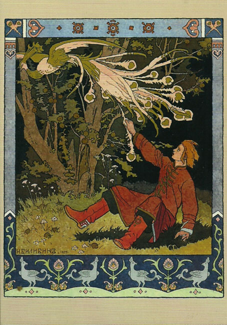
Ivan Tsarevich Catching the Firebird’s Feather (1899) by Ivan Bilibin.

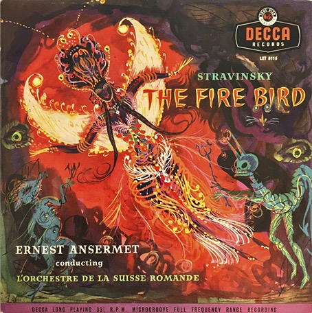
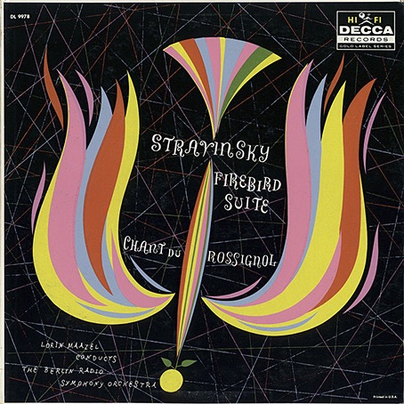
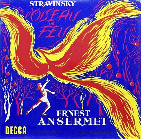
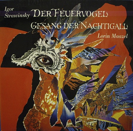
The firebirds are those that you find on the covers of recordings of Stravinsky’s Firebird ballet score, or on its popular distillation, The Firebird Suite. The latter has long been one of my favourite pieces of classical music, in fact it was one of the first I owned, via a cheap vinyl pairing with The Rite Of Spring that was mainly of interest for being conducted by Stravinsky himself. The cover photo showed a ballerina as the Firebird in a ballet performance, a common choice for the covers of Firebird recordings.

firebird-1955.jpg

No artist/designer credited, 1955.

Much better was the cover of Tomita’s Firebird album (see below) which I bought around the same time, an uncredited tapestry design which is also a better album cover than the painting used on the earlier Japanese release. Depicting the Firebird itself is the other obvious choice when designing Stravinsky albums, and the dazzling, magical bird has helped this particular opus fare better in the world of classical album design than many other recordings.

firebird-1958.jpg

No artist/designer credited, 1958.

It’s easy to cast aspersions at the designers or art directors of classical records when you see an uninspired cover design, but the format presents a number of difficulties. There’s no such thing as a fixed design for a classical album because classical albums have no fixed form. With the exception of albums devoted to a single long composition most classical albums are compilations, pairing longer works with shorter ones, often by two or more composers. This confusion of identity creates problems for the designer, as does the huge quantity of classical releases. Then there’s the problems posed by the music itself which is so often abstract; you can’t “illustrate” The Goldberg Variations. The default choice is to use a painting or a drawing or a photograph of the composer as a cover image, or a photo of the conductor or performer. The easiest assigments, as these Firebird covers demonstrate, are albums based around a composition with a well-defined theme that can be depicted visually. Nobody has ever had a problem designing a cover for recordings of Debussy’s La Mer, for example, the only difficulty is deciding what picture of the sea you want to use.

firebird-1960-1.jpg

No artist/designer credited, 1960.

I’ve never had the impression that classical devotees care very much about these issues, it’s the music and the performance they’re interested in. Record labels (or their marketing departments) do seem to pay attention to visual matters now and then, and you’ll find occasional attempts to create a new line of themed covers. (The Orphic Egg series was one of the more bizarre examples from the 1970s.) Deutsche Grammophon have a history of decent cover design but even they resort to using photos of the artist or conductor far too often. I’ve never been asked to design a classical release, and I’m not sure I’d relish the task, but the problems raised by the form fascinate me. This is a subject I’ll no doubt keep returning to.

firebird-nd2.jpg

Irma Seidat, no date.

Continue reading “Firebirds”

The art of Jean-Michel Nicollet

nicollet12.jpg

French artist Jean-Michel Nicollet isn’t really known as a comic artist but one of his strips appeared in the Métal Hurlant Lovecraft special in September, 1978, and was reprinted in the Heavy Metal Lovecraft special a year later. Nicollet’s three-page story, H.P.L., is a slight thing which you can read below but his paintings present more of the atmosphere of Lovecraft’s fictional worlds than many of the other strips in those issues, including the equally slight contribution from Moebius. Prior to this, Métal Hurlant had been using some of Nicollet’s paintings for cover art, as a result of which one of the same illustrations appeared on the cover of the very first issue of Heavy Metal magazine in 1977. The winged Lovecraft from his comic strip turned up again on the cover of a Robert Bloch story collection for French publisher Nouvelles Éditions Oswald (NéO) in 1980.

nicollet09.jpg

Nicollet seems to have retired now from cover work but during the 1970s and 80s he was a very prolific illustrator, especially for NéO. NooSFere has a gallery of his covers which are mostly for reprints of early 20th-century horror, fantasy and adventure tales, also a few detective stories. He seems to have enjoyed illustrating classic detective fiction (photos show him posing with a large Holmesian pipe) so there may well be more covers which aren’t included in the NooSFere list.

nicollet11.jpg

The selections I’ve chosen here match my own preferences for cosmic horror and weird fiction, and represent another attempt to look further afield for this type of illustration. French cover design can be unsympathetic to cover illustration, crowding the paintings with poor type choices and purposeless graphics. The uniform layouts of NéO treat the artwork with more respect.

nicollet13.jpg

nicollet14.jpg

Continue reading “The art of Jean-Michel Nicollet”