The art of Simon Moulijn, 1866–1948

moulijn5.jpg

Landscape, Drenthe (1896). Collection Hein Klaver.

Sander Bink’s previous guest posts here concerned some of the forgotten artists of the Dutch fin de siècle, in particular the Beardsley-inspired work of René Gockinga. This new post from Sander is more Symbolist-oriented, with a look at the work of another Dutch artist.

* * *

Simon Moulijn was a Dutch painter and graphic artist whose work shows a striking affinity with European Symbolism, in particular his prints and paintings made in the 1890s which would appear to provide a link between Dutch Realism and mystical Symbolism. Beyond their historical context, these are simply beautiful pictures which is, of course, the most important thing.

moulijn6.jpg

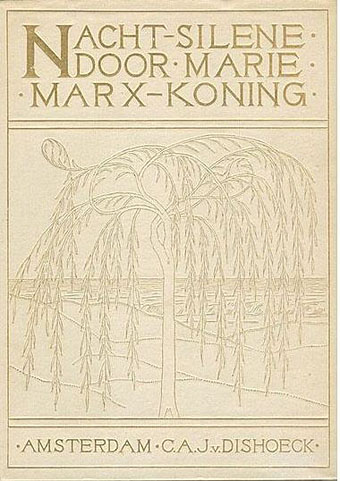
Cover design for Nachtsilene, 1902.

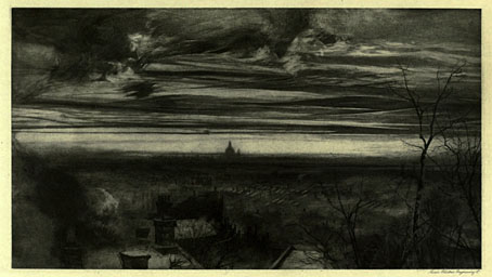
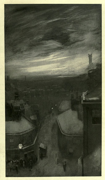
Landscapes were Moulijn’s main theme; some bring to mind the land- and cityscapes of Fernand Khnopff in which the world has become silent: a serene, quiet world, free from the noise and misery of modern life. “Anywhere out of this world”, but within the world we already know. Although not “Decadent” like Khnopff—there are no femmes fatales in his landscapes—Moulijn must certainly have been inspired by Khnopff and similar artists. Van Gogh and Jan Toorop were important for Moulijn as well. That Moulijn was well-versed in Symbolism and other new art forms at the time such as Art Nouveau is evidenced by his exhibition at Siegfried Bing’s Paris Gallery in 1895. Like many of the artists of his generation, he was greatly inspired by the mystical writing of Maeterlinck. No wonder, then, that he designed book covers and illustrations for Marie Marx-Koning, a Dutch writer unjustly neglected today, whose novels and stories also show a strong affinity with European mystical Symbolism.

moulijn1.jpg

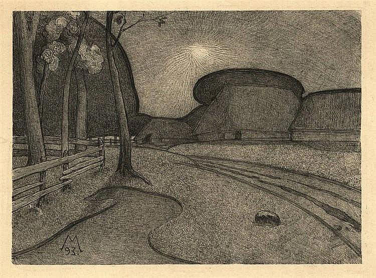
Night (1893). Lithograph.

These qualities are already exemplified by Moulijn’s first printed work, the lithograph Night from 1893 which depicts a traditional Dutch subject, a farm; but there are no peasants, and the nightly tones and silence make it look more like a farm from an Ingmar Bergman film than a landscape by his painter contemporaries from The Hague School.

moulijn2.jpg

Farm at Diphorn (1896). Gemeentemuseum Den Haag.

moulijn4.jpg

Spring (1896). Drents Museum.

moulijn3.jpg

Autumn (1895). Drents Museum.

An 1896 painting with the same subject, Farm at Diphorn, brings to mind the imaginary landscapes of Félix Vallotton, as do, more or less, two pastels which I personally feel to be his best: Spring and Autumn. Once again, the coloured areas in these Symbolist landscapes are reminiscent of a Vallotton or Franz Melchers. But where Vallotton’s landscapes might be characterised as psychological landscapes, these two by Moulijn are almost abstract experiments in colour.

moulijn7.jpg

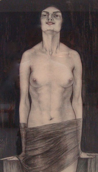
Vampire (1916). Collection Van Wezel.

Finally mention must be made, for curiosity’s sake and to satisfy the reader’s Decadent needs, of the 1916 coloured lithograph Vampire. This demonstrates Moulijn’s affinity with a more Decadent Symbolism, although by this time the style was increasingly outmoded.

Sander Bink

Previously on { feuilleton }
René Gockinga revisited
Gockinga’s Bacchanal and an unknown portrait of Fritz Klein
More from the Decadent Dutch

Weekend links 410

hog.jpg

William Hope Hodgson’s final Carnacki mystery, The Hog, received its first magazine publication in January 1947. The cover art by AR Tilburne may not have been originally created for Hodgson’s tale but it complements the story’s atmosphere of febrile dread.

• It’s still April so that means it’s still the month that saw the 100th anniversary of the death of William Hope Hodgson, bodybuilder, manacler of Harry Houdini, and the author of several novels of weird fiction that continue to entrance new generations of readers. The edition of Hodgson’s The House on the Borderland that I illustrated for Swan River Press would have been on sale this month but print problems have caused delays with the run as a whole; anyone interested is advised to contact the publisher for news. • Meanwhile, Jon Mueller (composer of the book’s accompanying soundtrack CD) and myself talked to Swan River Press about the attractions of Hodgson’s novel. • More Hodgsoniana: Greydogtales acknowledged the Hodgson centenary via a discussion with Hodgson scholar Sam Gafford, while Michael Dirda reviewed the new edition of The House on the Borderland and another SRP title, The Scarlet Soul (whose cover I also designed), for The Washington Post.

• “From the ashes of countless decayed Modernities comes Neo-Decadence, a profaned cathedral whose broken stained glass windows still glitter irregularly in the harsh light of a Symbolist sun. Behind this marvellously vandalised edifice, a motley band of revellers picnic in the graveyard of the Real, leaving behind all manner of rotting delicacies and toxic baubles in their wake.” Drowning in Beauty: The Neo-Decadent Anthology edited by Daniel Corrick & Justin Isis is published this month by Snuggly Books, an imprint whose catalogue of new books and first-time translations will be of interest to anyone who comes here for Decadence, Symbolism or anything related. Related to the above: A Neo-Decadence Day at Dennis Cooper’s.

• “Witches are change-makers. They’re transgressive beings who dwell on the fringes of society, and so they’re the perfect icon for rebels, outsiders, and rabble-rousers, especially those of the female persuasion.” Pam Grossman talks to Grimoire about witchcraft and related arts.

• Mixes of the week: Resident Advisor Podcast 621 by Grouper, and Bacchus Beltane 5: The Owl Service by The Ephemeral Man.

• Back in black: Publisher/translator James Conway and designer Cara Schwartz on the cover designs of Rixdorf Editions.

• I was talking again this week at The Writer’s Corner where JKA Short asked me about working as an illustrator.

All Gates Open: The Story of Can by Rob Young is published next week. The Wire has an extract.

• Delusional Albion: Brad Stevens on how foreign directors saw Britain in the Swinging Sixties.

• “There’s no book I love more than Derek Jarman’s Modern Nature,” says Olivia Laing.

Eden Tizard on Soliloquy For Lilith, the drone album by Nurse With Wound.

Owls (1969) by Ruth White | Decadent & Symmetrical (1995) by ELpH vs Coil | The Owls (2013) by Félicia Atkinson

The artists of Future Life

future.jpg

My earlier post about Future Life magazine mentioned the regular Portfolio series which featured interviews with illustrators and space artists, the latter group being the people who providing conceptual paintings for astronomy books and government entities such as NASA. Since the magazine files at the Internet Archive aren’t searchable I thought it worth making note of the interviews here, for my own benefit as much as anything else. (This blog has often served as a useful notebook.)

fl01-bonestell.jpg

Issue 1: Chesley Bonestell.

Many of the artists featured in Future Life were receiving their first (in some cases, only) high-profile feature at a time when little attention was given to the producers of this kind of work even in popular science-fiction magazines. The story magazines have always run interviews with writers but prior to Future Life, Science Fiction Monthly was the only magazine that I’d seen with a regular illustration feature, and that title didn’t last very long. Future Life covered some of the same people, Chris Foss, for example, while seeking out the prominent figures of the US illustration world. Not all the art is to my taste at all but the interviews are of interest even if you don’t like the pictures. One surprise was finding an interview in one of the issues that I’d missed with Ludek Pesek, a Czech artist whose views of the Solar System and depictions of the evolution of life on Earth I knew from the Puffin books he worked on with Peter Ryan. Those books were aimed at a young readership and were great favourites of mine before I’d seen anything by Foss and co. Another of the space artists interviewed is David Hardy, a British contemporary of Pesek’s whose view of an alien planet will be familiar to Hawkwind enthusiasts on the back cover of Hall Of The Mountain Grill. Another notable feature of the series is the lack of women artists, although this isn’t so surprising given that women creating pictures of space hardware are few even today. All the same, they might have featured Rowena Morrill, a popular cover artist for SF and fantasy novels at the time, and someone whose work I prefer to many of the people they did profile.

fl03-boris.jpg

Issue 3: Boris Vallejo.

fl04-mccall.jpg

Issue 4: Robert McCall.

fl05-nagaoka.jpg

Issue 5: Shusei Nagaoka.

A Japanese artist best known in the West for his album-cover art for ELO, Earth, Wind and Fire, and many others.

fl06-miller.jpg

Issue 6: Ron Miller.

fl07-hildebrandt.jpg

Issue 7: The Brothers Hildebrandt.

fl08-hardy.jpg

Issue 8: David Hardy.

Continue reading “The artists of Future Life”

Weekend links 409

steppenwolf.jpg

Poster for Steppenwolf (1974), a film directed by Fred Haines (his only one) based on the novel by Herman Hesse, and starring Max von Sydow and Dominique Sanda. No artist or designer credited.

• “…in her 20s, she heard two elderly folk singers and was struck by their ‘gentle dignity’. It cemented her own philosophy: ‘No dramatising a song, no selling it to an audience, no overdecorating in a way that was alien to English songs, and most of all, singing to people, not at them.'” Laura Snapes on Shirley Collins and her memoir, All in the Downs.

• Many of the BBC’s sound effects were available for years in necessarily small collections on vinyl, tape and CD. Now you can download over 16,000 of them for free here. The interface is still primitive so try typing some words into the search box to see what shows up.

Carl Swanson on Natalie Frank’s paintings based on Pauline Réage’s Story of O, and the problems these caused when she tried to exhibit them.

• Pictures of the Jazz Age: Regina Marler reviews three books about photographer Berenice Abbott.

• “The late Juraj Herz was a one-man wave of Czechoslovak horror,” says Kat Ellinger.

Mark Dery on William S. Burroughs and the dead-end horror of the Centipede God.

• Mixes of the week: FACT mix 648 by Laraaji, and XLR8R Podcast 538 by Fluxion.

Kashmir by Forming The Void, and Kazakhstan by Brian Eno.

• At Dennis Cooper’s: Dominique Sanda Day.

PixaTool by Kronbits.

Born To Be Wild (1968) by Steppenwolf | Steppenwolf (1976) by Hawkwind | Der Steppenwolf (2015) by Selofan

The Smoke

smoke01.jpg

London in 1898 was the most populous city in the world, a metropolis of “four million souls” as Arthur Conan Doyle continually reminds us in the Sherlock Holmes stories. The stereotypical representation of London in the 19th century is of a city wreathed in fog but the reality was closer to the dense smogs that plague Chinese cities today. The four million souls heated themselves by burning wood and coal, and the resulting smoke (and a fair amount of steam, no doubt) combined with the British climate to create the noxious, tinted “fogs” that fill the streets of Victorian fiction.

smoke02.jpg

Whatever the health hazards, the vaporous atmosphere had its champions in artists such as Claude Monet and James Whistler, both of whom relished the way the smoky air softened the silhouettes of the city. William Hyde may be added to the list for this superb series of etchings showing London at its most tenebrous, another chance discovery at the Internet Archive. London Impressions is an ambivalent celebration of the capital as a city of shadows, smoke and fog, the essays by Alice Meynell ruefully admitting that while the industrial cities of the north may rival London for their polluted atmosphere, their smaller size means that blue sky is never far away, something the Londoner of 1898 couldn’t take for granted. This is a marvellous book, and one I’d love to own if it wasn’t so rare; there’s a copy on eBay at the moment for $1,640. At least we can read it (and download the pages) here.

smoke03.jpg

smoke04.jpg

smoke05.jpg

smoke06.jpg

smoke07.jpg

smoke08.jpg

Continue reading “The Smoke”