Weekend links 244

scarpulla.jpg

MMOB :: Far West (2013) by Alison Scarpulla.

• “…although same-sex love is as old as love itself, the public discourse around it, and the political movement to win rights for it, arose in Germany in the late nineteenth and early twentieth centuries. This message may surprise those who believe that gay identity came of age in London and New York, sometime between the Oscar Wilde trials and the Stonewall riots.” Alex Ross reviewing Robert Beachy’s Gay Berlin: Birthplace of a Modern Identity. Beachy talks about his book here.

• “I was in a room with tube synthesizers, where you had to tune them up to play them. It was unbelievable.” John Carpenter talking to Joseph Stannard about composing with electronics. Carpenter’s album of new music, Lost Themes, may be previewed here.

• From 2010: John Ridpath on Mervyn Peake’s illustrations for Lewis Carroll’s Alice Through the Looking Glass and Alice in Wonderland. Related: “The most twisted version of Alice in Wonderland you’ll ever see.”

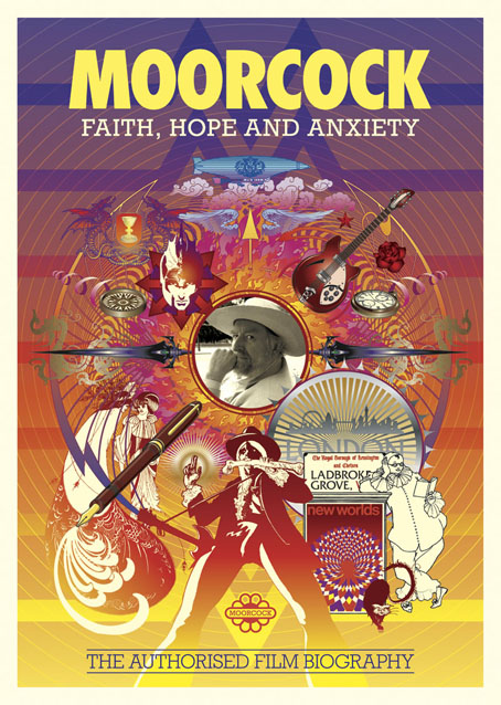
I was brought up in a world where art was something owned and insured—usually inherited: but seldom if ever made by anyone one I knew.

I had an early inkling that there was fun to be had over the hill, like the feeling when faced with a sunset that someone’s throwing a mega awesome party just beyond the nearest cloud, and I set off to join the caravan. Let’s just say I was in search of company, headed towards the glow, and I found it.

Tilda Swinton‘s speech at the Rothko Chapel

• “Her art often touches on alchemy and magic; and in her memoir of insanity she writes of misreading an Imperial Chemicals sign as ‘chemistry and alchemy’.” Charlotte Higgins on Leonora Carrington.
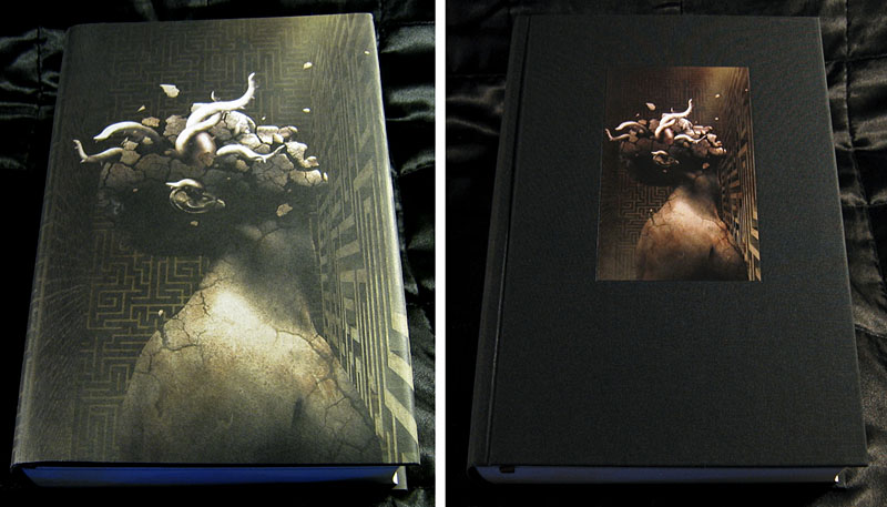
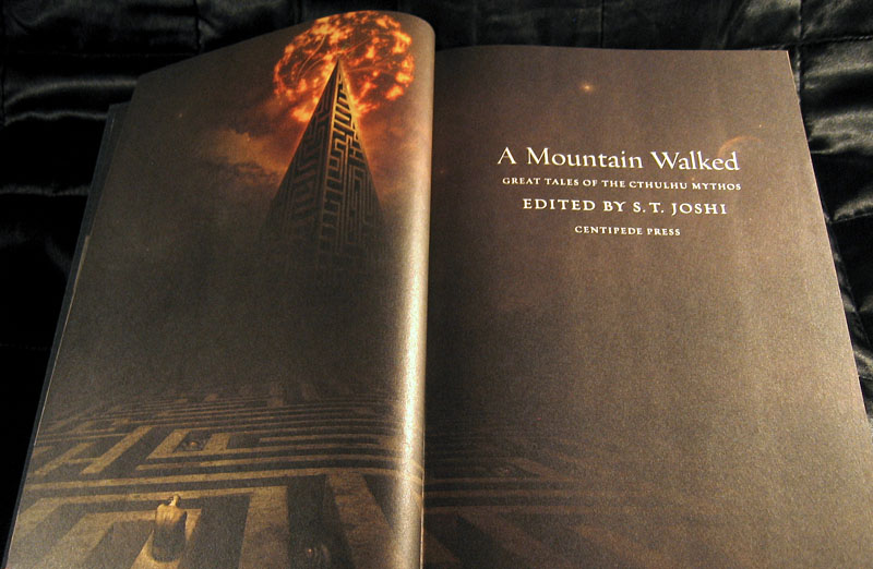
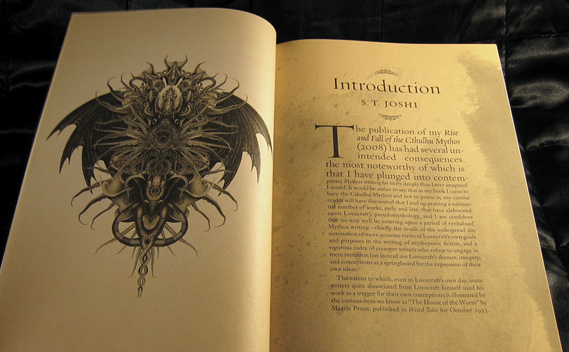
Shadows Over Main Street, an anthology of small-town Lovecraftian terror, is out this week from Hazardous Press. 20 stories and poems plus interior illustrations including a contribution of my own.

• “With Fantastic Planet, I felt torn about using it, because it’s…the title of an animated film.” Guitarist Sarah Lipstate, aka Noveller, talks to Ned Raggett about her new album.

Jim Jupp of Belbury Poly and the Ghost Box record label answers 15 questions.

• A DeLorean driving through a Tron cityscape: Retrowave by Florian Renner.

• Powell & Pressburger’s Tales of Hoffmann (1951) has been restored.

Music from Forbidden Planet (1956) by Louis & Bebe Barron | The Four Horsemen (1972) by Aphrodite’s Child | Assault on Precinct 13 (Main Theme) (1976) by John Carpenter

A Mountain Walked

mountain01.jpg

Art by David Ho.

This may be a frustrating post for some since it concerns a limited edition anthology that sold out almost as soon as it was announced a year or so ago. Even though the book was published last year it’s taken a few months for my copies to arrive. A Mountain Walked is a collection of Cthulhu Mythos stories compiled by leading Lovecraft scholar ST Joshi, and published in the US by Centipede Press. Anyone familiar with Centipede’s more luxurious volumes will know that they don’t do things by halves, and this weighty tome is no exception: a large-format hardback (the signed edition is also cased), with heavy paper stock, colour printing, tinted sheets and a bulk that runs to almost 700 pages.

mountain02.jpg

Art by David Ho.

Many of the stories are reprints but there’s also new material from contributors including Thomas Ligotti, Neil Gaiman, Caitlín R. Kiernan, Laird Barron, the late Michael Shea (to whom the book is dedicated), Patrick McGrath, TED Klein, Gemma Files, Ramsey Campbell and many others. The artwork also ranges widely; I’d not seen anything by David Ho before but he’s very good, hence the samples shown here. But there’s also a variety of other work, even a Lovecraftian Peanuts comic strip by Julien Baznet. I was pleased that my Cthulhoid picture was placed with the introduction, it makes up for my never having responded to Mr Joshi when he wrote to me years ago asking if I’d be interested in contributing something to Necronomicon Press.

Since the book was so successful there’s been talk of doing a cheaper reprint. In the meantime, bloated Lovecraftian plutocrats (Yuggothcrats?) will find very expensive copies for sale on eBay. A few more page samples follow.

mountain03.jpg

Continue reading “A Mountain Walked”

Oskar Schlemmer’s Triadic Ballet

schlemmer.jpg

Oskar Schlemmer’s Triadic Ballet of the 1920s is one of the more famous products of the Bauhaus movement, a radical reinvention of the medium which encased the dancers in cumbersome costumes. The outfits and stage designs are familiar from Bauhaus histories but you’re less likely to see an actual performance, something that’s possible with this 30-minute film made in 1970. The ballet is in three acts: yellow, pink and black. Erich Ferstl wrote the music for the filmed reconstruction by Margarete Hasting, the original score by Paul Hindemith being lost.

The ballet has additional interest for me in having influenced part of the Reverbstorm book. Oskar Schlemmer’s Bauhaus logo is reworked in the opening and closing pages together with other Bauhaus-derived graphics, but I also looked at Schlemmer’s ballet costumes when I was planning the final section which required a stylised transformation of Lord Horror. In the end I used a sketch by one of Schlemmer’s pupils, Klaus Barthelmess, for the Horror figure but the Barthelmess drawing was also of a dancer, and is very similar to some of Schlemmer’s designs, especially the silver-headed robot-like figures that appear in the black section of the ballet.

Previously on { feuilleton }
Reverbstorm: Bauhaus Horror

Moorcock: Faith, Hope and Anxiety

moorcock.jpg

Photo of the author by Linda Moorcock.

I mentioned a few days ago that I had another new piece of work to reveal, and this is it, a poster/promotional piece for Russell Wall’s forthcoming documentary about Michael Moorcock. The main challenge with one was to create something that would give a sense of Moorcock’s extensive career and the genre-spanning content of his many books.

mm1.jpg

I took the 1970s as the starting point, since this was the period when his reputation as a writer was established worldwide. The decade began with Britain’s bookshelves being colonised by Moorcock’s SF and fantasy novels published by Mayflower with vivid covers; it saw a cult feature film—The Final Programme—made from his first Jerry Cornelius novel, and it ended with the fourth Jerry Cornelius novel, The Condition of Muzak, winning a serious literary award, the Guardian Fiction Prize.

mm2.jpg

So the general appearance of the design, the headline typography, and the colour scheme are a nod to the Mayflower covers and especially to Bob Haberfield’s artwork which often used a similar style of Tibetan flames and clouds. The rest of the type is set in Rockwell, a preferred typeface of the Hipgnosis design team for much of the 1970s. Early on I had the idea of filling the design with stylised graphics like those used by some of the Hipgnosis illustrators, chiefly George Hardie, but that idea receded once the composition began to arrange itself. The fountain pen is the main hangover from this, a hard-edged graphic tilted at an angle like many of Hardie’s illustrations. The pen is a little inappropriate given that Moorcock is famous for knocking out novels at speed on a typewriter but it made a good visual rhyme with the guitar, a Rickenbacker like the one the author played in his Deep Fix band.

mm3.jpg

Elsewhere there are many specific references competing for attention: the Elric head is Jim Cawthorn’s illustration from the first edition of Stormbringer (1965); the Jerry Cornelius figure (straddling a repurposed Mayflower logo) is one of Mal Dean’s best, as seen on the cover of issue 191 of New Worlds magazine; the sorcerous blades are my own designs from 1985 as seen on the sleeve of Hawkwind’s Chronicle of the Black Sword album; the Beardsley figures from Salomé were a vague gesture to the 1890s but the Pierrot figure happens to be one Moorcock used for a while as a bookplate, something I didn’t know until I’d placed it in the design; the cat at Pierrot’s feet is another Beardsley from one of the Bon-Mots books; the London skyline is a contemporary one, London past and present having been a continual feature of Moorcock’s writing throughout his career. Lastly, all these details are contained by a graphic based on Abram Games’ BBC TV ident from the 1950s. When Russell and I began talking about this project the words “television biography” were being used so this would have connected to that idea, and to the decade when Moorcock’s career began.

mm4.jpg

I don’t know when the documentary will be released but any news will be posted here in due course. There’s also talk of making copies of the poster available for purchase but nothing concrete has been decided yet.

Previously on { feuilleton }
Eduardo Paolozzi at New Worlds
Elric 1: Le trône de rubis
Into the Media Web by Michael Moorcock
The Best of Michael Moorcock
Revenant volumes: Bob Haberfield, New Worlds and others

Enki by Melechesh

enki.jpg

Another album cover, and this time the artwork is my own, being my third cover for metal band Melechesh. The album won’t be released until February but the record label, Nuclear Blast, revealed the cover earlier this week so I thought I may as well post it myself. See a larger copy here. Note that other copies in circulation at the moment show a temporary title design (not my doing) which will probably be changed by release time.

This is my third cover for the band whose songs are preoccupied with Sumerian mythology, as should be evident from the symbolism. The artwork was also one of two elaborate (unconnected) designs I’d been working on over the autumn. The other one may be revealed next week so watch this space.

Elsewhere on { feuilleton }
The album covers archive

Previously on { feuilleton }
The Epigenesis by Melechesh