Charles J Strong’s Book of Designs

strong1.jpg

Another gem from the cornucopia of scanned books at the Internet Archive, Charles J Strong’s Book of Designs was a style guide and motif resource for artists and amateur craftspeople tasked with the creation of advertising show cards or shop display signs. The book was first published by the Detroit School of Lettering in 1910, hence the heavy reliance on Art Nouveau flourishes which by this stage had degenerated from their Mucha-derived elegance into unbridled, and frequently undisciplined, rococo embellishments.

strong9.jpg

If a few of the designs lack Mucha’s care there are still some great examples here of generic Art Nouveau in its final days before Art Deco streamlined all those curves away. In the examples below a poster suggestion shows everyone’s favourite fin de sìecle gal, Salomé, while the final example shows one of Strong’s typeface designs. For anyone who likes the look of these pages but would prefer them in better quality, Dover Publications have a reprint scheduled for later this year.

Continue reading “Charles J Strong’s Book of Designs”

The Art Nouveau dance goes on forever

nouveau1.jpg

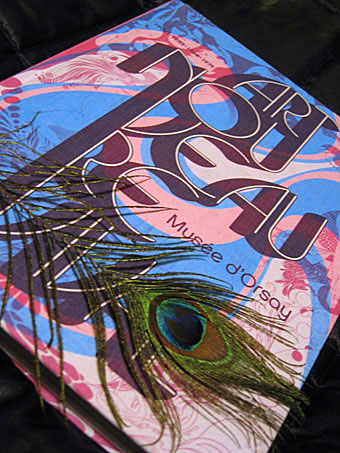
Catalogue for Art Nouveau Revival 1900 . 1933 . 1966 . 1974. Peacock feather not included.

Regular readers may recall my mention of the Musée d’Orsay exhibition Art Nouveau Revival which was launched late last year. I didn’t get to see the exhibition, unfortunately, but this week I finally ordered a copy of the catalogue, an expensive cloth-bound volume with essays (in French) by Philippe Thiébaut, Stephen Calloway, Irene de Guttry, Thierry Taittinger and Philippe Thieryre. Despite the ruinous postal charges incurred by the book’s weight this was worth every euro, it being the kind of polymorphous production which in solipsistic moments one can choose to believe was created solely for your own benefit.

nouveau3.jpg

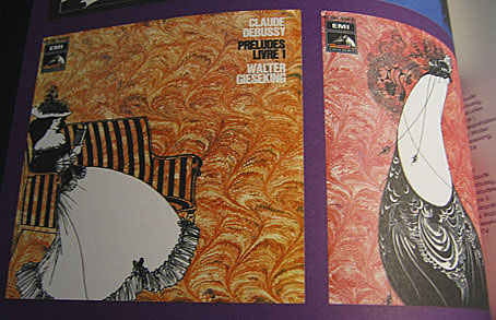
Aubrey again, album covers from 1974.

Much of the subject matter has been explored here in various small ways, with the curators following the influence of Art Nouveau through Surrealism (mainly Dalí) to the psychedelic art of the 1960s and on into the Pop Nouveau (for want of a better term) which flourished in the first half of the 1970s. Among the familiar Aubrey Beardsley graphics and psychedelic posters there are also some pleasantly surprising inclusions, including illustrations by Philippe Jullian (yes, I’m still intending on writing about him at some point), yet more Beardsley album covers, film posters, and even some of the sillier films of the late-60s such as Casino Royale. Being a French exhibition there’s a section devoted to comic strips which includes work by Moebius, Philippe Druillet and Guido Crepax.

nouveau2.jpg

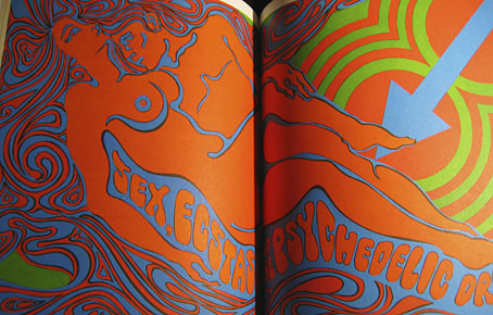
Sex and LSD, a spread from Playboy, 1967.

It’s common to see parallels drawn between the 1890s and the 1960s but the strange blooms of vulgarised fin de siècle style which burgeoned in the wake of psychedelia are seldom given much attention. One of the great things about this catalogue is the amount of ephemera the curators chose to include such as magazine ads and trend-chasing album sleeves. It was precisely this blend of 1890s + 1960s + 1970s I sought to capture in my recent cover for Dodgem Logic. As I said, it’s an expensive book but for anyone drawn to this aesthetic hothouse it’s also an essential purchase. Art Nouveau Revival can be ordered direct from the museum shop. Further samples follow.

Continue reading “The Art Nouveau dance goes on forever”

Johann Theodor de Bry’s Neiw Kunstliches Alphabet

debry.jpg

A page from Johann Theodor de Bry’s Neiw Kunstliches Alphabet (1595) which can be found in a free PDF version here, the scans being taken from a Victorian reprint. The late, lamented Giornale Nuovo featured some of these curious letter designs in 2005. Each capital is embellished with various symbolic figures—Moses appears perched on the letter M, for example—whilst also being draped with fruit, lobsters and even insects. I used a smaller redrawing of De Bry’s letter S for one of the page designs in Jeff VanderMeer’s City of Saints and Madmen in 2002. Probably not the use that De Bry intended but then I expect he’d be surprised that his work was still being used at all after four hundred years. Via BibliOdyssey.

strange.jpg

Previously on { feuilleton }
The Book of Ornamental Alphabets
Paul Franck’s calligraphy
Gramato-graphices
John Bickham’s Fables and other short poems
Letters and Lettering
Studies in Pen Art
Flourishes

Weekend links 20

wulfing.jpg

Transfiguration (1952) by Sulamith Wülfing.

• Observatory posted photos of its Lovecraft art exhibition; see if you can spot my pics. Related: Write Club has more photos. Also, A Word From Our Sponsor.

Taking the broooooaaaaad view of things: A Conversation with James Grauerholz on William S. Burroughs and Magick. Related: Beat Memories—The Photographs of Allen Ginsberg.

• Adam Curtis on BP and the Axis of Evil; how the the Anglo-Iranian Oil Company became British Petroleum and helped give Iran over to the Ayatollahs.

• The Quietus interviews Peter Christopherson (TG, Coil, etc) and Dr John.

The Strange World of Adolf Hoffmeister at A Journey Round My Skull.

An Artists’ Dialogue On CocoRosie’s Grey Oceans at Stereogum.

Werner Herzog and David Lynch combine their talents.

Jon Savage on The Residents versus The Beatles.

• BUTT magazine interviews James Bidgood.

• The Daily Drop Cap.

The Gay Rub.

Can on German TV in 1971.

New work: Two forms of darkness

darkness.jpg

Darkness: half-title page.

I’m still behind with site updates but here are two recent design jobs come to cast a shadow over the summer. Darkness is another fiction anthology from Tachyon, edited by Ellen Datlow and subtitled Two Decades of Modern Horror. Ann Monn’s cover design has a snake writhing through shadow so I carried the serpentine motif into the interior design. The book runs to 478 pages and, as the title implies, features lots of big names including Clive Barker, Joyce Carol Oates and Stephen King.

darkness2.jpg

Darkness: title spread.

dark-matter.jpg

Dark Matter, on the other hand, is a double-CD compilation of singles from Bristol’s Multiverse label which is released this month. If you need a descriptor then many of the tracks here would be classed as dubstep, and a few are doomy enough to serve as soundtracks for urban horror. Skream is one of the featured artists, and his Trapped In A Dark Bubble on Tectonic’s Plates 2 collection (which I designed last year) has a great sinister ambience.

dark-matter2.jpg

The design is very minimal with silver ink on a matt black digipak. The label requested graphics that mixed esoteric symbols with references to modern physics or astronomy without any of the allusions being too specific as to their origin or meaning. For the fonts I used the Fell types which take the design back to grimoires and old manuscripts.