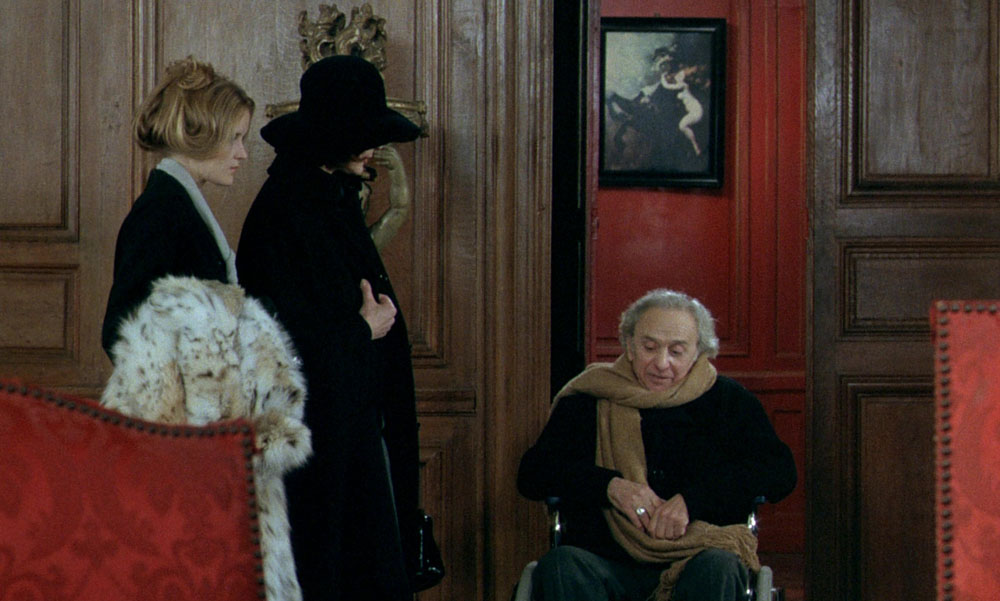
The Beast: Lisbeth Hummel, Elisabeth Kaza and Marcel Dalio.
In which Polish director Walerian Borowczyk places a little-known Symbolist painting in the background of The Beast, his strange sex film (or should that be strange-sex film?) from 1975. I’ve spent the past week or so working my way through Arrow’s box of Borowczyk films, of which The Beast is the last in the collection. It’s also the one film by the director that many people may be aware of even if they’ve never seen it, thanks to a historical reverie in which an 18th-century woman has a very graphic sexual encounter with the beast of the title, a bear-like creature with a fully-functioning phallus. This episode is framed by a somewhat farcical modern-day story set in a French chateau, with the bestiality flashback being the culmination of a parade of sexual antics that include equally graphic scenes of horse-breeding, female masturbation, and thwarted attempts by the daughter of the house to have sex with one of the servants.

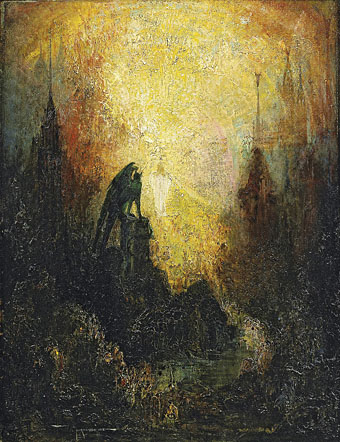
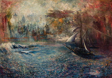
Frenzy aka Frenzy of Exultations (1893).
And this is the painting that Borowczyk shows. I said that it’s little-known but it happens to be the most visible of all the paintings by Polish artist Władysław Podkowiński (1866–1895), with a popularity in Poland that extends to reproduction on postcards and jigsaw puzzles. (That huge area of shadow must cause puzzle-solvers some headaches.) I only recognised the picture because Michael Gibson includes it in his wide-ranging study of Symbolist art, although he doesn’t have much to say about it apart from its having caused a minor scandal when it was first exhibited. This isn’t too surprising; prior to the 20th century there were few Western artworks that were so overt in their depiction of erotic delirium without tipping into outright pornography. Given this you’d expect Borowczyk to make more of the reference but he keeps the picture in the background, a reward for the small percentage of the audience who can identify the thing at a distance.
Frenzy is dramatically different to Podkowiński’s other paintings, most of which are Impressionist studies, and is further distinguished by having been attacked by its creator when the artist slashed the canvas with a knife while it was still being exhibited. Paintings and sculptures have been subject to attacks by members of the public for many years but this is the first I’ve heard of an artist attacking their own work while it was on display. The scandalous history suits the film as much as the salacious subject matter; The Beast was almost subject to an obscenity prosecution when an uncensored print was shown in London in the 1970s. For a long time it was one of those troublesome features that you’d be more likely to read about than to see.