Weekend links 425

tsuruta.jpg

Art by Ichiro Tsuruta.

• “Writing is so much about subverting dogmatisms of all kinds, above all the ones that insist you cannot go there! You must not say that! Writers need to go anywhere, to take anything on. And the only rule is to do it well.” Rikki Ducornet in a feature at Dennis Cooper’s which has been linked here before but was previously on DC’s old (now deleted) blog.

• “This book-cover trend is turning bookstores into flower shops,” says Kenzie Bryant. “How publishing’s floral-print trend came to rule the world’s bookshelves.” (Where “the world” means the USA, as usual…)

• The third edition of Wyrd Daze—”The multimedia zine of speculative fiction + extra-ordinary music, art & writing”—is out now.

For this listener, Nardis has become a full-on musical obsession. I have more than ninety official and bootleg recordings of the tune stored in the cloud, ranked in a fluid and continually updated order of preference, so they follow me wherever I go. In my travels as a writer, I use Nardis as a litmus test of musical competence: if I see a jazz band in a bar or a busker taking requests, I inevitably suggest it. (If they’ve never heard of it, I understand that they must be new at this game.) By now I’ve heard so many different interpretations, in such a far-flung variety of settings, that a Platonic ideal of the melody resides in my mind untethered to any actual performance. It’s as if Nardis were always going on somewhere, with players dropping in and out of a musical conversation beyond space and time.

Steve Silberman on the obsession that he and pianist Bill Evans share with Nardis, a Miles Davis composition that Davis himself never recorded

• Mixes of the week: Secret Thirteen Mix 263 by Jung An Tagen, and XLR8R Podcast 554 by Tutu.

• “René Magritte still has the power to surprise,” says Sophie Haigney.

• Ishmael Reed at the Brockport Writers Forum, 1st May, 1974.

• The On-U Sound label is now at Bandcamp.

• Brian Eno talks music, global politics, etc.

• Faded Flowers (1985) by Shriekback | Other Flowers (2003) by Harold Budd | White Flowers (2014) by Lutine

The Joe Phenix Detective Series

joephenix.jpg

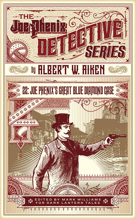
After six months of black-and-white drawing it’s been good to return to colour book covers of which this is the first of a new crop of designs. Albert W. Aiken (c.1846–1894) was a prolific American author of pulp fiction, whether writing under his own name or pseudonymously (and sometimes as a woman) for Dime Library, Banner Weekly, Saturday Journal and many other publications. Joe Phenix (also named Phoenix in later stories) was one of his more popular creations, a late-Victorian detective whose investigations ran to over 20 adventures. These tales are in the process of being made available by Mark Williams in ebook form so my task was to provide a single cover design that could function for all the titles.

In keeping with the new format, the style deployed here is mostly a pastiche of the dime novel idiom with a few contemporary touches. Many of the dime publications favoured a large box in the top third of the cover which would contain a typically florid title arrangement. The accompanying illustrations were often comparatively crude but the titles followed the style of the period with engraved drop shadows, gradients and lots of fine decoration. It’s fun to imitate this style although it can also be more time-consuming than contemporary design since everything has to be worked out one piece at a time. Several of the decorative elements on this cover are what printers used to refer to as “combination ornaments”, very small details which can be pieced together in a number of ways to form banners, borders and other motifs. Combination ornaments were a solution to the problem of working elaborate decoration into spaces of variable size and shape; instead of a pre-shaped design you’d shape the decoration to fit the space. They were also lucrative since printers charged for the use of each small element. In a digital composition such as this the joins between the pieces are invisible but in a period design you can often spot the combination pieces (especially in border designs) when the individual elements fail to line up properly. The figure with the gun, incidentally, is Mr Phenix himself, taken from the cover of Beadle’s Dime Library.

The first few Joe Phenix titles are available now at Amazon and other ebook outlets with further titles to follow.

Previously on { feuilleton }
• The man who wasn’t Tesla
• The George Dower Trilogy by KW Jeter
• Steampunk in the Tank
• More vapour trails
• Steampunk catalogued
• Steampunk: The Art of Victorian Futurism
• Steampunk Calendar
• Words and pictures
• Nathanial Krill at the Time Node
• Fiendish Schemes
• Ghosts in Gaslight, Monsters in Steam
• Steampunk Revolution
• The Bookman Histories
• Aether Cola
• Crafting steampunk illustrations
• SteamPunk Magazine
• Morlocks, airships and curious cabinets
• The Steampunk Bible
• Steampunk Reloaded
• Steampunk overloaded!
• More Steampunk and the Crawling Chaos
• Steampunk Redux
• Steampunk framed
• Steampunk Horror Shortcuts

Bibliothek des Hauses Usher

rottensteiner.jpg

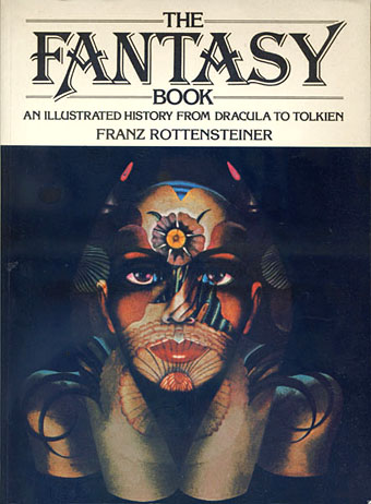
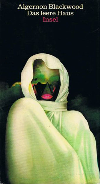
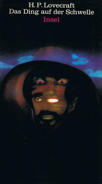
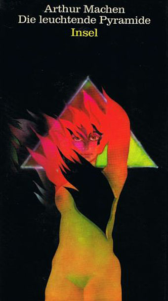
As promised a couple of weeks ago, this book-cover post is one of several that originates with Franz Rottensteiner’s horizon-expanding The Fantasy Book: The Ghostly, the Gothic, the Magical, the Unreal (1978). Rottensteiner’s study was important for me not only for its introduction to many hitherto unknown writers but also for its wide-ranging collection of illustrations and cover designs. Most of the artwork has since become very familiar but a few examples were by artists or designers I hadn’t encountered elsewhere. Hans Ulrich Osterwalder was one of these, his art for a series of German horror titles appearing inside the book and, in the case of the US edition of The Fantasy Book, on the cover. Searching for Osterwalder’s work a few weeks ago I was delighted to discover that the German covers were part of a series of horror/dark fantasy reprints for the Bibliothek des Hauses Usher imprint from Insel Verlag, for which Osterwalder created many more striking and unusual covers.

Bibliothek des Hauses Usher published 26 novels or story collections from 1969 to 1975. I thought at first that this was a paperback series but all the books were hardbacks with uniform black covers and white spines. The imprint logo is a rather ordinary looking House of Usher cracking down the middle (a nod to Arkham House, perhaps) with a slogan on the back cover borrowed from Ambrose Bierce: “Can such things be?” Each volume was printed on light green paper, at least until the paper stock ran out. The last three volumes were printed on white paper then on green again when further stocks were found.

page.jpg

Osterwalder’s work on this series stands out for being innovative, surreal and free of the cliches that persist on horror titles. Most of the artwork is illustrative of the contents but it manages this without being too overt or obvious which isn’t an easy thing to do. The list of authors is an interesting mix as well (if you overlook the typically lamentable absence of women writers): many of the names are those you’d expect in a series such as this but there are also some such as Jean Ray and Stefan Grabiński who you wouldn’t find in an Anglophone series. Grabiński was a Polish writer of weird fiction who receives a mention in Rottensteiner’s book (and is a favourite of China Miéville) but whose work is still largely unknown to Anglophone readers. Just as obscure to English readers is Thomas Owen who was a Belgian writer (real name Gérald Bertot) and a friend of Jean Ray’s. Tartarus Press published a collection of Owen’s stories in 2012 but I’ve not read it so can’t vouch for their quality.

All 26 covers are shown below in their order of publication. Hans Ulrich Osterwalder still works as an artist and designer, and has a website here. Franz Rottensteiner was interviewed at 50 Watts a few years ago.

usher01.jpg

usher02.jpg

usher03.jpg

Continue reading “Bibliothek des Hauses Usher”

Weekend links 421

wojnarowicz.jpg

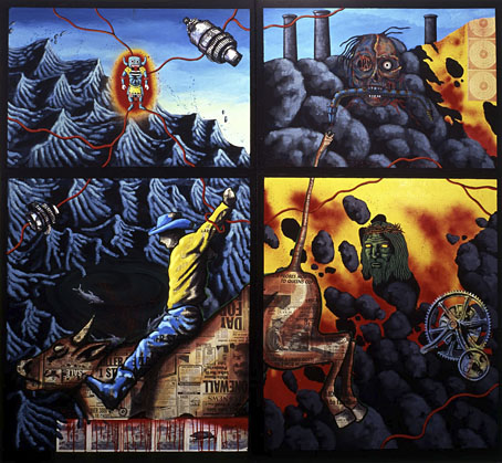
The Death of American Spirituality (1987) by David Wojnarowicz.

• Dau: “Art imitating life on an unprecedented scale”. Siddhant Adlakha on a colossal Russian feature-film project that sounds like a real-life equivalent of Synecdoche, New York. Adlakha’s piece, which claims that Dau is finished, was written a year ago but there’s still no sign of the film itself. Wikipedia has more details and links.

• Metropolis Magazine from Phantasm Press is a facsimile republication of the 32-page theatre programme produced for the UK premier of Fritz Lang’s feature film.

• Children Of The New Dawn is a preview of the score for Mandy by the late Jóhann Jóhannsson. From last year: The Drowned World (live) by Jóhann Jóhannsson.

• Grand Panorama of a Whaling Voyage ’Round the World (1848) by Benjamin Russell & Caleb Purrington is the longest painting in North America.

• “This summer, there is only one book to take to the Terminal Beach”: Applied Ballardianism: Memoir from a Parallel Universe by Simon Sellars.

• “La série des Fredi en trois volumes est une étude sincère et consciencieuse de l’inversion sexuelle.”

• “The Book was Mallarmé’s total artwork, a book to encompass all books,” says Sylvia Gorelick.

• At BLDGBLOG: Graphic Inferno, art by Rico Lebrun based on Dante’s Divine Comedy.

• Mixes of the week: XLR8R Podcast 549 by Hólmar, and FACT Mix 661 by Kelly Lee Owens.

• “Dealing with creative block? A deck of cards might help,” says Abigail Cain.

• The Instagram account archiving exquisite interiors from vintage porn.

• Polish composers report from Outer Space

• Wind From Nowhere (1994) by Uzect Plaush | Slolooblade : The Drowned World (1994) by Mo Boma | Inner Space Memorial for JG Ballard (2014) by Janek Schaefer

James Cawthorn: The Man and His Art

cawthorn-cover.jpg

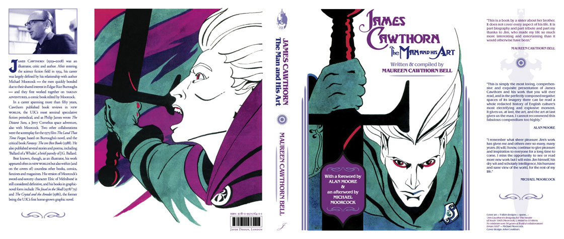
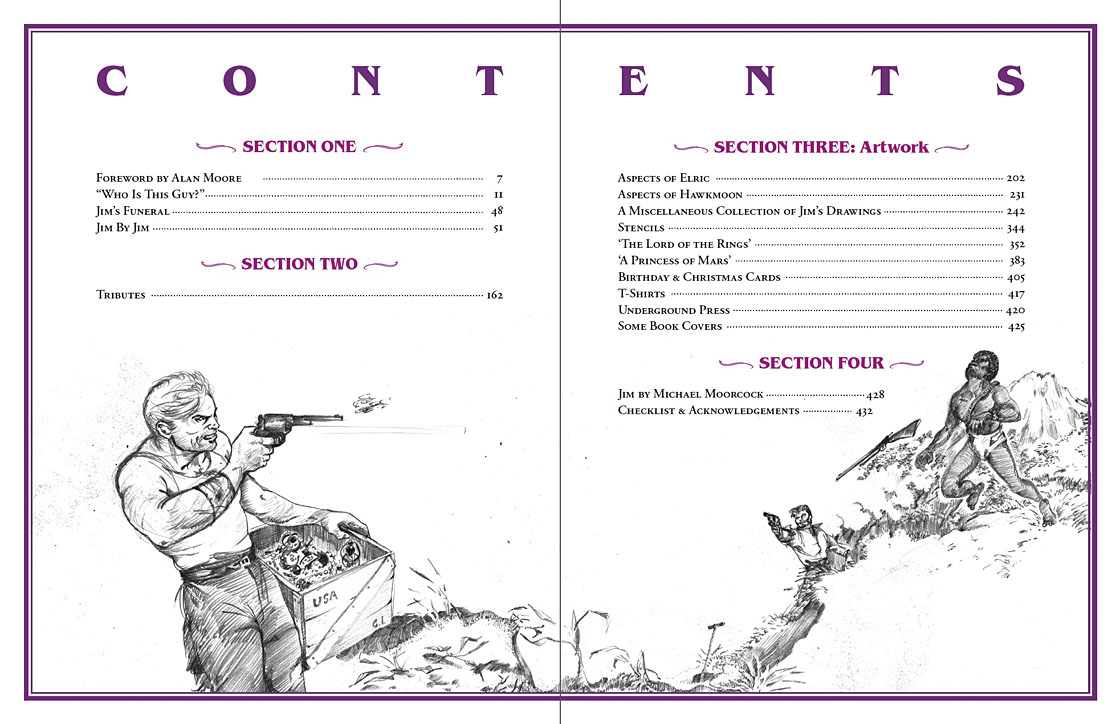
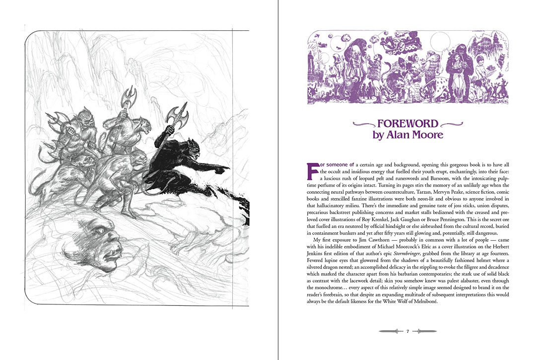
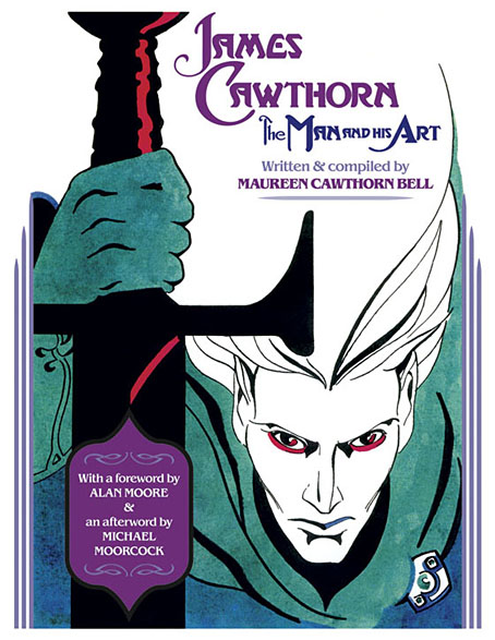
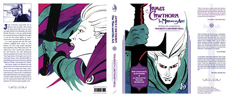
The past year would have been busier than usual with the amount of illustration work I had to deal with, but it was made even busier with my having to design this book at the same time. James Cawthorn: The Man and His Art was originally intended to be a modest memorial by Maureen Cawthorn Bell for her artist brother following his death in 2008, but the book grew into a heavyweight volume of 448 pages containing over 800 individual pieces of art: book covers, illustrations for magazines and fanzines, private pieces for friends and relatives, and many sketches or preliminary works, most of which have never seen print before.
cawthorn-coverspread.jpg

Given Jim Cawthorn’s long association with Michael Moorcock, as both friend and collaborator, the task of collating the artwork and editing the book went to Moorcock bibliographer John Davey, who also serves as the book’s publisher. John spent three years locating over 3000 pieces of artwork, large and small. Some of these pieces are now lodged with the Moorcock archives in the Bodleian Library, Oxford, while others may only be found in the pages of the many science fiction and fantasy fanzines that Jim illustrated, copies of which are stored at the British Library. From this body of material Maureen and John selected a core of representative work from Jim’s private as well as public life, although no-one at the outset of the project was expecting the final picture tally to be so high.
cawthorn-spread-01.jpg

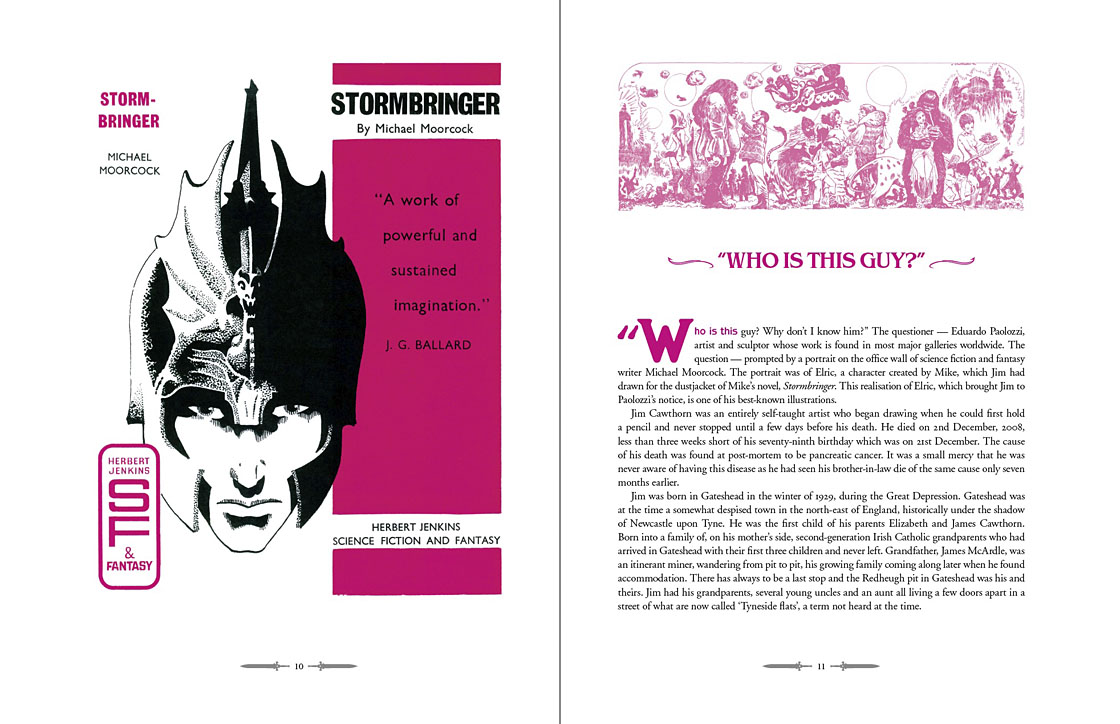
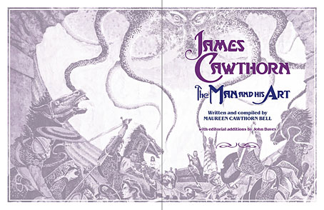
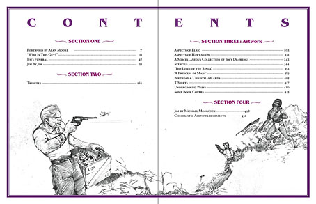
My task as the book’s designer involved making the text presentable (easy) and corralling the artwork (not so easy, and I also had to either clean or colour-adjust every single piece). Maureen had divided the book into several sections, beginning with a lengthy biographical reminiscence. Following this was “Jim by Jim”, a selection of interviews, magazine pieces, some fiction, essays and book reviews. There was also a lengthy extract from Fantasy: 100 Best Novels (1988), a book credited to Jim and Michael Moorcock but, by Moorcock’s admission, mostly Jim’s work. Jim Cawthorn was very well-read, especially in the genres—he was old enough and interested enough to have read The Lord of the Rings when it was first published—and could also present his erudition engagingly for a reader, so the text section of Maureen’s book is far from indulgent.
cawthorn-spread-02.jpg

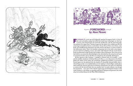
The book design isn’t as elaborate as some I’ve worked on but it didn’t need to be when the pictorial material is rich with what Moorcock calls “wizardry and wild romance”. Maureen wanted a particular picture of Moorcock’s Elric character on the cover so I took details and motifs from some of Jim’s many Elric illustrations to give the book a thematic thread and internal consistency. Cawthorn was present at the creation of Elric in the early 1960s; he not only provided Moorcock’s characters with their first illustrations but even helped plot one of the earliest stories, Kings in Darkness.

cawthorn-number.jpg

Page numbers are framed by the swords from the Elric stories.

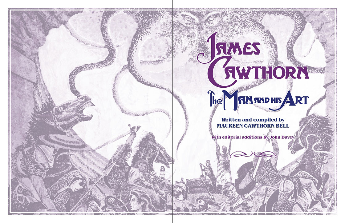
Using motifs such as the sword silhouette and Elric head is something I frequently do with book designs but for this book I also went to the trouble of creating a one-off font for the drop capitals based on Jim’s hand-drawn lettering. Jim drew titles and other lettering throughout his career, so again this was a decision warranted by the book’s contents. The few times we met I never asked him about this but I’ve always thought his lettering designs were derived from the stylised titles that J. Allen St. John created for many of the early Edgar Rice Burroughs books. Jim spent most of his life drawing Burroughs’ characters, and was very familiar with the work of Burroughs’ original illustrators. I was hoping to find a title design of Jim’s that I could rework for the book’s title but none of the examples worked as well as I hoped. For this reason the title lettering is based on different styles from the John Carter novels that were Jim’s favourites among Burroughs’ works.
cawthorn-spread-03.jpg

Other features include a foreword by Alan Moore, an afterword by Michael Moorcock, a gallery of Jim’s Lord of the Rings drawings and character sketches from the early 1960s (which predate all others bar those by Tolkien himself), artwork for Hawkwind (including Dave Brock’s “Meliadus” T-shirt), and even a handful of photos from the set of The Land that Time Forgot (1975), the ER Burroughs-derived feature film scripted by Jim with Michael Moorcock. The page samples here are necessarily few given the size of the book.
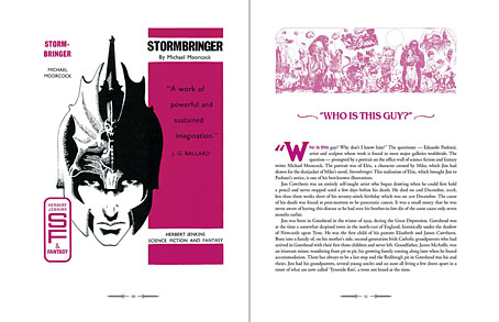
cawthorn-spread-04.jpg

For the moment James Cawthorn: The Man and His Art is available exclusively from publishers Jayde Design at a special pre-publication price of £20. After publication on 6th August the price will rise to £35. Further page samples follow.

Continue reading “James Cawthorn: The Man and His Art”