The Stormbringer Sessions by James Cawthorn

stormbringer15.jpg

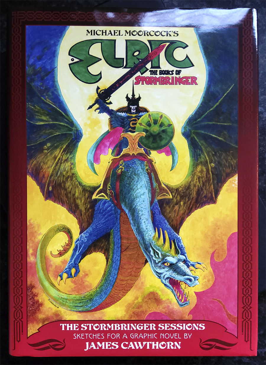
One of the books I was designing last year is published next month. The Stormbringer Sessons is a resurrection by John Davey of a sketchbook created by James Cawthorn in the mid-1980s for an Elric graphic novel that Cawthorn was commissioned to adapt and illustrate for Savoy Books. This is a limited edition that’s unlikely to be reprinted so anyone interested is advised to pre-order. (See below.)

stormbringer16.jpg

Slipcase decoration.

The original Stormbringer by Michael Moorcock isn’t a novel as such but a collection of the second series of linked novellas about Elric of Melniboné that Moorcock wrote for Science Fantasy from 1961 to 1964. Over the course of ten stories Moorcock introduced a character and a world that acted as a riposte to the Tolkienite school of heroic fantasy, where the divisions between Good and Evil are clear and fixed. Elric is like one of Sergio Leone’s characters: the difference between Clint Eastwood’s “Good” in The Good, the Bad and the Ugly and Lee Van Cleef’s “Bad” is merely a matter of degree; both men are killers chasing the same hoard of gold coins. (By coincidence, Leone was preparing to the upset the Western genre with A Fistful of Dollars just as Moorcock was finishing the first Elric stories.)

stormbringer03.jpg

James Cawthorn was one of Moorcock’s oldest friends, and a frequent collaborator. He not only illustrated the first Elric stories but also co-wrote the fourth one, Kings in Darkness. Despite having created many Elric illustrations Cawthorn always seemed to want to draw comics based on other characters, notably Moorcock’s Dorian Hawkmoon whose adventures have recently been reprinted in three volumes by Titan Books. The Stormbringer commission was a result of the late David Britton’s obsession with Elric in general and the Stormbringer book in particular. Stormbringer begins with Elric having retired from adventuring; his soul-stealing sword is locked away and he’s settled down to married life. The opening scenes parallel (and prefigure) many Hollywood plots: Elric’s wife is abducted for unknown reasons so Elric has to take up his sword and go after her. What follows is a pursuit into a world growing increasingly dark and chaotic, and with it the realisation that the events taking place are a part of a long-foretold apocalypse that will (and does) destroy that world. The progression from a regular sword & sorcery tale to doom-laden widescreen baroque, with a dragon army flying over a churning Boschian hellscape, is one of the enduring attractions of the book.

stormbringer04.jpg

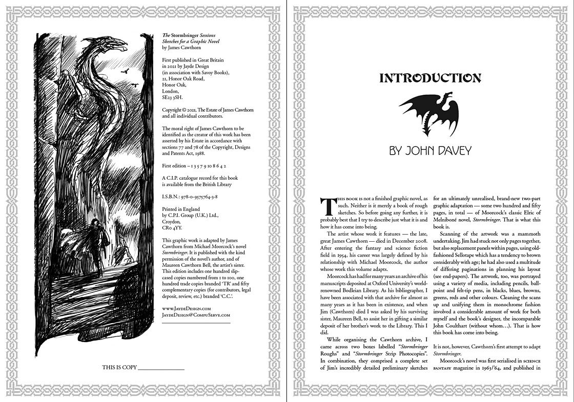
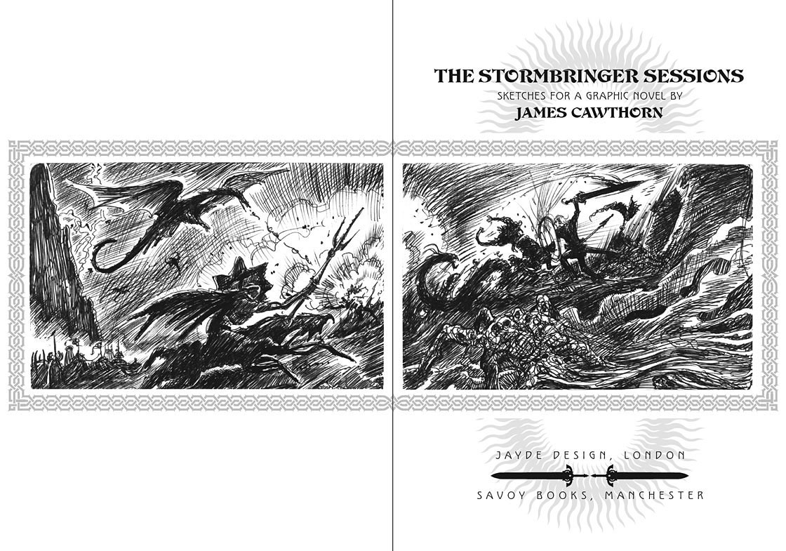
Britton had first persuaded Cawthorn to adapt Stormbringer into comic form in 1976 but the work on that occasion was compromised by lack of time. The sketches in The Stormbringer Sessions are Cawthorn’s roughs which were drawn in preparation for the second attempt, with the entire story worked out in panel form over 250 pages, complete with dialogue and captions. Some of the opening pages are rough indeed, but the drawings for the apocalyptic finale, presented in many double-page spreads, are almost finished pieces. The sketches may lack the finesse of Cawthorn’s other comics work but the power of his drawing and his imagination shines through. Nobody seems to know why he abandoned this project despite having a publisher waiting for it, but he was also adapting the third Hawkmoon book at the time, and had already spent the past decade working on the Hawkmoon trilogy.

stormbringer05.jpg

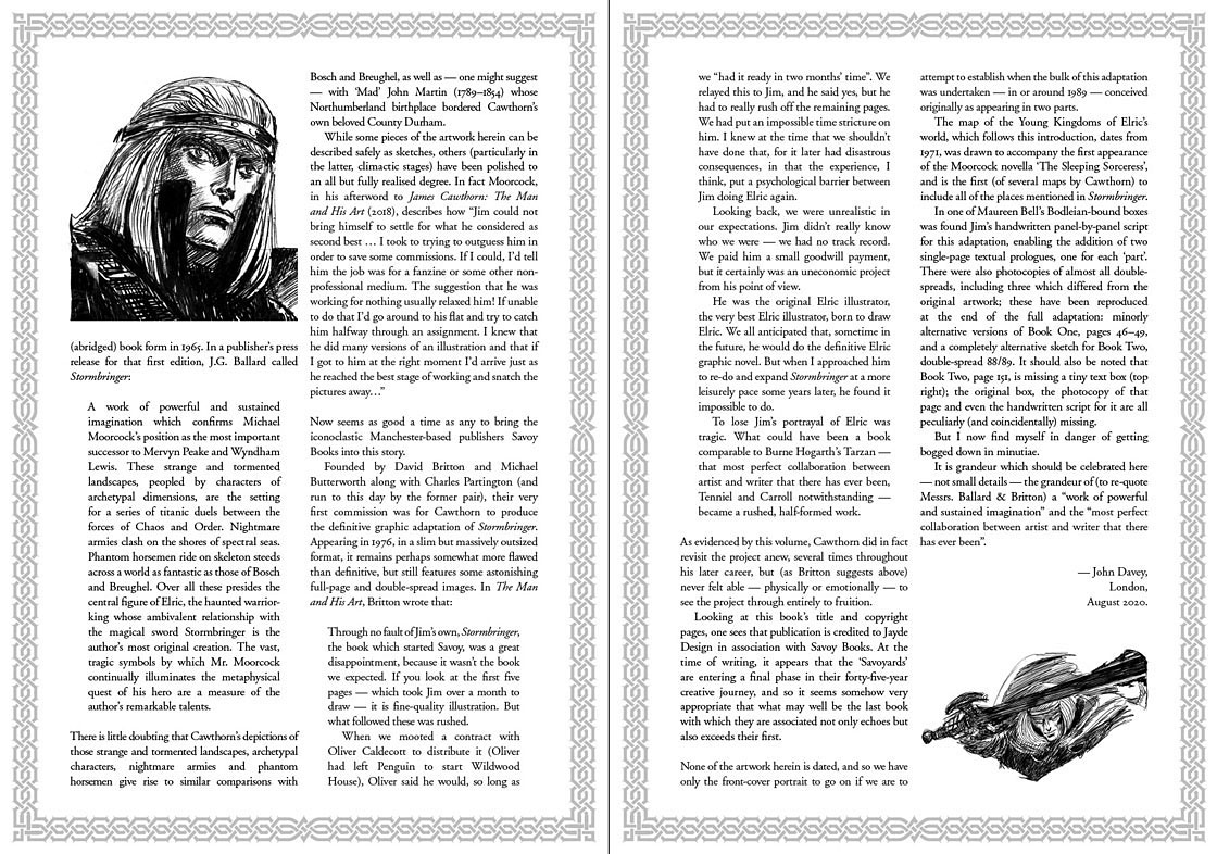
My design for this one is fairly straightforward, mostly a matter of framing and typesetting the opening and closing pages, as well as creating graphics for the cover and the slipcase. As with the Elric-themed Hawkwind album, The Chronicle of the Black Sword, I opted for Celtic-style knotwork for the decoration. Elric’s world isn’t our world but knotwork designs are universal (maybe even multiversal) while being satisfyingly antique and abstract. The publication is a co-production between Jayde Design and Savoy Books, with the book being limited to 100 numbered hardbacks in a decorated slipcase. Each copy also contains a colour print of the cover painting. The book may be ordered here. More page samples follow.

stormbringer06.jpg

Continue reading “The Stormbringer Sessions by James Cawthorn”

Weekend links 554

yokoo.jpg

Tadanori Yokoo Emphasizes Deliberate Misalignment in Contemporary Woodblock Series.

• Another week, another Paris Review essay on Leonora Carrington. This time it’s Olga Tokarczuk exploring eccentricity as feminism. At the same publication there’s more eccentricity in Lucy Scholes‘ feature about the neglected novels of Irene Handl, a woman best known for the characters she played in many British films and TV dramas. I’ve long been curious about Handl’s writing career so this was good to see.

• “The denial of our participation in the world, [Fisher] implies—the disavowal of our desire for iPhones even as we diligently think anti-capitalist thoughts—is incapacitating. It leads to a regressive utopianism that cannot envision going through capitalism, but only retreating or escaping from it, into a primitive past or fictional future.” Lola Seaton on the ghosts of Mark Fisher.

• More ghosts: Paranormal is the latest collection of spooky, atmospheric electronica from Grey Frequency, “an audio document exploring extraordinary phenomena which have challenged orthodox science, but which have also grown and evolved as part of contemporary culture and a wider folkloric landscape.”

• “Items billed as THE BEST EVER can stop us cold, and even cause us to take them for granted, never reassessing them, as we instead gesture, often without thought, to where they sit in the corner, under a halo and backdrop of blue ribbons.” Colin Fleming on Miles Davis and Kind Of Blue.

• “Diaboliques and Psycho both achieve something very rare: a perfect plot twist but an unspoilable movie,” says Milan Terlunen.

• Richard Kirk returns once more as “Cabaret Voltaire” with a new recording, Billion Dollar.

• Even more Leonora Carrington: some of the cards from her Tarot deck.

DJ Food on Zodiac Posters by Simboli Design, 1969.

Kodak Ghosts (1970) by Michael Chapman | Plight (The Spiralling Of Winter Ghosts) (1988) by David Sylvian & Holger Czukay | The Ghosts Of Animals (1995) by Paul Schütze

Le Château du Tarot

tarot1.jpg

In which Christian Dior promotes its latest collection with a 15-minute Tarot-themed film directed by Matteo Garrone. The fashion world is voracious in its search for novelty so something like this feels inevitable, especially now that the art world has decided it’s no longer embarrassed by occult themes. But designer Maria Grazia Chiuri notes that Christian Dior (the person) was obsessed with divination and prophecy, while the Tarot symbolism extends to some of the clothing itself. (Given the negative associations of The Moon card I’d be wary of making that crayfish such a prominent feature.) Chiuri also mentions reading Italo Calvino’s The Castle of Crossed Destinies in order to deepen her knowledge of the cards. The novel may have suggested the narrative of Garrone’s film in which a young woman (or her spiritual avatar) finds herself in an Orientalist palazzo populated with characters from the Tarot trumps. It’s a dreamy production that’s several worlds away from the murderous Neopolitan gangsters of Garrone’s Gomorrah. Watch it here.

tarot2.jpg

Previously on { feuilleton }
The Egyptian Tarot
The Kosmische Tarot
Alas Vegas Tarot cards
Palladini’s Aquarian Tarot
Le Tarot de Philippe Lemaire
Tarotism and Fergus Hall
Giger’s Tarot
The Major Arcana by Jak Flash
The art of Pamela Colman Smith, 1878–1951
The Major Arcana

Figures of Mortality: Lawrence versus Dalí

lawrence1.jpg

Famous Fantastic Mysteries (August, 1946).

Salvador Dalí and Philippe Halsman popularised the image of a human skull created by an arrangement of bodies in Halsman’s 1951 photo-portrait of the artist, In Voluptas Mors. The assemblage, which was based on a sketch by Dalí, has been imitated by photographers and poster designers but I’ve yet to see any mention of this painted precursor by illustrator Lawrence Sterne Stevens (or “Lawrence” as he was always credited) for Famous Fantastic Mysteries in August, 1946. I’d assume the similarity is a coincidence. The subliminal skull in painting and drawing goes back at least as far as the 1890s (see this post), while Dalí was always very adept at finding and creating visual rhymes. Variations on the skull-from-figures motif appear in paintings throughout his career, one of the earliest being a minor work, Dancer – Skull, from the 1930s. Another painting, a commission for a wartime poster warning US soldiers about the hazards of venereal disease, features a pair of women, and predates Lawrence’s cover by four years.

skull_dali_halsman.jpg

In Voluptas Mors (1951).

Lawrence deserves credit, however, for having created a more successful arrangement of bodies than Halsman and Dalí managed, although it’s easier to do this in a painting than it is to arrange a group of women in a studio. Some of the limbs of Lawrence’s figures are extended or foreshortened, while the contrast between light and shade has been reduced to aid the composition. Lawrence painted a further variation on the subliminal skull in a cover for Famous Fantastic Mysteries the year after the Dalí/Halsman portrait, while Dalí himself returned to the theme with Skull of Zurbarán in 1956.

lawrence2.jpg

Famous Fantastic Mysteries (June, 1952).

Previously on { feuilleton }
Être Dieu: Dalí versus Wakhévitch
Chance encounters on the dissecting table
Salvador Dalí’s Maze
Dalí in New York
Dalí’s discography
Soft Self-Portrait of Salvador Dalí
Mongolian impressions
Hello Dali!
Dirty Dalí
The skull beneath the skin
Impressions de la Haute Mongolie revisited

Patricia Highsmith book covers

ph1.jpg

Penguin, 1980; photo by David Thorpe.

A post for Patricia Highsmith, born 100 years ago today. Filling the cover of one of Highsmith’s books with a photograph of a snail may seem like a bizarre or even perverse decision but Eleven is a collection of short stories, two of which concern the author’s beloved gastropods. The snails in The Snail-Watcher and The Quest for ‘Blank Claveringi’ aren’t so lovable, however, and both stories make frequent appearances in horror collections. The Quest for ‘Blank Claveringi’ was even the lead story in The 6th Fontana Book of Great Horror Stories, prompting another snail cover.

ph4.jpg

left: First UK edition, Cresset Press, 1957; no artist credited. Right: Pan, 1960; cover art by David Tayler.

Highsmith’s enduring popularity means that most of her books have remained in print since their initial publication so there are many covers to look at. They’re a very mixed bag, as is often the case with thrillers where two design approaches predominate: symbolism that can either be vague or suggestive, or some kind of illustration which always runs the risk of spoiling the story. Nick Jones’ Existential Ennui blog contains a number of posts about Highsmith’s books, including this one which shows off his collection of first editions. I was surprised to see the bland cover for the original UK publication of The Talented Mr Ripley, an illustration that would suit any number of stories set on the Mediterranean coastline, and which gives no indication of the tangled web of deceit and murder inside the book. Perhaps this is a good thing but it feels like a missed opportunity. Another of Jones’ posts concerns Highsmith paperbacks, and here we see the spoilerish approach with the same novel featuring a painting that shows Ripley pushing Dickie Greenleaf’s body into the sea. This was common form for thriller paperbacks at the time: “Yes, there’s murder in this one!” My 1966 Pan paperback of Deep Water features a similar scene of body disposal (which rather spoiled the story while I was reading it) but it also has the following photo of the author on the back, looking as though she’s wondering how to dispose of your body when the time comes.

ph2.jpg

Pan, 1966; photo by Jerry Bauer. Also another book that features snails.

More recent Highsmith covers have tended towards the vague and symbolic, as seen in this blog post by Caustic Cover Critic. I’ve got several of those editions with the sketchy Vintage covers which I don’t like very much, most of them could too easily be applied to another book entirely. The same could be said for the Norton collection of the Ripley novels (below) which go the ultra-minimal route and reduce the contents of each book to a single motif. Individually these motifs might be used elsewhere but taken as a set they become unique. Choosing a high-heeled shoe for The Boy Who Followed Ripley is both funny and fitting but I won’t spoil the story by saying why.

ph3.jpg

Design by Chin-Yee Li.

A handful of Highsmith links:
Mavis Nicholson interviews Patricia Highsmith for Good Afternoon in 1978. From those far-off days when British television didn’t regard intelligent discussion as audience poison.
• “The interview was full of drama, as I suspected it might be.” Naim Attalah’s interview from 1993.
10 Best Patricia Highsmith Books as chosen by the author’s biographer, Joan Schenkar.
Patricia Highsmith’s Confessions and Rebellions at Yaddo by Richard Bradford.
The Patricia Highsmith Recommendation Engine.
Patricia Highsmith on Desert Island Discs, 1979.

Elsewhere on { feuilleton }
The book covers archive