
Ilya Chasnik
A journal by artist and designer John Coulthart.

Design
Cyberpunk pioneer has designs on a better world
The author of seminal science-fiction works is taking a very pragmatic approach to the world’s environmental challenges
Interview by Anthony Alexander
Thursday June 1, 2006, The Guardian
Technology Guardian: How did you get into environmentalism and climate change?
Bruce Sterling: Science-fiction writers are not effective activists. But if I’m aware of some trend as a futurist and a trend-spotter, and if it actually shows up on my doorstep as an immediate crisis, then I will try to do something pragmatic. Science-fiction writers are best as fantasists. But if there is mayhem on your doorstep, it’s morally obligatory to take some action.
TG: So, what did you decide to do?
BS: To go public with my unease about climate change, to attack it as a design problem, from an industrial and engineering standpoint. I announced I was starting an internet mailing list, because the internet is the only global tech phenomenon of the global scope of climate change. My key insight there was that one huge phenomenon could be harnessed to attack the other.
I still run my list, but I soon got sucked into the world of design. I recently wrote a little book for MIT Press, which is an academic precis on the problem, a little manifesto. One thing led to another. Now there’s a raft of top-end, designery green retail outfits – treehugger.com, worldchanging.com – there are meetings of designer groups, and so on. That’s what I was hoping to provoke. I wasn’t the only one doing this, but I was one of the first to say: “Yeah, this can be done.” We could have a new kind of designer green, cyber-green, or as my colleague Alex Steffen puts it, “bright green”.
TG: You called your email list Viridian, a very bright cyber-green. It’s also a website, www.viridiandesign.org.
BS: It’s something between a diary, a squabble, an archive and a manifesto. I’m one guy. This is my hobby. But a likely, plausible step is a designer-green non-governmental organisation, with a board of directors and revenue, a magazine maybe. Big players are entering the green design space. Fighting the greenhouse effect is going to be a universal effort. Everyone will have to do it pretty much all the time.
TG: In your book Shaping Things, you describe climate change as the result of technology pioneers like Edison and Ford. Yet you say the only solution is to press forward with technology and shift to a new type of society.
BS: Not many science-fiction writers write industrial design manifestoes, but I was commissioned by Peter Lunenfeld of Arts Centre College of Design in California, where I was visionary in residence. Why do you want a sci-fi writer in a design school? You want someone who’ll think outside the box. The book talks about a new tech phenomenon with six or seven terms attached: the Internet of Things, Ubiquitous Computation, Everyware, Ambient Findability, Spimes (my term).
My own theory, which has gone into Shaping Things, is the key element is the identity for objects. It’s putting tags on things that allow them to interact with digital networks. That is the key concept around which other things accrue. My goal in this is sustainability. I want us to invent a better way to put our toys away. We are emitting too much junk. Google is good at sorting garbage. We could do something similar if we tagged our garbage, basically, everything we make.
Ideally, we need to tag an object before it exists. We need to tag the blueprints and then the manufactured object. Then, when it’s junk, we need to read it, know where it goes, have it ripped apart and recycled.
TG: Where does the concept of Spimes come from?
BS: Spimes was one of those spontaneous neologisms I came up with at a conference, a contraction of “space” and “time.” The idea is you no longer look at an object as an artefact, but as a process. A modern bottle of wine in one sense does exactly the same as the clay jug and stopper that the ancient Greeks used. On the other hand, it is now mass produced industrial glass, with a machine-applied label containing a barcode and a host of other information, even an associated web page. These invite you to do more than just drink the wine. These innovations link this product into a wider relationship.
Yet the moment the bottle is empty, we make a subtle semantic reclassification and designate it “trash”. The logistics of manufacture and distribution will already have tracked the bottle from factory, to warehouse, to store. But the relationship is not a closed loop. The moment you buy the wine, it’s your responsibility. The onus is on you to recycle it, or it’ll spend eternity in landfill. We really should be thinking about the trajectory all this stuff follows. We are in trouble as a culture because we don’t have a strong idea of where we are in time, and what we might need to do to deserve a future.
Amazon.com, for instance, allows you to study lots of information about physical products (books) without needing to consider the physical artefact itself. Or bookcrossing.com, a site where you can track physical books from reader to reader. Wheresgeorge.com does the same with dollar bills. Spimes are both the physical object and the metadata related to that object. Then, as with Amazon’s reviews, we can start adding correspondence on the nature of objects, creating a forum to discuss all our stuff and what to do with it.
TG: So how do RFID (radio frequency identification) chips relate to this?
BS: To study spimes we need to be able to track them. RFID chips are the next evolutionary step from bar codes. They allow objects to have an identity that can be easily read. They were invented by the Pentagon’s shipping, tracking and logistics agency, and Wal-Mart, the world’s largest retailer, inspired by some work at MIT. Unlike the barcode, which needs to be scanned up-close, you can just ping a whole warehouse, or delivery truck or cargo container, and an RFID scanner will simultaneously detect and log everything in there. You also see them in swipe cards. These tags make it extremely easy to assign identities to objects and connect them to databases.
TG: Opponents of RFID see it as malign and unwanted technology.
BS: The opposition should thoroughly understand the scope of RFID technology, otherwise they’ll be baling seawater with a fork. RFID is for grocery clerks. It’s not as mysterious or arcane a technology as space shuttles, nuclear triggers or Echelon.
Bruce Sterling’s book Shaping Things is published by MIT Press.

I’ve had the late RT Gault’s extraordinary web achive linked on my main site for years but thought it was worth giving it another plug here. The title of his site, The Absolute Elsewhere, comes from the equally extraordinary Pauwels and Bergier book, The Morning of the Magicians, a unique concoction of fact, fiction and speculation that runs through alchemy, potential developments in human evolution, Forteana, Arthur Machen and Nazi mysticism, among a host of topics. This was the book that launched a thousand lesser crank volumes in the 1970s and also had a surreptitious influence on works as diverse as Shea and Wilson’s Illuminatus! trilogy and David Bowie’s Hunky Dory album.
Gault described his site thus:
This is a bibliography of visionary, occult, new age, fringe science, strange and even crackpot works published between 1945 and 1988. Added to the mix are some other works which may relate to them, or at least give a sense of the spirit of the times. The main emphasis is upon works produced between 1960 and 1980, as the subtitle suggests.
and it’s his wonderful collection of paperback covers that’s the chief delight here. One can wish for the scans to be slightly higher quality and for the collection to be more extensive but what’s there is well worth a look, if only to see how lurid paperback styles evolve over the course of a couple of decades.
The web is an increasingly valuable repository for people with collections like this. Some of Mr Gault’s other pages seem to have gone offline but his Arthur Machen pages are still there with a nice gallery of rare editions. Other favourite archive sites would include the Violet Books galleries, the Vintage Paperbacks site, and the hilariously silly Gay on the Range, which I’ve mentioned before.
Update: Following Gault’s death the site has been deleted so I’ve updated the links to the Wayback Machine’s archive. There’s also a mirror of the site here.
Elsewhere on { feuilleton }
• The book covers archive

Seven Songs by 23 Skidoo, FM 2008, 1982.
Since I made a post earlier about bad album design, it’s only right to redress the balance somewhat. Neville Brody has long been a favourite designer and something of an influence since it was looking at his work during the 1980s that made me think seriously about design when I’d previously had little interest in the field.
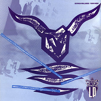
Pow-wow by Stephen Mallinder, FM 2010, 1982.
The record sleeves Brody produced for Fetish Records from 1980–82 are great examples of post punk style that showcase his particularly individual approach to design. This involved much use of hand-crafted elements, whether painted, printed, cast or carved. (In the days before computer design everything had to be pasted together from paper cut-outs, film overlays or PMT [photo-mechanical transfer] prints, with type provided by a professional typesetter.) Some of the Fetish sleeves used three-dimensional work that was then photographed, such as the wooden carvings or plaster hands on the 23 Skidoo sleeves. This approach might have provided a new direction for other sleeve designers but was quickly passed over as the decade progressed in favour of a weak pastiching of Modernist styles and the cultivation of a slick corporatism, much of it watered-down from Brody’s highly influential innovations for The Face magazine.

8 Eyed Spy by 8 Eyed Spy, FR 2003, 1981.
Brody has said of the Fetish period:
The musicians on Fetish were also totally open to the idea of me working under my own steam; there has been such a shift in this respect—most groups now take a much bigger hand in design which does not necessarily make for a better cover.
The Graphic Language of Neville Brody, 1988.
The situation is just as bad, if not worse, today. The open-ended nature of digital art has created a situation whereby a given design can be subject to endless revision merely because the client knows that the technology allows changes to be made.
Brody continues to work as a designer even though he’s less visible now, heading his own Research Studios.

Diddy Wah Diddy by 8 Eyed Spy, FE 19, 1980.

Wipe Out by Z’ev, FE 13, 1982.
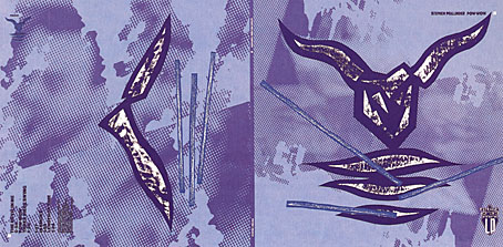
Pow-wow by Stephen Mallinder, FM 2010, 1982.
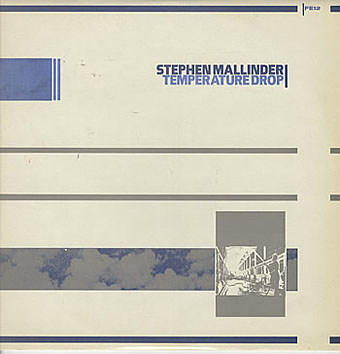
Temperature Drop by Stephen Mallinder, FE 12, 1981.

Five Albums by Throbbing Gristle, FUX 001, 1981.

Things That Go Boom In The Night by Bush Tetras, FET 007, 1981.

Thirst by Clock DVA, FR2002, 1981.
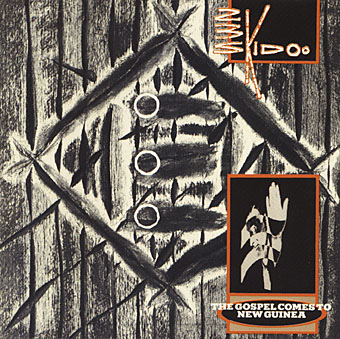
The Gospel Comes To New Guinea by 23 Skidoo, FE 11, 1981.
(This is actually the cover of a CD compilation which somehow gained
three circles that weren’t on the original sleeve.)

Zebra Club by The Bongos, FE 17, 1982.

Mambo Sun by The Bongos, FE 18, 1982.

The Last Testament, Various Artists, FR 2011, 1983.
Update: added a couple more sleeves (Bush Tetras and Clock DVA). Since there’s little information about the record company available, I’ve also added Jon Savage’s sleeve note from The Last Testament (1983), the final Fetish release and a compilation which acted as a celebration and epitaph for the label.
I’D IMAGINE IT TO BE SYMPTOMATIC that the word Fetish should have changed in the middle to late 70s, from being a slogan on an obscure Mail Art T Shirt to becoming the tradename of an internationally renowned record label—Maida Vale’s own ‘Home of the Hits’—but that’s showbiz.
AS WAS PRACTISED FOR A BRIEF TIME: Fetish now appears a product of a particular period when the separate streams of pop and avant-garde—the difference being in self-estimation as much as anything else—were thought expedient, cool and all those things, to crossover. In practice, this tended to mean press coverage disproportionate to sales, plenty of amusing attitudes struck, and streams of ill-advised people like myself being persuaded to view such artistes as are on offer here in dark and dingy basements. These last would always give the lie to pop’s brave new world pretensions.
IN THIS PULSATING SCENE, Fetish represented an opportune, if haphazard, meeting of New York, Sheffield, and Hackney. All of these spots have been glamourised to a greater or lesser degree, so you would have thought that this brand name was onto a winner. It is, however, an undoubted sign of human perversity that Fetish’s greatest success was to occur at the point when mogul Rod Pearce was shutting up shop: in early 1982, 23 Skidoo’s ‘Seven Songs’, produced by noted noisemakers Genesis P-Orridge and Peter Christopherson, became NUMBER 1 in the indie charts. Phew! Luckily, insufficient interest combined with too much time spent promoting the Bongos meant that this incredible success was nipped in the bud: disheartened at rock ‘n’ roll’s indifference, Pearcey announced that Fetish was to cease operating. People in polytechnics wept.
MAY I NOW IMAGINE YOU holding what I hope will be a beautifully designed sleeve (although you never can tell) and wondering why you should part with the money? (And, as they used to say, if you’re not going to, please don’t leave fingermarks all over Neville Brody’s labour of love). Apart from all the usual ‘unreleased’ and ‘live tracks’ sales points, you will own 12 tracks from a brief, hothouse period, a temporary delay in the long slide from the Sex Pistols to ABC. You will find preoccupations of the times faithfully represented: the full flowering of ‘industrial’, mature works from your favourite New York noisemakers, and the first UK meshing of punk and funk
1980! 1981! THOSE WERE THE DAYS! Those heady days of idealism are over. The fragile dividing line between art and commerce which Fetish represented has now shattered: Rod Pearce and Perry Haines are now prostituting themselves with King, Genesis P-Orridge and Peter Christopherson with Psychic TV, Adi Newton with DVA, and Neville Brody with the Face. I too, am deeply implicated, having sold my soul similarly to PTV and the Face. How worlds change! Isn’t life tough?
JON SAVAGE
Elsewhere on { feuilleton }
• The album covers archive

The world is over-stuffed with bad design, from food packaging to tv graphics and awful websites, but it’s fun to be reminded now and then just how bad things can get when all aesthetic considerations are thrown to the winds. The Museum of Bad Album Covers features some of the choicest examples from the music world, such as the sleeve above for Marty Feldman-eyed Heino, a classic of Easy Listening kitsch (Cooper Black is a favourite typeface for this kind of thing). Heino’s records don’t look that terrible compared to other German albums of the 70s which often managed to combine outrageous bad taste with abysmal graphics and illustration. God only knows what sounds Foster Edwards and his band of bewigged elephants produced. Next time someone tells you that you can get any album on CD, ask them about Foster and his jumbos.

The Museum site threatens to bring us a complementary Museum of Bad Single Covers soon. If you’re still not sated in the meantime, Dana Countryman’s Virtual Museum of Unusual Cover Art has further examples of graphic strangeness from the vanished vinyl wastelands.
Elsewhere on { feuilleton }
• The album covers archive