Splendid Suns

suns.jpg

I answered a few interview questions recently for Shunga Gallery, a site concerned with the erotic side of Japanese prints, and with contemporary practitioners who work in a similar areas. (All NSFW, needless to say.) I’m not really an erotic artist but Marijn has selected a few examples of my artwork that contain prominent erections, going back to the badly-proportioned drawing of the Great God Pan that I did in 1986 for my late friend, Ed, when he was part of a Dutch music & performance group, Abrahadabra. The drawing appeared in the zine of the same name, and later provoked mild disapproval from the organisers of a video festival in Den Haag where Ed and friends were using it as a flyer to promote their activities. Also at Shunga Gallery are a few pages from the rebarbative Reverbstorm, a book that’s the darkest and nastiest thing I’ll ever do. Some of that artwork provoked a rather more serious form of disapproval, as I explain in the interview.

Continue reading “Splendid Suns”

Through The Gates Of Yesterday

broadcast1.jpg

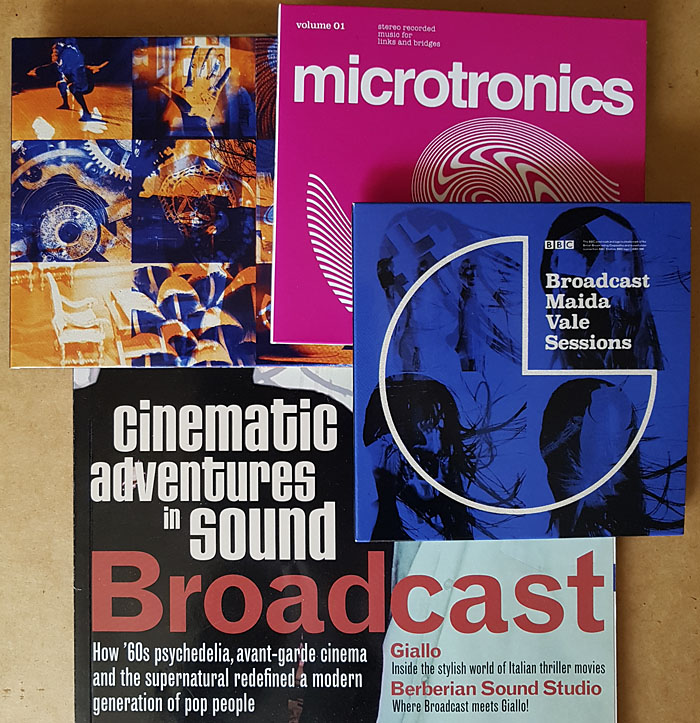
Here at last, the two Broadcast reissues and the album of officially released radio sessions. I already had much of the music so these purchases are mostly for reasons of cult completism and the Julian House cover designs. Mr House had already designed the rest of the Broadcast discography, as well as collaborating with them in his Focus Group guise, so this continuity was essential.

broadcast2.jpg

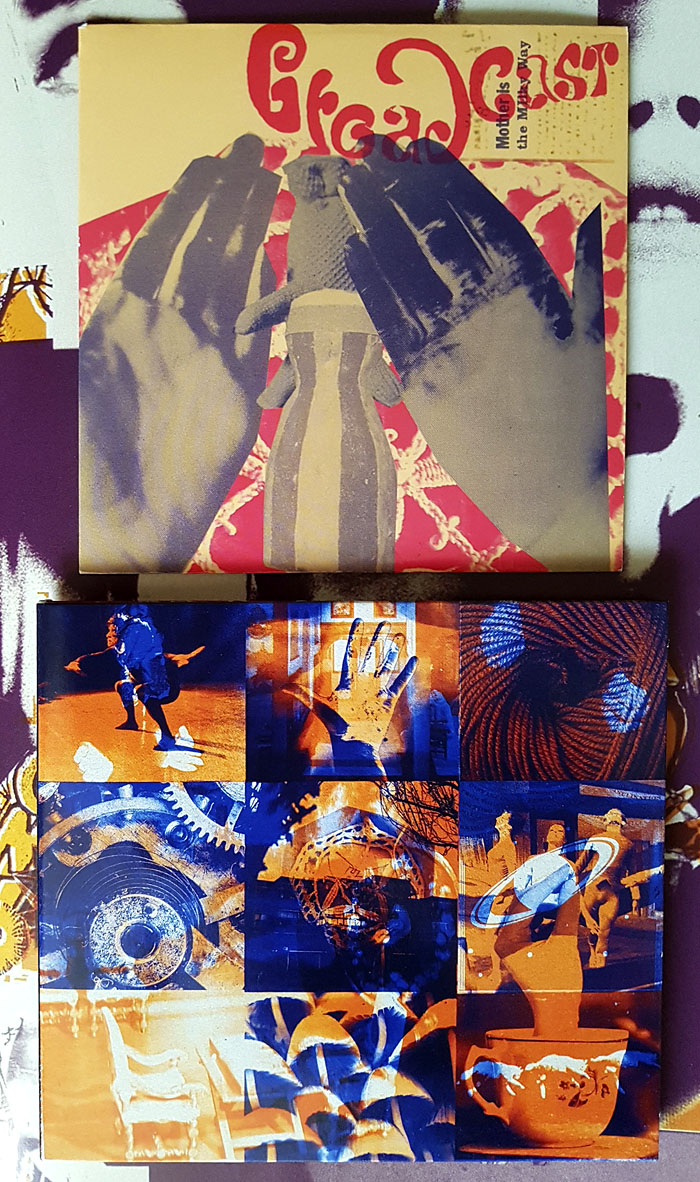
Also essential, music-wise, is the Mother Is The Milky Way EP even though it’s only 20 minutes long. This was originally limited to 750 copies sold during the 2009 tour so it’s always been hard to find. Musically, it’s of a piece with the Witch Cults Of The Radio Age album, and just as beguiling, a dreamy mélange of song fragments and sound samples—Kurt Schwitters’ Ursonate colliding with Jonathan Miller’s Alice in Wonderland—that’s more genuinely “psychedelic” than many attempts to conjure these qualities by mimicing old musical styles. The overlaid images on the cover may be alluding to the layered sounds…and are those magic mushrooms in one of the squares? Answers on a lysergic sugarcube.

broadcast3.jpg

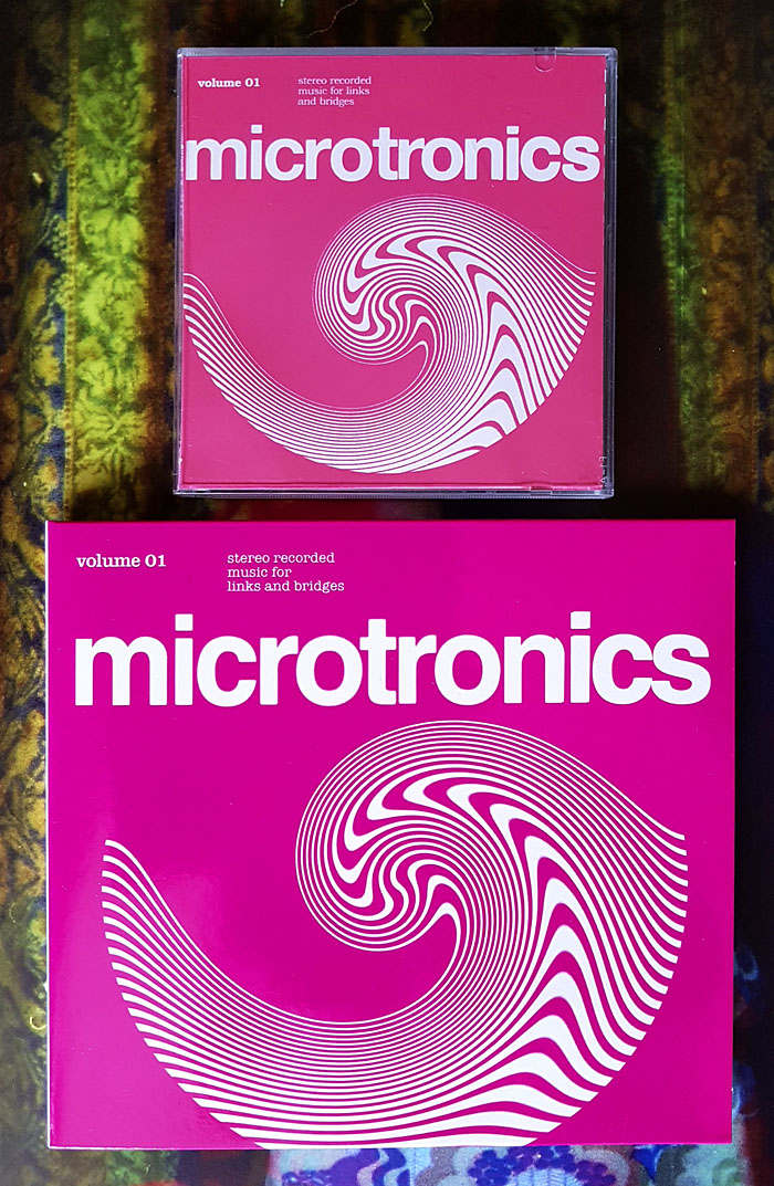
The two Microtronics EPs were intended to be functional works rather than entertainments, “Music for links and bridges”, although I don’t know if they’ve ever been used as such outside Broadcast mixes. These were also sold on separate tours as mini CDs but they now come packaged together, including a first-time release on vinyl which will keep the fetishists happy despite the format seeming like overkill for a collection of 21 very short squawks and drum loops.

broadcast4.jpg

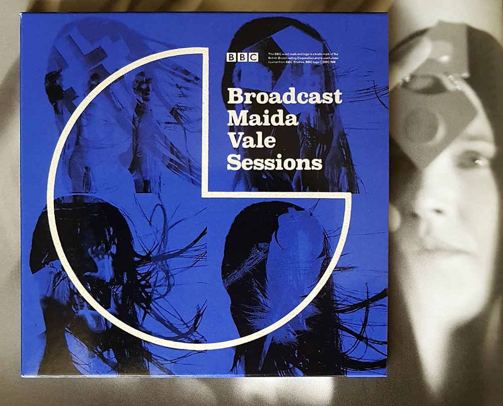
Maida Vale Sessions will also be essential for some listeners, comprising the group’s three sessions for John Peel’s show (1996, 2000, 2003) plus one from 1997 for Steve Lamacq’s Evening Session, 54 minutes in total. Being a collector of Broadcast bootlegs I already had most of these but they sound so much better coming from the original recordings. The final session, which I hadn’t heard before, is a fantastic set, and includes one of their few covers, a version of Sixty Forty by Nico. John Peel was an enthusiast, unsurprisingly, who may be heard on a bootleg of a Birmingham concert introducing the group as “one of the nation’s great bands”.

And if any of the above has stimulated your interest, Warp Records wisely commissioned The Gaslamp Killer to create an hour-long mix from the new records which may be heard here.

Previously on { feuilleton }
• Esoterica 49
• Peter Strickland’s Stone Tape
• Valerie and Her Week of Wonders
• The Ghost Box Study Series

Covering Ishiguro

ishiguro1.jpg

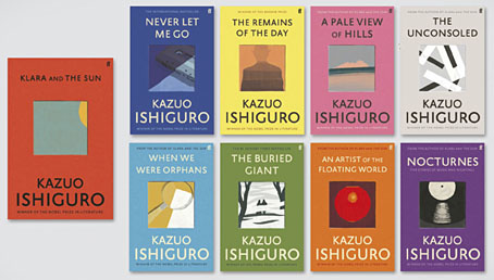
I like seeing an author’s works designed as a set, and so do the bigger publishers for whom redesigns are a useful way to freshen their back catalogue. This month the Faber edition of Klara and the Sun by Kazuo Ishiguro provides the template for a redesign of the author’s previous works, with new editions of the seven other novels plus a story collection, Nocturnes. I’ve not read any of these books so I’ll leave it to Ishiguro’s readers to gauge the suitability of the minimal illustrations, although the one for Nocturnes is the kind of visual pun that designers today often search for. The image is explained by the book’s subtitle, “Five Stories of Music and Nightfall”. I’d have been tempted to go the George Hardie route with the illustrations, flattening the colours, adding outlines, and placing that cassette and shadow at forty-five-degree angles. But Hardie’s bold isometrics might seem a little too cartoony for Ishiguro. Faber designer Pete Adlington recounts the thinking behind his covers here.

ishiguro2.jpg

ishiguro3.jpg

ishiguro4.jpg

ishiguro5.jpg

Continue reading “Covering Ishiguro”

Clichés & Gravures

cliche01.jpg

The clichés we have here aren’t the verbal variety but those which the OED defines as:

1. The French name for a stereotype block; a cast or ‘dab’; applied esp. to a metal stereotype of a wood-engraving used to print from. Originally, a cast obtained by letting a matrix fall face downward upon a surface of molten metal on the point of cooling, called in English type-foundries ‘dabbing’.

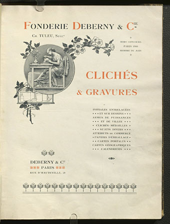
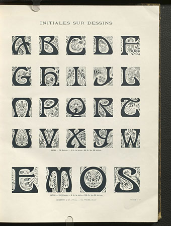
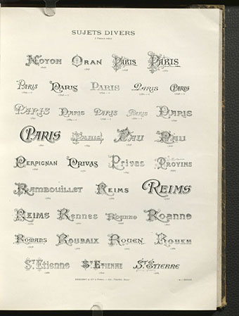
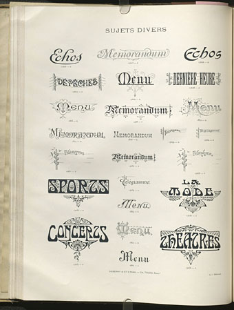
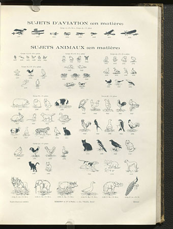
Clichés & Gravures is a two-volume collection (Volume 1 and Volume 2) of emblems, icons, small illustrations, initials, headings, frames and other print details published by the Deberny type foundry in 1912. Carol Belanger Grafton’s 3,800 Early Advertising Cuts is an edited selection of the same images which Dover Publications added to their Pictorial Archive series in 1991. I’ve been borrowing from Ms. Grafton’s book for many years, during which time I’ve wondered what might have been omitted from her selection. Once again the Internet Archive turns up the goods. The Dover reprint gives no indication that Deberny’s collection ran to two volumes and included colour printing in the second volume, plus a few pages of type designs; the Art Nouveau-styled design shown below is one that I can find immediate use for. If all of this somehow wasn’t enough, there are yet more clichés et gravures (and a lot more typefaces) in this type catalogue which Deberny published a few years later.

cliche02.jpg

cliche03.jpg

cliche04.jpg

cliche05.jpg

Continue reading “Clichés & Gravures”

Weekend links 611

ltpf.jpg

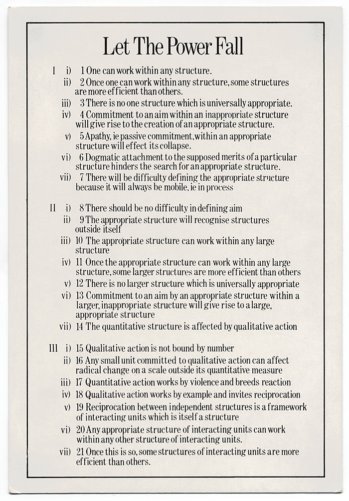
Let The Power Fall (1981) by Robert Fripp. A postcard included with the original vinyl release of the Let The Power Fall album.

• Exposures 1977–1983 is the title of another wallet-busting CD/DVD/blu-ray box which will be released by DGM at the end of May. Unlike the previous King Crimson sets this one will be devoted to Robert Fripp’s first run of solo releases, covering the albums that emerged from the artistic campaign he described at the time as “The Drive to 1981”: Exposure (1979), God Save The Queen/Under Heavy Manners (1980), The League Of Gentlemen (1981), and Let The Power Fall (1981). If you’re as interested as I am in this period of Fripp’s career then this is all very exciting. Exposure has been reissued several times over the years, and exists in three different “editions” featuring alternate mixes and song variations, but the other albums have been unavailable in any form for decades, possibly as a result of the turmoil caused by the mismanagement and eventual collapse of the EG label. In addition to the reissues the box will include live recordings, a League Of Gentlemen Peel session plus a substantial quantity of Frippertronics material, including the loops that were recorded for Eno & Byrne’s My Life In The Bush Of Ghosts. Fripp retained a credit for his contribution to Regiment but the results are so far down in the mix that they’re easy to miss. Related: The Drive to 1981: Robert Fripp’s Art-Rock Classic Exposure.

• Galerie Georges-Philippe & Nathalie Valloisin, Paris, is currently creeping out visitors to Strange Aeons—We will meet you there, an exhibition by Peybak (Peyman Barabadi and Babak Alebrahim Dehkordi) that borrows its title from HP Lovecraft and includes a number of creatures, “neither embryos nor chimeras”, which may be found prostrate and breathing on the gallery floor.

• New music: Sub Zero, in which Kevin Richard Martin returns to the subterranean/subaqueous/subarctic zones he charted on his Isolationism and Driftworks compilations in the 1990s; plus The Carrier by Large Plants, an album of “psych rock belters” coming soon on the Ghost Box label.

• Science fiction as revolution: Joe Banks talks to Iain McIntyre, co-editor of Dangerous Visions and New Worlds—Radical Science Fiction, 1950–1985, about the flourishing of the New Wave of SF in the 1960s and 70s.

• “We know from his letters that Joyce sent a Greek flag to Nutting for him to colour-match. So, he was aiming for ‘Greek’ blue.” It’s that book again. Cleo Hanaway-Oakley on Ulysses, blindness and blue.

• Intermittent Eyeball Fodder: More visual delights gathered by S. Elizabeth.

• Steven Heller’s font of the month is Nicholas.

• Galerie Dennis Cooper presents…Liz Larner.

• Let The Power Fall (1971) by Max Romeo | Minor Man (1981) by The League Of Gentlemen ft. Danielle Dax | Heptaparapashinokh (1981) by The League Of Gentlemen