Quay Brothers posters

quays01.jpg

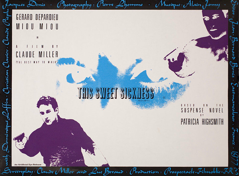
This Sweet Sickness (1977).

Looking around for Quay Brothers designs turned up an item I hadn’t seen before, a poster for the UK release of a French film by Claude Miller, This Sweet Sickness, starring Gérard Depardieu. I’ve not seen the film either, nor have I read the Patricia Highsmith novel on which it was based although a copy of the book has been sitting on my shelves for some time, together with a couple of other unread Highsmiths. The poster dates from just before the Quays started to get serious about their own film-making.
quays02.jpg

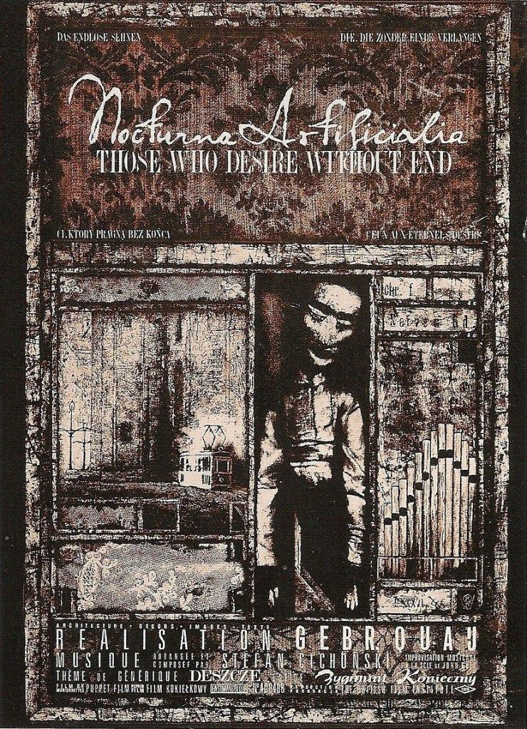
Nocturna Artificiala: Those Who Desire Without End (1979). The organ pipes, which don’t appear in the film, are an allusion to the improvised organ score by Stefan Cichonski.

Being graphic designers as well as film-makers puts the Quay Brothers in a very rare class, one where they not only make the films but also design the posters used to promote their films. Offhand, I can only think of the late Eva Švankmajerová as being in the same company so it’s perhaps fitting that her husband and artistic collaborator, Jan Švankmajer, was the subject of an early film by the Quays.
quays03.jpg

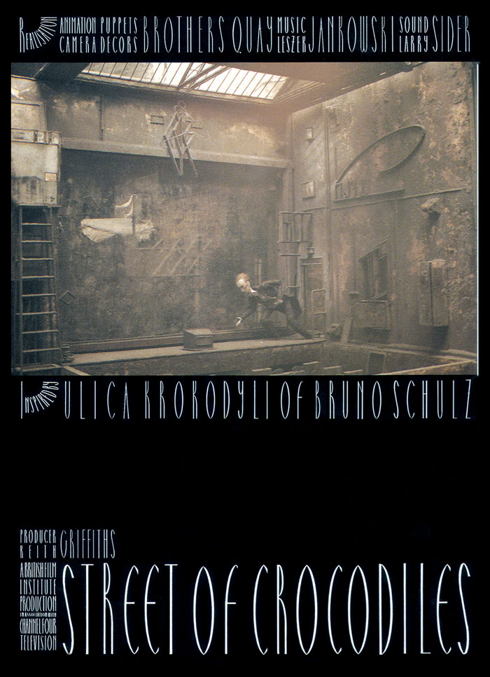
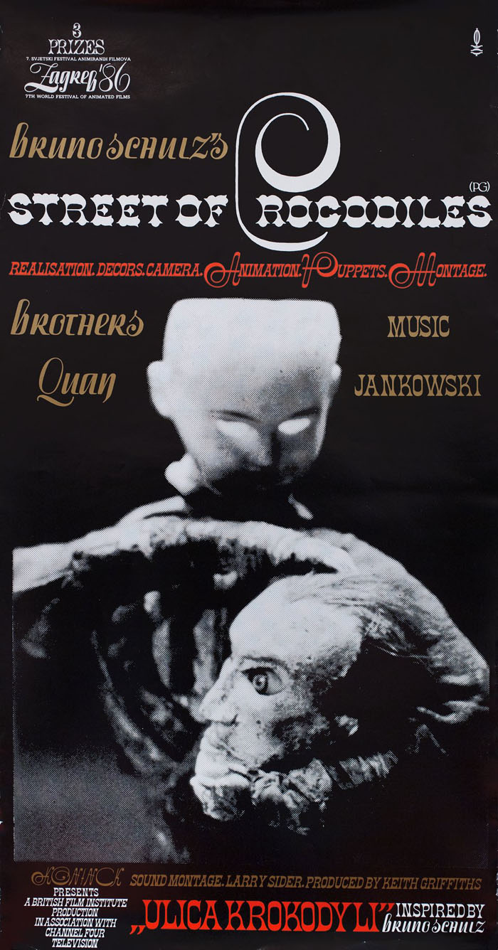
Street of Crocodiles (1986).

quays04.jpg

quays05.jpg

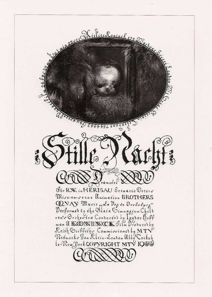
Stille Nacht: Dramolet (1988). An early use of Heinrich Holzmüller’s typographic designs.
Continue reading “Quay Brothers posters”

Hipgnosis interview

hipgnosis1.jpg

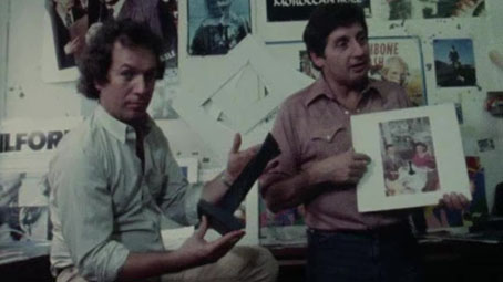
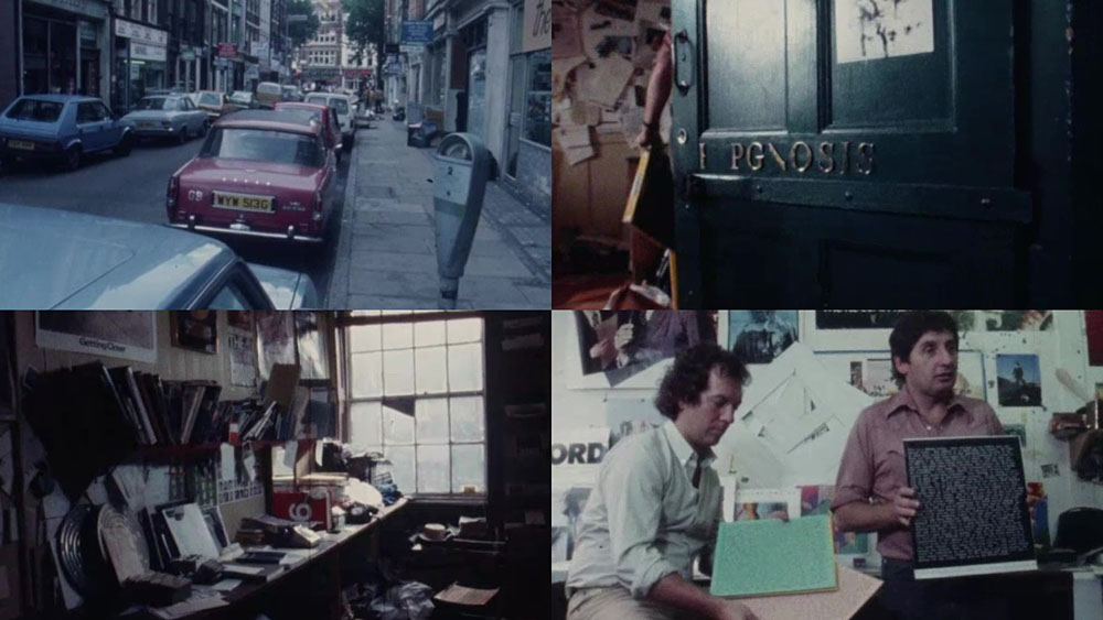
This is a frustratingly short piece of film—a mere 16 minutes—but it’s fascinating all the same for the brief views it gives inside the London studio of the Hipgnosis design partnership at the tail end of their golden decade, the 1970s. Being an occasional album cover designer as well as a minor Hipgnosis obsessive I like to see where so many of the team’s album covers originated. The two Hipgnosis founders, Aubrey Powell and Storm Thorgerson are both interviewed; the third member of the partnership, Peter Christopherson, is absent. The film is also undated but the discussion of the cover photo for Look Hear? by 10cc puts the year at around 1980. The views of the studio aren’t much different from the rather murky shots of the place in the first Hipgnosis book, An ABC of the Work of Hipgnosis: Walk Away René (1978), but the film gives a better sense of the dishevelled actuality: those stairs that Thorgerson runs up at the opening are the same ones that form the background to the melting Peter Gabriel photo used on the cover of Gabriel’s third album. Powell and Thorgerson are such engaging interviewees they really ought to have been profiled at greater length by the BBC or ITV, not given a few minutes to discuss some of their more notable creations by a small French film crew.

hipgnosis2.jpg

Aubrey Powell shows off the mystery object from the Presence album by Led Zeppelin.

The Hipgnosis studio occupied two floors of a building in Denmark Street, a minor thoroughfare off the Charing Cross Road that used to be a home to music publishers, rehearsal rooms and many of London’s musical instrument vendors. For a few years it was also home to the original and equally dishevelled Forbidden Planet book and comic shop, a place I first visited shortly after it opened in 1978. I always used to visit Forbidden Planet when I was in the capital but the Hipgnosis team had gone their separate ways by the time I found out they’d been based in the same street. Had I known about this earlier I probably would have wandered around for a while wondering which door led to their rooms. With its clutter and blithe disregard for client-flattering furnishings (the reception room, said Thorgerson, had nowhere to sit down) the studio was a long way from anybody’s idea of a well-appointed design business. The place reminds me of the offices occupied for many years by Savoy Books in Deansgate, Manchester: ancient, first-floor rooms whose better days were long past, with tools of the trade littering every surface, recent works-in-progress on the walls and old stickers peeling off the door. In Walk Away René, Thorgerson also admits that the studio lacked a toilet so they had to resort to pissing in a sink, a disgraceful expediency also shared by the Savoy office. In such places was art once made.

Previously on { feuilleton }
• Design as virus 16: Prisms
• Storm Thorgerson, 1944–2013
• Hipgnosis turkeys
• Peter Christopherson, 1955–2010
• Storm Thorgerson: Right But Wrong

Old Marvel versus Sherlock Holmes

oldmarvel4.jpg

Arriving in the post this week, one of the books whose covers I was creating late last year. Work-wise, the past year has been busier than usual which means I’ve fallen behind with the logging of recent commissions. In the past few months I’ve created several album designs, more book covers, an entire book design (cover plus interior), and also been working on two bigger projects at the same time. Things have calmed down a little now so updates will be forthcoming.

oldmarvel1.jpg

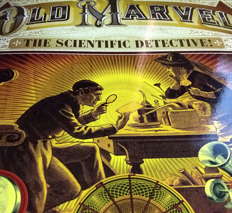
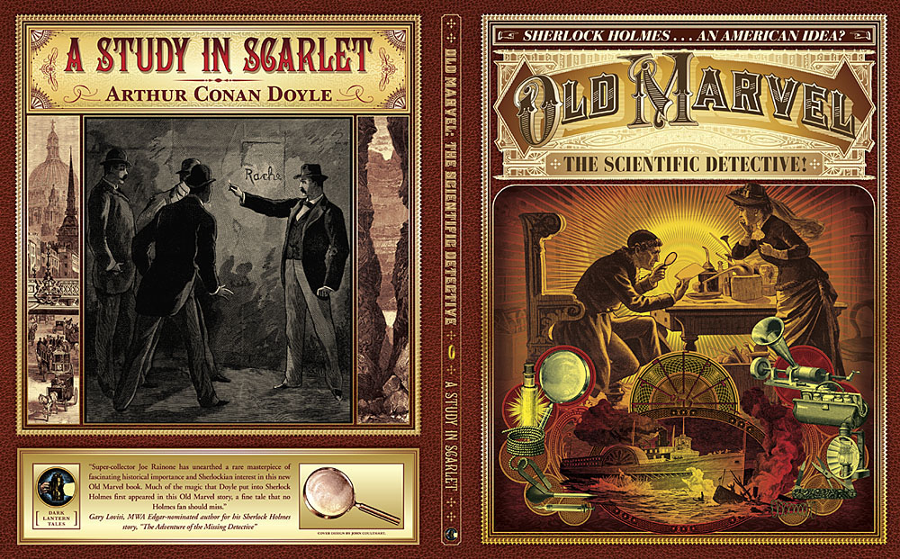
Old Marvel: The Scientific Detective is another design for Mark Williams’ Dark Lantern Tales imprint which once again resurrects a forgotten detective from pulp obscurity, and in a larger format than before. The new volume is significant for presenting a Sherlock Holmes-like character—credited to the pseudonymous “Grip”—who predates Holmes’ first appearance by three years, thereby suggesting a possible inspiration for Arthur Conan Doyle. Holmes collector Joe Rainone provides the details of publication and sets out the available evidence in an informative foreword. The Old Marvel character not only pre-empts Holmes by using his scientific knowledge to solve mysteries but he also pre-empts subsequent generations of spies and investigators with the various gadgets he uses, including what may be the first fictional deployment of an Edison voice recorder. My brief for the cover was to combine the illustration of the character with a vignette showing a shipping disaster from the story plus some of the contents of the detective’s tool kit.

oldmarvel2.jpg

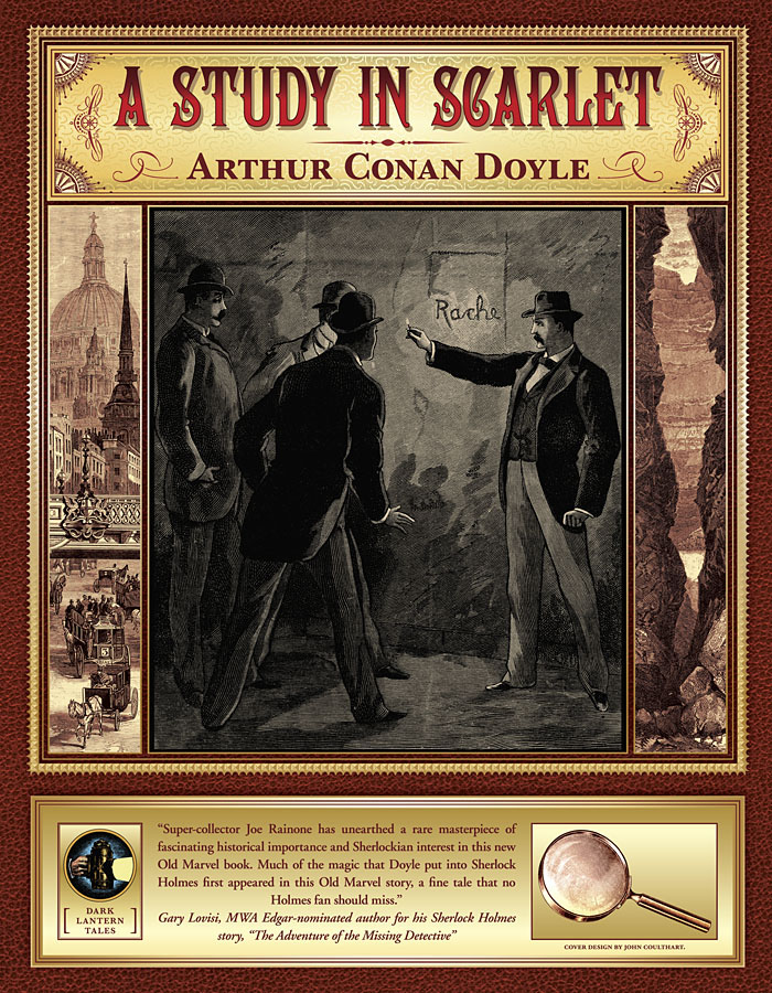
The book is actually two stories in one volume, with the second half being a reprint of the very first Sherlock Holmes novel, A Study in Scarlet. Both stories are presented as semi-facsimiles of their original US printings, together with reproductions of title pages and so on. The Holmes story is reproduced from its appearance in The Illustrated Home Guest in 1892, and includes rare illustrations one of which appears on the cover. Doyle’s first Holmes novel is the most controversial of all his stories—at least if you’re a Mormon—since this is the one where the inhabitants of Salt Lake City are depicted as a murderous religious cult. I filled out the cover with panels showing the two main story locations: a view of London via Ludgate Circus and a canyon in Utah. Finding a period engraving of St Paul’s Cathedral that remained visually interesting when narrowed down in this way took some time.

oldmarvel3.jpg

Previously on { feuilleton }
• More detectives
• The Joe Phenix Detective Series
• Illustrating Sherlock Holmes

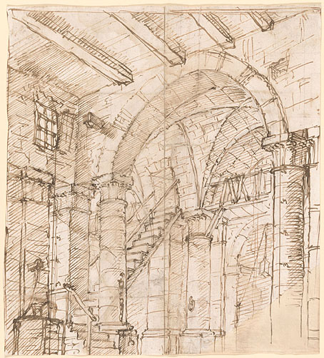
The other Carceri

carceri12.jpg

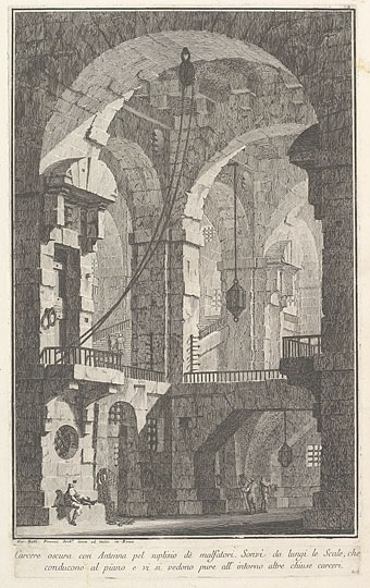
Dark prison with a courtyard for the punishment of criminals (c.1750) by Giovanni Battista Piranesi. (NB: not one of the Carceri d’Invenzione although it is another imaginary prison.)

Piranesi’s etchings of imaginary prisons, the Carceri d’Invenzione, are his most celebrated and influential works but they’re not the only such views to be found in 18th-century art. What you see here are some of the prison settings designed for the theatre and opera of the time, where incarceration or unjust imprisonment was a recurrent theme. Beethoven’s only opera, Fidelio, is one of the more famous examples, with all the action taking place inside the walls of a Spanish prison.

carceri08.jpg

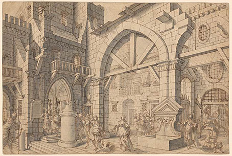
Prison Courtyard with Figures (c. 1720). Attributed to Francesco Galli Bibiena.

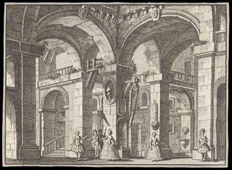
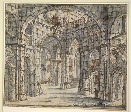
Many of these designs are by various Galli Bibienas, a multi-generational family of Italian artists and architects who included theatrical designers among their talented number. The Galli Bibienas’ prisons lack the invention and menace of Piranesi’s etchings—many of them look as neat and tidy as their designs for colossal gardens and palaces—but I enjoy the dramatic perspectives all the same.

carceri01.jpg

Prison Interior (c.1725–1730) by Antonio Galli Bibiena.

carceri01.jpg

Print depicting the Prison scene in the opera-ballet Cerere placata at the Royal Palace of Jove (1772). Carlo Bibiena (artist) and Giovanni Battista Nolli (etcher).

carceri03.jpg

Design for a stage set: the interior of a prison. School of Francesco Galli Bibiena.

Continue reading “The other Carceri”

Quay Brothers record covers

quays01.jpg

Institute Benjamenta (1998) by Lech Jankowski.

Continuing an occasional series about artists or designers whose work has appeared on record sleeves. Regular readers won’t be surprised to hear that I’ve had this one in mind for some time but it’s taken a while to put together. The main problem has been the Quay Brothers’ habit of using a variety of different names when they were working as designers; variations include “Stefen” rather than Stephen Quay, the Brothers Quai, Gebr. Quay, Jumeaux Quay, The Quays, Atelier Koninck (or Koninck Atelier), and so on. The catalogue compilers at Discogs do a good job of keeping up with the alternate names of groups or musical artists but stumble over those used by anyone else associated with an album’s production. Consequently, this collection of covers shouldn’t be taken as complete or final. Some of the discoveries would have been impossible without the checklist of Quays ephemera that accompanied the MoMA exhibition in 2012.

quays02.jpg

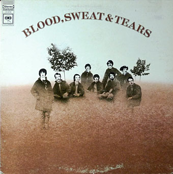
Blood, Sweat & Tears (1968) by Blood, Sweat & Tears.

This must be one of the earliest of the Quays’ commercial works. As with other covers from the first decade of their career, the credit is for illustration alone, graphic design came later.

quays03.jpg

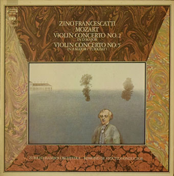
Mozart: Violin Concerto No. 2 In D Major, Violin Concerto No. 5 In A Major (“Turkish”) (197?); Zurich Chamber Orchestra, Zino Francescatti, Edmond De Stoutz.

quays04.jpg

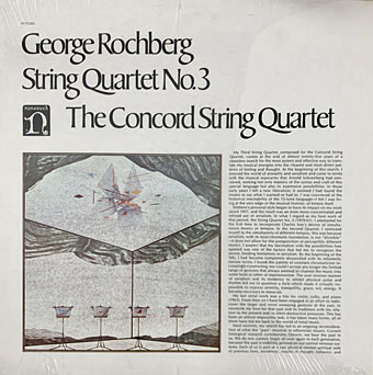
George Rochberg: String Quartet No. 3 (1973); The Concord String Quartet.

quays05.jpg

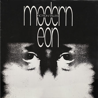
Fiction Tales (1981) by Modern Eon.

Continue reading “Quay Brothers record covers”