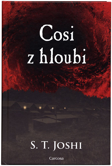
A Czech edition of Something from Below by ST Joshi, 2022.
A few of my illustrations and cover designs have been reprinted on foreign editions over the past couple of years so I thought I’d note them here. All the books are cosmic horror of one kind or another which isn’t too surprising when I’m known more for this than for my work in other genres. Seeing your cover art reused in other countries (or in your own country, for that matter) happens less often than you might think. The music business goes in the opposite direction in this regard. Books, for a variety of reasons, tend to be reprinted with new covers whereas album releases will sail through the years packaged in whatever cover they were fortunate (sometimes unfortunate) to have received when first released. Consequently, you can’t predict which design or illustration might end up being used for a reprint or a new edition.

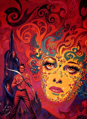
A Swedish edition of The Call of Cthulhu and other stories, 2022. The cover art is from the series of illustrations I produced for Lovecraft’s Monsters, a story collection edited by Ellen Datlow.
This list isn’t necessarily all that may be out there. Another peculiarity of the publishing world is that you can be told a foreign edition is being planned then, after various agreements have been made, never hear about it again. This is partly a result of the Babel-like nature of the internet, in which we navigate our own language zones while remaining ignorant of the other zones which exist close by. If nobody tells you the book was published then you’re unlikely to encounter it by accident. Publishing is also a slow business, so that you might agree to a reprint, send off the artwork then forget all about it until somebody contacts you a year later asking where they should send a complimentary copy. (And publishers don’t always send complimentary copies…) Missing from this list are a Russian edition of Under the Pendulum Sun by Jeannette Ng, and a Chinese edition of The King in Yellow by Robert W. Chambers. In both cases I sent the publishers the artwork and was paid a small fee as a result but I’ve yet to discover whether the books were published using my cover art, or even published at all.
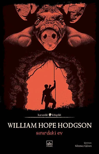
The above is a Turkish edition of The House on the Borderland published by the Karanlik Kitaplik imprint of Ithaki. The imprint title translates as “Dark Bookshelf” although “Dark Library” seems more likely, with the other books in the series being horror novels that feature similar cover designs using tinted monochrome artwork. My illustration is from the interior of the Swan River Press edition which I would, of course, recommend to all Anglophone readers. The Turkish publisher said they planned to reprint some of my other Hodgson illustrations inside their edition but I don’t know whether they’ve done this. Ithaki also have another edition of the novel which reuses the Ian Miller cover art from the old Panther paperback.
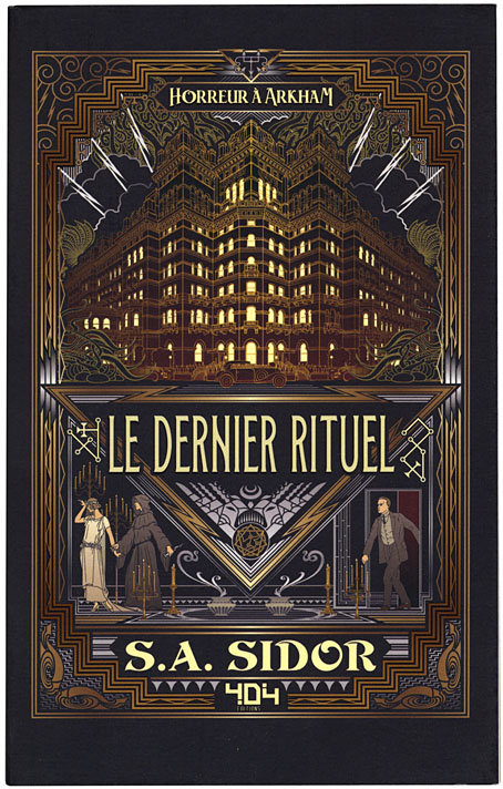
French edition of The Last Ritual by SA Sidor, 2021.
Asmodee has tentacles in many countries so the spin-off books published by the company’s Aconyte imprint have generated a number of foreign editions, one of which has already been mentioned here. I’m pleased to see the reworked covers using fonts sympathetic to the Deco-style design. There are more books in this series (the most recent being The Ravening Deep) so there may be more foreign editions in the future.
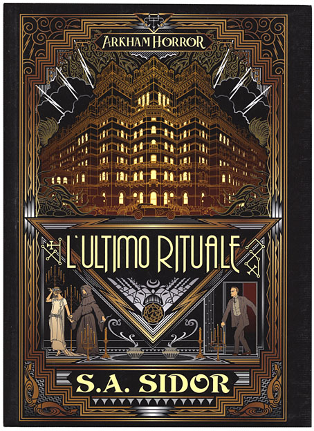
Italy, 2021.
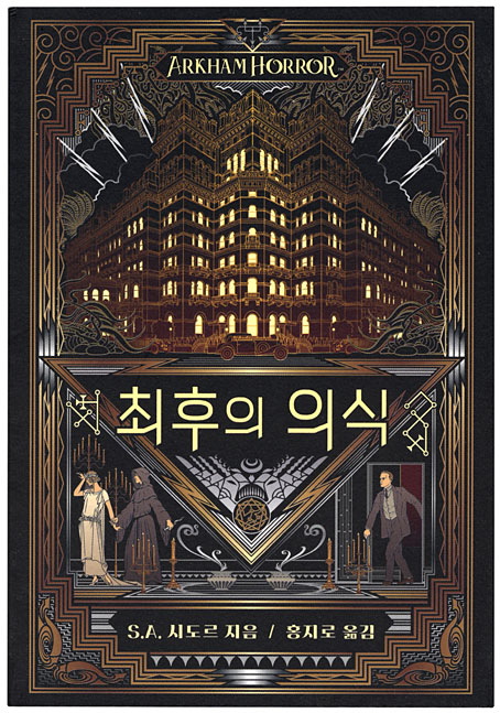
South Korea, 2022.
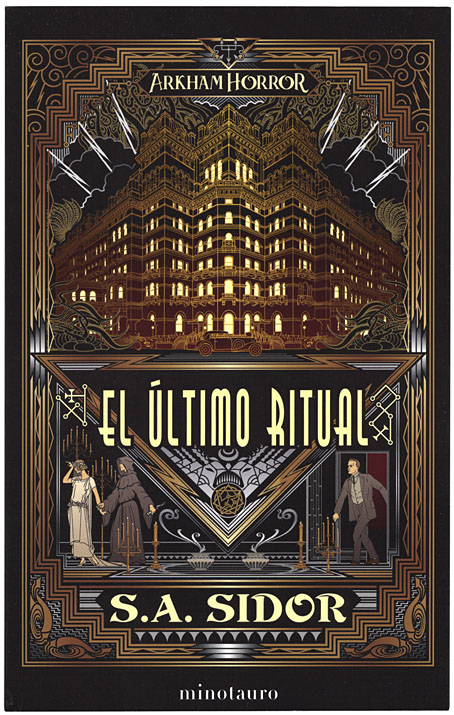
Spain, 2022. This one comes with a postcard of the cover design.
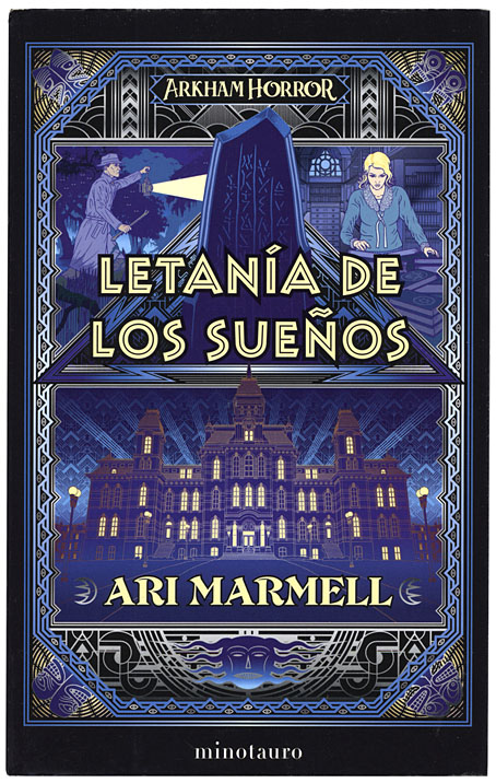
Spanish edition of Litany of Dreams by Ari Marmell, 2022.
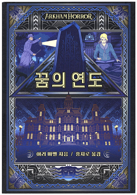
South Korea, 2022.
Previously on { feuilleton }
• Das Letzte Ritual
• Litany of Dreams
• The Last Ritual
• Something from Below
• Lovecraft’s Monsters