Lovecraft’s Brood

brood01.jpg

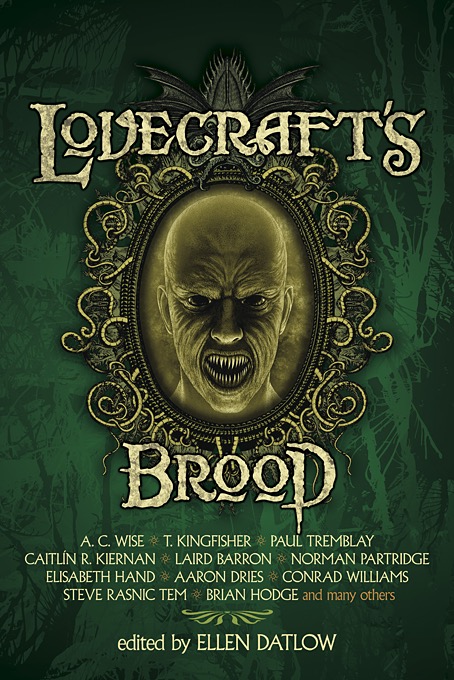
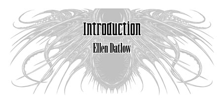
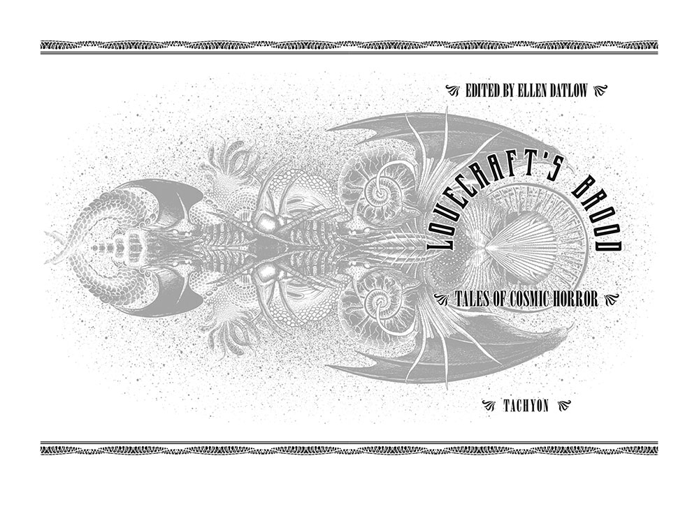
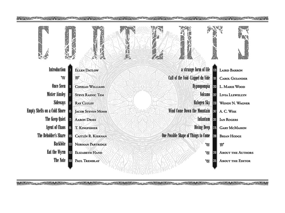
It’s that man again, or some of his progeny, infecting the world with their nightmares. Lovecraft’s Brood is a story collection edited by Ellen Datlow, a kind of follow-up to Lovecraft’s Monsters, although the new book is a more expansive take on the Lovecraftian weird tale. As with the earlier collection, I designed and illustrated this one throughout. The illustrations were more of a challenge this time since the stories weren’t always focused on explicitly physical threats; or if they were, the threats remained either unseen or inexplicable. That can be good sometimes—there’s a tendency in horror illustration to always go for monster portraits or spoilerish scenes from the end of the story—but it doesn’t make the artist’s task an easy one. For a few of the pictures I used a minor detail; in the case of Mister Ainsley, for example, there’s a mention of taxidermy experiments which is what I chose to focus on. What “Mister Ainsley” looks like (or actually is) is never described as such, the reader’s imagination is left to fill the gaps in the story.
brood21.jpg

Among the other pictures there’s my first ever drawing of the real church that gave Lovecraft his model for the home of The Starry Wisdom cult in The Haunter of the Dark. This church, or its fictional counterpart, has haunted my imagination for a long time, being the subject of my first Lovecraft illustration in 1979 and (of course) the subject of my first Lovecraft comic strip in 1986. In Lovecraft’s Brood the church appears in The Beholder’s Share, another fine riff on Lovecraft’s fiction by Caitlín R. Kiernan in which the Starry Wisdom cult actually existed, with the old Catholic church on Federal Hill being the centre of their operations. The real church was demolished in 1992 but the location is still easy to find since the grounds have been turned into a small recreational area which retains the walls that surrounded the building. When I was in Providence in 2015 I walked over to Federal Hill to see a concert performance in a converted cinema but I didn’t manage to visit the site of the church, something I now regret.
brood22.jpg

On the technical side, this set of illustrations is the first where I’ve used Glitch Lab in the creation of some of the artwork. Glitch Lab is one of several tablet-based image-processing apps made by Ilixa that function like Photoshop’s filters but with many more options. Photoshop hasn’t done much with its basic suite of filters since the 1990s, something that doesn’t bother me most of the time but every so often you find yourself wanting to imitate a technical effect that can’t easily be achieved without a lot of work. For two of these illustrations I wanted views seen through different kinds of monitors, the first a low-quality TV screen of a type you’d see in a supermarket, then a distorted image from a malfunctioning camera whose output is being viewed on a computer monitor. Glitch Lab specialises in this kind of technical distortion, and can imitate a wide range of visual glitches of a type generated by old TV sets. The Note is the story with the security camera for which I painted a relatively minimal greyscale scene. This wouldn’t have worked on its own but running it through the filters gave it the required appearance. Wind Come Down the Mountain is much more heavily processed, and could have been pushed a lot further but I’d already destroyed a lot of the detail I’d put into the picture.

Lovecraft’s Brood is out now in print and digital from Tachyon and all the usual outlets.
brood23.jpg

brood02.jpg

Once Seen by Conrad Williams.

brood03.jpg

Mister Ainsley by Steve Rasnic Tem.
Continue reading “Lovecraft’s Brood”

Things Get Ugly

tgu.jpg

Last month I said I had one more cover from 2022 to be made public, having forgotten that there was this one plus another which is currently at the printer, and which I’ll write about at a later date. Things Get Ugly follows last year’s Born For Trouble in being another Joe R. Lansdale cover for Tachyon that uses typography for the whole of the design. As with the earlier cover, this approach sidestepped having to try and summarise a collection of short stories with a single image or graphic. Adding imagery to a collection usually works best when the contents follow a specific theme, which isn’t the case here.

The stories may be described as crime but quite a few of them are dark enough to be included in horror collections. Things do, indeed, get ugly. The intersection between crime and horror fiction isn’t exactly new, the two genres have been entangled since The Murders in the Rue Morgue, and the boundaries remain permeable to this day. The most well-known piece in the new collection is Incident On and Off a Mountain Road, a story that was filmed for TV by Don Coscarelli for the Masters of Horror series, and which also opened the first season in 2005. Coscarelli’s adaptation is even nastier than its source but not everything in the collection is unrelentingly grim. Lansdale has a flair for black comedy which is to the fore in another story, Driving to Geromino’s Grave, in which two Depression-era children have to bring home the rotting body of their deceased uncle. This may not be everybody’s idea of an amusing read but the witty dialogue made me laugh. As well as the cover I’ve designed the interior of this one so I may post samples at a later date.

Things Get Ugly will be published in August. The book can be pre-ordered here.

Previously on { feuilleton }
Born for Trouble
Of Mice and Minestrone

Born for Trouble

trouble.jpg

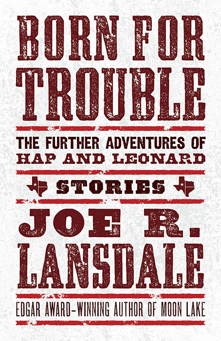
I said at the weekend that I’d recently designed an all-type cover, and here it is. This is my second design for Joe R. Lansdale’s detective duo, and like the earlier Of Mice and Minestrone this one went through more iterations than usual. It’s often the case that the more popular a book is likely to be, the more constraints will be imposed on the cover design. Hap and Leonard are very popular characters so this commission arrived with a number of prerequisites regarding the amount of text, the size of the type and so on. It also required the inclusion of the word “Stories” to emphasise that the book is a story collection rather than a novel. The latter feature is a recent trend in American publishing, one that follows the not-so-recent trend of appending the words “A Novel” to the covers of…novels. As a reader I find these labels to be superfluous and even mildly insulting but as a designer I have to follow the brief, and the brief was to present all of this information in a suitably harmonious manner. Most of the early iterations tried to do this with the addition of some illustrative graphics but the results were persistently unsatisfactory, hence the decision to let the type do the work.

Born for Trouble will be published by Tachyon in March 2022.

Previously on { feuilleton }
Foiled at last
Of Mice and Minestrone

Hardy art

hardy1.jpg

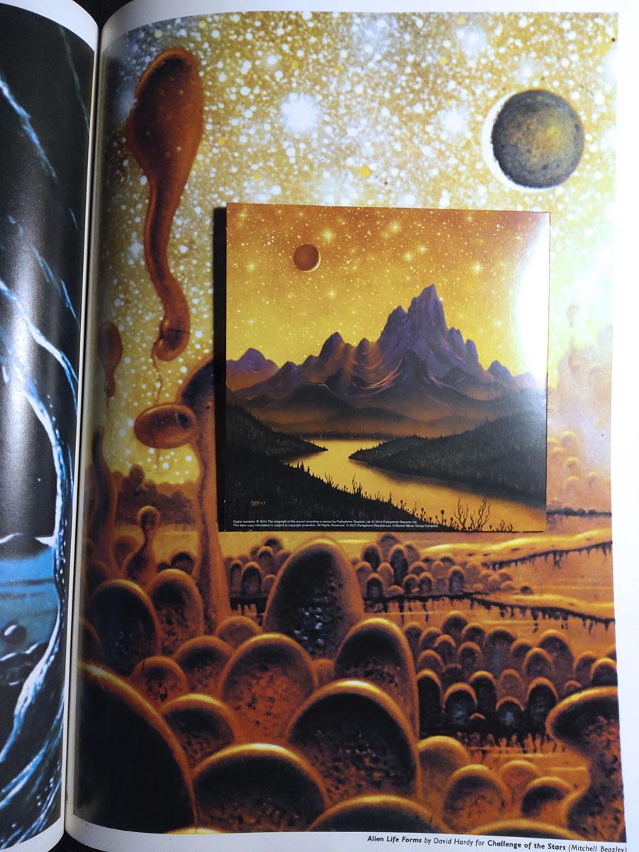
Hawkwind continue to be the overwhelming topic of the moment while I’m reading Joe Banks’ marvellously detailed account of the group’s first decade. One of the many attractions of Hawkwind for this listener was their intersection with other areas of interest: Moorcock and New Worlds, obviously (two of Robert Calvert’s poems appeared in New Worlds Quarterly), but also SF and fantasy in general. The alien planet on the back cover of the Hall of the Mountain Grill album was immediately recognisable as the work of British space artist David A. Hardy thanks to a feature in Visions of the Future (1976) a collection of artwork reprints from the art and fiction magazine Science Fiction Monthly. Hardy had a long association with astronomer Patrick Moore, illustrating the covers of Moore’s novels and later collaborating on a speculative science book, Challenge of the Stars (1972). A few of the latter paintings were reprinted in Visions of the Future, including one with the title Alien Life Forms that depicted amoeboid creatures on a remote planet. The painting would have become the back cover of the Hawkwind album if Hardy hadn’t insisted on creating a new work in a more suitable ratio.

Hardy’s association with Hawkwind extended to their stage shows, with a series of circular paintings used by “Liquid Len” (Jonathan Smeeton) on a rotating projector that covered the band in moving panoramas of ancient monuments, dinosaurs, alien landscapes and exploding worlds. Two of the paintings appear as the endpapers in Joe’s book; the dinosaurs and the monuments may be seen here.

hardy2.jpg

Cover design by Bryan Cholfin.

My own Hawkwind covers make very poor comparisons to Hardy’s meticulous renderings but we do have a further connection via The Very Best of Fantasy and Science Fiction, a collection of stories from the long-running magazine edited by Gordon Van Gelder. I designed the book’s interiors and Hardy contributed the cover art. Hardy painted many covers for F&SF throughout the 1970s and 80s, this shining rocket being a reworking of a cover he produced for the magazine’s 60th anniversary issue. The archetypal spacecraft of classic science fiction, and almost a definitive example. You might even call it a silver machine…

Previously on { feuilleton }
Silver machines
Notes from the Underground
Hawkwind: Days of the Underground
The artists of Future Life
Science Fiction Monthly
The Chronicle of the Cursed Sleeve
Rock shirts
The Cosmic Grill
Void City
Hawk things
The Sonic Assassins
New things for July
Barney Bubbles: artist and designer