
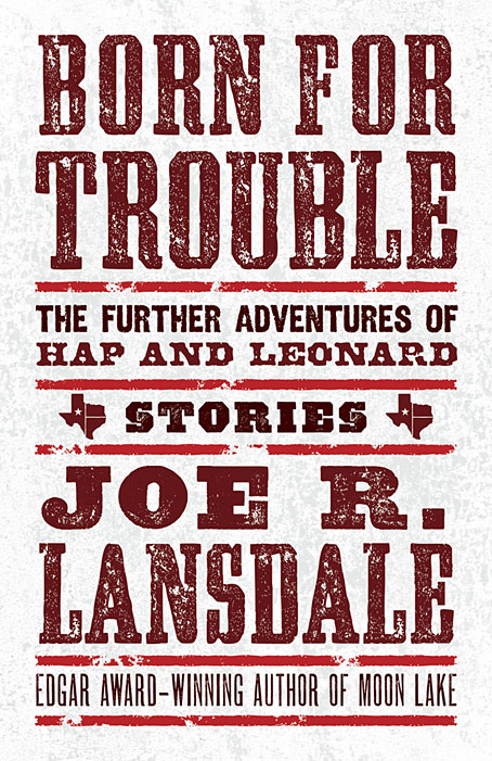
I said at the weekend that I’d recently designed an all-type cover, and here it is. This is my second design for Joe R. Lansdale’s detective duo, and like the earlier Of Mice and Minestrone this one went through more iterations than usual. It’s often the case that the more popular a book is likely to be, the more constraints will be imposed on the cover design. Hap and Leonard are very popular characters so this commission arrived with a number of prerequisites regarding the amount of text, the size of the type and so on. It also required the inclusion of the word “Stories” to emphasise that the book is a story collection rather than a novel. The latter feature is a recent trend in American publishing, one that follows the not-so-recent trend of appending the words “A Novel” to the covers of…novels. As a reader I find these labels to be superfluous and even mildly insulting but as a designer I have to follow the brief, and the brief was to present all of this information in a suitably harmonious manner. Most of the early iterations tried to do this with the addition of some illustrative graphics but the results were persistently unsatisfactory, hence the decision to let the type do the work.
Born for Trouble will be published by Tachyon in March 2022.
Previously on { feuilleton }
• Foiled at last
• Of Mice and Minestrone
Bravo. Excellent work.
For me there is too much information on the cover, hard to know where to look (first). A quick scan will not do. On a shelf in a bookstore (if there’s still one near you) I’d pass by quickly.
Wordy things like ‘Edgar-award winning whatever’….? ‘The further adventures of…’ – couldn’t one lose the ‘The’..?
This is of course a critic af the design brief and not of the designer ;-)
Peter: Thanks :)
Akiro: Yes, I would have omitted the Edgar line if I could. American publishing is like America’s other cultural industries in being obsessed with signifiers of merit; awards and the like have to be mentioned at every available opportunity. Joe’s surname is very large on this cover so that alone would attract his readers.
As an ex sign painter and graphics geek, I too would like to see the title a bit larger and the “further adventures ” lines scaled down a bit. My eye is searching for a place to land.
The assemblage of text itself forms a visual picture, as it resembles a nineteenth c. poster/flyer; in this sense there’s no sharp distinction between cover as image & as text.
‘Stories’ is quite nice in that context.
Personally, as the author, I love it.
I do think the cover looks crowded.
I’m looking forward to reading it, regardless.
Thanks, Joe!