Weekend links 685

katoh.jpg

Art by Naoyuki Katoh, 1982.

• RIP Paul Reubens. Here’s Steven Heller on Pee-wee Herman and his clinically hyperactive playhouse (not forgetting Gary Panter’s involvement); Bruce Handy on Paul Reubens’ preposterous grace; and David Hudson on Paul Reubens before and after Pee-wee.

Three Thousand (2017), a short film by Asinnajaq in which “a riveting collage portrays a century of Inuit history, and envisions a vibrant future”.

• New music: Velocity Of Water by Suki Sou; The Blue Beyond by Jana Winderen; and Jäi mieleen by Aki Yli-Salomäki.

DJ Food posted a handful of psychedelic LP sleeves for non-psychedelic artists. There’s a lot more to be found.

• “We had no rules. Song structure didn’t exist. It was nihilistic.” It’s Bush Tetras again.

• “Infrared light reveals hidden portrait beneath 1943 René Magritte painting.”

• At Dennis Cooper’s: Gakuryu Ishii Day.

Tequila (1958) by The Champs | Tequila (1958) by Perez Prado | Tequila (1972) by Hot Butter

Biblio-hauntology

hauntology.jpg

An invented book cover from the latest post at blissblog. Since I like fakes of this nature, especially when they’re carefully done, I had to go in search of the creator. Rachel Laine is the person responsible, and there’s more along these lines at her Flickr pages, together with many similar items from the universe next door. (I know someone who’ll appreciate all those faded magazine covers combining soft-porn photos with headlines for stories about analogue synths.) Another of the book covers is a guide to “Witches and Witch Craft”, a title whose real-life counterparts included books such as the Hamlyn guide to witchcraft and black magic from 1971. As I’m often saying, the 1970s was the witchiest decade of the 20th century.

uncanny.jpg

All of which reminded me of a couple of recent inventions of my own. One of the advantages of writing here is that I can retrieve from obscurity some of the things I’d previously cast into the Malebolge formerly known as Twitter. This impromptu creation is something I threw together after Callum J posted the cover of an old I-Spy book dedicated to “The Unusual”. (If you don’t know what the I-Spy books were—and still are—Wikipedia has the history.) The screen-grab from Whistle and I’ll Come to You is a lazy choice but I wanted to surprise Callum by reworking his cover as quickly as possible.

quatermass-stamps.jpg

A little more considered is this proposal for a set of British postage stamps dedicated to Nigel Kneale and his works. This one came about after a comment from Kim Newman that such a thing was overdue from the Royal Mail. Since I agreed I thought I could at least fake them into existence. They’re still a little incomplete—actual stamps would have a mention of Kneale on each one—but they look plausible. The artwork was swiped from a series of Quatermass book covers created by the prolific Karel Thole for Mondadori in the late 1970s. The images for the first Quatermass and Quatermass and the Pit work very well, I think, the fourth one less so. If I was doing these myself I’d try some combination of a radio telescope and a stone circle. Windows into another world; in the universe next door Quatermass is bigger than Star Wars. But we live here, not there.

Previously on { feuilleton }
Disciples of the Scorpion
Ghost Box and The Infinity Box
Llewellyn occult magazine and book catalogue, 1971
Typefaces of the occult revival
The Book of the Lost
Books Borges never wrote
Forbidden volumes

The exposition moiré

expo2000-1.jpg

Logos designed by QWER, Iris Utikal and Michael Gais.

Hannover’s Expo 2000 wasn’t very successful as expositions go but it had an attractive logo, a combination of bold sans-serif type with a moiré background pattern which ideally had to be seen in its animated form. World expositions tend to be concerned with technical innovations and novelties, and this animated design was certainly novel, if impossible to replicate in print. All the static versions of the logo are essentially screenshots of the moving version, with the moiré image frozen at a various places to generate many shape and colour variations. Not all of these are satisfactory. I think it was Matisse who said that anyone can put two colours together; the real challenge is putting three together in a harmonious manner.

expo_logo.gifThe pattern was a little more animated on the original exposition website, albeit reduced to this tiny gif. The site is mostly intact and browsable at the Internet Archive, a primitive thing by today’s standards but Expo 2000 was the first world exposition with a dedicated website, something which really did set it apart from its predecessors. Many of the exposition’s buildings and exhibits would have seemed bizarre or alarmingly ugly to the people who attended the Paris Exposition Universelle in 1900 but much that was on display in Hannover would at least have been comprehensible to a visitor from the past. Trying to explain what “a website” was to someone in 1900, even a futurologist like HG Wells, would have required considerable effort.

expo2000-2.jpg

Video for Expo 2000 by Kraftwerk.

Ephemerality is a distinguishing characteristic of world expositions, all those splendid pavilions and eye-catching constructions don’t last very long even though the events themselves involve years of planning. A list of exposition features that have managed to survive would be a disparate collection, taking in well-known landmarks like the Eiffel Tower, Seattle’s Space Needle and the Atomium in Brussels, architectural projects such as the Grand Palais in Paris and the Biosphere in Montreal, and one-off oddities like the Unisphere in Queens and the cement dinosaurs in Crystal Palace Park. If Expo 2000 is remembered for anything today it’s the one-off song that Kraftwerk wrote for the occasion, Expo 2000, which arrived with graphics and visuals based on the expo logo. Kraftwerk had been hired at great cost to create the jingles in different languages that accompany the animated logo. This is turn led to the song, the group’s first new studio composition in 14 years.

expo2000-4.jpg

I thought these abstract images were a good match for Kraftwerk, I prefer them to the other designs for the single which show the four computer-generated figures that later appeared on the cover of Minimum-Maximum. The CD case at the top left was made with lenticular plastic which imitated the moiré effect of the animated logo. I didn’t buy this one when I had the chance, choosing instead the “enhanced” version which came with a minuscule copy of the video in a CD-ROM section. Like most CD-ROM singles, the audio tracks still play but the enhanced section no longer works. Welcome to the future.

Continue reading “The exposition moiré”

Weekend links 684

okamoto.jpg

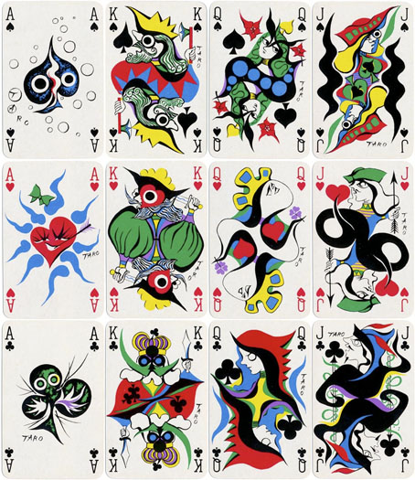
Playing cards designed in 1977 by Taro Okamoto.

• “This practice of looking does not prioritise academic or historical perspectives on art. It is divorced from the artist, the industry and the formal study of the arts. By paying attention to the form, title and other perceptible ‘clues’ in the work, this practice is primarily interested in using the intuitive, sensory, suggestive and aleatory to engage in conversation with a creative work. The point is not to develop an answer, an interpretation that ‘settles’ the ‘question’ of the painting, or to intellectualise the work in terms of form, style, history or the concerns of the artist. Rather, in this practice, a piece of art or writing becomes a test or opportunity for working one’s imagination—an exercise in making associations.” Aparna Chivukula on choosing art over wellness apps.

• “But with the discourse about the limitations of moralizing steadily growing, the question of an alternative naturally arises. The critics of self-righteousness and trauma mongering are for the most part not calling for a return to the amoral ironism that governed the Nineties and early Aughts—the sensibility that surely gave rise, at least in part, to the overgrowth of didacticism that followed. But if not this, then what? Where do we go from here?” Anastasia Berg on “the aesthetic turn”.

• “…by choosing ordinary creatures, the fabulist naturalises the stories in a world that is close to hand, which helps the writer communicate opinions that are often subversive.” Marina Warner on Kalilah wa-Dimnah and the animal fable.

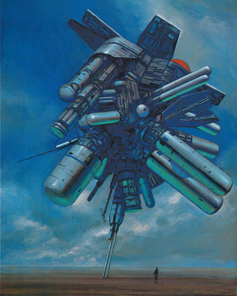
• Coming soon from Strange Attractor: Austin Osman Spare, a revised and expanded edition of Phil Baker’s excellent biography of the artist/occultist.

• At Rarefilmm: The Marat/Sade (1967), Peter Brook’s film (previously) of the 1965 Broadway production of Peter Weiss’s play.

• New music: Hostile Environment by Creation Rebel, and Tone Maps by Field Lines Cartographer.

• Mixes of the week: Isolatedmix 122 by Mary Yalex, and XLR8R Podcast 810 by Zaumne.

• At Dennis Cooper’s: Pierre Clementi Day.

Sade Masoch (1968) by Bobby Callender | On Sadism (1979) by Material | Sadistic (1995) by Stereolab

Dekalog posters by Ewa Bajek-Wein

dekalog01.jpg

One of the pleasures of our age of cultural plenitude is the opportunity to immerse yourself in entire filmographies. I did this recently with almost all of Wes Anderson’s films (I skipped Bottle Rocket, and I still haven’t seen Asteroid City); last week it was the turn of Krzysztof Kieślowski, with a run through four of his Polish films—The Scar, Camera Buff, Blind Chance and No End—followed by the final quartet of The Double Life of Veronique and the Three Colours Trilogy. This week I’ll be working my way through Kieślowski’s Dekalog, a cycle of ten hour-long films that I’ve had on disc for years but not watched all the way through for some time.

dekalog02.jpg

Dekalog (or The Decalogue) is a series that Kieślowski made for Polish TV in 1988, although subsequent acclaim for the cycle (famously from Stanley Kubrick) has seen it treated as a work of cinema in its own right, albeit one that few people are likely to watch in a single sitting. Two of the films were also expanded to feature length and released individually as A Short Film About Love and A Short Film About Killing. Each film concerns different inhabitants of the same housing estate, with the problems they face (or that they create) being related to one of the Ten Commandments. None of the Commandments are named as such, we’re left to guess from the numbers which is which. I imagine this would have been more obvious to an audience in Poland where Catholicism remained a dominant presence despite the disapproval of the Communist authorities. I was dragged through the Catholic church as a child but I still couldn’t list all the Ten Commandments today without cheating. Kieślowski’s films aren’t as dourly moralistic as this structure might suggest. Ironic circumstance was one of his persistent themes, his characters usually find their desires thwarted or fulfilled in ways they didn’t anticipate at all. Fate, rather than the hand of God also plays a part, dramatically so in Blind Chance where we see three different futures for a young student running to catch a train.

dekalog03.jpg

Ewa Bajek-Wein’s posters turned up when I was searching for designs by Andrzej Pągowski, an artist responsible for many of the Polish posters for Kieślowski’s films, including the two Dekalog features. Bajek-Wein’s designs, created for a 2009 reissue of the cycle, continue the Polish tradition of original and unorthodox approaches to the cinema poster which extends in this case to the graphics as well as the artwork. Titles and other credits on 20th-century Polish posters were often casually hand-lettered, with the details pushed to the margins. The artwork here maintains the elusiveness of the theme; if you don’t know which number relates to which Commandment you’re left to guess from the picture. Films five and six are easy enough to decipher but I’ll be looking up the titles of the rest before I watch them again.

dekalog04.jpg

dekalog05.jpg

Continue reading “Dekalog posters by Ewa Bajek-Wein”