Bob Peak revisited

peak.jpg

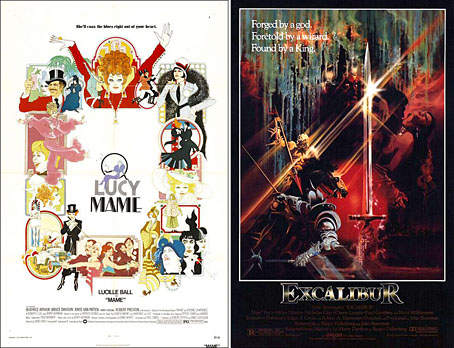
left: Mame (1974); right: Excalibur (1981).

Matthew Peak, son of film poster artist Bob Peak, left on a comment this week on an earlier post I made about his father’s art with news of the relaunch of the Peak site. I’m looking forward to seeing what gets posted there especially since the additions to date are such good quality. Peak was a tremendously powerful and dramatic artist whose posters are often a lot more engaging than the films they were intended to promote. He was also exceptionally versatile, as the two examples above demonstrate (via IMP Awards), being equally adept at hard-edged graphics as he was with nebulous airbrush paintings. As with the similarly versatile Richard Amsel, the more time passes, the more these posters seem evidence of an artistry and individuality which has vanished from the world of film design.

Previously on { feuilleton }
• The art of Aquirax Uno
• Alice in Acidland
• Salomé posters
• Polish posters: Freedom on the Fence
• Kaleidoscope: the switched-on thriller
• The Robing of The Birds
• Franciszek Starowieyski, 1930–2009
• Dallamano’s Dorian Gray
• Czech film posters
• The poster art of Richard Amsel
• Bollywood posters
• Lussuria, Invidia, Superbia
• The poster art of Bob Peak
• A premonition of Premonition
• Metropolis posters
• Film noir posters

Weekend links 14

fraser.jpg

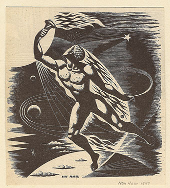
A drawing by Eric Fraser from the Radio Times, 1947. From this Flickr set.

• I helped put together the design for the Pursuit Grooves album recently. FACT magazine interviewed Vanese Smith about her work.

• One of the books whose interiors I designed last year for Tachyon was The Secret History of Science Fiction, a story collection edited by James Patrick Kelly and John Kessel. (And a book which I’ve yet to add to my web pages, I’m still behind with updates.) The LA Times has a piece about the anthology here, focusing on the Don DeLillo contribution, Human Moments in World War III.

• It’s been another week of Facebook hate; being a self-satisfied refusenik I can’t help but find this amusing. Too many good pieces to list but Gizmodo had more reasons why you should still quit Facebook, Jason Calacanis gathered lots of links to other stories on his blog while social media expert Danah Boyd got to the heart of the matter with a very cogent polemic.

• If you want an alternative to Facebook, Diaspora is “the privacy aware, personally controlled, do-it-all distributed open source social network”.

• David Toop has a new book out next month. “Sinister Resonance begins with the premise that sound is a haunting, a ghost, a presence whose location is ambiguous and whose existence is transitory. The intangibility of sound is uncanny – a phenomenal presence in the head, at its point of source and all around. The close listener is like a medium who draws out substance from that which is not entirely there.”

• Coilhouse looks at the late Decadent artist and designer Hans Henning Voigt (1887–1969), better known as Alastair.
mclark.jpg

come, been and gone.

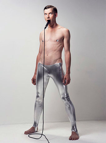
• “After a sold out season at the Barbican in 2009 Michael Clark Company returns with the next instalment of his critically acclaimed production made primarily to the music of David Bowie. come, been and gone also embraces the work of Bowie’s key collaborators: Lou Reed , Iggy Pop , Brian Eno and touches on some of his influences; The Velvet Underground , Kraftwerk and Nina Simone……This production contains loud music and graphic images.” I should hope so.

• “Why should boys always be boys, and girls always be girls?” Brutal/Beautiful, photography by Austin Green.

• John Foxx, Iain Sinclair and others appear at Short Circuit 2010 next month.

• Black, Brown, and Beige: Duke Ellington’s music and race in America.

• Jane Siberry has made all her albums available as free downloads.

• Ruth Bayer photographs people after they’ve inhaled poppers.

• Swiss artist catalogues mutant insects around nuclear plants.

• Pompeii’s X-rated art will titillate a new generation.

• The Happy, Haunted Island of Poveglia, Venice.

• The Art of American Book Covers, a blog.

• Kanellos, the Greek protest dog.

• Song of the week: Twiggy Twiggy (1994) by Pizzicato Five.

Gothic alphabets

gothic1.jpg

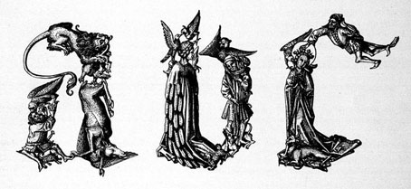
I have a couple of books with examples of medieval capitals like these, each letter being an amalgam of people, animals or (in the case of the example below) duelling knights. These are from Gothische Alphabete (1897), a book by Jaro Springer at the excellent University of Heidelberg which has the whole volume available as a PDF or as scans of individual pages.

gothic2.jpg

Previously on { feuilleton }
• Letters and Lettering

Into the Media Web by Michael Moorcock

itmw11.jpg

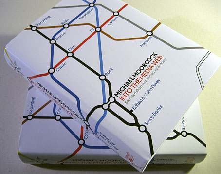
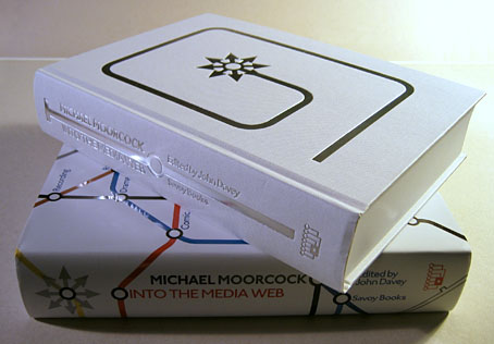
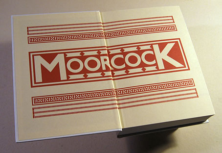
Here at last is the book I spent a good part of last year designing. Into the Media Web is a huge volume as befits a huge talent, 720 pages of Michael Moorcock’s non-fiction spanning fifty years of his career from his days writing for sf and fantasy fanzines, through to journalism, reviews and articles for major newspapers and magazines. Moorcock expert John Davey did an amazingly thorough job of compiling, editing and annotating it all, and it’s been a considerable pleasure to design such an important collection. Alan Moore provided the substantial introduction. Savoy Books haven’t announced a price yet but it’s going to be about £45 since it’s another limited edition and weighs a ton. Into the Media Web makes a fine companion to last year’s The Best of Michael Moorcock from Tachyon, also edited by John Davey (with Ann & Jeff VanderMeer) and whose interior I also designed. Details about Into the Media Web‘s design follow below.

itmw12.jpg

The dust jacket is matt white with a spot UV layer which picks out the titles and lines in gloss.

itmw13.jpg

Continue reading “Into the Media Web by Michael Moorcock”

Jugend, 1900

jugend-1900-01.jpg

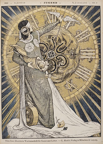
Continuing the rake through back issues of Jugend magazine, the German fin de siècle periodical of “art and life”, this post covers the year 1900 and will be the final Jugend image trawl. I mentioned in the post for 1899 that the magazine loses its Art Nouveau dynamism as the years pass. 1900 represents the point where all the graphics which make Jugend valued today—and which gave the name to the German manifestation of Art Nouveau: Jugendstil—are being pushed aside by the burgeoning nationalist and militarist fervour which led eventually to the First World War. At this point a couple of the notable Art Nouveau stylists such as Otto Eckman and Julius Diez are still present, and the work of Hugo Höppener, aka “Fidus” is increasingly prominent. In subsequent years the eccentric Fidus is mostly on his own, pursuing his obsession with naked figures, and his work seems even more curious in such staid surrounds. As before, anyone wanting to see more of these graphics is advised to explore the bound volumes at the Heidelberg University archive. The two books for 1900 can be found here and here.

jugend-1900-02.jpg

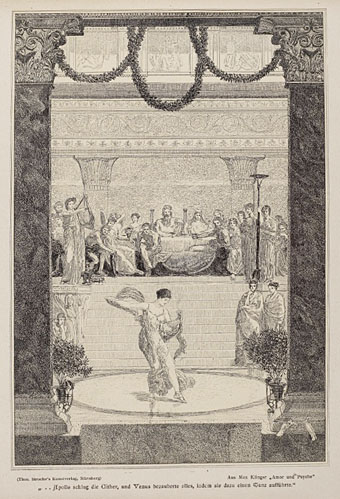
A picture by the Symbolist and Secession artist, Max Klinger.

jugend-1900-03.jpg

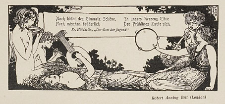
Nymphs and satyrs by English artist and illustrator Robert Anning Bell.

Continue reading “Jugend, 1900”